Today the Obama Administration will direct the Department of Labor to revise an important regulation on the payment for overtime as it pertains to workers classified as "managers/supervisors" who are paid a fixed salary instead of an hourly wage, regardless of the number of hours worked.
There is a VERY low threshold under the Department of Labor regulations that allows employers to classify someone as a manager. It can be as few as TWO workers that the manager manages or if they have some day to day control over functions of a business. See HERE for more on that.
Right now, a business is required to pay someone in a management position at least $455.00 per week in salary to avoid paying over-time. The Department of Labor has some defined parameters for who is considered a manager HERE.
At this point, it is not known exactly what the Administration will propose as a new threshold BUT with a tiny bit of research it seems like there is a consensus that it will be around $650.
This means if you are now paid somewhere BETWEEN $455.00 and $650.00 (tentative!) for your management expertise, then your employer will have to consider ANY overtime hours you work and pay you accordingly for them OR they can bump you up to at least $650.00 per week.
Or they could decide you are not worth that much at that pay level and cut your position and consolidate your duties with a manager already making over $650.00 per week. Ouch.
Implementation of this won't happen any time soon, though. It has to go though regulatory approval.
I will provide more details when they are released.
Wednesday, March 12, 2014
Tuesday, March 11, 2014
A single mom with two kids will get a 39% pay increase if the minimum wage goes to $10.10, right? She will be the first one to tell you NO, not even close! See the numbers here.
Here is a table (I modified it a little) from The Economix that shows how an increase in the minimum wage from $7.25 to $10.10 per hour will affect different peoples NET INCOME. That is income after taxes are subtracted and benefits are added in.
Two things (at least 2) happen when your income increases: (1) the payroll taxes owed increases and (2) government benefits tend to decrease because they are "means tested". This means the amount a person receives depends on the level of income earned AND the benefit decreases as income increases.
I high-lighted the "Single Mother with Two Children" category because these families tend to have higher poverty rates than the other categories. And we care about the poor, right?
The first table shows the minimum wage at its current level of $7.25. The wage earner would pay no income tax on that level of income, but pay $1,154 in mandatory payroll taxes (6.2% in Social Security and 1.45% in Medicare tax(es)). They would receive tax credits (a "refundable tax credit") in the amounts of $5,460 and $1,812. They would also be eligible for $2,898 in a food stamp (SNAP) benefit.
If you take the persons total income, subtract payroll taxes, then add in the tax credits and the SNAP benefit, their effective "take home pay" is $24,069.
Using this number we can calculate the "effective hourly wage rate" ($24,069/2,080 hours (40 hours per week times 52 weeks) or $11.57 per hour in wages/tax credits and benefits. Remember that number.
But what happens to the single mother's effective wage rate when the minimum wage increases to $10.10 per hour (a 39% increase)? Will here total compensation rise by that much? See the 2nd table.
Wage income increases. Payroll taxes increase (the more you earn, the more you pay). Income tax at that level of income is still $0. However, there are changes in the mix of tax credits and SNAP benefits. On net, those are LOWER than they were before.
When all totaled together NET INCOME is now $28,200. Certainly higher than it was before, but how much higher? As much as the minimum wage increase, as I think most people would believe?
If we divide $28,200 by 2080 hours worked in a year we get an effective wage of $13.56.
If we compare the change AFTER we include all the relevant numbers we can see that the single mom with two kids is making $13.56 per hour instead of $11.57.
That is an increase of 17%. Far cry from the 39% increase in the minimum wage.
So, when discussing the minimum wage and the magnitude of help it will give a single mother, we need to include more than the nominal increase in it.
It tells only half the story. BUT a hardworking single mother will probably already be able to tell you that things are not always as they seem.
Two things (at least 2) happen when your income increases: (1) the payroll taxes owed increases and (2) government benefits tend to decrease because they are "means tested". This means the amount a person receives depends on the level of income earned AND the benefit decreases as income increases.
I high-lighted the "Single Mother with Two Children" category because these families tend to have higher poverty rates than the other categories. And we care about the poor, right?
The first table shows the minimum wage at its current level of $7.25. The wage earner would pay no income tax on that level of income, but pay $1,154 in mandatory payroll taxes (6.2% in Social Security and 1.45% in Medicare tax(es)). They would receive tax credits (a "refundable tax credit") in the amounts of $5,460 and $1,812. They would also be eligible for $2,898 in a food stamp (SNAP) benefit.
If you take the persons total income, subtract payroll taxes, then add in the tax credits and the SNAP benefit, their effective "take home pay" is $24,069.
Using this number we can calculate the "effective hourly wage rate" ($24,069/2,080 hours (40 hours per week times 52 weeks) or $11.57 per hour in wages/tax credits and benefits. Remember that number.
 |
| Source: Economix at The New York Times |
But what happens to the single mother's effective wage rate when the minimum wage increases to $10.10 per hour (a 39% increase)? Will here total compensation rise by that much? See the 2nd table.
Wage income increases. Payroll taxes increase (the more you earn, the more you pay). Income tax at that level of income is still $0. However, there are changes in the mix of tax credits and SNAP benefits. On net, those are LOWER than they were before.
When all totaled together NET INCOME is now $28,200. Certainly higher than it was before, but how much higher? As much as the minimum wage increase, as I think most people would believe?
If we divide $28,200 by 2080 hours worked in a year we get an effective wage of $13.56.
If we compare the change AFTER we include all the relevant numbers we can see that the single mom with two kids is making $13.56 per hour instead of $11.57.
That is an increase of 17%. Far cry from the 39% increase in the minimum wage.
So, when discussing the minimum wage and the magnitude of help it will give a single mother, we need to include more than the nominal increase in it.
It tells only half the story. BUT a hardworking single mother will probably already be able to tell you that things are not always as they seem.
Monday, March 10, 2014
Nice graphic on how much it costs to manufacture US coins. Time for the penny AND Nickel to go???
The Washington Post has an excellent story and a few graphs on the cost of making money. Not earning money but the actual manufacture of currency and coinage.
Making a dollar bill is pretty profitable but making pennies and nickels is a money losing proposition.
Isn't is really time to let the penny go and become a historical footnote?

The cost of the metal bares much of the blame for the increased production costs.
The graph below shows how much it costs to produce $1.00 worth of each bill and coin.

Saturday, March 8, 2014
Made a graphic to show why Chipotle is concerned about the supply of avocados. Maybe we DO need to be worried after you see this.
I pieced together two maps (sources cited below) to show why the Chipotle restaurant chain has expressed some concern about its supply chain in regards to avocados.
California produces 86% of the avocado crop in the US. Roughly 390 million pounds.
Chipotle uses about 35 million pounds of Avocados per year, or 9% of the total crop by itself.
Any reduction in the crop due to drought loss would have a negative impact on the over-all supply. Hence rationing by price would be the order of the day.
Might be a good time to get into the futures market for Avocados....IF there is one!?!?!
California produces 86% of the avocado crop in the US. Roughly 390 million pounds.
Chipotle uses about 35 million pounds of Avocados per year, or 9% of the total crop by itself.
Any reduction in the crop due to drought loss would have a negative impact on the over-all supply. Hence rationing by price would be the order of the day.
Might be a good time to get into the futures market for Avocados....IF there is one!?!?!
 |
| Drought Map from Washington Post. The avocado map from Mission Avacado |
All the nuts are in California. No, really, they are. Nice graphic on nut production (and veggies and fruits) in the Bay State.
This from Mother Jones via Big Agriculture.
I was very surprised by the percentages here. I am guessing you might be as well.
They include a nice reference map of the drought areas so you can see how it may affect food stuff production, hence the price of food in the chain.

I was very surprised by the percentages here. I am guessing you might be as well.
They include a nice reference map of the drought areas so you can see how it may affect food stuff production, hence the price of food in the chain.
Friday, March 7, 2014
Why did the unemployment rate INCREASE in February when more jobs were created than expected? You know what they say about Statistics. See here the what for's...
Lately the pace of job creating has been tepid, to say the least, BUT the unemployment rate has been going DOWN. How does that happen?
This month (Feb 2014) the number of jobs created has been far better than in past months BUT the unemployment went UP. How does that happen?
Mostly has to do with the movement of people in and out of the labor force.
I pluck the following data from the latest Household Survey on Employment (Feb 2014). I highlighted the "Civilian Labor Force" in yellow. This shows the number of people employed and unemployed added together.
I highlighted in brownish the numbers for the past two months and for one year ago (Feb 2013). Notice the Civilian Labor Force DECREASED on net last year. From January 2013 to December 2013 there was a net DECLINE in the Labor Force of 51,000. This will tend to LOWER the unemployment rate as people exit the labor force for various reasons (retirement, giving up looking for work).
So, a decrease in the unemployment rate in the short run can be a bad sign.
However, in February there was a BIG bump UP in the Labor Force by 264,000. This will tend to INCREASE the unemployment rate as more people jump back in (or enter for the first time) to the Labor Force.
This can be a GOOD thing! If people are more confident about job prospects then initially more people who were not looking for jobs are not looking.
So, an increase in the unemployment rate in the short run can be a positive sign.
Don't you just love economics and statistics?

This month (Feb 2014) the number of jobs created has been far better than in past months BUT the unemployment went UP. How does that happen?
Mostly has to do with the movement of people in and out of the labor force.
I pluck the following data from the latest Household Survey on Employment (Feb 2014). I highlighted the "Civilian Labor Force" in yellow. This shows the number of people employed and unemployed added together.
I highlighted in brownish the numbers for the past two months and for one year ago (Feb 2013). Notice the Civilian Labor Force DECREASED on net last year. From January 2013 to December 2013 there was a net DECLINE in the Labor Force of 51,000. This will tend to LOWER the unemployment rate as people exit the labor force for various reasons (retirement, giving up looking for work).
So, a decrease in the unemployment rate in the short run can be a bad sign.
However, in February there was a BIG bump UP in the Labor Force by 264,000. This will tend to INCREASE the unemployment rate as more people jump back in (or enter for the first time) to the Labor Force.
This can be a GOOD thing! If people are more confident about job prospects then initially more people who were not looking for jobs are not looking.
So, an increase in the unemployment rate in the short run can be a positive sign.
Don't you just love economics and statistics?
First look at the latest jobs report out today. Some good, some bad, but not necessarily ugly.
Here is your first look at the BLS's "Establishment Survey" of employment in the US for Feb 2014. This is a survey of US businesses (big and small) to determine how many jobs have been created in the economy.
I highlight in YELLOW the positives and in RED the lukewarm-to-negatives.
A total of 175,000 new jobs were created in February. Of that total, 162,000 were private industry jobs and 13,000 were public sector government jobs. Of those 13,000 government jobs, 11,000 were at the State level, 8,000 were at the Local level and there was a net LOSS of Federal government jobs of 6,000. I have not looked but guessing a good chunk of those were post office jobs.
"Professional and Businesses Services" was a big gainer at +79,000. This represents 45% of all the new jobs. Within the category, 24,400 were Temp jobs. This represents 31% of the Business and Services jobs created. So, Professional and Business Service jobs minus Temp jobs was 54,600, which is 31% of all the jobs created. It has not performed so well the last couple of months, so it picked up the slack somewhat from other sectors that faltered.
We want all job sector boats to rise in the tide. Seems like job creation lately has been more displacement from one sector to the other as opposed to consistent growth overall. And THAT latter thing is what we need!

I highlight in YELLOW the positives and in RED the lukewarm-to-negatives.
A total of 175,000 new jobs were created in February. Of that total, 162,000 were private industry jobs and 13,000 were public sector government jobs. Of those 13,000 government jobs, 11,000 were at the State level, 8,000 were at the Local level and there was a net LOSS of Federal government jobs of 6,000. I have not looked but guessing a good chunk of those were post office jobs.
"Professional and Businesses Services" was a big gainer at +79,000. This represents 45% of all the new jobs. Within the category, 24,400 were Temp jobs. This represents 31% of the Business and Services jobs created. So, Professional and Business Service jobs minus Temp jobs was 54,600, which is 31% of all the jobs created. It has not performed so well the last couple of months, so it picked up the slack somewhat from other sectors that faltered.
We want all job sector boats to rise in the tide. Seems like job creation lately has been more displacement from one sector to the other as opposed to consistent growth overall. And THAT latter thing is what we need!
Tuesday, March 4, 2014
Maps of India, South Africa and the Korean Peninsula at night. One has more light, one has the same, and one has none. Economic progress in one blog posting...
One of my favorite maps is "The World at Night". It is composite map that shows the presence of artificial light or more specifically the presence of electricity to create that light. It is an indicator of modern economic and social activity.
It makes a great lesson for an economics and/or geography class.

I came across these two maps below that show to specific countries and the difference in the presence of artificial light. It is suggested that this tells a story of differing paces of economic progress.
The first is of India in 1994 (left) and 2010 (right). A very noticeable difference.

The one below is of South Africa from 2000 to 2009. I can't see an appreciable difference. To be fair it is only a period of 9-10 years.

Here is another one that NEVER changes. The Korean Peninsula. Lights out for the North...

It makes a great lesson for an economics and/or geography class.
I came across these two maps below that show to specific countries and the difference in the presence of artificial light. It is suggested that this tells a story of differing paces of economic progress.
The first is of India in 1994 (left) and 2010 (right). A very noticeable difference.
The one below is of South Africa from 2000 to 2009. I can't see an appreciable difference. To be fair it is only a period of 9-10 years.
Here is another one that NEVER changes. The Korean Peninsula. Lights out for the North...
Monday, March 3, 2014
Conserve Water, Eat Less Broccoli. Nice infographic on amount of water needed for various food staples.
How much water does it take to grow your favorite veggie?
Conserve water. Eat LESS Broccoli...Done. :)
Found HERE

Conserve water. Eat LESS Broccoli...Done. :)
Found HERE
My take-down of a Wall Street Journal article. It helps with understanding the difference between a Giffen and a Veblen Good AND a market reaction. They confuse ALL three!
In today's Wall Street Journal there is an article on the state of the world wide luxury goods market.
In my opinion they make LOTS of Microeconomics 101 (or AP Microeconomics) mistakes in their analysis. Read for yourself but I want to focus on how they use, or misuse, the term "Giffen Good". Here is the relevant excerpt:
"...An economic theory holds that for certain goods, higher prices increase desirability and drive sales, rather than suppress demand as they would for ordinary products. Economists refer to such luxury products as Giffen goods, named for Scottish economist Robert Giffen, who described the phenomenon...."
First, they REALLY should have used the term Veblen Good instead of a Giffen Good. A Veblen Good refers to luxuries ("status or pretige goods") and a Giffen Good is used generally in the context of inferior goods.
Here is a definition I found that I REALLY like and makes the concept easier for me to understand:
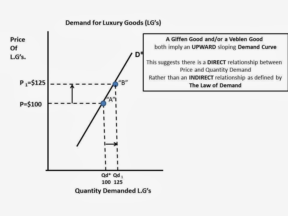
This is counter to the Law of Demand that indicates we buy more only when the price decreases (or less when the price decreases).
So, what is really going on in the Market for Luxury Goods that I believe maintains the integrity of the Law of Demand? Let's go to the graphs!
Here is a downward sloping Demand Curve for Luxury Goods. I just made up some random numbers for illustration purposes and to make the math easy.
At a price of $100 assume the market quantity demanded is 100. Total Revenue would be $10,000

Assume the price of the Luxury Good increased to $125 and following the Law of Demand the Quantity Demanded decreases to 80. Even though price increased and quantity demanded decreases, Total Revenues stayed the same. This could or could not happen. It depends on "Elasticity of Demand", but I am not going to include that analysis here to keep it simple and short. :)

Why do I believe this is true in "Real Life". Well, because the article told me so, in TWO places:
The article introduces two variables into the equation---rising income from China which creates new entrants into the market for Luxury Goods.

"A change in Income" and "A change in the Number of Buyers" are two determinants of demand that will shift our demand curve, either left or right.
If at the SAME TIME there is a decrease in quantity demanded (20 units) from "the West" because of an increase in price, rising incomes and more Chinese wanting Luxury Goods can off-set this decrease in quantity demanded at $125.
Point "C" represents a new Price ($125) and Quantity Demanded (100) that lies to the RIGHT of the original Demand Curve "D*" (Price $125, Quantity Demanded 80).

We can assume (Ceterus Paribus) what happened between Point "B" and Point "C" will happen at
every other point along Demand Curve "D*. The Demand Curve will shift to Right:

Bottom line: I THINK I maintained the integrity of the Law of Demand within the context of the Wall Street Journal article and its suggestion there is a case of Giffen/Veblen Goods going on in the luxury goods market.
This is just one inconsistency I found in the article. I believe there are many more.
Extra Credit if you can find them!! :)
In my opinion they make LOTS of Microeconomics 101 (or AP Microeconomics) mistakes in their analysis. Read for yourself but I want to focus on how they use, or misuse, the term "Giffen Good". Here is the relevant excerpt:
"...An economic theory holds that for certain goods, higher prices increase desirability and drive sales, rather than suppress demand as they would for ordinary products. Economists refer to such luxury products as Giffen goods, named for Scottish economist Robert Giffen, who described the phenomenon...."
First, they REALLY should have used the term Veblen Good instead of a Giffen Good. A Veblen Good refers to luxuries ("status or pretige goods") and a Giffen Good is used generally in the context of inferior goods.
Here is a definition I found that I REALLY like and makes the concept easier for me to understand:
"We use the term “Giffen behavior” rather than “Giffen good” to emphasize that the Giffen property is one that holds for particular consumers in a particular situation and therefore depends on, among other things, prices and wealth. Thus, it is not the good that is Giffen, but the consumers’ behavior. The Giffen phenomenon should also not be confused with prestige or Veblen goods, where consumers desire the goods precisely because the price is high, “snob appeal,” where consumers desire the good because it is rare, or situations where consumers interpret a high price as a signal of high quality. In all three cases, the goods in question are normal. Giffen behavior is a phenomenon that arises entirely within the neoclassical framework where consumers care about price only inasmuch as it affects their budget sets. If demand is Giffen the good in question must also be inferior, which rules out Veblen, snob and signaling effects". ---LINK HERE to where I got this definition.
In both cases it suggests the Market Demand Curve is UPWARD sloping, indicating there is a DIRECT relationship between Price and Quantity Demanded of a good. In other words, we only buy MORE when the price increases (or buy less when the price decreases). This graph illustrates this phenomena:
So, what is really going on in the Market for Luxury Goods that I believe maintains the integrity of the Law of Demand? Let's go to the graphs!
Here is a downward sloping Demand Curve for Luxury Goods. I just made up some random numbers for illustration purposes and to make the math easy.
At a price of $100 assume the market quantity demanded is 100. Total Revenue would be $10,000
(1)---One reason ultra luxury brands are raising prices is to distinguish their products from entry-level luxury goods that are fast picking up market share.
"The more Tory Burches and Michael Kors there are, the more the Chanels and Louis Vuittons will try to price up," said Milton Pedraza, the chief executive of the Luxury Institute, a research and consulting firm.
The unintended consequence could be that the luxury brands drive even more customers toward less-expensive rivals....
...(2)---Jamie Moore, a homemaker in Cleveland, Tenn., said that on her annual shopping sojourn to New York, she usually splurged on a Prada handbag, for which even a basic nylon model can cost $1,230. Not this year.
"The prices have gotten so expensive that I'm not buying one," she said.So, a switch to an less expensive brand because of a viable substitute (1) AND because it is no longer affordable (2). Nice example of BOTH the "Substitution AND Income Effects" that explain the DOWNWARD sloping nature of a demand curve...Hmmmm...
The article introduces two variables into the equation---rising income from China which creates new entrants into the market for Luxury Goods.
If at the SAME TIME there is a decrease in quantity demanded (20 units) from "the West" because of an increase in price, rising incomes and more Chinese wanting Luxury Goods can off-set this decrease in quantity demanded at $125.
Point "C" represents a new Price ($125) and Quantity Demanded (100) that lies to the RIGHT of the original Demand Curve "D*" (Price $125, Quantity Demanded 80).
every other point along Demand Curve "D*. The Demand Curve will shift to Right:
Bottom line: I THINK I maintained the integrity of the Law of Demand within the context of the Wall Street Journal article and its suggestion there is a case of Giffen/Veblen Goods going on in the luxury goods market.
This is just one inconsistency I found in the article. I believe there are many more.
Extra Credit if you can find them!! :)
Saturday, March 1, 2014
Interesting data on New Home sales in the past 2 years. Evidence of economic recovery or income inequality? I report, you decide...
Below is some new housing data I took from the US Census report on New Housing in the US(January 2013).
It shows the number of New Houses sold and a price range for those houses in the years 2012 and 2013. The numbers are in "thousands" so add 3 zeroes to the end of the numbers you see below.
In nominal numbers, the lions share of new houses are in the $200-$300,000 dollar range (141,000 built and sold in 2013).
I calculated the year over year percentage change in the number of houses in each price band.
The lower end of the market, the under $150,000 up to $200,000, had a net decline of 5%.
The upper end of the market, $500,000 and over, had a net increase of 56.25%.
Evidence of an income inequality gap? I report, you decide.
Not sure how this compares to prior years and if this is an anomaly. Guess that is for another blog posting.

It shows the number of New Houses sold and a price range for those houses in the years 2012 and 2013. The numbers are in "thousands" so add 3 zeroes to the end of the numbers you see below.
In nominal numbers, the lions share of new houses are in the $200-$300,000 dollar range (141,000 built and sold in 2013).
I calculated the year over year percentage change in the number of houses in each price band.
The lower end of the market, the under $150,000 up to $200,000, had a net decline of 5%.
The upper end of the market, $500,000 and over, had a net increase of 56.25%.
Evidence of an income inequality gap? I report, you decide.
Not sure how this compares to prior years and if this is an anomaly. Guess that is for another blog posting.
Friday, February 28, 2014
Population trends and the Federal Budget. One captures the other by the tail.
Demographics---I harp on this a lot, I know. My prior posting HERE you can see a graph that gives me hope regarding the economic future. Started me thinking about the present and the bind our politicians have put us in, in terms of how we view the Federal budget and entitlements. I think it is important to consider when we talk about Federal Budget priorities and resource allocation in the US.
The first graph shows in index form, the change in the general population in the US (RED LINE) and the percentage change in a subset of the whole population---the 25 to 55 age group (BLUE LINE). This age group is considered to be the heart of the labor force in terms of productivity and consumption of consumer goods. (To calculate the percent take whatever the current Index is at any point on a line and subtract 100. That will give you the percentage change from 1990).
You can see in about the middle of 2003 we had a break in terms of this age group trending with the rest of the population. The divergence is remarkable. The general population continued to grow at a steady rate but the 25 to 55 age group pretty much stagnated and even declined.
Where did the other folks go?

Oh, I found them! The got older. A few years prior to 2003 you can see (GREEN LINE) the percentage of people 55 and older increased at a rate higher than the the general population and the subgroup of 25 to 55 year old's.
In terms of the changing mix of spending the Federal Government does can you see how we moved from "doing things" to a system that predominately is a "check writer" for transfer payments?
Not that there is anything wrong with that but it does create, on a large scale, a different allocation of societal resources. This is assuming a relatively fixed amount of government spending relative to national income. Spend more on one, spend less on the other (less "physical infrastructure" and more health spending on Medicare, for instance). In terms of the way politicians and policymakers perceive money and the budget this is not going to change any time soon.

The first graph shows in index form, the change in the general population in the US (RED LINE) and the percentage change in a subset of the whole population---the 25 to 55 age group (BLUE LINE). This age group is considered to be the heart of the labor force in terms of productivity and consumption of consumer goods. (To calculate the percent take whatever the current Index is at any point on a line and subtract 100. That will give you the percentage change from 1990).
You can see in about the middle of 2003 we had a break in terms of this age group trending with the rest of the population. The divergence is remarkable. The general population continued to grow at a steady rate but the 25 to 55 age group pretty much stagnated and even declined.
Where did the other folks go?
Oh, I found them! The got older. A few years prior to 2003 you can see (GREEN LINE) the percentage of people 55 and older increased at a rate higher than the the general population and the subgroup of 25 to 55 year old's.
In terms of the changing mix of spending the Federal Government does can you see how we moved from "doing things" to a system that predominately is a "check writer" for transfer payments?
Not that there is anything wrong with that but it does create, on a large scale, a different allocation of societal resources. This is assuming a relatively fixed amount of government spending relative to national income. Spend more on one, spend less on the other (less "physical infrastructure" and more health spending on Medicare, for instance). In terms of the way politicians and policymakers perceive money and the budget this is not going to change any time soon.
Nice graph showing the saviors of the US economy are those of you in High School and College right now. We just have to wait for you to get into your 30's!!
Saw this graph at Motley Fools and felt more hopeful about our economic future. The age group 30-44 is an important one because it represents the heart of the working age population on the supply side AND the driver of consumption on the demand side (housing, cars, kids and all that entails in needing goods and services).
In 2010 we reached a low point in that age group in the US. Just eyeballing it, there were about 5 million FEWER people 30 to 44 than in the late 90's and early 2000's. Between that time and 2010 observe the large drop off in this age group. BUT you see a recovery to a possible new peak in 2025 at about 69 million.
Is this dearth of 30 to 44 years old's the (or a) reason we plodding along economically? Surely cannot help, right?
Human capital is important for economic growth. Is the stock of it we are building now (that is YOU high school and college students!) going to be the REAL bailout our stagnant economy needs.
I like the story this graph contributes to the debate. As I said...hope.

In 2010 we reached a low point in that age group in the US. Just eyeballing it, there were about 5 million FEWER people 30 to 44 than in the late 90's and early 2000's. Between that time and 2010 observe the large drop off in this age group. BUT you see a recovery to a possible new peak in 2025 at about 69 million.
Is this dearth of 30 to 44 years old's the (or a) reason we plodding along economically? Surely cannot help, right?
Human capital is important for economic growth. Is the stock of it we are building now (that is YOU high school and college students!) going to be the REAL bailout our stagnant economy needs.
I like the story this graph contributes to the debate. As I said...hope.
Here are some important points made in the article HERE:
That's important for economic growth, because we know a few things about Americans aged 30 to 44.
For one, they start a lot of businesses. According to the Kaufman Foundation, the median age of a company founder when beginning his or her current business is 40. This should make sense -- old enough to be experienced; young enough to be ambitious. And it bodes well for jobs growth. Despite what you might hear, most jobs growth doesn't come from small businesses, per se. Instead, new businesses are the key driver to new jobs. A separate study by the Kaufman Foundation found that from 1980 to 2005, "nearly all net job creation in the United States occurred in firms less than five years old."
The group of 30- to 44-year-olds also buys a lot of homes. The median age of a homebuyer is 39, according to the National Association of Realtors. The median age of a first-time buyer -- the group expanding homeownership rather than merely shuffling it around -- is 30. This will create more natural demand for housing over the next decade than there was in the last one. Still trying to recover from the housing bust, new-home construction is already far below average. It will need to rebound sharply just to keep up with normal population growth. Add in this demographic tailwind, and it could be a remarkable decade for the housing industry.
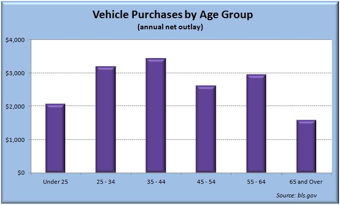
The group also buys a lot of cars. A decade ago, 28% of new-car purchases were by those aged 35 to 44 -- the highest of any age group, and more than the cohort's 22% share of the overall population. The recession pushed the average age of a new car buyer from 48 in 2007 to 51, according to industry analysis group Polk. But the 30-to-44 cohort may take the reins again, because their average income has rebounded from the recession faster than any other group in the working-age population. Factor in used-car sales, and those aged 35 to 44 on average spend more for vehicles than any other age group. Investors bullish on the U.S. auto industry tend to cite an aging fleet of vehicles that needs to be replaced. But there's another boost many are ignoring: growing ranks of prime-age car buyers.
Go down the Census Bureau's list of spending by age group, and our rising cohort leads in several categories. Per person, they spend the most on food. The most on housing services. The most on furniture, apparel, footwear, and entertainment. In many ways they are the driver of U.S. economic growth. And they're about to begin growing again for the first time in a decade.
Wednesday, February 26, 2014
Energy use as a Variable Cost. Nice analysis that gives me a chance to GO TO THE GRAPHS! :)
Consumer good manufacturing is a highly competitive industry. There is constant pressure to reduce costs. Most of the costs producers face are Variable Costs. Variable Costs are costs that vary with production--they tend to increase as more is produced and decrease as less is produced. Bottom line: Variable Costs, well, vary with production (ceterus paribus).
Here is an analysis that centers of energy use in the production process. They suggest that it is an overlooked cost, even though it represents a significant portion of unit costs of producing a good. With careful analysis and remediation firms in manufacturing could save lots of cost by reducing the use of energy, hence lowering their Variable Costs.
Read the selection (or go read the whole analysis--it is worth the time). The highlights are mine. Below it I inserted the graph of the firm that operates in a perfectly competitive market and illustrated how the firms cost curves are affected and in turn how production and profitability change.
A nice primer for an AP Microeconomics FRQ!
Bringing lean thinking to energy
Beset by rising costs, resource-intensive manufacturers are applying lean-management thinking in new ways to reduce the amount of energy used in production, to increase resource productivity—or both.
Over the years, many global manufacturers have secured big gains in labor and capital productivity by applying the principles of lean manufacturing. Fewer companies, however, have applied lean know-how to energy productivity. Line workers and even senior managers often consider energy a given when they consider it at all. The waste of energy and resources is typically overlooked or excluded from lean problem solving on the grounds that it is too complex for the front line to address, cuts across too many functions, or both.
That’s a mistake, given the importance of energy and raw materials as cost drivers. Indeed, for one LCD-television manufacturer we studied, energy represented 45 percent of total production costs. Meanwhile, for many “upstream” manufacturers (such as steel and chemical makers) energy typically accounts for up to 15 percent or more of overall production costs—the largest share after raw materials, which often account for at least 50 percent of the cost base. Our experience suggests that many of these manufacturers could reduce the amount of energy they use in production by as much as 30 percent (with similarly reduced resource losses), in part by applying lean principles and by shifting mind-sets to focus the organization on eliminating anything that doesn’t add value for customers.


Common question from students: Do I need to file a tax return or what? Well...yes, no, maybe. See here for the basics...
This time of year I often get inquiries from students about filing tax returns. Mostly whether if they need to or not because of the limited amount of income they earn.
Below is a snapshot of the relevant section from the IRS website showing your options.
The first big qualifier is your "dependency" status. IF your parents are claiming you as a "qualified" dependent on THEIR tax return this information will be relevant to you. IF you are "independent" and are NOT being claimed by someone else then this DOES NOT apply to you.
If you have more than $1,000 in "unearned income" then you must file a tax return. Unearned income would be interest on savings, Capital Gains on stocks, bonds or some other qualified investment. In short, it is money you get that is NOT from salary, wages, bonuses, tips, etc. If you are not sure about this part, check with a professional tax professional.
MOST young people fall into the second point below. The cut-off is $6,100. If you make even $1.00 over this you must file a tax return! Remember, the IRS already has copies of all your W-2 forms in their possession. They are just waiting for you to report what they already know.
If your Gross Income (total wages, salary, tips) is LESS than this amount then you are not required to file a tax return. HOWEVER (and this is a BIG however) if you had ANY Federal With-holding from your check(s) throughout the year you must file a return in order to receive a refund of the with-holding. The IRS WILL NOT hunt you down and remind you the US Treasury has some extra money for you!


Below is a snapshot of the relevant section from the IRS website showing your options.
The first big qualifier is your "dependency" status. IF your parents are claiming you as a "qualified" dependent on THEIR tax return this information will be relevant to you. IF you are "independent" and are NOT being claimed by someone else then this DOES NOT apply to you.
If you have more than $1,000 in "unearned income" then you must file a tax return. Unearned income would be interest on savings, Capital Gains on stocks, bonds or some other qualified investment. In short, it is money you get that is NOT from salary, wages, bonuses, tips, etc. If you are not sure about this part, check with a professional tax professional.
MOST young people fall into the second point below. The cut-off is $6,100. If you make even $1.00 over this you must file a tax return! Remember, the IRS already has copies of all your W-2 forms in their possession. They are just waiting for you to report what they already know.
If your Gross Income (total wages, salary, tips) is LESS than this amount then you are not required to file a tax return. HOWEVER (and this is a BIG however) if you had ANY Federal With-holding from your check(s) throughout the year you must file a return in order to receive a refund of the with-holding. The IRS WILL NOT hunt you down and remind you the US Treasury has some extra money for you!
Caveat: Regardless of how much you earn, especially if you are a college student receiving financial aid, it is good policy to file a return even if you don't have to. It helps to have that paper trail for filling out the FAFSA and other requests for aid.
If you know during the year that you will not earn at least $6,100 in GROSS earnings, you can amend your W-4 form that you fill out at work that tells your employer how much to take out of your paycheck for Federal With-holding. You can request to be EXEMPT from with-holding and no money will be with-held from your check because you do not believe you will owe any income tax. BE CAREFUL about this. Don't flirt with that $6,100 mark.
Here is a W-4 form with the line to do this highlighted in YELLOW. Go HERE to print your own out.
NOTE: I am not a tax attorney or qualified tax preparer. I just play one as a high school economics teacher. :)
Subscribe to:
Posts (Atom)
 View My Stats