Showing posts with label Employment. Show all posts

Friday, August 22, 2014

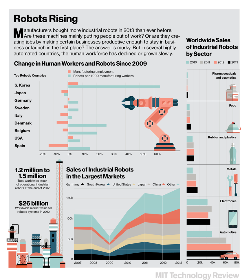
The rise of the robots! In the movies the heroes usually win that battle. How will the Labor Markets fair?

A nice graphic from MIT Technology Review on the rise in the use of robotics in manufacturing versus the change in manufacturing employment.  It certainly is a mixed bag in terms of the relationship (as they note in the graphic).

There is no question that the two will be co-joined in the short and long(er) term as the workplace changes and labor adapts to new technology, and vice versa.


Wednesday, June 4, 2014

Number of hours worked has returned to pre-recession levels. Must be good news, right?

Here is a graphic showing the number of hours worked by different sectors of the economy classified by how they have fared since 2007 (just prior to the recession---Dark GRAY area).  Go HERE for the short and informative article on the topic.

I inserted a RED line to show the point of the official end of the recession (late 2009) where hours worked SHOULD start increasing for all sectors, presumably, as the recovery got underway.

Total hours worked has returned to pre-recession levels (mentioned in the article). But there has been a reshuffling of those work hours from higher paying construction and manufacturing jobs to lower paying leisure and hospitality.  A significant part of healthcare job growth is in lower paying home health aides.

Construction jobs suffered the biggest drop as a result of the recession and has held pretty steady at its low point with only a tiny increase in hours worked in the past 4 years.

I believe construction will eventually pick up, but unless manufacturing is defined in a new way I do not believe employment in that sector will increase dramatically.  Technology is the pinch there.

Construction workers might experience a boom building manufacturing plants and infrastructure but they will be staffed by machines and robotics.

Source: St Louis Federal Reserve

Friday, March 7, 2014

Why did the unemployment rate INCREASE in February when more jobs were created than expected? You know what they say about Statistics. See here the what for's...

Lately the pace of job creating has been tepid, to say the least, BUT the unemployment rate has been going DOWN.  How does that happen?

This month (Feb 2014) the number of jobs created has been far better than in past months BUT the unemployment went UP.  How does that happen?

Mostly has to do with the movement of people in and out of the labor force.

I pluck the following data from the latest Household Survey on Employment (Feb 2014).  I highlighted the "Civilian Labor Force" in yellow.  This shows the number of people employed and unemployed added together.

I highlighted in brownish the numbers for the past two months and for one year ago (Feb 2013).  Notice the Civilian Labor Force DECREASED on net last year.  From January 2013 to December 2013 there was a net DECLINE in the Labor Force of 51,000.  This will tend to LOWER the unemployment rate as people exit the labor force for various reasons (retirement, giving up looking for work).

So, a decrease in the unemployment rate in the short run can be a bad sign.

However, in February there was a BIG bump UP in the Labor Force by 264,000.  This will tend to INCREASE the unemployment rate as more people jump back in (or enter for the first time) to the Labor Force.

This can be a GOOD thing!  If people are more confident about job prospects then initially more people who were not looking for jobs are not looking.

So, an increase in the unemployment rate in the short run can be a positive sign.

Don't you just love economics and statistics?


Saturday, December 21, 2013

If you lose your job you can apply for unemployment compensation. What are the requirements? You might be surprised.

When teaching basic macroeconomics in high school (AP or "regular") one of the topics that seems to generate the most student queries is unemployment (or its flip side employment). Most of the questions center around eligibility.

The Center on Budget Policy and Analysis offers a nice primer on the subject in VERY understandable language  for laymen like myself.

I may write a series of very short blog entries on this topic to explain further some of finer points of the Unemployment Insurance program that I find are misunderstood by many/most students.

First, I will start with eligibility.

Who Is Eligible for Unemployment Insurance?
To qualify for unemployment insurance benefits, a person must:

(1)  have lost a job through no fault of his or her own;
(2)  be “able to work, available to work, and actively seeking work;” and
(3) have earned at least a certain amount of money during a “base period” prior to becoming unemployed. 

You cannot collect unemployment benefits if you (1) voluntarily quit your job to look for another one, (2) are in the job market for the first time looking for work (high school dropout, high school or college graduate seeking first job), (3) a re-entrant into the workforce (stay at home parent looking for a job after raising kids, retiree looking for another job, formerly incarcerated person looking of job).

However, if you are (1) laid off (2) lost job due to business closing, (3) in some narrow instances on strike, you are entitled to unemployment compensation. You would have been considered to "have lost a job through no fault of" your own.  As an aside, you MAY qualify for benefits if you quit your job because of "harassment", but you would have to make that case individually.

While you are collecting compensation you are required to show you are "actively seeking work".  The burden of proof is quite low. Showing that you filled out an application (in writing or online) or got a business card from a prospective employer is usually sufficient (I know this from being an employer in the past).

Bullet point #3 is the one students seen to ask about the most. Students suggest: "I will get a job then get myself fired the first week file for unemployment compensation!"

Not so fast.  You must have earned a specified minimum amount of income in what is termed a "base period" before you lost your job.

This is generally defined as "the first four of the last five of the last calendar quarters".  In other words you must have earned a minimum amount of money spread out over the previous 12 months.

This required minimum income to qualify varies considerably from State to State.  HERE is a link to a US Dept of Labor document that gives an overview (scroll down to Table 3-3). You can find your State there.

This is certainly not comprehensive, but I hope it gives you a better idea of who is and isn't eligible for unemployment compensation.
NOTE:  Just saw this late today on the St. Louis Fed.  A lesson on unemployment that covers some things I did not cover BUT I covered some things they did not.  They have a few nice "quiz" questions for you to use.


Tuesday, December 17, 2013

Map of where "Multiple Jobs Holders" are located in the US. Why do you think the Mid-West has a majority of these workaholics?

This is from the Bureau of Labor Statistics (BLS).  It shows the concentration of people who are considered "Multiple Job Holders". That could be someone with a a full time job and a part time job or 2 full time jobs, or two part time jobs, etc. Some combination there of.

The darker blue the area the higher the percentage of people with multiple jobs.  Notice much of this takes place in the Mid-West. The Farm Belt, for the most part.  The BLS does not breakdown the data to this level (that I could find) but could it be farmers who have to hold down second jobs during the non-harvest time of the growing season?

Just a guess on my part.  What do you think?

Friday, September 6, 2013

Where did the missing 312,000 people from the Labor Force go last month? I know where 80,000 of them went but not the rest. I am worried about them. See here why.

In July and August the latest jobs report shows 312,000 FEWER people counted as a part of the labor force (either were working and retired or were not working and exited the labor force, or became "disabled" and started collecting benefits).  The number is highlighted in yellow.

Much has been made of the fact that this is due to demographic trends---aging baby boom population retiring in large numbers and as that same group gets older they are susceptible to work related injuries. 

I have not doubt this is true. Just wondered how many of those 312,000 were a part of this demographic group?

Took a screenshot of the data from the Social Security Online database of the data isolated just for people who officially retired or started collecting disability benefits.

Look at the highlighted numbers for July and August. Subtract the two and you get 79,813. Subtract that from 312,000 and you have 232,187 people who exited the workforce for reasons OTHER than the ones stated above.

That's a lot of people.  Why did they exit and where did they go?  Have not seem any solid  analysis from real economist yet on that question.  

Friday, June 7, 2013

Quick Snapshot of today's employment report. 175,000 net new jobs created. But are they "good jobs"? See the evidence here...

In May the BLS reports the number of new jobs created (net) was 175,000 (first yellow highlight).

Of those 175,000 jobs the big gainers were in the categories of Retail Trade (+27,700), Temporary Help Services (+25,500) and Leisure and Hospitality (+43,000).

These three sectors accounted for 96,200 of the jobs created, or 55% of the total.

Not sure what the breakout is, but I would say a good portion of these jobs are part-time, lower wage positions. No data to back that up having worked in those sectors in my lifetime, I think from experience I am safe in than conclusion.

It is great that we are creating these jobs.  But are we creating a healthy, vibrant economy.

I don't think when over 50% of the new jobs are in these categories we are.  What do you think?

Thursday, June 6, 2013

New revision to the number of jobs needed to maintain a steady unemployment rate. The change is dramatic and of consequence!

When the monthly employment report is published by the Bureau of Labor Statistics (BLS) it reports the number of new jobs created and lost during the month and the change in the unemployment rate.  In a seemingly odd quirk, when there is a net gain in jobs created sometimes the unemployment rate goes down (as it seems it should) OR up (as it seems it SHOULDN'T).  How does that happen?

Variables such as a change in population due to birth rates or aging, new entrants such as high school or college graduates, immigration, can affect the number of people classified as part of the labor force.

In a recovering economy the only way to bring down the unemployment rate is to have net job creation that is greater than the number of new entrants/re-entrants into the labor force PLUS some that are already in the labor force but are currently classified as officially unemployed.

 Net job creation can be positive but unless it at least EQUALS the change in labor force then the unemployment rate will stay the same.  If less, then the unemployment rate will increase (ceteris paribus).

Previously in the media and in the economic blogosphere, economist have suggested that we need anywhere between 150,00 to 225,000 net new jobs just to keep up with the increase in the labor force.

A new study from the Federal Reserve suggests this number is MUCH lower, about 80,000 per month!

Here is a short excerpt.  The paper is very short and has some interesting graphs. I encourage you to read it to keep up on this important trend in the labor markets!

Estimating the trend in employment growth
For the unemployment rate to decline, the U.S. economy needs to generate above-trend
job growth. We currently estimate trend employment growth to be around 80,000 jobs
per month,
and we expect it to decline over the remainder of the decade, due largely
to changing labor force demographics and slower population growth.

Thursday, February 28, 2013

Nice graphic showing jobs losses and job gains in the last 4 years cross-referenced by wage level. Where did the Middle Class go??

Here is a nice summary of job losses and jobs gained since the advent of the Great Recession.

They are broken down into wage categories (High, Mid and Low) and by losses (dark blue bar) and gains (light blue bar).

High wage jobs are back to even. Mid-wage jobs have taken a beating.  Low wage jobs have come back with a vengeance.

Is this a textbook case of "hollowing out of the middle class"?
Source: Washington Post

Monday, November 19, 2012

"Manufacturing Is ALIVE and Manufacturing jobs are DEAD!!" Not a winning campaign slogan, but it is the truth...

Well, mostly true.  A new report Manufacturing the future: The next era of global growth and innovation is circulating on the econ blogoshere and it speaks of the divergence in manufacturing output relative to manufacturing employment.

IMPORTANT NOTE: This report is on GLOBAL manufacturing, NOT just the US!

Note 3 things in the graphic below.  Employment in manufacturing in 2006 was only 14% of jobs in the private sector.  Private Sector R&D in manufacturing is very high relative to other sectors, but I assume these would not be blue collar "on the assembly line" jobs. Employment in manufacturing from 1996-2006 shows a net loss relative to other sectors.


The "old" manufacturing model was how does/do management and white collar workers assist the line worker in producing the best product.

Going forward the new mantra will be how does/do management and white collar workers assist the machines/robots/ technologically advanced production lines in producing the best product.

Notice the line workers job missing in the second part?

The future....

Thursday, August 16, 2012

Nice graph showing Total Government jobs now exceed Total Private Sector Goods producing jobs. Is this the new normal? I think so...


Nice graph showing where jobs have been concentrated since 1940. 

On the vertical axis are the jobs in "thousands", which means you add 3 zeroes to the end of the number you see and read it as "10 million or 20 million" as you move up the axis.

Jobs can be divided up into 3 major categories--Private sector service-providing, Private sector good-producing, and Government sector jobs (Federal, State, and Local).

Source: The Big Picture Blog
Our march towards a service-type economy has been a long time coming. The service sector line and the goods producing sector started to diverge in the 1950's and increased at an increasing rate thereafter. 

It is also interesting to note the private goods producing line relative to the government jobs line. They converge for the first time in 2002 and as of 2008 there are more government sector jobs than there are goods producing jobs.

It is a fact that, in real terms, we are producing more manufactured goods than ever--even TODAY, factoring in the recession!! Why is this?
""The falling cost of automation, globalization, relative wages, productivity increases, consumer/worker preferences, the rise of the internet, and political forces, are just a few of the many causes of the shift to service jobs, which now make up almost 70 percent of nonfarm payrolls.""---Source HERE
Increases in productivity in manufacturing occur external to what is happening with population.  It is much more difficult to get the same productivity from government with increases in population.  I am not saying you can't get better productivity in government, but you can't expect the same gains relative to private manufacturing.  OR CAN YOU? 

What do you think??

Friday, August 3, 2012

I think the President SHOULD have said "The Federal employment sector is doing just fine". Here is the proof in one easy graph...

Planet Money at NPR has been following the change in government jobs at the Federal, State and Local level since the beginning of the recession. 

Due to the first large stimulus package in 2008 that aided states in budget crisis, employment actually increased for State and local governments during the downturn.

As you can see from the graph below since the exhaustion of Federal stimulus local government employment has taken the biggest hit, losing over 400,000 jobs, followed by State level jobs at loss of about 100,000.

Federal employment has remained elevated ABOVE pre-recession levels.

You could say "Federal employment is doing fine". State and local not so much.


How does this compare to private sector jobs?

Looking this next graph you can see the magnitude of government job loss, in relative terms, pales in comparison to private sector job loss.  We still have a long way to go....

Saturday, June 16, 2012

Nice video showing advancement in Robotics. How many jobs is this GOING to eliminate OR (gasp!) create?

Below is an awesome video (HT: Carpe Diem) illustrating an advancement in robotics and its potential application to everyday life---industrial and personal. What will be the effect on employment when this technology becomes routine in daily life? I see the potential for creating instances of "structural unemployment" in the marketplace---people losing jobs to machines that can perform the same tasks as a worker. It is easy to see the jobs that might be lost and other costs this technology might impose on society. However, what about the "unseen" benefits of this technology on society and even on employment? Extra credit for good answers.

Wednesday, December 14, 2011

Nice Graphic...Jobs/Careers projected to need the most workers in the next decade...Are YOU on the right path?

What is not debatable is the fact that continued education is needed to make sure you have the necessary skills to be an employable worker in the future.  Do not stagnate and think you have enough knowledge to perform a job.  Always look to the next step within your chosen career field and be ready/prepared to move in any career direction. 
Source: Jared Bernstein

Saturday, December 3, 2011

Snapshot of where jobs were gained and lost in the lastest Employment Report...Read it and weep...

Here are the major categories of industries and the change in jobs in each of those industries.  Under "Nov 2011" are the number of jobs created (or if a negatice, jobs lost)  in those industries in the month of November (add 3 zeroes to the number you see to get the correct number in thousands).  It also shows a comparison to Oct and Sept 2011 AND compares to a year ago (Nov 2010). 

The biggest number to jump out is "Retail Trade"---a net increase of 49,000 jobs.  This would in large part be seasonal hiring for the holidays. One would have to assume most of these jobs will go away in a month.  This will show up in the January report, which would come out in Feb 2012.

Read it and weep...

Source: BLS.gov

Friday, November 4, 2011

GDP vs EMPLOYMENT...This is THE graph people FOR and AGAINST the OWS protesters need to see and think about...

In AP Macroeconomics we teach students there is a direct relationship between changes in Real GDP and Employment (or an inverse relationship between Real GDP and UN-employment). 

In the graph below this relationship holds nicely, whether Real GDP (Blue Line) is increasing or decreasing. Employment (RED Line) follows, albeit to different degrees but the relationship is relatively tight.  It makes sense: If in real terms, more goods and/or services are produced, more people will be hired. If fewer goods and/or services are produced, fewer people are needed.
Source: Carpe Diem

However, in the first/second quarter of 2009 this relationship breaks down. While Real GDP bottoms out, employment continues a free fall.  As Real GDP recovers and increases, employment STILL falls before leveling out.  We have a large GDP to employment deficit. 

Starting in the first quarter of 2010 notice the change in the slope of the Real GDP line relative to the slope of the employment line. The former becomes steeper and the latter relatively less steep.  Very different from previous years.  Real GDP is now at its pre-recession level BUT employment is at approx. 6.6 million FEWER workers. What a difference two years makes!

If, on a macro-level, businesses are producing and selling the same dollar amount of goods and/or services as they did before the recession and doing it with many fewer workers, it is relatively easy to see why corporate profits are at record levels. 

Can we chalk this up to "corporate greed"? Were these 6 million workers not really needed in the first place? Has technology and/or efficiencies/improved processes rendered many workers unnecessary? Are businesses working the remaining workers to death to wring as much profit out of them as possible? 

Corporate greed is not a new thing.  If this was the case, why did it not happen to this extent before?  Did corporations just recently figure out how to do more with less?  Below I extended the timeline of the above graph back to 1950.  The last time we had a significant separation between these Real GDP and Employment was back in the 1950's.  Why did the gap close for so many years/decades then reappear?  Are the two periods comparable in any way? Is there no connection?  Am I completely off the mark and comparing apples and oranges?   I honestly don't know and would love to hear any suggestions....

Thursday, August 4, 2011

Two nice graphs/charts showing the emergence of developing countries and their influence on resource demand. What an amazing 20 years...Are you preparing to serve these markets???

Both of these graphs/charts come from The Economist.  I continue to emphasize the rise of emerging markets around the world. We can see this as a problem or as an opportunity.  Businesses looking for opportunities for the future are increasingly looking outside the US. Are YOU on board with this in planning your future?

The decline and growth of respective world share of GDP in the graph below (left) since 1990 is quite dramatic.  If does not mean that our GDP has not increased but our share of global GDP has decreased.  Analogy: while our slice of the GDP pie is got bigger, the pie itself got larger too. Economic growth is not a zero sum game.  Wealth is not fixed, and through processes, technology and productivity it increases over time.


Sunday, July 24, 2011

Nice graphics showing the difference in employment levels between Texas and California AND the price of moving trucks/vans between the two states..The signs are everywhere...

 
Source: Carpe Diem
 I don't know the number of jobs Texas has "stolen" from California, but I am sure there has been somewhat of a zero-sum result in net gain/loss in jobs between the two states.  One underlying market sign as to what may be happening is the self-moving truck/van market.  From the two graphics I clipped today (July 24th) from the U-Haul website shows a dramatic difference in price depending on which way you are going. There may be other reasons for the difference in price, but I surmise migration for employment opportunities is a major reason...It could NOT possibly be for the social programs Texas has...

Cost to rent a U-Haul Truck to move from Texas to California:


Cost to rent a U-Haul Truck to move from California to Texas:

Saturday, June 25, 2011

This "Summer" we need to "Fall" for the Arab "Spring" or it will be a dark "Winter" for seasons to come for us. The issue in one chart here...

Further evidence (for me) that the underlying reason for the "Arab Spring" movement in the Middle East can be explained in economic terms.  The chart below shows the rate of unemployment for young(er) people in select Middle Eastern countries relative to other parts of the world.  Below that are snapshots of most of the countries represented in the chart.  Focus just on the population pyramids in each one.

There is a toxic mix of a lack of economic opportunity AND a demographic balance tilted toward the very young.  Also, as noted here, "In contrast to most of the world, joblessness in many Middle Eastern countries tends to increase with schooling: the unemployment rate among those with college degrees exceeds 15 percent in Egypt, Jordan, and Tunisia."

Hmmm...lots of young, educated people with access to technology, diffuse knowledge of the "outside" world and a lack of opportunity domestically---Change in the region is inevitable--regardless of the despots actions today...   

Source: The Conversable Economist


View My Stats