Showing posts with label Charts. Show all posts

Monday, July 4, 2016

Theme Park Price Index and the Disney Effect.

I saw this line graph on my Twitter feed from the FRED data bank. It shows the change in the price index for "Amusement and Theme Parks" admission ticket prices.

They started at the beginning of 2006 with an index of 100.  As of May, 1 2016 the index was just a touch over 180.  This means that theme park ticket prices overall have increased by 80% in that time span.


My first thought when I saw this was what is the impact of Disney on the price of tickets.  I found this website which tracks their price changes.

I inserted RED bars (month and year on top) that show all of the Disney price increases (they had no price decreases) in this time period.

At the beginning of 2006 a single one day ticket to a Disney park was priced at $63.00 (see link above). Today a single day ("regular" price) is $110.00.  That is a 75% increase!

Remember, theme park (Six Flags et al) tickets increased by 80% overall.  Disney accounts for a disproportionate amount of that change.

If Disney admission tickets had just kept up with inflation during that time (using the CPI), ticket prices should only be $75.05, a 19.1% increase.

Seems clear that Disney is a "Price Maker" as opposed to a "Price Taker" and they are a "Price Leader" as well. However, the latter is harder to discern without doing the math.

When Disney raised prices did other theme parks follow suit at the same time?  If you look at the times in-between Disney price increases (gotta look really close) there seems to be a bump up in the line indicating a lag (sometimes short, sometimes longer) when other theme parks followed with price increases.

I did find it interesting that Disney elected to increase prices in the dead middle of the Great Recession (noted on graph in gray area).

Pricing power, indeed!

Friday, May 30, 2014

I found a Microeconomics Unicorn! See the chart here.

A rare treat for an economics teacher.  A chart that quantifies (not completely but enough) the difference between "Economic Costs" which include opportunity costs (implicit costs) as well as money costs (explicit costs), and "Accounting Costs" which include ONLY money costs. 

Source: USDA ERS

Costs of production for U.S. milk decline as the size of the dairy operation (measured by the number of cows) increases.  Based on 2013 data, average total economic costs of milk production—a measure that includes the opportunity costs of land, labor, and other owned resources—fell by nearly 60 percent, from an average of about $50 per hundredweight (cwt) for producers with fewer than 50 cows to about $20 per cwt for those with 1,000 cows or more. Average costs are lower on larger farms because fixed cost items, such as management, land, and other resource costs, are spread across a larger number of cows, and because average output per cow increases along with farm size. Mean output per cow was just over 15,000 pounds among operations with less than 50 cows, while operations with 1,000 or more head averaged more than 23,000 pounds per cow. Higher milk yields on larger farms stem from factors such as better breeding, nutrition, and health management, as well as the ability to access competitively priced supplies of high quality feed inputs.  This chart is based on data found in Milk Cost of Production Estimates.
 

This is a key concept in AP Microeconomics that is somewhat difficult to convey to high school aged students.

The vertical difference between the RED and BLUE lines represents the Opportunity Costs to the producer for staying in business.

The price or Marginal Revenue (MR) or Average Revenue (AR), a producer receives must at least equal the RED line for her to "Break Even".  

However, she could still make an Accounting Profit at that price.  Is she?

According to the USDA ERS (HERE) the average price for "all classes of milk" was $20.05 per CWT) in 2013.  Now look back at the graph and draw a straight line across the $20.00 mark denoted on the vertical axis.  Compare that to the RED and BLUE lines.

At that price ONLY the large producers (1000 or more milk cows) are Breaking Even in "Economic" terms BUT making profit in "Accounting" terms.

Notice at about 300 cows the average costs start to drop at a relatively steep rate and production increases quickly.  I assume that is the inflection point where economies of scale really kick in.

Hope this helps with teaching and/or learning about this important concept when the topic of a firm that operates in a "Perfectly Competitive" market.

Thursday, May 29, 2014

Chart showing why AT THE MINIMUM you should go to (and finish) a Community College.

The Upshot at the NY Times has a terrific analysis (and the bar chart below) of how important the Community College systems is in the US.  Personally, I don't think it gets enough attention and should be much more high profile.  It needs to be a integral part of preparing the workforce for the present and future.

Note how close the unemployment rate is to those with a bachelors degree.  A "2-year degree, occupational" trains you to do a specific job.  This statistic should be one that schools, teachers and counselors shout from the rooftops!!

I went to a C.C. to get, quite frankly, some confidence that I could do college.  I was not a good student in high school.  I went into the Marine Corps for 4 years.  After I got out I knew I wanted to go to college but thought for a variety of reasons I could not cut it.  We can get caught up in our insecurities to our detriment.

Turns out to succeed in college all you need is some self-discipline, perseverance, a willingness to ask questions and a desire to find the answers.  Who would have thunk'?

Anyway, props to the C.C. system and I hope you get the attention you deserve.

Source: The Upshot at NYTIMES

Thursday, May 22, 2014

Nice graphs of traffic fatalities, miles driven and recessions since the early 70's.

Saw this graphic in an article on why Southern cities have more pedestrian fatalities than other regions of the country.  It includes pedestrian and regular ol' traffic accidents that result in the death of someone.

Go HERE for the full analysis, but I was intrigued by the year 1974. Why the big drop-off from 1973? (I marked 1973 with the RED arrow as the high watermark for traffic fatalities).
Source: Washington Post


Here is a graph from Calculated Risk that shows miles driven over time (1971-Present). In addition it shows all the recessions, mild and severe, during that time span.

If you look at the periods of recession in this graph and line them up with the graph of fatalities above you will notice there is is dip in miles driven and traffic fatalities. The only exception is the recession in 2001-02.  Miles driven did not skip a beat.

The one I marked with arrow is the result of the Arab oil embargo that increased gas prices significantly and price controls made scarcity a problem (I remember those days as a teenager).  People were very careful in their consumption of fuel and (1) made fewer trips and (2) voluntarily slowed down on the highways to conserve even more.


I don't think this explains all of  the long term trend in decreased traffic fatalities.  There has to be more, right?

What do you think could be a contributing factor?

In terms of recent times, what correlation can you make with the leveling off of miles driven during and post-Great recession and the rapid decrease in traffic fatalities?  The recession is over so it should be trending up, right?

So many questions!  Do you have answers?

Friday, December 13, 2013

US Defense spending from Soup to Nuts. No, really, from soup to nuts...

From Mother Jones:  See more on defense spending at the link.


How is the Federal Budget like a loaf of bread? You got your Texas Toast and your breadcrumbs. Which one will fill you up faster? Congress seems to think it is the breadcrumbs....

A nice quick reference visual that gives you an idea of of the relationship between Mandatory ("Non-Discretionary") and Discretionary ("Non-Mandatory") spending in the US Federal budget.

To use a baked good analogy, a loaf of bread, mandatory spending items are thickly cut slices of bread. Think Texas Toast (the BIG circles)! Non-mandatory spending item are either (1) thin slices, like crostini's (medium sized circles), or (2) even smaller pieces, like breadcrumbs used for Thanksgiving stuffing (the small circles).

In budget negotiations politicians are trying to make a political meal out of the breadcrumbs (cutting the small-ish things) and think it will nourish the Federal budget body and make it healthy.

The real "bread", if you will, is in the Texas Toast. However, it is neglected, left to mold, and get crusty.

Oh, well, whichever side YOU butter your bread I hope you find this graphic warm and toasty.

Source: Mother Jones

Wednesday, March 20, 2013

Why are women obtaining college degrees at a much higher rate than men? Do the guys need a little extra help??

I saw this graphic in an article at The Atlantic illustrating the "colleg degree gap" between men and women in cities/metropolitan areas around the US.  The article is very interesting. Worth a read.

I have to admit, the disparity took me a bit by surprise.  As of 2011, as a percentage, women earned 27% more college degrees than men earned (36.1% - 28.4%/28.4% X 100). That seems statistically significant, even to a high school economics teacher.

What are the social implications, if any, of this trend? Do we need more Affirmative Action policies for men from all the groups listed below? 
Source: The Atlantic

Thursday, December 6, 2012

Interesting graphic showing how someone earning $69,000 or $29,000 ends up with the same income (cash and non-cash) after taxes/benefits/subsidies are factored in/out. Enlightening regardless of your politics.

This chart has been bouncing around various blogs. I tried to find something to counter the points made here but could not find anything substantial. I made some edits, just to highlight reference points to make it clearer.

The chart suggests that a single mother (with 2 children and lives in Pennsylvania) earning a gross income of  $69,000 in a year ("D") would have a net income (after taxes and adding in any cash and non-cash benefits) of $57,327 ("C").

IF a different mother earned a gross income of $29,000 ("A") in a year, she would have a net income (after taxes and adding in any cash and non-cash benefits) of $57,045 ("B"). 

Their after tax/after benefits (cash and non-cash) would just about equalize their income.  The mother with the $69,000 income would be a net "loser" of $11,673 and the mother with an income of $29,000 would be a net "gainer" of tax dollars/subsidies of $28,045.

Source: Here
This is interesting BUT there is more!  If this data is correct and this is the system people operate under, there is a GLARING unintentional consequence here.  Can you see it?

Look at the income level and benefit level at point "B", $29,000.  This this mother earns $1.00 more what happens to her level of benefits overall?  Yikes, they decrease by much more than the extra dollar she earned from, perhaps, a raise or a promotion.  This is a significant penalty for someone who is just getting by. 

So, what happens to the incentive to earn more, and by implication to be more productive? Notice the same thing happens to someone when they reach the $45,000 income level. The next dollar earned is VERY costly. 

People trying to get by and do the best they can are going to respond to the real-life, immediate, incentives put in front of them. 

This does not appear to be a system that promotes self-sufficiency as people climb the income ladder. 

Maybe I am looking at it wrong.  What do you think?  Tell me where I am going off the rails.


Sunday, August 19, 2012

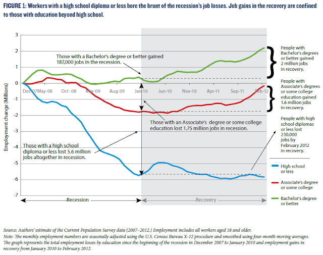
Teachers: If you need a quick visual to emphasize to students the link between education and employment show them these graphs. Students: If you need a reminder as to the importance of education and future employment, PLEASE look at these too.

There is a lot going on in this first graph, but it is important to know what is happening.

The vertical axis shows the percentage change in employment (jobs gained) since the official start of the Great Recession, through the official end of the recession (everything to the left of Jan 2010) and finally through the "recovery" to the present (everything in blue).

Note the bold brackets to the right showing the numerical change in jobs based on the level of education a worker has. 

More education does not guarantee you anything but statistically you are more likely to (1) find a job, (2) not lose your job, (3) if you do lose your job you are more likely to find another one in a shorter period of time.

Source: KPC


 This second graph shows the value of education over an extended period of time--since 1989.

Dropping out or even finishing high school is not enough. ANY type of additional education will help you gain skills that make you more valuable to employers. 

Source: KPC

Friday, August 17, 2012

Nice graph breaking down voting by age group over time. I guess it is easier to get to the polls using a walker as opposed to a skateboard. Go figure...

Hard to see the colors, but the line in the middle (58.2% on the right) is the"Total Voting Age Population" trend line.  The top line (68.1%) represents "65 years and over". The other age groups are above or below the Total Voting Age Population line.

If you follow the 65 years and over line from right to left, you will see it is pretty steady over time. 
While there is a decline in every other age group along the way, they show back up in the golden years.

If you were running for national office, which group would you target for votes and which group would you pay lip service to?   Yeah, me too. 
Source: Conversable Economist

Thursday, August 9, 2012

Food prices increasing? It is that #%*^&^& Ethanol policy! See chart here for the damage. Paging Frederic Bastiat!!

Congress has mandated (not asked, not requested) that the nation produce 13.3 Billion gallons of ethanol to be an additive to fuel.  Big Picture Agriculture estimates it takes 4.7 Billion bushels of corn to produce that much ethanol.
 
This number of bushels of corn WILL BE taken out of the market for ethanol production, regardless of the total number of bushels of corn harvested.  Read that again.

If the drought reduces the total harvest below expectations, then there will be less corn for the food/feed market. This will put upward pressure on the price  of everything else that requires corn as an input.

A consequence "unseen" to policymakers, but very "seen" to the "good economist" (go HERE for a short explanation. If you were a student of mine, you already know)...

What Percent of this Year’s U.S. Corn Crop Will be Required to Fulfill the Ethanol Mandate?
Source: Big Picture Agriculture
From HERE: 

''I’ve simplified the answer to the question by ignoring RINS credits and ethanol in storage, cutting to the crux of the issue. And of course, final corn crop production numbers are premature.

To do my calculation, I used the following:
  • To produce the 13.2 billion gallons of ethanol mandated this year requires 4.7 billion bushels of corn.
  • U.S. corn yields may average 117.6 bushels an acre this year, according to the results of a survey of 1,900 growers by Farm Futures magazine. This would amount to 9.86 billion bushels.
In 2013 the ethanol mandate will rise to 13.8 billion gallons, an increase of 4.5 percent over this year.

Friday, August 3, 2012

Entitlement Spending and Public Investment in 3 easy graphs. Hey, this is not a flashy subject but none more important...

The following sets of graphs illustrate the "Emperor has no clothes" in terms of the Federal Budget. Everyone knows the problem but no one does much about it.
Mandatory, or non-discretionary, Federal spending is concentrated in 3 major areas--Social Security, Medicare and Medicaid (and its subprograms). As illustrated in the first graph, these programs over time have steadily consumed a larger part of the Federal budget---approx. 47%!


Other parts of the budget consist of non-mandatory, or discretionary, spending.  Within this category you have "Investment Spending" by the Federal government. The following is a definition of Federal Investment from HERE:
"Federal investment is the portion of Federal spending intended to yield long-term benefits for the economy and the country. It promotes improved efficiency within Federal agencies, as well as growth in the national economy by increasing the overall stock of capital. Investment spending can take the form of direct Federal spending or of grants to State and local governments. It can be designated for physical capital, which creates a tangible asset that yields a stream of services over a period of years. It also can be for research and development, education, or training, all of which are intangible but still increase income in the future or provide other long-term benefits."
The graph below shows the decline over time of Federal Investment as a percentage of the Federal budget.  The implication is that there is significantly less funding for public works projects that confer benefits on everyone that the private market does not supply.


The last graph puts these two areas of the Federal budget together.  Budget dollars are not unlimited.  Over time, mandatory transfer payments to senior citizens and the poor have significantly surpassed non-mandatory public expenditures/investment in infrastructure. 

The Federal government does not do much of anything anymore in terms of physical public goods. They pretty much just write checks.  Think about that.

How do we address this issue? I dunno, I am just a high school economics teacher.  You will have to ask the Emperor and the Court Jesters we call the Executive and Legislative branches.

Sunday, July 22, 2012

Find out how your city/region would fare in terms of GDP if it was its own country.

Here is a world GDP (Gross Domestic Product) ranking by country AND with the added twist of including the dollar value of production of goods/services in US cities/metropolitan areas. 

To look at this properly, DO NOT include the US GDP number. This is because  the overall US GDP number INCLUDES the city/metropolitan area number.  It is there for reference and scale. In your mind, bump up every country/city on the list one spot.

If you look down the list, you see "New York/Northern New Jersey-Long Island, NY-NJ-PA". This represents a regional geographic area that produces $1.287 TRILLION dollars in final goods and services.

If this geographic area were its own country, it would be the 13th (remember, you have to bump up one spot) largest economy in the world in terms of the dollar value of goods and services it produces.

Go down the list and find your city/metropolitan area and see how it ranks relative to the rest of the world.  The US is STILL a production machine. We often forget that. 

Note: The screen shots I took here are not the entire list. Go HERE at the Wall Street Journal to find the rest, if you don't see your area here.


Nice graphic showing the decline over time in the number of teenagers getting drivers licenses. WHY is this the trend?

Why don't young people want to drive anymore? Is this a good or bad thing?

As you move from left to right on this graphic, focus on the difference in the BLUE line (1983) and the GREEN line (2010). The bars represent the percentage of that age group in those particular years that have drivers licenses given that year. In other words, the number with licenses in that age group divided by the number of people in that age group in that particular year (1983, 2008, 2010).

Example: In 1983 approx 70% of 17 year olds had licenses. Fast forward to 2010 and approx 47% did. That is around a 33% decrease.  Certainly not insignificant.

Source: The Atlantic
The article this graphic comes from points out the statistically significant decline between 2008 (the RED bar) and 2010 (the GREEN bar) and asks what is driving this decline in the desire to get a license.

On the negative side I can see this affecting used cars sales, a big business for car dealers.

On the positive side I see fewer accidents, hence injuries and deaths.  Use of less gasoline.  Parents don't have to pay high car insurance premiums.

I can come up with more positives than negatives.  Extra credit for good responses at to how this trend may negatively impact the economy as a whole today and in the future.

Wednesday, July 18, 2012

Was Romney right in saying we need fewer Fire Fighters? See the graphs/data here before yelling at me...

Here are a couple of graphs showing some interesting information regarding firemen (and women).

The first one shows the decrease in the number of fires since 1980 (the RED line and look at the left hand scale) of about 40% and the increase in the number of firefighters (BLUE line and look at the right hand scale) of about 40%.  We have many more firemen fighting fewer fires.
Source: Marginal Revolution

The second graph is pretty self-explanatory.  The left scale shows the number of calls to the fire department  for medical calls (BLUE line), actual fire calls (Solid RED line) and false alarms (dotted RED line). 
Source: Marginal Revolution

In most cities we have firehouses that support BOTH ambulance service and firefighting equipment/trucks.  The trend in the graphs seem to show we need fewer, expensive full service firehouses and more ambulance based houses with less capital requirements (trucks, etc) that would be less expensive. 

Having said this, I LOVE MY FIRE DEPARTMENT!! :)

Sunday, January 15, 2012

Nice chart showing gas taxes in various "rich" countries and an excellent graph showing the effect of these taxes on the quantity demanded for gasoline. Bet you can guess what the answer is.

One of the primary reasons for the differences in the retail price of gasoline in the "rich world" is the differences in the gas/fuel tax levied on each gallon of gasoline.

This first graph shows, in US dollars, the amount of tax various countries levy on gasoline and diesel fuels.  Quite a difference!
Source: Econbrowser
Here is a chart from a different source showing the pre and post tax price of gas and diesel in the coutries listed above and some others.  The blue line is pre-tax. You can see the price of fuel is basically the same in all areas

Source: HERE

The post-tax retail price of gasoline is going to be higher when the above taxes are added to the pre-tax price of gasoline, to state the obvious.

The Law of Demand in economics states that the price and quantity demanded of a good are INVERSELY related---price increases the quantity demanded decreases---price decreases the quantity demanded increases.  Makes sense, right?

The next graph illustrates this point explicitly.  Note the price on this graph is along the horizontal axis and the quantity demanded of fuel is on the vertical. This is the OPPOSITE of what is traditionally done in economics textbooks.  The inverse relationship between price and quantity demanded holds up rather well.

Source: Econbrowser

What are the implications?  If you want to seriously decrease the consumption of carbon-based fuels, the most effective way is through an increase in gas prices at the retail level.  Is this politically possible? Absolutely not.

To read more about this important topic go HERE for the source for this posting and/or go HERE for the original research paper that has more in detail. Worth a look if you are at all interested.

Sunday, November 6, 2011

New and improved US Debt charts with China---always stunning to see how it has changed in just 10 years...

Don't know why I like debt graphs/charts as they relate to China.  I suppose it is because of the shocking rise of it such a short period of time. 

The first one (smaller one with yellow bars) shows the dollar amount of US Treasury's owned by China ( I assume by the Govt and/or its citizens). The second part of the graph shows the total US PUBLIC debt of $10 Trillion. This excludes the portion of the total National Debt (approx $5 Trillion) that is called PRIVATE debt. This is the debt incurred by the Federal Govt as it borrows from various Trust Funds, such as Social Security, that the Federal Govt administers. In other words, money the Federal Govt borrows from itself (that is another story for another day).
Source: Christian Science Monitor
The next chart shows in the same time period, China's change in direct investment outside of its borders (the US and elsewhere). This could include other financial investments stocks, commodities, bonds (how much of YOUR house or student loans or car is owed to them??) or investments in physical properties (businesses, land, natural resources, etc).
Source: Christian Science Monitor

You might be asking yourself: "Where do they get all this money since 2001 to loan us or to invest?"

This chart shows the difference between what we EXPORT (BLUE line) and what we IMPORT (RED line) from China.  You can easily see US Net Exports ($$$ Exports minus $$$ Imports) is negative. We import much more from China than we export to them.

The net flow of dollars on merchandise and services between our two countries is we send many more dollars to China than they return back to the US to buy our merchandise and services.  What do they do with all those surplus dollars? Go back to the beginning of this posting and start again---it is a continous loop. Those dollars we send them don't just disappear. A good number of them come back to the US to buy our debt instead of our merchandise. Crazy system, ain't it??? :)

FRED Graph

Saturday, October 15, 2011

Nice population pyramid charts to remind us of the ticking fiscal timebomb awaiting the next generation. THIS is what the OWC's SHOULD be protesting...Go South protesters-- towards Capitol Hill...

Click on the video below to see the age-demographic change occurring in the US.  This is ground zero for a potential busted national budget in the coming decades.  Notice the shape of the pyramid in 1981, specifically the proportion of young working age adults to the retired population (65 and older).  It is a distinct triangle with a wide base and narrow top.  There are far more younger workers paying social security taxes and medicare taxes relative to the recipients, 65 and older.  This is ok---this entitlement program is solvent.

 As the decades pass, notice how the pyramid shape becomes more like a pear.  This is not so good.  The proportion of workers to retirees becomes more equal.  However, what does not become more equal is the tax revenue-to-tax expenditure ratio--expenditures will drastically increase relative to the tax revenues (at current payroll tax rates).  Retirees are living longer, there are more of them and their health care needs (read that "costs") will only increase. This is not ok---this will make these two retiree entitlement programs INSOLVENT, unless serious reform takes place--now.  Well, now is almost too late. Should have been done 15-20 years ago.


 Each of the graphs are below as well (Source for the Graphs HERE)


Saturday, August 20, 2011

If we taxed the "Super Rich" at 100% of their income, would that close our budget deficit? An interesting look at those numbers here...

There has been a lot of talk about putting an additional tax on millionaires to increase revenues to the Federal Government.  Let me be more radical. Let's take ALL their taxable income for one year!

Below are data from the IRS (year 2009). Look at the incomes for "$1,000 under $1,500" on down to "$10,000,000 or more". The data are in "thousands", so add 3 zeroes to the end of the numbers to get millions.  The third column shows "Income Tax Paid" and the fourth column shows "After Tax Income (What is left)" for each of the benchmark levels of income. 

In addition to to what they have already paid in the third column, let's go ahead and take the amount in the fourth column too (the amount the rich have left over after paying taxes).

That total is $549,411,208,000 (billions).

Look at the data below, specifically the "Deficit (-) or Surplus (+)" line of numbers. If, in 2009, we took what rich taxpayers already pay in taxes PLUS what they have left over (in others words tax them at 100%), it would still not come close to closing the budget deficit for the fiscal year 2010 (or 2011 or 2012). Add the $549 billion number to the negative number--it becomes LESS negative.

The budget deficit would be very small in 2013, and indeed, it be gone by 2014... BUT that assumes there would be ANY millionaires around anymore to tax.

Far be it from me to defend the rich. Not one and never will be.  My goal here is to show the scale and scope of our budget issues at the Federal level. If taking all money from the rich does not come close to solving the problem, then what IS the problem? (Art--I DO already know the answer :) )

Do the Super Rich need to be subjected to higher taxes? That is a political question. It might make people feel better, but it is not the solution to our long term budget problems.  Can't we have a better class of politicians (Dem/Reps) working on our behalf? Rhetorical question, needs no answer....

Friday, August 19, 2011

Results of a Gallup Poll on how people view their childs school relative to other schools around them.

Is this a case of cognitive dissonance?  People surveyed tend to rate their own childs school highly while the other schools in their area are viewed as a cut below (or many cuts below).  I think it is because we are more aware of what goes on in our schools and tend to take ownership of it because it is more personal.  Or is it simply more of a comfort thing---it HAS to be good/fine/ok because I trust them with my child. 

How can the public simultaneously like their own school, but not have a positive view of everone elses school?  This is similar to our views on politicians---everyone loves their own, but thinks Congress as a whole is broken.  How do we reconcile the two?  Maybe we ARE crazy....
Source: Gallup Poll

As an aside: Why did the percentage of people expressing a positive view of their childs school spike from 2007 to 2008? That is a 58% increase!  It was the first year of the recession.  I cannot think of a good reason, can you?

View My Stats