Friday, January 3, 2014

Is a new house about to become more expensive? Plywood producers seeking an Import Tariff on plywood from China. Let's go to the graphs and examine this!

Plywood manufacturers in the US petitioned the Government to investigate claims that Chinese producers of plywood were "dumping" their plywood on the US market at unfair prices.  The implication is the Chinese government is giving their producers subsidies so they can sell the plywood at prices that are actually below the cost of producing them.  The overall goal of "dumping" is to gain market share as (1) the company sells more because the price is cheaper and (2) competitors without the subsidies go out of business because the dumping price is lower than their cost of producing.

U.S.Plywood industry's plea for help rejected: Firms complain of Chinese 'dumping' on domestic market.
That's more than Sloan can say for the inside of the mill, where Columbia has been hit hard by Chinese competitors dumping plywood on the North American market, undercutting price by as much as 56%, says Gary Gillespie, Columbia's general manager for northern operations.
Dumping is defined by the U.S. Department of Commerce as a foreign company selling a product in the U.S. at "less than its fair value."
U.S. producers are crying foul and would like have tariffs imposed on each piece of plywood imported into the US.
Welch testified before the ITC this past September, urging it to impose tariffs on Chinese plywood imports to ensure a "level playing field."
Microeconomics has a lot to say about the effect tariffs have on the marketplace.  I am going to show you graphically how this MAY/MIGHT play out in the Market for Plywood. This is an IMPORTANT concept in AP Microeconomics so I hope it will be helpful to you.

The following graphs have made up prices and quantities.  They are just for instructional purposes and not to be taken literally.

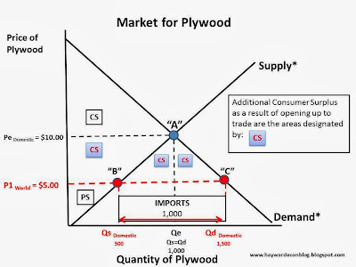
If an economy is not open to trade with foreigners it is said to be in a state of Autarky (pronounced "Otter-Key").  The first graph shows the market in this state with a domestic price or $10.00 and a domestic market quantity of 1,000 pieces of plywood.

This next graph is the same as above but shows the areas of Consumer Surplus and Producer Surplus in equilibrium in autarky. 


Now, assume the country engages in trade and comes out of autarky.  The price of the same good when it is imported is $5.00. Half of the domestic price!

When the price of the good changes we MOVE ALONG the respective Supply and Demand Curves (Law  of Supply and Law of Demand). We can see in the graph above, when the price is $5.00 the Domestic Quantity Supplied is 500 (Point "B") and the Domestic Quantity Demanded is 1,500 (Point "A").  Our Domestic Market for Plywood is no longer in equilibrium---Quantity Demanded ("C") is GREATER than Quantity Supplied ("B"). Normally this would result in a shortage, but the shortfall is going to be made up with  IMPORTS or 1,000 pieces of plywood from China.

Important point: Notice what happens to Consumer Surplus in the graph below.  There is additional CS for consumers: They get to "enjoy" more plywood at a lower price than before trade. However, notice that Producer Surplus is less than it was before.  Some producer surplus was transferred to consumers.  Producers are left with a small sliver on the bottom left hand portion of Supply*.

So, US consumers are much better off and US producers are much worse off.


Because US producers are worse off, they may choose to try to "level the playing field" by lobbying for a tariff to be assessed on imported plywood so the price will closer reflect the US cost of producing.  In other words, to take away the un-competitive edge the foreign governments may have given their producer.

Assume they are successful  and a tariff of $3.00 is levied on each piece of plywood (graph below).  This will increase the price to $8.00


Remember: PRICE increases we (again) MOVE ALONG our respective Supply Curve (from Point B" to "F") and Demand Curve (from Point "C" to "E"):


As a result of the tariff, we have a change in Imports, Domestic production, Domestic Consumption, Surplus, Dead Weight Loss, and Tariff Revenue.  The most significant change is imports have been reduced to 500 pieces of plywood. The higher price as a result of the tariff induced the producers to increase quantity supplied by 250 (movement from "B" to "F") AND the the higher price has decreased the quantity demanded by US consumer by 250 pieces of plywood (movement from "C" to "E"). 

Other significant changes take place as well.  These areas have the "?" in them and are important to be able to identify.  Note they are all areas that USED to be Consumer Surplus. That is going to go away!


The first one (below) Producer Surplus is recaptured by US manufacturers of plywood. Because the price is now $8.00 in the marketplace they are induced to produce an additional 250 pieces of plywood (Law of Supply!).

The second area is "Dead Weight Loss" (DWL) to consumers.  This is the area just below the Demand curve between Point  "C" and "E".  This means that as a result of the tariff consumers lose the benefit of purchasing 250 pieces of plywood at the lower import price of $5.00.


The second area of "Dead Weight Loss"(DWL) is attributed to "Society" (graph below).  It is DWL because resources were allocated to produce additional plywood SOLELY as a result of the tariff.  This implication is society could have benefited in two ways: (1) consumers could have enjoyed more plywood at lower prices from the foreign producer and (2) the resources allocated to produce the additional units of plywood could have been used for something else.  You might recognize this as  "Opportunity Costs".

Lastly, the some lost Consumer Surplus is transferred to the Government by way of the tariff.  We can calculate the Tariff Revenue ("T.R.") by taking the amount of the tariff ($3.00) and multiply it by the number of imported pieces of plywood (500) and get $1,500.  This area is not considered DWL because the tariff revenue could be used by the government to subsidize the production of another good, creating surplus somewhere else.  
Oh, wait, isn't that what the foreign government did in the first place to create this situation?  Makes you think, doesn't it?? :)

Thursday, January 2, 2014

Makin' Bacon in 2014 may be a little more expensive.These little piggies, unfortunately, are not going to make it to market...

Makin' Bacon is likely to cost a bit more this year. All is not well down on the farm.  Here is a short article about it. Read it and then "go to the graphs" below for a basic supply and demand lesson.

Pork market prices are expected to rise in 2014

The million-dollar question that many livestock producers want the answer to is: How market prices will fare in the future.Steve Meyer, the founder and president of Paragon Economics, said in a recent interview that producers can expect to see some changes in pork figures next quarter as a result of the porcine epidemic diarrhea virus, which hit first in June and July. 
Due to this, he noted, that there will be a reduction in slaughter numbers from where they would have been had the animals not been sick
The first and second quarters of the new year probably will be down between 2 percent and 4 percent in slaughter production, Meyer said. 
The good news for pork producers is that hog prices will be positive.
“Reduce supplies, prices go up,” Meyer said, adding that producers whose hogs were infected with PEDV most likely lost three to four weeks of production. 
Another thing that will help producers in the coming year is that the cost to produce a pig will be $35 lower per head. Meyer explained that this can be attributed to a good corn and soybean crop. 
“It was the fourth-largest soybean crop ever,” he said, adding that a bigger crop helps drive down the average cost of feed. 
Although Meyer doesn’t believe a lot of new individuals will start raising pork, he does believe that pork producers who have been waiting to expand, but hadn’t because they were waiting for better market prices, finally will expand their sow herds.
There are a many basic microeconomics concepts we can cull from these few paragraphs.  The one I want to focus on is how a short run disruption on the supply side, as described in the article, affects the market.

A couple of qualifications: (1) I just made up the prices and quantities you see in the graphs just to give reference points, (2) I make assumptions regarding the relative elasticities for both the Demand and Supply Curves in the Market for Pork products. The second one is certainly open to debate but for simplicity, go with it.


At the end of the article it is suggested that in response to the high(er) price additional producers may enter the market.  This means that over time the situation will reverse itself.  The Supply Curve will shift back towards the RIGHT, indicating that at the market price there will be an INCREASE in Quantity Supplied.  Quantity Supplied will be greater than Quantity Demanded (Surplus!!) and the price will decrease.  As the price decreases, the quantity demanded increases (Law of Demand).

The market will tend towards settling at the Long Run price and quantity...Until it doesn't.

Lunch time. For some reason I am craving a BLT.  :)

Tuesday, December 31, 2013

What do the historical Demand for Beef and my Junior Year (the first time) in High School have in common? Both dropped like a rock but one has recovered. Guess which one?

Well, I dropped out of school (for a time) and the bottom dropped out of the market for beef. Neither of us has recovered fully, but one has done better than the other. I will let you judge the winner.

I saw this graphic on meat consumption in the US since 1909 at a couple of different sites (NPR and Pricenomics).  The numbers on the vertical axis represent "US Meat Consumption, pounds per person".

Neither article pointed out the obvious: What happened in the mid to late 1970's with the consumption of beef to cause it to peak and start a rapid decline from its previous 30 year sharp ascent?

Source: NPR via Pricenomics
(NOTE:  I doctored the graphic a bit to isolate the period observed.  I inserted arrows to show the trajectory of consumption for each of the meat choices. The change in Beef (sharp decrease) just about equals the increase in Pork and Chicken (and to a much lesser extent Turkey) consumption).


I had to do a little searching but found an pretty good answer and it comes in three interesting parts, two which relate to two of the Determinants of Demand that economics students know so well: A change in Real Income and the Availability of Substitutes.  And one the reason a Demand Curve slopes downward: The Substitution Effect.
""Aggregate income in the United States, in 1972 dollars. went from $1122.4 billion in 1970 to $1480.7 billion in 1980 - a 32 percent increase. Personal income similarly increased over the period from $869.1 billion to $1209 billion. However, average real spendable weekly earnings peaked in 1972 at $97.11 and declined fairly consistently to $83.56 in 1980 - a decrease of 14 percent (fig. 1). In the critical period, 1976 to 1980, average real spendable earnings went from $91.42 to $83.56 - a 9 percent drop."" 
Real Income in a relatively short period of time took a pretty good hit. If income decreases and the quantity demanded for a good decreases, regardless of the price, then DEMAND is said to decrease (Demand Curve shifts to the LEFT). This was the first ding to the market for beef.

The second came on the pricing side of beef relative to the price of chicken and pork:
""Divergence between the beef price index and the chicken price index was not great between 1973 and 1977 (fig. 2). Subsequently, however, the beef price index increased at a fairly steep rate, reaching 270.3 by 1980 compared with 190.8 for chicken - a gap of 79.5 points. Between 1975 and 1980, the price index for chicken increased by 17.5 percent, the beef index by 59 percent.''
 ""Beef prices began to increase at a noticeable rate in 1977, and by 1980, the beef price index was 61 points higher than that of pork (fig. 2).""
Source: HERE
Because of the availability of the protein substitutes Chicken and/or Pork, when the price of beef increased then the quantity demanded for Chicken and Pork products INCREASED at the given price(s) in their respective markets (the Demand Curves for Chicken and Pork shifted to the RIGHT). 

Lastly, notice in Figure 2 that the prices of chicken and pork products did increase as a result BUT not relative to beef products.  Because of the relative price difference, there was a Substitution EFFECT in the market for beef---as the price of beef increased, the quantity demanded for beef decreased (moved ALONG the demand curve.

So, there was a confluence of events that help explain the "Beef Cliff" in 1977:  Lower real incomes and higher beef prices at the same time.

A medium-rare slice of the malaise of the mid to late 70's.  Or as I called it "My High School Years".  :)

Monday, December 30, 2013

Since 2007 GDP has increased by $800B and the number of total jobs has decreased by 2 million. How can that happen and "Where is the Money??""

The graph below is from HERE.

The percentage change in Real GDP from the 4th quarter of 2007 (when recession began) to the 3rd quarter of 2013 (the last reporting period) was 5.6%.  In dollar terms that is about $800 billion dollars (more or less).

The number of jobs in December of 2007 was 146,000,000.  Now it is about 144,000,000.  Two million jobs less than the high point in 2007.

So, we are producing roughly $800B MORE in dollar value of goods and services with 2M overall FEWER workers.  That is $400,000 more per one less worker ($800B/2Million) that is going, well, somewhere other than to hire new workers.  Machines? Software? Increased health costs? Profits? Profits? Did I mention Corporate profits?  See 2nd graph...

gdp

FRED Graph
View My Stats