Saturday, March 22, 2014

Full-employment, Progressive Era style. Nice photo of bowling pin setters in 1910.

This photo accompanies a nice article on "The Rise and Fall of Professional Bowling". 

It was taken in 1910.   From Wikipedia, here is the description of it:
1:00 A.M. Pin boys working in Subway Bowling Alleys, 65 South St., B'klyn, N.Y. every night. 3 smaller boys were kept out of the photo by Boss. Location: New York--Brooklyn, New York (State) Hine, Lewis Wickes, 1874-1940, photographer. April, 1910
Child Labor in action.  Nice illustration for a history class.

I am 53 years old and I remember watching bowling on TV in the late 60's.  I was a big deal! But I missed its real heyday long prior to that (pre and post WWII).

If you are interested in the subject or just like reading about historical cultural niches that people have mostly forgot, then this may be for you.

Source: Priceonomics

See how the price and quantity sold of the simple i-Pod as changed over time since its introduction in 2003. The i-Pod is Dead, Long Live the i-Pod...

Ok, it is not really dead, but it is on its way to becoming an impulse buy in line at the grocery store.

The iPod will go down in history as a breakthrough technology that lead to the "i"-everything revolution in consumer electronics.

When it debuted in 2003 (yes a short 11 years ago) its introductory nominal price was $400.00 (see left scale, blue line. Using the BLS inflation calculator for overall changes in prices, in today's dollars that would be equivalent to $510.30.

Following the BLUE line you can see the price dropped rapidly as more units were sold (GOLD line using the Right Hand scale).

In 2006 the price stabilized at its longer term price floor of just over $150.00 regardless of the number of units sold (with some seasonal fluctuations). Those seem to coincide with the very high peaks that center on the Christmas shopping season. Pretty consistent, eh?

For an additional reference point, I put the price of an i-Pod today (estimated at $155.00) in 2003 dollars: $121.47.  That is a 70% reduction in price using 2003 prices ($121.47-$400.00 = -$278.53/$400.00). Or you could use 2014 prices.

During that time, the general level of all prices, as measured by the Consumer Price Index, increased 28%.

Wish we could innovate with the cost of gas and or electricity to this extent so our heating bills would be lower by 70%.  :)
Source: Twitter Tweet via Quartz

Wednesday, March 19, 2014

A survey suggests businesses won't reduce staff, maybe slow hiring of new workers BUT raise prices if the minimum wage goes to $10.10. Let me show you how this is possible.

The Wall Street Journal had this graphic based on a recent survey regarding business sentiment towards a potential increase in the Federal minimum wage to $10.10 per hour.

Sixty-one percent of businesses won't cut their existing workforce (Red means NO, Blue means YES), which is good. About 52% say they won't reduce hiring in the future. Not a ringing endorsement going forward, but we will take it. About 63% say they would raise prices.  THAT doesn't sound good.

So, good for low wage workers who have a job. This is easy to quantify. Not so good for low skilled workers not in the labor force now but may/will be in the future. Not so easy (impossible?) to quantify.  Not good for people who purchase goods/services produced from low wage/low skilled labor. This is VERY easy to quantify.

Source: Wall Street Journal
In AP Microeconomics we have a unit called "Factor Markets" in which we use a very simplified model to graphically illustrate the "Profit Maximizing Number of Workers" a firm will hire given the changing market conditions, such as it described in the graphic.  

According to what you will learn below (all the relevant info is embedded in the slides) the ONLY way the conditions above can be met (no cut in workforce and possible reduced hiring) is if PRICES INCREASE.

The highly competitive industries that employ lots of low wage/low skilled workers AND is dealing with a relatively slow economy, this seems very difficult.  

But I am going to go with it and show you how it is possible for everything to work out just as the graphic suggests.  

Let me know if you spot any mistakes in content. Constructive criticism always welcome.


Which is the most and least expensive city to attend an NBA game for you and 3 friends? For once, geography does not seem to matter. See interesting data here...

Here is an interesting survey of NBA (National Basketball Association) teams and how much it costs to attend a game.  Lots of interesting data on individual costs for various items, from tickets to parking.

This report compiled a "Fan Cost Index".  It shows how much a "basket" of items costs for you and 3 friends to attend a game in all the cities that have a franchise. I highlighted that in YELLOW and they are in descending order from most expensive to least.

Here is how the report characterizes the components of the Fan Cost Index (FCI):
The Fan Cost Index® comprises the prices of four (4) average-price season tickets, two (2) cheapest draft beers, four (4) cheapest soft drinks, four (4) regular-size hot dogs, parking for one (1) car, two (2) game programs and two (2) least-expensive, adult-size adjustable caps. Costs were determined by telephone calls with representatives of the teams, venues and concessionaires, along with information provided on the teams’ official Web site, or through outside sources. Identical questions were asked in all interviews.
Source: 2013 Team Marketing Report via PRICEONOMICS

Tuesday, March 18, 2014

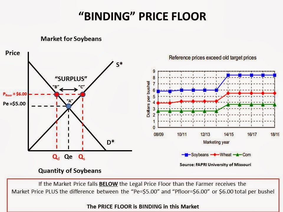
Nice real time data and graphs to illustrate a Price Floor. A must know concept for the AP Microeconomics test!

Agricultural commodities are produced in technically what is called a “Perfectly Competitive” Market. .  

The prices are established in commodity exchanges, like the Chicago Mercantile Exchange (CME), based on world-wide demand and supply.  Farmers simply have to accept what is offered.  In economics, these producers  are termed “Price-Takers”.

Agricultural markets are relatively stable over time, but because of many endogenous and exogenous variables that can and do affect farming, prices fluctuate.  Sometimes the price is higher than normal, sometimes lower.

In order to smooth out this pricing volatility nations often employ various polices to make the price a farmer receives for their crop more predictable over time.  The Unitied States does this within the context of the US Farm Bill.

One such policy the government uses to aid farmers is called a “PRICE FLOOR”

Price Floors legally establish a MINIMUM PRICE that the Farmer will receive per bushel of crop harvested. 

If the market price falls below the Price Floor, the government makes up the difference so the farmer receives the pre-determined Price Floor price.  This is what is termed a "BINDING PRICE FLOOR". 

If the market price rises ABOVE the legal Price Floor then the farmer receives the market price and the Price Floor becomes irrelevant. This is termed a "NON-BINDING PRICE FLOOR".

Below is a series of graphs I made to illustrate both binding and non-binding price floors.  For labeling purposes, I used Soybeans BUT it could apply to any of the commodities.

Within the slides I inserted a graph that shows the ACTUAL price floors past, present and future for Soybeans, Corn and Wheat as established in the recently passed US Farm Bill.  I got this from HERE via Agricultural Reader.

This is a MUST know concept for the AP Microeconomics test! Hope it helps.


Sunday, March 16, 2014

A grade earned in an introductory college course is a pretty good predictor as to whether someone is going to major in that subject. HOWEVER, men and women respond very differently to that grade. Nice graphic with an example here.

This graphic comes from a study by Harvard professor Claudia Goldin (click for an article by her on this topic).

It shows, by grade attained in an introductory economics class, which gender is more likely to continue on and major in Economics.

When BOTH men (blue bar) and women (red bar) receive an "A" in the class, women are slightly more likely to go on and major in the subject.  However, as the grade earned gets lower women flee the major at a much higher rate than men do.

In other words, men are undeterred by a lower grade in deciding to major in economics and women quickly have second thoughts and move on to something else.

Economics suffers from a deficit of females in the major similar to the STEM majors.

This excellent analysis HERE at the Washington Post goes deeper into the potential reasons.  I highly recommend it if you are interested in the issue.
Source: Washington Post
View My Stats