Showing posts with label Demand. Show all posts

Tuesday, July 18, 2017

Bacon and Supply/Demand Graphs. What a great breakfast combination.

A nice article to practice graphing Supply and Demand.  

America’s Lust for Bacon Is Pushing Pork Belly Prices to Records


Once considered an unhealthy byproduct, bacon has become a guilty pleasure—with prices to match.

Excerpt for graphing:
""Some analysts say bacon, meanwhile, is becoming a yearlong staple that consumers are eager to procure. That voracious demand has left wholesalers in a squeeze. Retailers “have turned hand-to-mouth, buying only what they need, waiting for production to increase and prices to decline,” said Dennis Smith, a commodities broker at Archer Financial Services in Chicago. 
Pig farmers are struggling to keep up with demand. The national hog herd rose to a seasonal record of 71.7 million head in early June, according to the U.S. Department of Agriculture, up 3% from a year earlier. 
But it hasn’t been enough to satiate bacon demand. Stocks of pork bellies in commercial freezers fell to 31.6 million pounds in May, down 59% from a year earlier and the lowest figure for the month since the USDA began keeping track in the 1950s.""

Wednesday, September 28, 2016

Beef. It's what for dinner...before you run a half-marathon.

One of the Determinants of Demand is "a change in consumer tastes/preferences".  Advertisers and other advocacy groups try to promote their products in order to influence the buying decisions of consumers.

Here is an example from a Beef Industry lobbying group (from Morning Ag Clips):

The beef checkoff’s Northeast Beef Promotion Initiative in partnership with the South Dakota Beef Industry Council, the Pennsylvania Beef Council and the Kentucky Beef Council encouraged runners to “fuel up” with lean beef at the Rock ‘n’ Roll Philadelphia Half Marathon Health & Fitness Expo, Sept. 16-17.
Nearly 30,000 runners and their families toured the expo during the two-day event.  Visitors to the beef booth were challenged to test their beef knowledge through the ever-popular beef trivia spin wheel to win beef-related prizes. Attendees also learned the importance of fueling with high-quality protein through the checkoff’s Protein Challenge campaign. The checkoff’s Millennial-2-Millennial advocates and Team Beef members assisted checkoff by staffing the beef both.  After interacting with booth staff, an on-site event survey showed that 88 percent of attendees polled felt the positives of beef to outweigh the negatives.
- See more at: https://www.morningagclips.com/runners-fuel-up-with-beef/#sthash.Kb94esx8.dpuf

Below I created some slides to show students how this plays out on the Demand side of a Market.

Hope it helps!


Tuesday, July 19, 2016

The fountain of youth: Pomegranates and the Demand Curve

A nice example to use with a basic Demand Curve lesson.

Two of the Determinants of Demand are a "change in consumer tastes/expectations" and "change in the number of buyers".  This article suggests research shows pomegranates have some anti-ageing properties:

"...The humble pomegranate may old the secret to a long and healthy life. 
Scientists say the Middle Eastern fruit contains a ‘miracle’ ingredient that strengthens ageing muscles and extends life. 
With experiments in worms and mice producing results that ‘are nothing sort of amazing’, they are now testing the fountain of youth supplement on people. 
Even something as simple as keeping muscles young could reduce the number of falls among the elderly and increase independence, allowing people to live in their own homes for longer. 
The Swiss scientists said: ‘We believe this research is a milestone in anti-ageing efforts.’ 
Their excitement centres on the pomegranate’s ability to keep mitochondria, the tiny 'battery packs' that power our cells, charged up...."---The Daily Mail

This new information, once widely disseminated, will likely have an impact on the current market for pomegranates.

The current market for pomegranates has a specific price ("Pe") and market quantity demanded ("Qe").  See graph:


With this new finding it seems reasonable that at that same price a higher/larger quantity demanded ("Q1") will emerge as people who previously were not interested in pomegranates become intrigued by this potential fountain of youth:

Ceteris Paribus, what happens at "Pe" and "Q1" will also happen at ALL other points along the "Demand*".  Without plotting those additional points, we can intuitively see a new Demand Curve is created that lies wholly to the RIGHT of the previous one.
Note: the impetus for the change in demand was NOT the price for pomegranates.  The price stayed the same but a larger quantity was demanded at that price because something OTHER than the price occurred in the market for pomegranates ("miracle fruit!).

Subsequently there will likely be a change in price which in turn WILL affect the Quantity Demanded until we reach a new equilibrium price.


Thursday, July 7, 2016

Gasoline prices and how they affect many markets. Nice practice!

Here is a terrific article from the WSJ (I think it is ungated) that illustrates a bunch of introductory microeconomic concepts within the Supply and Demand unit.

This paragraph speaks mostly to the Demand-side:
“Households had the potential to save $630 at the pump, of which they spent the majority58%. This spending provided more than a $200 boost to spending on non-gas goods and services, primarily restaurants and retailers. The lower gas prices also caused significant changes in household transportation choices, leading people to spend $150 more at gas stations and spend less on transit.”---WSJ Real Time Economics
Substitutes, Complements, movement along and a shifting of various Demand curve(s).

Happy graph drawing!

Sunday, June 26, 2016

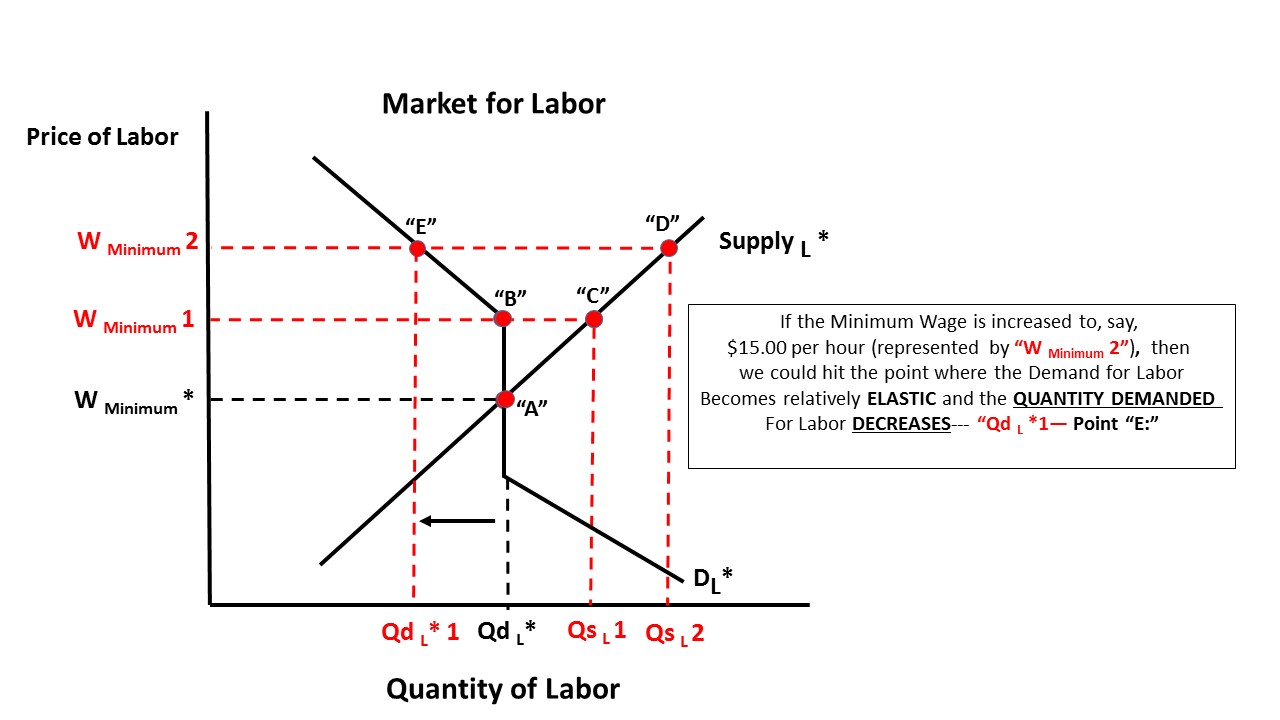
What is the right Minimum Wage? In typical Economics fashion: "It depends"

When I am asked whether or not we should have a higher minimum wage my answer is usually something like "a wage that helps all low/no skilled workers concerned and does not harm any current or future low/no skilled workers".  Admittedly not very helpful.

I put together some slides with explanations of how I try to objectively view the issue.  There maybe a sweet spot for the minimum wage.  Where that is, well, I fall back onto "it depends".  I think that is actually the best answer.

I hope this helps someone, teacher or student.  Feel free to comment.


Wednesday, September 17, 2014

Basic Supply and Demand illustration. Hope it helps.

The corn crop for this year (2014) is scheduled to be the most productive ever, with per acre yields in the 162 bushel range (a bushel is 70 pounds for Corn).

For farmers this is a blessing and a curse at the same time. For the individual farmer a bumper crop is good--more corn to sell at the anticipated market price.  However, if ALL farmers experience a bumper crop then that will increase the supply of corn and lower the expect price of corn (per bushel).  It is a catch 22 situation:

Farmers worry good corn crop could mean low prices

"Agricultural officials are projecting an 11 percent increase in the size of Wisconsin's corn harvest this year, a prediction that has farmers worried prices will drop too low for them to make a profit.
State projections call for corn yields of 162 bushels per acre, an increase of 16 bushels per acre from last year....
Richard Halopka, an agriculture agent in Clark County, noted that if prices are too low, farmers don't have to sell right away.
"One unique thing in this county is that we do have a fair amount of storage locally, which could get stretched if we have a bumper crop," he said....
I put together some slides to illustrate this excerpt from the article.  

If you are teaching or learning the basics of Supply and Demand you may find it useful. 

Distinguishing the difference between a change is Supply vs a change in Quantity Supplied (the same for Demand) is one of the most diffcult things to intuitively understand in an economics principles class. I hope it helps.


Monday, September 15, 2014

Literally and figuratively the butter spread is getting wider. See how that affects trade flows.

The price of butter has surged in recent days as well as recent months. Here is a graph I created showing the price of butter in the US and in world markets.  The prices are per pound based on a  metric ton (2204.62 lbs) so this is the price at production for wholesale sale, NOT RETAIL (the price you see at the store).

The world prices since 2/19/2013 are in RED and the US price is in BLUE.

Notice, of the most part, world prices are consisently above the US price but a crossover occurs between March 19th and April 19 of 2014.  Then there is a significant diverence where the US price quickly outpaces the world price.

As of today (9/15/2015) the US price is at $3.00 lbs and the world price is about $1.25 (Source) so on the graph the RED world price line end point is the same but the US red line extends up to the $3.00 mark.  The spread is even wider than what appears on the graph!

Source: Haywardeconblog. Using historical data from HERE and HERE
This gives me an opportunity to do a lesson on international trade to show what happens in markets when the world price of a good is differnt from the domestic price and how trade flows might be affected.


"Mainstream media" article that extensively uses elasticity to describe a market. What a pleasant surprise!

A terrific article that explains the current market for corn using many micro and a few macroeconomic concepts.

Bumper crop is bummer for some (Edward Lotterman)


The main ones are  Elasticity of Demand and of Supply. Rare it is to find an article in mainstream media that uses correct terminology to describe economic events.  Warms my heart!

Check it out.  Offers MANY opportunities to practice drawing and analyzing basic supple and demand graphs.

Here is a quick "sketch" of what it looks like after all is said and done:


Friday, May 16, 2014

Where's the Beef? No, seriously, where is the beef!!

Here is a look at the past, present and future of the Supply Side of the meat industry. This data is from the USDA ERS for the years 2013, 2014 and 2015. Part of 2014 and all of 2015 are predictions based on known numbers in the herds, flocks, whatever. Numbers are in "millions".

Here are the percentage changes, from 2012 to 2015 in the potential "Quantity Supplied" (in millions of pounds of meat) of meat for consumption:

Beef:  -6.2%
Pork: +4.5%
Lamb/Mutton: -5.8%
Broilers (chickens): +6%
Turkeys: -.7%

Beef production has experienced a steady decline since 2012.  Pork is still below 2012 production levels but expected to rebound in 2015.  Chicken is a bright spot in that it has increased at a fairly steady rate.

While the supplies of chicken and pork will increase, prices will not likely decrease as you might expect.  As the price of beef is most assuredly going to be higher, the demand for chicken and pork as viable substitutes will increase and put upward pressure on the price of  both of those meats.

TANSTAAFL---Now I am hungry for lunch.  Will it be Chicken or Pork Fried Rice?

Monday, March 3, 2014

My take-down of a Wall Street Journal article. It helps with understanding the difference between a Giffen and a Veblen Good AND a market reaction. They confuse ALL three!

In today's Wall Street Journal there is an article on the state of the world wide luxury goods market.

In my opinion they make LOTS of Microeconomics 101 (or AP Microeconomics) mistakes in their analysis. Read for yourself but I want to focus on how they use, or misuse, the term "Giffen Good".  Here is the relevant excerpt:

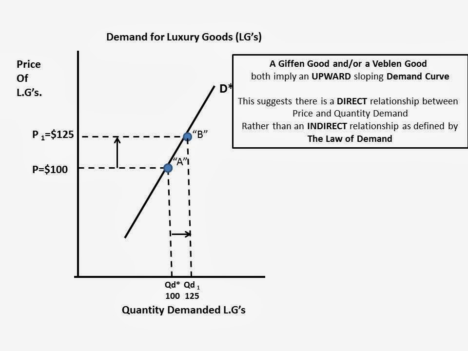
"...An economic theory holds that for certain goods, higher prices increase desirability and drive sales, rather than suppress demand as they would for ordinary products. Economists refer to such luxury products as Giffen goods, named for Scottish economist Robert Giffen, who described the phenomenon...."

First, they REALLY should have used the term Veblen Good instead of a Giffen Good.  A Veblen Good refers to luxuries ("status or pretige goods") and a Giffen Good is used generally in the context of inferior goods.

Here is a definition I found that I REALLY like and makes the concept easier for me to understand:
 "We use the term “Giffen behavior” rather than “Giffen good” to emphasize that the Giffen property is one that holds for particular consumers in a particular situation and therefore depends on, among other things, prices and wealth. Thus, it is not the good that is Giffen, but the consumers’ behavior. The Giffen phenomenon should also not be confused with prestige or Veblen goods, where consumers desire the goods precisely because the price is high, “snob appeal,” where consumers desire the good because it is rare, or situations where consumers interpret a high price as a signal of high quality. In all three cases, the goods in question are normal. Giffen behavior is a phenomenon that arises entirely within the neoclassical framework where consumers care about price only inasmuch as it affects their budget sets. If demand is Giffen the good in question must also be inferior, which rules out Veblen, snob and signaling effects". ---LINK HERE to where I got this definition.
In both cases it suggests the Market Demand Curve is UPWARD sloping, indicating there is a DIRECT relationship between Price and Quantity Demanded of a good.  In other words, we only buy MORE when the price increases (or buy less when the price decreases).  This graph illustrates this phenomena:


This is counter to the Law of Demand that indicates we buy more only when the price decreases (or less when the price decreases).

So, what is really going on in the Market for Luxury Goods that I believe maintains the integrity of the Law of Demand?  Let's go to the graphs!

Here is a downward sloping Demand Curve for Luxury Goods. I just made up some random numbers for illustration purposes and to make the math easy.

At a price of $100 assume the market quantity demanded is 100.  Total Revenue would be $10,000


Assume the price of the Luxury Good increased to $125 and following the Law of Demand the Quantity Demanded decreases to 80.  Even though price increased and quantity demanded decreases, Total Revenues stayed the same.  This could or could not happen. It depends on "Elasticity of Demand", but I am not going to include that analysis here to keep it simple and short. :)


Why do I believe this is true in "Real Life".  Well, because the article told me so, in TWO places:
(1)---One reason ultra luxury brands are raising prices is to distinguish their products from entry-level luxury goods that are fast picking up market share. 
"The more Tory Burches and Michael Kors there are, the more the Chanels and Louis Vuittons will try to price up," said Milton Pedraza, the chief executive of the Luxury Institute, a research and consulting firm. 
The unintended consequence could be that the luxury brands drive even more customers toward less-expensive rivals....
...(2)---Jamie Moore, a homemaker in Cleveland, Tenn., said that on her annual shopping sojourn to New York, she usually splurged on a Prada handbag, for which even a basic nylon model can cost $1,230. Not this year. 
"The prices have gotten so expensive that I'm not buying one," she said.
So, a switch to an less expensive brand because of a viable substitute (1) AND because it is no longer affordable (2).  Nice example of BOTH the "Substitution AND Income Effects" that explain the DOWNWARD sloping nature of a demand curve...Hmmmm...

The article introduces two variables into the equation---rising income from China which creates new entrants into the market for Luxury Goods.


"A change in Income"  and "A change in the Number of Buyers" are two determinants of demand that will shift our demand curve, either left or right.

If at the SAME TIME there is a decrease in quantity demanded (20 units) from "the West" because of an increase in price, rising incomes and more Chinese wanting Luxury Goods can off-set this decrease in quantity demanded at $125.

Point "C" represents a new Price ($125) and Quantity Demanded (100) that lies to the RIGHT of the original Demand Curve "D*" (Price $125, Quantity Demanded 80).


We can assume (Ceterus Paribus) what happened between Point "B" and Point "C" will happen at 
every other point along Demand Curve "D*.  The Demand Curve will shift to Right:

Bottom line: I THINK  I maintained the integrity of the Law of Demand within the context of the Wall Street Journal article and its suggestion there is a case of Giffen/Veblen Goods going on in the luxury goods market.

This is just one inconsistency I found in the article. I believe there are many more.  

Extra Credit if you can find them!!  :)
View My Stats