Saturday, September 14, 2013

Has "King Dollar" been demoted to a Prince? Nice chart showing all major currencies and their ranking in terms of use in international transactions....

Here is a chart showing a list of currencies and their ranking in terms of use to facilitate a whole host of international transactions, such as the buying and selling of goods and services, or physical and/or financial assets. (The chart is from HERE with a HT from The Conversable Economist.)

The US dollar is still by far the most desired "medium of exchange" for engaging in international trade.

With most major commodities such as oil and agricultural products, US dollars are used to between the countries trading, even if the countries themselves do not use the US dollar as the currency of record.

In other words, if Russia sells oil to China the transaction is conducted in US dollars, not Rubles or Renminbi.

One interesting note from the chart is since 2001 the share of US dollars used in international transactions has decreased a bit but the use of the Chinese Renminbi has increased dramatically, moving from 35th place to 9th place in a relatively short period of time.

Source: TriennialCentral Bank Survey Foreign exchange turnover in April 2013: preliminary global results 

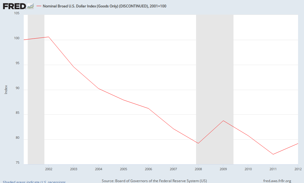
If the use of the US dollar in international transactions has declined since 2001, we might expect the value of the dollar to fall as well.  Not to imply correlation is causation, but the graph below shows how the value of the US dollar has changed compared to a "basket of other major currencies".

Using 2001 as a base year, the dollar has declined in value roughly 21%.

Has "King Dollar" been demoted to "Prince"? Not yet, but he should be looking over his shoulder.
FRED Graph


Monday, September 9, 2013

Nice graph showing the change over time in High, Medium and Low Skilled employment in the US. I see a major reason for income inequality. What do you see?

There are lots of reasons stated for income inequality in the US, and for that matter, around the world (it is not a problem solely with the US)---greed, unbalanced tax code, globalization, etc.

The one that does not get enough serious attention is the argument that the returns from education and high skills acquisition by INDIVIDUALS is a significant culprit.

I copied and pasted and modified a couple of graphics from HERE that show in the US the change, in millions, the number of workers engaged in either "High Skilled", "Medium Skilled" or "Low Skilled" employment.  Below the graph I calculated the percentage change in each category since 1995 to 2008.
(I left off 2009 for the calculation to leave out one year of the recession).

If we believe that "Education = Earning Power" then this seems to be some supporting evidence for increasing income inequality.

High Skilled employment increased 36% from 1995 to 2008.  Medium Skill employment edged up 6.10%. Low Skilled employment actually DECREASED by 4.20%.

The number of total net jobs created over that time is 17.7 million (151.7-134.0), or an increase of 13%.  So, a preponderance of those those jobs have gone to the High Skilled workers---13.3 million  (50.7-37.4) of the 17.3 million!
Source: www.KNOEMA.com

From 1995 to 2009 who Internationally is winning the "High Skilled Worker War" compared to the US? Looks like just about everyone. See the graphic here...

In the first days of introductory Economics we discuss the resources a society has available to combine to create goods and services that contribute to  a high standard of living.  I emphasize the phrase "Quantity and Quality" in regards to these resources.

One of the vital resources is "Labor".  Investment in "Human Capital" is vital to maintaining or moving to a high standard of living.

Here are a couple of graphics I combined from HERE that illustrate the change in High Skilled Employment in 13 countries (see more countries at the site) that results from investment in human capital.

The graphic on the left shows the number of people, in millions, engaged in high skilled labor in 1995.  The one on the right shows the number in 2009.  I calculated the percentage change for each country on the far right (the percentage change corresponds to the country listed on the right (2009).  China has increased the number of high skilled workers by 222%, the US by 34%, India by 92%, Brazil by 96% and so on...

Are we (the US) behind? About right? Or OK?  What am I leaving out in looking at these numbers that might mitigate (lessen) the impact of seemingly slow growth in the number of high skilled workers in the US?


View My Stats