Monday, February 24, 2014

Disney has raised its theme park prices AGAIN! See here by how much and how it compares to inflation. Pricing Power, indeed!

Disney has increased the price of admissions to its Theme Parks (Orlando Fla and in California) effective, well, immediately.

The old prices (since last June when they were raised then) are on the LEFT and the new prices are on the RIGHT (See their website HERE for all the changes)

I calculated the percentage change in prices. You can see those in black (ages 10 and above) and red (ages 3 to 9) on the right side.


The Bureaus of Labor Statistics reports in the Price index for the sub category of "Amusement and Theme Parks" that the admissions prices to Amusement and Theme parks in general rose 1.2% since last June.  (see the Price Indexes below for where I got the data)

Disney has increase its admission price to The Magic Kingdom 3.6 times the rate of inflation in that sector in the past year  (4.3%/1.2%).  A 4 Day ticket is 4.5 times inflation.

As we discuss in Microeconomics the Pricing Power that Monopolies (or near Monopolies)  keep this in mind!


My explain-er on the Demand for Labor in a Perfectly Competitive Labor Market. Might be useful for AP teachers and students alike.

Can you tell we are getting closer to the AP Micro test in May?  Here is a PPT on one part of the Labor Market---Perfectly Competitive Labor Market where a wage is established and the Firms are "Wage Takers"---they can hire as many workers as fits their "Marginal  Revenue Product" (defined within).

Excuse some of the bad formatting that you will see.

As always, let me know of any mistakes in content. I can always be better and make the presentation better.

Hope it helps.


My explain-er on the the Monopolists Demand Curve, Total Revenue Curve, Elasticity and Marginal Revenue. Whew!!!

It any teacher or student of AP Microeconomics needs an explain-er on:

1. A Monopolists Demand Curve and the Total Revenue Curve
2. The Demand Curve and the Total Revenue Test for Elasticity
3. How Elasticity is represented along the Total Revenue Curve.
4. How the Marginal Revenue Curve is derived with emphasis on the importance of locating the REVENUE MAXIMIZING QUANTITY where MR = 0.

Probably some other stuff I forgot about. :)

If you review it PLEASE let me know of any errors.  I am my own worst proof reader. Also, any constructive criticism of the content is welcome as well.

Sunday, February 23, 2014

Interesting back story behind the infamous "Mission Accomplished" banner. Things are not always as they appear.

Learned something new today from David Henderson at Econlog that is not about economics.

He relayed a first person account of the back story of the infamous "Mission Accomplished" banner that formed the back drop to Pres Bush's speech aboard the aircraft carrier he landed on.

Turns out the message was not so much about Iraq as a whole but more about the specific sentiments of the crew of the ship. Context is everything:
The banner saying "Mission Accomplished" on the deck of the carrier USS Abraham Lincoln when George W. Bush landed there. Almost everyone likes to make fun of Bush for that. But there's a back story that I learned from one of my students who happened to be an officer on that ship at the time. The White House had contacted the ship's captain and asked what message they wanted on a banner. The captain opened the decision up to the officers in the ward room and they, wanting to celebrate finally getting back to home port, chose "Mission Accomplished." ---Econlog
This will not change anyone's mind about the incident or circumstances, nor should it, but it is kinda nice to know the details of significant events and how small seemingly insignificant decisions can haunt forever.

Only one passenger car on the market lasts, on average, more than 200,000 miles in this Top 10 list. Guess before you look.

Only one car makes the list, Honda's Accord. The rest are pickups and SUVs (click on link to see the rest): 

"If you want to own a vehicle that you can drive into the ground -- and then wonder why it refuses to die -- then maybe you should be driving a big truck or SUV. 
That seems to be the conclusion of a study from a website that aggregates millions of used-car sales listings around the country. ISeeCars.com went looking for listings of vehicles with at least 200,000 miles on the odometer. It says it analyzed 30 million listings from 1981 to 2010. 
Conclusion: In the search for the top 12 vehicles that have clocked at least 200,000 miles, only one was a car. In last place, in a three-way tie, came the Honda Accord. The rest of the list has nothing but trucks -- pickups or SUVs."---From USA Today.
Thee vehicles and the percentage of them showing at least 200,000 miles
1. Ford F-250 Super Duty, 4.3%
2. Chevrolet Silverado 2500HD, 3.6%
3. Chevrolet Suburban, 3.6%
4. Toyota 4Runner, 3.5%
5. Ford Expedition, 3%
6. GMC Sierra 2500HD, 2.7%
7. Chevrolet Tahoe, 2.1%
8. GMC Yukon XL, 1.9%
9. Toyota Sequoia. 1.7%
10. GMC Sierra 1500, 1.6%
11. GMC Yukon, 1.6%
12. Honda Accord, 1.6%

Economists who write the most about income inequality and stagnant mobility work at some of the most unequal universities in the US.

I saw this graphic HERE and I think of the MANY academic bloggers I read everyday who write about the issue of inequality.

Many/Most of them are employed at the Ivy League schools or upper tier private colleges/universities.

They work at schools that are EXTREMELY unequal (bars over "Most Competitive" and "Competitive") in terms of the rich/poor divide among the student body.

Wonder if they see the irony.

Heard a saying before:  "Think Globally, Act Locally".  Should be more than a bumper sticker on a BMW....

Just an observation.

Note: "Less and None Competitive" schools would be the typical State school or university.  Pretty equal, those are...

dynarski_fig2
Source: MoneyBox

Saturday, February 22, 2014

Interesting graph showing the decline of the Mini-van era and the rise of the "Suburban Assault Vehicle'. Even with our cars we have asked to be Super-Sized.

Here is a graph (from Statista) of the Market Share of Domestic"Light Trucks" sold in the US from 1990 to 2012.  Instructively, it color codes the type of truck by body type and/or size.  See the key below.

I highlight a portion of of the market share in 1990 and 2013 (in RED) that interested me the most.

I see the rise of the "Suburban Assault Vehicles" (Lt Blue and Purple) for the soccer moms and dads and the decline of the Mini-van era (Green).  

You can see by the by 2012 the market for small to mid-sized trucks has become so small they are just a trace of the whole market.

The market share for "Large Trucks" has remained pretty constant at about 28% (give or take).

In terms of this class of vehicles, Americans have emphatically declared:  SUPER-SIZE ME!


Friday, February 21, 2014

Latest report on the holders of the US National Debt is out. Nice graphic showing the recent historical trend and who the buyers of our IOU's are.

Here is a graph (from HERE) of the latest report from the US Treasury (December 2013) on the various holders of the Public portion of the National Debt. That total is about $12.2 Trillion dollars.

The National Debt is divided up into two categories: Private and Public.  The Private portion of the National Debt is comprised of borrowing from various government Trust Funds and is about $5 trillion dollars, give or take a few hundred billion. The Public portion comes from sources outside the government and includes the US Federal Reserve Bank.

In the chart, just for reference, I highlighted the time period of the recession.  On the right I highlighted the owners of the debt and the percent that dollar amount is of the whole.

Some people are concerned about the amount of debt we owe to the foreign sector "Private Foreign plus Official Foreign"), a total of 47%.  Foreigners might stop lending to us or blackmail us by dumping the debt on the open market.

No problem. The Federal Reserve stands ready to fill the void if there is any shortfall.
The Fed bought a net $543 billion of Treasuries during 2013. That was not a record acmount — in 2011 it had purchased $656 billion — but it enabled to Fed to finance 71 percent of the net Treasury borrowing during the year. That was the highest proportion since the government resumed running deficits in 2002. The 2011 purchases amounted to 61 percent of the money the government borrowed that year.
I don't know if the Fed is a lender of last resort, first resort or somewhere in-between.  They are involved in a substantial way that they were not prior to the recession OR during it!  You can see they did not get involved in a big way until mid-2010.


Where your Cup o' Joe comes from and why it is likely to increase in price this year. What happens in Brazil is not staying in Brazil...

The Washington Post has an article today about the increase in the price of coffee in the commodities futures market.  You can see in this first graph the price going from about $1.20 in January 2014 to $1.72 for contracts to deliver in March 2014 (This is for the most plentiful Arabica bean).

Why the sudden spike in price?
Source: Washington Post

This graphic from Businessweek, shows where the two main coffee beans (Arabica and Robusta) are produced and the countries that are the main suppliers.  Brazil is dominates the cultivation and export of the Arabica bean.  However, the growing season has not been productive:
"...Usually during this time of year, the delicate Arabica coffee plants in the mountains of Brazil, where most of the world's coffee comes from, are maturing. White, fragrant flowers have appeared, followed by cherry-like fruit, each containing two seeds: Arabica coffee beans, the most popular in the world.
But last month, the worst drought in decades hit Brazil's coffee belt region, destroying crop yields and causing the price of coffee to shoot up by more than 50 percent so far this year. The drought is historic, with more than 140 cities in Brazil rationing water. The country's leading newspapers reported that some neighborhoods are only receiving water every three days.
For now, retail prices for coffee are stable. Roasters typically have enough supplies to cover themselves for a few months. But if the price of the Arabica (pronounced uh-RAB-ick-uh) beans continues to rise, consumers could start seeing the cost of their morning coffee creep up later this year, according to Jack Scoville, a futures market analyst specializing in grains and coffee, among other commodities...." (Washington Post)
Source: Businessweeek


The State of US manufacturing and employment. See here why Buggy Whips represent our past and our future.

I am always startled by this data. (From The Conversable Economist)

In terms of a share of the US economy as a whole, the manufacturing sector has been a relatively fixed percent of the total.  It has had its ebbs and flows but fairly constant.

What has not been constant is the mix of final goods produced by that sector. We have moved from manufacturing consumer goods (appliances, electronics and other "gadgets") to capital goods and higher value inputs (chemicals, pharmaceuticals, software, etc). In other words we are producing less stuff people see and more stuff that is not as obvious. Or as I like to say, we make everything else except the stuff you see at Walmart.

The other thing that has been constant but not is a positive way is the decline in manufacturing jobs.  This is not a new thing--the trend is long in the making.

Jobs in the manufacturing sector have declined from about 24% of all jobs to less than 10%.

Today it just simply takes fewer workers per manufacturing dollar relative to the past to make something.

In 1960 the ratio of share of workers to manufacturing as a share of GDP was (eyeball estimate) 24/12= 2(workers) to 1 in 1960. Today it is (eyeball estimate) 9/13 = .69 (of a worker) to 1.

Buggy Whip manufacturing (low skilled, routine production stuff) is not coming back to the US, but the technology, software and composite materials to make a new high tech buggy whip is likely to be produced here---if we foster it.

However, we seem to focus on the former and not enough on the latter.

What do you think???

Source: The Conversable Economist

Do you eat to satisfy hunger or to justify the amount of money you spent on the meal? My confession here with a study to back me up.

The Priceonomics blog has a posting regarding a study on All You Can Eat buffets.  The researchers were able to do real time observation with the cooperation of a restaurant in the Chicago area.

Here is the abstract to the paper:
Are price and consumption independent in fixed-price service contexts? A field experiment at an all-you-can-eat pizza restaurant shows that a 50% discount on the price of the meal led customers to consume 27.9% less pizza (2.95 vs. 4.09 pieces). This difference is significant and of similar size when controlling for age, height, gender and the day of participation. Additional analysis suggests that individual ratings of taste may be inversely related to consumption within treatment. Thus those who like it more, may consume less. One interpretation of our result is that, within this flat rate setting, individuals are consuming to get their money’s worth rather than consuming until their marginal hedonic utility of consumption is zero. 
The numbers I highlighted in bold above are put on a bar graph below to illustrate the finding.

Do we eat to satisfy our hunger (a fixed point) or to justify how much we paid  for the food (a variable amount)?

If I were honest about it, I would say this relationship holds for me.  I  believe I eat more at Golden Corral, on average, then I do at a CiCi's Pizza.  While price may not be at the forefront when I am consuming but it plays a part in how much I decide to consume, independent of how full I feel.

Don't judge me.  :)

Thursday, February 20, 2014

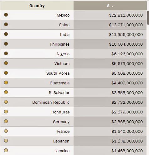
How much did foreign citizens working in the US earn and send home in 2013? And where is home? See the BIG numbers here...

When we study Balance of Payments (see here for latest report) as a part of the International Trade unit, one topic that is always of interest to students is "Unilateral Transfer Payment (net)".  A sub-topic of that is "Remittances".

Remittances are US dollars that foreign nationals earn in the US and send back to their home country. On net the US sends out more dollars than are returned to the US by US citizens living abroad and sending payments home.

Pew Research (a bonanza for blog fodder lately!) has a nice interactive map and data on remittances.

Here are Top 30 destinations for US dollars being "exported" abroad:


Here is a 2010 list of the Top 25 recipients of US Foreign Aid (tax dollars).  I highlighted the countries that appear on the remittance list above too.  In several cases, the residents of these countries are in the working in the US and sending home MORE US dollars than we send them in foreign aid.

Source: HERE

How has labor union membership fared in the last 30 years? Depends on if you are a public sector or private sector employee. See the graph here!!

Pew Research has a posting on union membership and peoples attitudes about unions in the US.

It contained this graphic.  In 201 total membership in public (Federal, State, and Local employees) AND private unions was 14.5 million people, roughly split 50-50 between public and private.

This is very different than the mix in 1983. Total union membership was 17.6 million (21% more than today), but in 1983 the private sector union membership was 68% of the total.

The public sector has increased membership by 26% (from 5.7 M to 7.2M) since 83' and private sector membership has decreased by 39% (from 11.9M to 7.3M).

About 33% of all public sector workers belong to a union.  Only about 6.7% of hourly wage workers in the private sector in US belong to a union.


Wednesday, February 19, 2014

Half of the US GDP is produced in very small geographic sections of the country. What is up with the rest of the US?

Not a fair question, as I will address below...

This graphic has been passed around the Twitter-sphere so much I do not know its origin.

Quite amazing if accurate. Roughly 20 metropolitan areas in the US are responsible for 50%, or about $8.4 Trillion of the US GDP in 2013 ($16.8 Trillion nominal dollars).  

One the one hand it makes sense because these areas have very high population densities and much of the US is relatively rural.  

Still, kinda looks unbalanced to look at it like this.


Should the Community College System be a part of the Social Safety Net in the US? I think so. What say you?

For a long time I have felt the Community College system in the US is a resource that is under-utilized and under-appreciated.  The latter probably more so than the former, unfortunately.

Seems like IF we accept the premise that we have multi-millions of the Long Term Unemployed who are not in the workforce, but would like to be, then we should do something to make obtaining additional education/skills much easier.  Otherwise, the problem will persist and ancillary social problems will arise from this involuntary idleness.

This short analysis of the Community College system by EMSI give credence to the value of doing so.  I excerpted part of it and highlighted what I think is the key point:

The Economic Impact of America’s Community Colleges

EMSI’s nationwide economic impact study, released this week by the American Association of Community Colleges, shows the net total impact of community colleges on the U.S. economy was $809 billion in 2012. That’s equal to 5.4% of the nation’s gross domestic product. Put another way, the added income created in the U.S. through increased student productivity and the spending of international students supported the equivalent of 15.5 million jobs in 2012. 
How do colleges contribute so much added income? Think of it this way. Anyone who has studied at a community college enters or re-enters the workforce with new skills. Millions of these students are working across the country today, and when they apply those skills, they’re rewarded with higher incomes than they would have otherwise (e.g., a home health aide who becomes a licensed practical nurse). They also raise business profits through their increased productivity. Together, these higher incomes and increased profits create even more income as they are spent in the U.S. economy.
I ain't no genius but this seems like a no-brainer.  The idea is easy, however, the devil is in the details of how to finance it and get people to take advantage of the opportunity.  Seems like it could be integrated into the existing social safety net.  We either pay for people today to become more self-sufficient or we will pay for them to be dependent for, well, a long time.

Any ideas??
View My Stats