.jpg)
Friday, December 13, 2013
How is the Federal Budget like a loaf of bread? You got your Texas Toast and your breadcrumbs. Which one will fill you up faster? Congress seems to think it is the breadcrumbs....
A nice quick reference visual that gives you an idea of of the relationship between Mandatory ("Non-Discretionary") and Discretionary ("Non-Mandatory") spending in the US Federal budget.
To use a baked good analogy, a loaf of bread, mandatory spending items are thickly cut slices of bread. Think Texas Toast (the BIG circles)! Non-mandatory spending item are either (1) thin slices, like crostini's (medium sized circles), or (2) even smaller pieces, like breadcrumbs used for Thanksgiving stuffing (the small circles).
In budget negotiations politicians are trying to make a political meal out of the breadcrumbs (cutting the small-ish things) and think it will nourish the Federal budget body and make it healthy.
The real "bread", if you will, is in the Texas Toast. However, it is neglected, left to mold, and get crusty.
Oh, well, whichever side YOU butter your bread I hope you find this graphic warm and toasty.
To use a baked good analogy, a loaf of bread, mandatory spending items are thickly cut slices of bread. Think Texas Toast (the BIG circles)! Non-mandatory spending item are either (1) thin slices, like crostini's (medium sized circles), or (2) even smaller pieces, like breadcrumbs used for Thanksgiving stuffing (the small circles).
In budget negotiations politicians are trying to make a political meal out of the breadcrumbs (cutting the small-ish things) and think it will nourish the Federal budget body and make it healthy.
The real "bread", if you will, is in the Texas Toast. However, it is neglected, left to mold, and get crusty.
Oh, well, whichever side YOU butter your bread I hope you find this graphic warm and toasty.
 |
| Source: Mother Jones |
Tuesday, December 10, 2013
Has the minimum wage lost purchasing power over the last 30 years? Well, Yes and No. Read here why the ambivalence.
Lots of debate about how the current minimum wage of $7.25 has not kept pace inflation over the past 30 years or so and it how it has hurt the working poor with families.
This graph (the BLUE LINE) below shows the yearly income of person working 2,000 hours in a year and earning a minimum wage of $7.25. That would be a gross total of $14,500. Going from Right to Left on the BLUE line is that $14,500 adjusted for inflation. Example: Go back to 1976 (the left most tip of the blue line). Take the $18,300 annual income and divide by 2,000 hours worked. You get a wage of $9.15. This means for a minimum wage worker TODAY to have the SAME purchasing power as a minimum wage worker in 1976 he/she would have to earn $9.15 per hour. This is what it means when people refer to the minimum wage not keeping up with inflation.
However, wages are not the only source of "income" for low wage working families. There is a Federal tax credit available to the "working poor" call the Earned Income Tax Credit ("EITC"). Basically it a "reverse tax" and the recipient is entitled to receive this in cash.
A household that has one wage earner making just the minimum wage AND has 2 dependent children is eligible for a cash tax credit of $5,320 (source HERE).
The RED line in the graph above shows the early salary of a minimum wage worker PLUS the dollar value of the EITC in any given year since 1976.
So, in 2013 if we include the EITC as income/compensation along with the $14,500 in wage income we get a gross total of $19,872 for those 2,000 hours worked. That is an effective hourly wage rate of $9.94.
Now look at the same graph below with the dotted line I inserted. While the the nominal minimum wage has lost purchasing power due to inflation, the difference in the erosion has been compensated for, in large part, by the increase in EITC payments.

So, if we include the EITC as a form of compensation to the working poor we get different take on whether or not the working poor are worse off compared to yesteryear.
My take is the working poor are not better off or worse off when you look at it like this. However, if the increasing use of tax money is used to make up the difference in lost purchasing power for the working poor, then we seriously have to look at the minimum wage and the function it serves.
This serves as ANOTHER subsidy for employers, especially the LARGE ONES who pay the minimum. Think about that. There has to be a better way.
Whatcha' think????
Addendum: I estimated this wage earner would be eligible for about $400.00 per month in SNAP (food assistance/Food Stamps). On a yearly basis that would be a cash value of $4,800.00. Using the 2,000 hours worked in a year, that would work out to $2.40 per hour we would have to add to the $9.94.
So total hourly wage with EITC and SNAP benefits would be $12.34.
In effect, taxpayers at the minimum are subsidizing minimum wage paying companies to the tune of $5.09 in order to lift people out of poverty. Pretty sure I could come up with additional transfer payments that would increase that subsidy.
This graph (the BLUE LINE) below shows the yearly income of person working 2,000 hours in a year and earning a minimum wage of $7.25. That would be a gross total of $14,500. Going from Right to Left on the BLUE line is that $14,500 adjusted for inflation. Example: Go back to 1976 (the left most tip of the blue line). Take the $18,300 annual income and divide by 2,000 hours worked. You get a wage of $9.15. This means for a minimum wage worker TODAY to have the SAME purchasing power as a minimum wage worker in 1976 he/she would have to earn $9.15 per hour. This is what it means when people refer to the minimum wage not keeping up with inflation.
 |
| Source: NY TIMES Tax Policy Center |
A household that has one wage earner making just the minimum wage AND has 2 dependent children is eligible for a cash tax credit of $5,320 (source HERE).
The RED line in the graph above shows the early salary of a minimum wage worker PLUS the dollar value of the EITC in any given year since 1976.
So, in 2013 if we include the EITC as income/compensation along with the $14,500 in wage income we get a gross total of $19,872 for those 2,000 hours worked. That is an effective hourly wage rate of $9.94.
Now look at the same graph below with the dotted line I inserted. While the the nominal minimum wage has lost purchasing power due to inflation, the difference in the erosion has been compensated for, in large part, by the increase in EITC payments.

So, if we include the EITC as a form of compensation to the working poor we get different take on whether or not the working poor are worse off compared to yesteryear.
My take is the working poor are not better off or worse off when you look at it like this. However, if the increasing use of tax money is used to make up the difference in lost purchasing power for the working poor, then we seriously have to look at the minimum wage and the function it serves.
This serves as ANOTHER subsidy for employers, especially the LARGE ONES who pay the minimum. Think about that. There has to be a better way.
Whatcha' think????
Addendum: I estimated this wage earner would be eligible for about $400.00 per month in SNAP (food assistance/Food Stamps). On a yearly basis that would be a cash value of $4,800.00. Using the 2,000 hours worked in a year, that would work out to $2.40 per hour we would have to add to the $9.94.
So total hourly wage with EITC and SNAP benefits would be $12.34.
In effect, taxpayers at the minimum are subsidizing minimum wage paying companies to the tune of $5.09 in order to lift people out of poverty. Pretty sure I could come up with additional transfer payments that would increase that subsidy.
Corn farmers are challenging the underlying theory of the market they operate in. Don't they understand basic microeconomics?
Well, yes, the average framer probably does and likely much more than even the best micro-economist.
Some farmers have provided a nice, real life scenario that gives me an opportunity to illustrate a basic economics concept: Supply and Demand.
The Wall Street Journal has a article on a how one of the determinants that shift a market supply curve, "Producer Expectations", is playing out down on the farm.
Some farmers have provided a nice, real life scenario that gives me an opportunity to illustrate a basic economics concept: Supply and Demand.
The Wall Street Journal has a article on a how one of the determinants that shift a market supply curve, "Producer Expectations", is playing out down on the farm.
Farmers Hoard Corn as Prices Drop
"...Faced with the lowest corn prices in more than three years, many U.S. farmers are stashing away their grain in a bet on a rebound.
The strategy is sending ripples through the corn belt—affecting everyone from grain buyers to storage-bin makers—and tempering the price declines in the $27 billion corn-futures market.
By hoarding freshly harvested supplies, farmers are forcing livestock producers, ethanol companies and food makers to pay a premium over futures in some areas to secure corn, helping to buoy prices during what is expected to be a record U.S. harvest, traders and analysts say..." Wall Street JournalLet's go to the graphs!!
Here is the Market for Corn at some equilibrium at Pe and Qe-- Point "A"


With the decrease in supply the market price is going to increase. When the market price increases then the Quantity Supplied increases (Law of Supply) and the market moves ALONG the new Supply curve from Point "B" to Point "C". The Quantity Demanded decreases (Law of Demand) and the market moves along the same Demand curve from Point "A" to Point "C". The market will reach a new equilibrium at the higher price of "P1" and a lower market quantity of "Q1" at Point "C".

Good Luck to them!!
Monday, December 9, 2013
The cultural trend for males to sprout facial stubble might look good but it hurts the economy in ways we don't think about. See here how...

The fashionability of facial hair is bad news for the razor industry.From Quartz
The male shaving sector has slowed down in both the US and Europe this year, and that’s at least in part due to the rising popularity of stubble, according to a recent report from Euromonitor. A move away from a culture of everyday shaving and towards one in which men embrace an artfully trimmed permanent two-day shadow—or, indeed, a full beard—has pinched some of the industry’s largest players.
Energizer Holdings, which owns both Schick and Edge, is among those feeling the stubble effect. The company has cited shrinking razor and blade sales in several of its earnings calls this year. “The weakness in some of the Personal Care categories in the US… are kind of unprecedented,” CEO Ward Klein said last month. “And I’m really talking about razors and blades in particular,” he added.
Razors and shaving cream are complements in economic terms. Two separate and distinct goods but their fates are pretty much tied together, at least in the male grooming category. Less shaving overall, less need for both of these products, at the margin and then some possibly.
Interesting how a cultural trend can have an affect that appears to be unseen but is certainly felt by those employed in the industries.
Sunday, December 8, 2013
Americans gotta consume...No, really, Americans GOTTA consume. See here how much...
Retail and Food sales are a nice indicator of the health of the economy. It shows the level of spending primarily by consumers with money they earned, saved, borrowed, or received from other private or public transfers.
Below is a long term graph of expenditures in this category---the BLUE line. The blue line includes the sale of gasoline. The creator of the graph (Calculated Risk) factors out spending on gasoline, a single good, to show how everything sold in the retail sector is faring in sales---the RED line. So, the red line is all other retail and food spending that goes on in the economy sans the dollar value of gasoline.

With apologies to a real economist at Calculated Risk, I used his graph and marked it up to illustrate an interesting point, in my opinion.
I inserted a straight dotted line along the expanse of the BLUE total retail and food sales line. Just connected the current data point with the point at the start, January 1992. Amazing...a straight line that for 21 years hugs the sales trend and only deviates from what we know now are traumatic economic events.
There is a small divergence above the trend line in 2000-01, a larger one in magnitude starting in 2005 then the "crash" where the bottom fell out and sales were way below the trend line in 2008. BUT we are now back along the trend line! Good news, right??

Remember, the blue line includes gasoline sales. Now look at the long term trend without gasoline sales. That will be the RED Line. Again, the dotted line I inserted is the SAME one as before but shifted down exactly parallel.
Notice how it hugs the red retail/food sales ex. gasoline (Red Line) very tightly up to 2008. The bottom falls out BUT there is a persistent gap between sales and the trend line.

In this last graph I estimate there is roughly a $30 billion dollar deficit between current spending and the established longer term trend. This $30B IN ADDITION to spending on gasoline!

Where is that spending going to come from? Gotta create some jobs so people can go to the mall, buy some stuff and grab some lunch. Just like the old days...before the recession...
Below is a long term graph of expenditures in this category---the BLUE line. The blue line includes the sale of gasoline. The creator of the graph (Calculated Risk) factors out spending on gasoline, a single good, to show how everything sold in the retail sector is faring in sales---the RED line. So, the red line is all other retail and food spending that goes on in the economy sans the dollar value of gasoline.

With apologies to a real economist at Calculated Risk, I used his graph and marked it up to illustrate an interesting point, in my opinion.
I inserted a straight dotted line along the expanse of the BLUE total retail and food sales line. Just connected the current data point with the point at the start, January 1992. Amazing...a straight line that for 21 years hugs the sales trend and only deviates from what we know now are traumatic economic events.
There is a small divergence above the trend line in 2000-01, a larger one in magnitude starting in 2005 then the "crash" where the bottom fell out and sales were way below the trend line in 2008. BUT we are now back along the trend line! Good news, right??

Remember, the blue line includes gasoline sales. Now look at the long term trend without gasoline sales. That will be the RED Line. Again, the dotted line I inserted is the SAME one as before but shifted down exactly parallel.
Notice how it hugs the red retail/food sales ex. gasoline (Red Line) very tightly up to 2008. The bottom falls out BUT there is a persistent gap between sales and the trend line.

In this last graph I estimate there is roughly a $30 billion dollar deficit between current spending and the established longer term trend. This $30B IN ADDITION to spending on gasoline!

Friday, December 6, 2013
Wind mills now have a license to kill. Find out here who the victims will be.
Bald Eagles are an impediment to the expansion of the Wind Farm industry. Because they have strict Federal protections afforded them, investors are hesitant about making significant investments in this form of renewable energy.
You see, wind mills tend to kill eagles, along with MANY other species of birds. The Federal government and various wildlife preservation societies frown upon that and are willing to fine and/or sue the operators of said wind mills. This regulatory burden slows down the growth of the industry.
Well, maybe not. The industry has sought protection (immunity?) from this sort of action through a rule change handed down by the "Office of Information and Regulatory Affairs". It in effect holds them harmless in the event of an eagle kill because, well, they didn't really mean to.
Here is the relevant part (bolding and underling are mine). The whole rule can be found HERE:
You see, wind mills tend to kill eagles, along with MANY other species of birds. The Federal government and various wildlife preservation societies frown upon that and are willing to fine and/or sue the operators of said wind mills. This regulatory burden slows down the growth of the industry.
Well, maybe not. The industry has sought protection (immunity?) from this sort of action through a rule change handed down by the "Office of Information and Regulatory Affairs". It in effect holds them harmless in the event of an eagle kill because, well, they didn't really mean to.
Here is the relevant part (bolding and underling are mine). The whole rule can be found HERE:
Title: Eagle Permits; Changes in the Regulations Governing Eagle Permitting | |
Abstract: We will finalize our proposal to revise the regulations for permits for non-purposeful of take of eagles--that is, where the take is associated with, but not the purpose of, the activity. We proposed to extend the possible maximum term for programmatic permits to 30 years, as long as the permits incorporate conditions requiring the permittee to implement additional adaptive conservation measures if such measures are necessary to ensure the preservation of eagles. This change will facilitate the development of renewable energy and other projects that are designed to be in operation for many decades. These regulations will provide a measure of certainty to project proponents and their funders, while continuing to protect eagles consistent with statutory mandates.Basically 30 years of protection from prosecution for the industry. Do you agree or disagree with this? Here is a video of a this happening. WARNING!! NOT for the squeamish. |
The Weather Channel is going Greek---in naming the back to back storms we are experiencing. Dion is up next...
It appears The Weather Channel is going Greek, as in Mythology, to name the back to back winter storms we are experiencing (From Wikipedia):
Cleon (died 422 BCE) was an Athenian statesman and a strategos during the Peloponnesian War. He was the first prominent representative of the commercial class in Athenian politics, although he was an aristocrat himself. Contemporaries Thucydides and Aristophanes represented him as a warmonger and a demagogue.
Dion (Greek: Διών) was a King in Laconia and husband of Amphithea, the daughter of Pronax.[1]God Apollo, who had been kindly received by Dion and Amphithea, rewarded them by conferring upon their three daughters, Orphe, Lyco, and Carya, the gift of prophecy, on condition, however, that they should not betray the gods nor search after forbidden things.[2]Dion erected a temple to Dionysus, who also visited his house and fell in love with Carya. When Orphe and Lyco tried not to let their sister consort with the god (thus breaking the restrictions imposed by Apollo), Dionysus changed them into rocks and Carya into a walnut tree. The Lacedaemonians, on being informed of it by Artemis, dedicated a temple to Artemis Caryatis.[3][4][5][6]Here is a link to The Weather Channel and ALL the storm names they are using. Electra is up next.
Part 2: Educational Attainment and Employment---How has it fared since the start of The Great Recession. The numbers are incredible!
The data below is an extension of my prior posting regarding the connection between the attainment of education and the number of jobs held with that level of education. HERE is that posting where I just compared Nov 2012 with Nov 2013.
Using data from the BLS (HERE) I extended the time span back to November of 2007, which is one month BEFORE the official start of The Great Recession (NBER).
 The Change in Total Jobs from 11/2007 to 11/2013 is a minus 279,000. In other words, we have that many fewer jobs, on net, today than back then.
The only group that is better off, on net, are those who have a bachelor's degree or higher. All other categories have big net losses for the most part.
Not sure what to make of this. We have roughly the same number of jobs BUT the composition of the those jobs based on educational attainment is VERY unequal.
What say you? Any thoughts?
Using data from the BLS (HERE) I extended the time span back to November of 2007, which is one month BEFORE the official start of The Great Recession (NBER).

The only group that is better off, on net, are those who have a bachelor's degree or higher. All other categories have big net losses for the most part.
Not sure what to make of this. We have roughly the same number of jobs BUT the composition of the those jobs based on educational attainment is VERY unequal.
What say you? Any thoughts?
How has the job market changed in the past year based on educational attainment? You don't want to miss this chart. It will make Finals Week SO MUCH MORE comforting...
How important is education in terms of employment prospects?
I used the latest data (today!) from the BLS report on Educational Attainment (Seasonally Adjusted) to create the chart below.
I wanted to look at a one year's change in employment by level of education. The numbers you see in the month columns are the TOTAL number of people employed that month. The "Change" is the nominal change year over year in jobs in that category.
Are you shocked?
Those with less than a high school diploma along with high school graduates have a net LOSS in employment of 319,000 jobs (-323,000 + 3,000). Those with some college/Associates Degree or a Bachelor's Degree or higher have a net GAIN of 1,357,000 jobs (1,258,000 + 99,000).
The chasm between the haves (have jobs) and have nots (no job) based on educational attainment has grown in the past year.
STAY IN SCHOOL, KIDDOES!!
I used the latest data (today!) from the BLS report on Educational Attainment (Seasonally Adjusted) to create the chart below.
I wanted to look at a one year's change in employment by level of education. The numbers you see in the month columns are the TOTAL number of people employed that month. The "Change" is the nominal change year over year in jobs in that category.
 |
| Source: haywardeconblog.blogspot.com Data From BLS |
Those with less than a high school diploma along with high school graduates have a net LOSS in employment of 319,000 jobs (-323,000 + 3,000). Those with some college/Associates Degree or a Bachelor's Degree or higher have a net GAIN of 1,357,000 jobs (1,258,000 + 99,000).
The chasm between the haves (have jobs) and have nots (no job) based on educational attainment has grown in the past year.
STAY IN SCHOOL, KIDDOES!!
Wednesday, December 4, 2013
How the common Christmas Gifts you buy helps keep the inflation rate lower than it otherwise would be...
The Wall Street Journal keeps tabs on the prices of common Christmas gift items and compiles a Gift Index that measures the change in prices of those gifts over time. Looking at the accompanying graphic below, you can see the prices of those commonly given gifts have gone down over time (RED line):
I e-mailed the writer of the article and asked him what percentage of the items in the market basket he used were imports. He estimated around 50%.
Looking at the list of categories of gifts I would guess it to be much higher (Toys, Clothes, Shoes???).
In economic terms, we could say that we are not just importing these tangible goods but what we are really importing is low prices. Because the price of imported goods are included in the Consumer Price Index this has help keep the official US inflation rate lower than it otherwise would be.
That is a good thing, right???
At a time when overall inflation has been very low, price tags on items that people typically give as gifts have been stagnant or falling. Prices for clothing, shoes, watches and other apparel, for example, were down 0.2% in October from a year earlier, according to the Labor Department. For small appliances—toasters and the like—they fell 1.6%. Toy prices were down 5.6
Indeed, an equal-weighted index of gift prices, put together by The Wall Street Journal and including the above items as well as ones like technology products, books and sporting goods, was down 2.5% in October from a year earlier. That represented one of the steepest drops since early 2011, when a weak global economy was weighing on prices.The BLUE line represents the change in price of most other goods consumers typically buy (as measured by the Cleveland Fed's "Median Consumer Price Index").
 |
| Source: Wall Street Journal |
I e-mailed the writer of the article and asked him what percentage of the items in the market basket he used were imports. He estimated around 50%.
Looking at the list of categories of gifts I would guess it to be much higher (Toys, Clothes, Shoes???).
In economic terms, we could say that we are not just importing these tangible goods but what we are really importing is low prices. Because the price of imported goods are included in the Consumer Price Index this has help keep the official US inflation rate lower than it otherwise would be.
That is a good thing, right???
If Texas was its own country it would rank #10 in oil production. Drill, Baby, Drill...
Drill, Baby, Drill----the important economic concept of Comparative Advantage into your brain.
Interesting factoid from Carpe Diem. In terms of oil extraction, if Texas were its own country it would rank number 10 in world oil production (on a daily basis in July). Total US production was 7,487,000 (ranked 3rd) which means Texas' contribution was 35%.
Interesting factoid from Carpe Diem. In terms of oil extraction, if Texas were its own country it would rank number 10 in world oil production (on a daily basis in July). Total US production was 7,487,000 (ranked 3rd) which means Texas' contribution was 35%.
 |
| Source: Mark Perry AEI |
Tuesday, December 3, 2013
King Dollar is slowly being demoted to Prince. Should we care?
Found this graphic HERE.
It shows, in percentage terms, how much a particular currency is used to conduct international trade transactions. Countries trade with each other but most often NOT in their own currencies. Why?
As you can see it is still relatively minor in comparison to the use of the US Dollar. However, the article suggests that it could become the currency of record with trades in the Asian sphere. This would make the dollar less desirable and could hurt its long term value in the foreign exchange market:
It shows, in percentage terms, how much a particular currency is used to conduct international trade transactions. Countries trade with each other but most often NOT in their own currencies. Why?
""Suppose you're a textile manufacturer in Malaysia, and you want to sell your goods all across Asia and beyond. You sell those goods on credit, letting buyers pay you later for goods shipped today. But what currency should that credit be extended in? You might prefer it be denominated in Malaysian ringgit. Your buyers would prefer their home currencies--the Indonesian rupiah, the Thai baht, whatever. So you settle on something neutral--a currency that is viewed as having stable value and which each party can easily convert funds into and out of.
For decades, that has meant you finance this trade in dollars, and only dollars. This is one important piece of America's role as issuer of the "global reserve currency," a result of the dollar functioning as the bedrock of the global financial system.""--Washington PostThe article is about how the Chinese currency, the Remnimbi, has moved up the currency ladder as a choice medium of exchange in international transactions. The change from last year is highlighted in GREEN.

As you can see it is still relatively minor in comparison to the use of the US Dollar. However, the article suggests that it could become the currency of record with trades in the Asian sphere. This would make the dollar less desirable and could hurt its long term value in the foreign exchange market:
""So China is taking concerted measures to make renminbi a more useful currency for global commerce, and it is starting to pay off in its usage for trade finance. Should America care? Does this matter for the United State's financial future?
The dollar's status as reserve currency creates an "exorbitant privilege," as it has been called, insulating the United States from many of the vicissitudes of global financial flows and making long-term U.S. interest rates lower than they would be otherwise. It also has some costs, most notably keeping the value of the dollar higher than it would otherwise be on global currency markets, which makes U.S. exporters a bit less competitive.""
Primary Source link to The Popes comments on Economics and "Free" Markets. See what he says before and after the now famous passage...
Here is the link to the document that contains the Popes commentary on contemporary economics and, in his view, the what "Free Markets" have wrought on the world, for better or worse. (I put quotation marks around "Free Markets" as a qualifier---There Ain't No Such Thing As A Free Market (TANSTAAFM) )
The document is VERY long and has some interesting tidbits other than the one that relates to economics. If you go to the document it starts on Page 45 and goes to 51.
I thought it interesting that he believes the Church needs to decentralize and become less bureaucratic so that it can serve communities and people better---sort of like what "Free" Markets (absent Cronyism) do. But I digress...
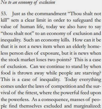
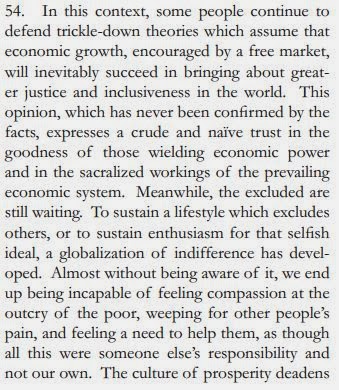
I excerpted the relevant parts before and after the specific quote that is making the rounds in blogs and the talking heads on TV. The one that refers to the "Trickle-Down Theories" is in Passage 54.
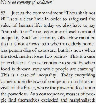


The document is VERY long and has some interesting tidbits other than the one that relates to economics. If you go to the document it starts on Page 45 and goes to 51.
I thought it interesting that he believes the Church needs to decentralize and become less bureaucratic so that it can serve communities and people better---sort of like what "Free" Markets (absent Cronyism) do. But I digress...
I excerpted the relevant parts before and after the specific quote that is making the rounds in blogs and the talking heads on TV. The one that refers to the "Trickle-Down Theories" is in Passage 54.

Passage 54 is the one that is being referred to:


Saturday, November 30, 2013
Nice graphic showing Top 10 States that are recipients of Farm Subsidies and SNAP (aka Food Stamps) benefits. Shows how one political party speaks out of both side sides its ideological mouth.
A terrific graphic from the WSJ showing the recipients of Farm Subsidies and SNAP (formerly known as Food Stamps) benefits by State and Presidential candidate from the 2012 election (this suggests the overall political leanings of the State). Both programs are funded within the context of the Farm Bill passed by Congress every 5 years and it is administered by the US Dept of Agriculture.
Focus on the "Top 10" in each category. Notice that States in RED, indicating Republican leaning States, are heavily represented in the Top 10 of BOTH programs. There is nothing notable about the farm subsidies and the States they go to BUT what observation can you make about SNAP subsidies in the form of food assistance? Interestingly enough, THOSE States lean Republican as well.
The article that accompanies this graphic points out that these States don't have large urban areas and really illustrates the level of rural poverty that exists in the US.
Focus on the "Top 10" in each category. Notice that States in RED, indicating Republican leaning States, are heavily represented in the Top 10 of BOTH programs. There is nothing notable about the farm subsidies and the States they go to BUT what observation can you make about SNAP subsidies in the form of food assistance? Interestingly enough, THOSE States lean Republican as well.
The article that accompanies this graphic points out that these States don't have large urban areas and really illustrates the level of rural poverty that exists in the US.
 |
| Source: Wall Street Journal |
Subscribe to:
Posts (Atom)
 View My Stats