Friday, December 6, 2013

The Weather Channel is going Greek---in naming the back to back storms we are experiencing. Dion is up next...

It appears The Weather Channel is going Greek, as in Mythology, to name the back to back winter storms we are experiencing (From Wikipedia):
Cleon  (died 422 BCE) was an Athenian statesman and a strategos during the Peloponnesian War. He was the first prominent representative of the commercial class in Athenian politics, although he was an aristocrat himself. Contemporaries Thucydides and Aristophanes represented him as a warmonger and a demagogue.
Dion (GreekΔιών) was a King in Laconia and husband of Amphithea, the daughter of Pronax.[1]God Apollo, who had been kindly received by Dion and Amphithea, rewarded them by conferring upon their three daughters, Orphe, Lyco, and Carya, the gift of prophecy, on condition, however, that they should not betray the gods nor search after forbidden things.[2]Dion erected a temple to Dionysus, who also visited his house and fell in love with Carya. When Orphe and Lyco tried not to let their sister consort with the god (thus breaking the restrictions imposed by Apollo), Dionysus changed them into rocks and Carya into a walnut tree. The Lacedaemonians, on being informed of it by Artemis, dedicated a temple to Artemis Caryatis.[3][4][5][6]
Here is a link to The Weather Channel and ALL the storm names they are using.   Electra is up next.

Part 2: Educational Attainment and Employment---How has it fared since the start of The Great Recession. The numbers are incredible!

The data below is an extension of my prior posting regarding the connection between the attainment of education and the number of jobs held with that level of education.  HERE is that posting where I just compared Nov 2012 with Nov 2013.

Using data from the BLS (HERE) I extended the time span back to November of 2007, which is one month BEFORE the official start of The Great Recession (NBER).
The Change in Total Jobs from 11/2007 to 11/2013 is a minus 279,000. In other words, we have that many fewer jobs, on net,  today than back then.

The only group that is better off, on net, are those who have a bachelor's degree or higher. All other categories have big net losses for the most part.

 Not sure what to make of this.  We have roughly the same number of jobs BUT the composition of the those jobs based on educational attainment is VERY unequal.

What say you?  Any thoughts?

How has the job market changed in the past year based on educational attainment? You don't want to miss this chart. It will make Finals Week SO MUCH MORE comforting...

How important is education in terms of employment prospects?

I used the latest data (today!) from the BLS report on Educational Attainment (Seasonally Adjusted) to create the chart below.

I wanted to look at a one year's change in employment by level of education. The numbers you see in the month columns are the TOTAL number of people employed that month.  The "Change" is the nominal change year over year in jobs in that category.
Source: haywardeconblog.blogspot.com
Data From BLS
Are you shocked?

Those with less than a high school diploma along with high school graduates have a net LOSS in employment of 319,000 jobs (-323,000 + 3,000).  Those with some college/Associates Degree or a Bachelor's Degree or higher have a net GAIN of 1,357,000 jobs (1,258,000 + 99,000).

The chasm between the haves (have jobs) and have nots (no job) based on educational attainment has grown in the past year.

 STAY IN SCHOOL, KIDDOES!!

Wednesday, December 4, 2013

How the common Christmas Gifts you buy helps keep the inflation rate lower than it otherwise would be...

The Wall Street Journal keeps tabs on the prices of common Christmas gift items and compiles a Gift Index that measures the change in prices of those gifts over time.  Looking at the accompanying graphic below, you can see the prices of those commonly given gifts have gone down over time (RED line):
At a time when overall inflation has been very low, price tags on items that people typically give as gifts have been stagnant or falling. Prices for clothing, shoes, watches and other apparel, for example, were down 0.2% in October from a year earlier, according to the Labor Department. For small appliances—toasters and the like—they fell 1.6%. Toy prices were down 5.6 
Indeed, an equal-weighted index of gift prices, put together by The Wall Street Journal and including the above items as well as ones like technology products, books and sporting goods, was down 2.5% in October from a year earlier. That represented one of the steepest drops since early 2011, when a weak global economy was weighing on prices.
The BLUE line represents the change in price of most other goods consumers typically buy (as measured by the Cleveland Fed's "Median Consumer Price Index").

cat
Source: Wall Street Journal

I e-mailed the writer of the article and asked him what percentage of the items in the market basket he used were imports. He estimated around 50%.

Looking at the list of categories of gifts I would guess it to be much higher (Toys, Clothes, Shoes???).

In economic terms, we could say that we are not just importing these tangible goods but what we are really importing is low prices.  Because the price of imported goods are included in the Consumer Price Index this has help keep the official US inflation rate lower than it otherwise would be.

That is a good thing, right???

If Texas was its own country it would rank #10 in oil production. Drill, Baby, Drill...

Drill, Baby, Drill----the important economic concept of Comparative Advantage into your brain.

Interesting factoid from Carpe Diem.   In terms of oil extraction, if Texas were its own country it would rank number 10 in world oil production (on a daily basis in July).  Total US production was 7,487,000 (ranked 3rd) which means Texas' contribution was 35%.

Source: Mark Perry AEI

Tuesday, December 3, 2013

King Dollar is slowly being demoted to Prince. Should we care?

Found this graphic HERE.

It shows, in percentage terms, how much a particular currency is used to conduct international trade transactions. Countries trade with each other but most often NOT in their own currencies. Why?
""Suppose you're a textile manufacturer in Malaysia, and you want to sell your goods all across Asia and beyond. You sell those goods on credit, letting buyers pay you later for goods shipped today. But what currency should that credit be extended in? You might prefer it be denominated in Malaysian ringgit. Your buyers would prefer their home currencies--the Indonesian rupiah, the Thai baht, whatever. So you settle on something neutral--a currency that is viewed as having stable value and which each party can easily convert funds into and out of. 
For decades, that has meant you finance this trade in dollars, and only dollars. This is one important piece of America's role as issuer of the "global reserve currency," a result of the dollar functioning as the bedrock of the global financial system.""--Washington PostRMBChart
The article is about how the Chinese currency, the Remnimbi, has moved up the currency ladder as a choice medium of exchange in international transactions.  The change from last year is highlighted in GREEN.

As you can see it is still relatively minor in comparison to the use of the US Dollar.  However, the article suggests that it could become the currency of record with trades in the Asian sphere.  This would make the dollar less desirable and could hurt its long term value in the foreign exchange market:
""So China is taking concerted measures to make renminbi a more useful currency for global commerce, and it is starting to pay off in its usage for trade finance. Should America care? Does this matter for the United State's financial future? 
The dollar's status as reserve currency creates an "exorbitant privilege," as it has been called, insulating the United States from many of the vicissitudes of global financial flows and making long-term U.S. interest rates lower than they would be otherwise. It also has some costs, most notably keeping the value of the dollar higher than it would otherwise be on global currency markets, which makes U.S. exporters a bit less competitive.""


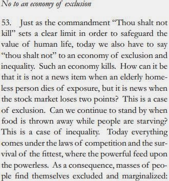
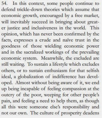
Primary Source link to The Popes comments on Economics and "Free" Markets. See what he says before and after the now famous passage...

Here is the link to the document that contains the Popes commentary on contemporary economics and, in his view, the what "Free Markets" have wrought on the world, for better or worse. (I put quotation marks around "Free Markets" as a qualifier---There Ain't No Such Thing As A Free Market (TANSTAAFM) )

The document is VERY long and has some interesting tidbits other than the one that relates to economics. If you go to the document it starts on Page 45 and goes to 51.

I thought it interesting that he believes the Church needs to decentralize and become less bureaucratic so that it can serve communities and people better---sort of like what "Free" Markets (absent Cronyism)  do.  But I digress...

I excerpted the relevant parts before and after the specific quote that is making the rounds in blogs and the talking heads on TV.  The one that refers to the "Trickle-Down Theories" is in Passage 54.


Passage 54 is the one that is being referred to: 


Saturday, November 30, 2013

Nice graphic showing Top 10 States that are recipients of Farm Subsidies and SNAP (aka Food Stamps) benefits. Shows how one political party speaks out of both side sides its ideological mouth.

A terrific graphic from the WSJ showing the recipients of Farm Subsidies and SNAP (formerly known as Food Stamps) benefits by State and Presidential candidate from the 2012 election (this suggests the overall political leanings of the State).  Both programs are funded within the context of the Farm Bill passed by Congress every 5 years and it is administered by the US Dept of Agriculture.

Focus on the "Top 10" in each category.  Notice that States in RED, indicating Republican leaning States, are heavily represented in the Top 10 of BOTH programs.  There is nothing notable about the farm subsidies and the States they go to BUT what observation can you make about SNAP subsidies in the form of food assistance?  Interestingly enough, THOSE States lean Republican as well.

The article that accompanies this graphic points out that these States don't have large urban areas and really illustrates the level of rural poverty that exists in the US.

Source: Wall Street Journal

"We lose money on every sale, but make up for it in volume"---See chart here that shows profit margins of major retailers during the holiday season vs the rest of the year...

Are Black Friday "deals" just an illusion or is there something else going on?

Here is a chart I found at Bloomberg.  It shows various major retailers (horizontal axis) and 2012 "Operating Profit Margin (OPM)" for those retailers.  Here is link to a very short and very helpful video that explains Operating Profit Margin.  In a nutshell, it is what is left over from revenues to pay taxes, interest on debt and other fixed costs AFTER all variable costs (wages, cost of the goods sold, etc) are paid.
 For example, look at the Walmart.  For the first 9 months of the year (bar with cross hatches) its OPM was a little bit below 6%--lets call it 5.8%.  This means that Walmart paid 94.2% of its Net Revenues in operating costs and has 5.8% left over to pay taxes, interest on debt and other fixed costs it incurred.

In last quarter of 2012 is OPM was OVER 6%, lets call it 6.8% (the solid BLACK bar).  So, Walmart had a HIGHER OPM during the Christmas season than during the rest of the year! It is the law of averages, I guess.  

Throughout the year it is "Every Low Prices" but during the holiday they can obscure the pricing landscape with blowout prices on some things then higher average prices ("regular prices) on complementary or select other goods.

Use this analysis to view the other retailers pricing scheme during this selling season.

Home Depot and Lowes are the only ones who have a lower OPM during the last quarter compared to the rest of the year.

All the others seem to conform to the humorous observation often made regarding retail...

"We lose money on every sale, but make it up in volume".

At least that is what we are lead to believe.

Friday, November 29, 2013

What companies comprise "The Dow" and how they have changed over time. I see Creative Destruction, globalization and division of labor. What do you see?

On the nightly news (and throughout the day on cable new stations, i.e. CNN, Fox Business, CNBC) there are  updates as to how the stock market is faring.  The most quoted measure is the Dow Jones Industrial Average (DJIA). It is also referred to as "The Dow".

What most people don't know it that this oft quoted measure comes from the performance of 30 companies. Yes, that is right, just 30.  They are generally regarded as bellwether companies that represent a large/dominant presence in their particular market sector.

This graphic below (from HERE) illustrates how the composition of the DJIA has changed over time.  Because of the shifting nature of economic due to the forces of Creative Destruction the companies that make up the Dow change as well.

Note differences from the the first column to the third.  The list on the left is heavy on mineral extraction and manufacturing.  The list on the right still has some of that but there is clearly a shift to soft manufacturing (pharma, healthcare), technology and retail. Finance/Banking/Insurance is present today where there was none in the early days.

Another observation.  The companies on the left were much more vertically integrated. Meaning they owned more of the supply chain from beginning to end (inputs to outputs). They relied less on the cooperation of others to produce their product.  The companies on the right  depend more on a globalized supply chain of outsourced and/or off-shored inputs to produce their outputs.

Source: The Conversable Economist

Wednesday, November 27, 2013

The producers of Sriracha Hot Sauce are in some Hot Water. The sauce produces a foul odor. No, it is not what you think...

Apparently the production of Sriracha Hot Sauce is imposing a non-monetary cost on the residents of the nearby factory:

Sriracha hot sauce factory production partially halted (From BBC)

""A California judge has temporarily curbed production of the popular Sriracha Asian-style hot sauce after residents of a Los Angeles suburb complained of the factory's odour.
The fumes emitted from Huy Fong Foods' factory in Irwindale are "extremely annoying, irritating and offensive to the senses", Judge Robert O'Brien said.""
In the Social Welfare unit of Microeconomics we learn how some costs, whether they be monetary or non-monetary, are imposed on parties not directly involved in a transaction between sellers (producers) and buyers.  These costs are external to the actual production of the good and are not captured in the cost of producing the good. If the producer was absorbing, or "internalizing" the cost of the nuisance, then the cost of producing Sriracha sauce would be higher.  The producer would either have to pass on the cost to the consumer with a higher price or reduce the quantity supplied at the market price.

The producer could be forced to internalize the smelly cost imposed on nearby residents:
(1) by installing scrubbing or filtering equipment to clean the refuse before it leaves the factory
(1) with a lump sum fine by the government.
(2) with a per unit tax levied by the government on each unit of production of the sauce.
(3) by paying the residents of the neighborhood a fair market value for their willingness to put up with the bad smell.

The trick is to make sure the method of internalizing the cost is equal to the cost of the externality itself.  If not then there is some social welfare lost to society.

Tuesday, November 26, 2013

Nice Map showing the intensity of economic activity in the US. The Good, The Bad and The Ugly.

Business Insider has a terrific map giving a quick, albeit shallow, geographic overview of the US economy. Green means hot economic activity, yellow average and red, well, not so good.

economics map
Source: Business Insider

Monday, November 25, 2013

Who is going to pay for the ACA ("Obamacare")? Nice graph here showing the age group that the Act is depending on to finance it. Is that a middle finger I see from you 27 year olds?

This is courtesy of the US Census.  It shows the percentage (vertical axis) of uninsured by age group (horizontal axis).  A couple of observations.

(1) the middle blue bar that shoots up over the rest represents a portion of 27 year olds who likely lost their parental coverage.  In 2010 one of the first parts of the Affordable Care Act (ACA---"Obamacare") to kick in was the requirement that a dependent child could stay on the parents insurance until age 26.  Booted off after that.

(2) the whole age group represented by the blue bars represents what is termed "The Invincibles--- Young people who have relatively few health issues and forgo purchasing health insurance because they believe the costs outweigh the benefits.  THIS is the group that the financial success of the ACA is dependent upon and the individual mandate is primarily aimed at this demographic ( I don't THINK that is in dispute).  They are going to either purchase coverage OR pay the penalty (or Tax, if you will).  Their contribution will go towards subsidizing the health care of those on the right AND left of the distribution.


Note: I added the YELLOW highlighted area as "spillover" Invincibles up to the age of 40.  Notice the drop off after 40....Guess it is time to get real for those folks!! :)

How has the "Nominal" and "Real" price of a Thanksgiving Meal changed over time? I am glad you asked. See the answer here...

Here is a handy-dandy topic you can use on Thanksgiving Day when you run out things to say to your relatives.

The American Farm Bureau has released its annual update as to the cost of a Thanksgiving meal.

Here are the items in the market basket for the "average meal" on the Big Day (not inclusive of EVERYTHING we might have for dinner) and the price change from last year to this year.  This is an informal survey of prices nationally and they certainly will vary from region to region, urban to rural, etc.

Source: American Farm Bureau
Of course there HAS to be a deeper economic lesson and I am happy to provide that for you.

This graph shows, over time, the nominal price of the ingredients (just the prices in the particular year measured) in GOLD and the inflation adjusted prices in BLUE/GREEN.

The BLUE line is relatively flat, at least since post-1990, and hugs the $20.00 level.  This suggests that the "Real Cost" of a Thanksgiving meal has not change that much in 20+ years.  Only recently has it remained over $20 in real terms for consecutive years.  On an inflation adjusted basis we have enjoyed a relatively price stable Thanksgiving feast.
Source: American Farm Bureau
 Here is a chart with the nominal prices since 1986.

Source: American Farm Bureau
Here is a link specific to Texas. A nice graphic there as well...


Thursday, November 21, 2013

We are at the same level of beef consumption per person as we were in the 1940's. Good for people, bad for cows...

Here is a graph (which I modified a bit) from The Big Picture Agriculture blog that shows Meat Consumption from 1900 to 2012 by type of meat.  It shows that on a per person basis we are back to early 1940's level of consumption of beef, about 52 pounds per person per year.  BUT down considerably for a high of 91 pounds around 1978.  I wonder what happened in the late 70' to cause the rapid descent in consumption never to recover. I am of age to know but do not remember.  Maybe Mad Cow disease first emerged???

This is good for people is terms of health, but it is not good for the health of cows.

In 1942 the US population was 135 million.  Which means Americans consumed 7,020,000,000 (7.02 billion) pounds of beef.

In 2012 the US population was 314 million. Which means Americans consumed 16,328,000,000 (16.328 Billion) pounds of beef.  That is a 132% INCREASE in the total consumption meat.

Each cow produces, on average (in 2005), 585 pounds (I am taking this sites word for it) of beef.

That means approx. 16,000 more cows are needed to satisfy the demand for beef today compared to 1940-ish.  (Math---16.328M-7.020M divided by 585).

Isn't your life better for knowing this. To celebrate I am going to eat a cheeseburger.


View My Stats