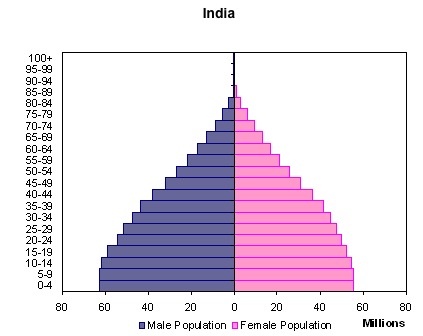
Two graphs comparing the size of different age groups in China and India, the worlds two most populated countries. Together, they represent between 1/4 to 1/3 of the worlds population. India is going to be young for a LONG time and China is going to face the problem much of the developed world is encountering now---an aging population with a relatively smaller replacement birth rate...I can see power and the economic landscape shifting in the coming decades....


 View My Stats
May I know what is the year of the china and India pyramid ?
ReplyDeleteThank you for reading my blog...I went back and checked the links and I believe those graphs represent the populations for India and China as late as 2010 and no earlier than 2005. Even if it is 2005 the numbers will still be fairly close. I need to find some new ones to keep it updated.
ReplyDelete