Saturday, April 27, 2013

Here is a story about the 90% Debt threshold, a mouse and a dancing elephant. You would think people would be more concerned about the elephant.

This from my cyber-friend "The New Arthurian"

The Blue Line is Total Federal Debt (private and public) as a percent of GDP.

The Green Line is fixed at 90% of GDP.  The "alleged" cut-off point that suggests if a nations combined government debt exceeds that threshold it will dampen economic growth.

The Red Line is a line you NEVER/RARELY see inserted into the argument. It represents Total Private Debt (mine and yours and a few of our Wall Street/Corporate friends) as a percent of GDP.

Not to put words into the mouth of The New Arthurian, but I believe he is suggesting we are focused too much on dancing around the mouse in the room (the Green Line) and are not so much on the elephant sashaying behind out collective backs. 

I am a terrible dancer, but I know a Two-Stepping Elephant when I see it.


Source: The New Arthurian Economics

Link to interesting posting on the why software developers better be familiar with psychology. "Do you REALLY want your search for the price of a product to return the fastest result to you?" You might be surprised by the answer...

A bit off topic for me, but I found this posting on "Cognitive Overhead" an interesting merge between technology and human behavior.  A tech product/service can fail because it gets ahead of  normal human impulses and tendencies.  I encourage you to read the whole thing. It is not long

This is one paragraph I found to be true after thinking about it.

Slow down your product.
We’ve all heard stories of Google’s relentless quest for search-result speed, but sometimes you need to let your user understand and appreciate what your service is doing for them. Studies have shown that intentionally slowing down results on travel search websites can actually increase perceived user value — people realize and appreciate that the service is doing a lot of work searching all the different travel options on their behalf.
 
While I WANT a quick result when I put in a search request for a good or service that has many possible suppliers, if I get it TOO FAST I am naturally suspicious that it was pre-determined and I am being steered.

(Wonder if car dealers employ the same technique---"I will speak to the sales manager" ALWAYS takes way too long.  Do I perceive they are in tough negotiations on my behalf and coming back too soon makes me think otherwise?)

Think about this the next time you do a search for a price sensitive good/service.  The result is ALREADY in the system, WHY does it take so long to retieve it?  Now you know.

Programmers and software developers have to be students of psychology as well.


Friday, April 26, 2013

US economy Trivial Pursuit. Trivia about something not so, well, trivial...

HT: The Big Picture Blog.

These very informative slides are courtesy of the Bureau of Economic Analysis (BEA), a part of the Department of Labor.

They give an overview of various sectors of the economy.  My favorites are the ones on manufacturing.  One of the most misunderstood industries in the US.

Which one(s) is/are your favorites?

Cspan Slides Myths and Misperceptions

Thursday, April 25, 2013

If US manufacturing was its own country, it would rank 10th in the world in terms of dollar value of output. See the stunning chart HERE!!

This chart is interesting for a couple of reasons.  (From Mark Perry at Carpe Diem)

1. It shows how much of an economic powerhouse the US STILL is in terms of the dollar value of the production of Goods and Services in a given year. We produce more than China and Japan together PLUS about half of Germany's production.

2.  US manufacturing is ALIVE (although US manufacturing EMPLOYMENT has devolved). In fact, if you take the dollar value of US manufacturing production and compare it to total dollar value of  production in the rest of the industrialized world, it ranks 10th in the world if it was its own separate country.

Source: Carpe Diem

Starwood Hotels (Westin, Sheraton, Aloft) have an interesting Microeconomics experiment going on---Buy one night at the regular price and get 2 more nights at the dollar equivalent of your birth year.

Just saw this at Freakonomics.  Starwood Hotels (Westin, Sheraton, Aloft) has a unique promotion going on.

If you pay the Regular Rate for the first night, you the second and third nights at the dollar equivalent of the last two digits of your birth year.

For instance, I would pay $235 + 60 + 60 =  $355.00 or $118.33 per night.  Not bad for a Westin hotel!

Interesting strategy. The older you are the less you pay.   A form of discrimination that only an economist/economics teacher could love.

Here is an example from the Dallas area.  Go HERE to find a hotel in your area.


Monday, April 22, 2013

The growth in the printing of $100 bills has increased 500% in 20 years. Where are those Benjamins going? See here for the answer...

The number of $100 dollar bills in circulation has increase dramatically relative to the other US currency denominations in the last 20 years, as you can see from the graph below. 
Bills In Circulation (Percentage Change Since 1990)
Source: NPR Planet Money

Where are those Benjamins going?  A good number are going "off-shore".  Seems the $100 is a nice "Store of Value" for foreigners who want to hold there money wealth in US dollars instead of their own currency.  Nice mattress stuffers!! 

Oh, and it also is probably circulating among drug dealer and other nefarious underworld activities.  Gotta love the CASH!!

Percentage Of $100 Bills Held Outside The U.S. (1990-2011)


Friday, April 19, 2013

Reason 1,001 why immigration is good for the US. Nice graph showing the incidence of entrepreneurship in the US. Immigrants carry the load in starting businesses. We need more of this, not less...

This graphic comes from a recent study (found HERE) on the state of entrepreneuship in the US.  There are MANY other interesting graphs and data in the study, but this one interested me because I believe it is important element in the movement to reform our immigration policies.

It shows the incidence of entrepreneurship between native born Americans and Immigrants.  The gray line represent immigrants, the blue line "native borns". Look at the trend over time.

Immigration = Entrepreneurship = Economic activity = Jobs.  We need to be mindful of this when we formulate policy. 

Something about babies and bath water, if  I recall.

HT: New York Times for the link to this study

Thursday, April 18, 2013

What can a new Kubota production plant in the US tell us about manufacturing and employment in the US? You will need i-pad skills to work there, not welding or assembly skills..

Kubota, a Japanese maker of heavy equipment/smallish tractors,  just opened a new manufacturing facility in Georgia.  This is a nice example of state of manufacturing and manufacturing employment in the world today. Here is the operative paragraph from an article about the grand opening:
"Efficiency is a watchword in every aspect at the plant. Robots do 70% of the welds. Workers with iPads do quality checks and wirelessly send reports to large monitors so supervisors can follow progress every step of the way. If automated sensors on parts of the line detect a bolt is not tightened to specifications, the line shuts down. 
The 522,000-square-foot plant is up and running. But more work is needed before it produces its capacity of up to 22,000 tractors annually. Another 100 workers will soon join the current 100 employees. Expansion space is available."
 
200 or so workers to produce 1,000's of tractors. The line workers carrying i-Pads instead of welding torches. Robots doing most of the skilled labor and heavy lifting.

Manufacturing revival without the revival in the employment of traditional manufacturing labor skills. 

Politicians and policymakers want to make industrial policy with the notion that these two are still directly linked in the 21st century.

We need a better plan...


HT: Big Picture Agriculture for link to article

Nice graph showing the dramatic reduction in Extreme Poverty world-wide since 1981. THIS is a good thing!!

From  The World Bank in a report on the reduction of "extreme poverty" (subsisting on less than $1.25 per day):
Extreme poverty in the world has decreased considerably in the past three decades (figure 1). In 1981, more than half of citizens in the developing world lived on less than $1.25 a day.
This rate has dropped dramatically to 21 percent in 2010. Moreover, despite a 59 percent increase in the developing world’s population, there were significantly fewer people living on less than $1.25 a day in 2010 (1.2 billion) than there were three decades ago (1.9 billion).
But 1.2 billion people living in extreme poverty is still a extremely high figure, so the task ahead of us remains herculean.---The World Bank
The fact that the reduction comes in spite of a 59% INCREASE in population in developing countries over this time is stunning to me.  Greater Asia and India account for a disproportionate amount of the reduction.

Open markets, the Asian supply line, and free(er) trade have lifted 100's of millions out of extreme poverty.  This is a good thing.


Wednesday, April 17, 2013

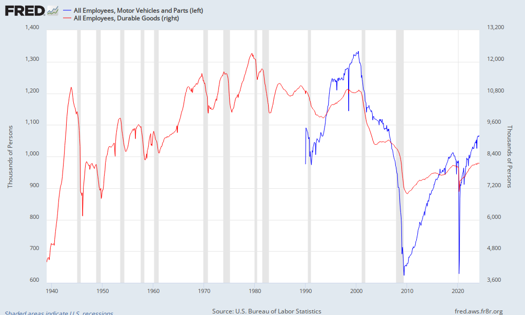
Manufacturing Output and Manufacturing Employment. Never shall the two meet again...See graphs here...

Mark Perry at AEI (Carpe Diem) has this graph showing the state of manufacturing in the US to date.  Specifically, Industrial Production of Durable Goods and Motor Vehicles and Parts. 

He puts the scale in an index form.  Look at the line labeled "100" and move straight across.  Manufacturing OUTPUT is back to pre-recession levels.  Nice! However, what has this done for EMPLOYMENT in the manufacturing sector?  See the next graph below.

ipcars
Source: Carpe Diem

The lines are colored coded to represent the same industries in both graphs.  The employment graph is scaled in "thousands or persons", so add 3 zeroes to the numbers you see below.

Employment pre and post recession has not made the same gains as output.  The question of the day is WHY do you think that is so?  It is getting better, but the separation between output and employment continues.   Look at the time period between the last recession in 2001-2002 and the one we just went through.  What do you notice? Is employment in this sector EVER going to return to that level? The problem is not as easy to identify as it is portrayed in the media and by politicians. 

FRED Graph

Monday, April 15, 2013

Want to know where your Federal Tax dollars go? Nice interactive shows you in detail based on a programs percentage of the budget.

Here is a cool interactive ("cool" is a relative term when speaking of taxes) that allows you to input how much in Federal Taxes you actually paid (Income, Social Security, Medicare) and displays the specific programs (based on percent of the Federal Budget) your money was spent on. 

If you are not sure, input $10,000 just to get an idea. Be sure to choose the "Expand All" button to ge the full effect.

CLICK HERE FOR THE LINK.


Saturday, April 13, 2013

My Texas Billboard Story. A lawyer advertising "Gun Trusts". What is a Gun Trust? Find out here. FASCINATING!!!

In December of 2011 I move from Texas (after living there for 27 years) to Illinois.

This weekend I am visiting Texas A&M in College Station.

On the drive from Houston along FM 105 I saw this sign (don't remember the town).  I have never heard of, or seen advertised, legal services to establish  a "Gun Trust". 

Of course, I was curious and had to find out what it was all about.

A trust is a legal entity where someone can place physical and/or financial assets and it (1) ensures continuity of ownership of the assets by the trust (not the "real owner" of the assets) and (2) keeps the assets from being subjected to the estate tax OR seizure from the government for tax purposes---the trust never dies!

But a trust confers some addtional benefits that will delight gun owners and irritate gun control proponents.

The National Firearms Act ("NFA") requires purchasers of certain categories of weapons (i.e. machine guns) to register them with the Bureal of Alcohol, Tobacco and Firearms ("BATF").
"All NFA items  must be registered with the Bureau of Alcohol, Tobacco, , and Explosives (ATF). Private owners wishing to purchase an NFA item must obtain approval from the ATF, obtain a signature from the Chief Law Enforcement Officer (CLEO) who is the county sheriff or city or town chief of police (not necessarily permission), pass an extensive background check to include submitting a photograph and fingerprints, fully register the firearm, receive ATF written permission before moving the firearm across state lines, and pay a tax"---Wikipedia
 
Don't want to do that? Too intrusive?  Then establish a  "Gun Trust" and place ownership of them in it. Note the significant reporting requirement changes:
"NFA items may also be transferred to corporations (or other legal entities such as a trust). When the paperwork to request transfer of an NFA item is initiated by an officer of a corporation, a signature from local law enforcement is not required, and fingerprint cards and photographs do not need to be submitted with the transfer request. Therefore, an individual who lives in a location where the chief law enforcement officer will not sign a transfer form can still own an NFA item if he or she owns a corporation("trust")"---Wikipedia.
So, a Gun Trust helps one shelter their weapons (specific ones) from taxation and seizure AND registration/scrutiny.

Now you will know the story of this billboard as well.  If you see it you can dazzle your friends with your new found knowledge.

You are welcome... :) 

Friday, April 12, 2013

Nice map showing each States level of taxation on a pack of cigarettes. I am quite surprised how LOW the taxes are in many States.

One way to discourage the consumption of a good that imposes negative outcomes on individuals, but perhaps more importantly on society at large, is to impose a tax on the good proportionate to the damage it creates. 

Cigarettes seem to be a good that is ripe for taxation of this sort.  As you can see from the map below the level of taxes imposed on a pack of cigarettes varies a lot across state lines.

Keep in mind the numbers you see are taxes levied by the each State.

There is also a $1.01 FEDERAL tax levied on a pack as well.  So, add that to the number in the map to get the total level of taxation.

Observations:  (1) Taxes in the tobacco producing States have VERY low State taxes on cigarettes.  Probably should be no surprise there.  Having said that, what is up with Missouri ("MO")?? Seventeen cents? (2)  States with low level of taxes on cigarettes are States known to have, in general, the poorest individual (and collective) health outcomes overall.  I am not suggesting low taxes on cigarettes are the cause...but it certainly does not help, it seems.


Source: KPC

Monday, April 8, 2013

Why do so many people start to collect Social Security benefits in January and so few in December? Nice graphs showing monthly data that prompt such fascinating questions!!

I was looking at Social Security benefit data and noticed a couple of things.  Below you will see the monthly (starting in 1995) Social Security benefit awards to both retired workers and their spouses. The long term trend line is in RED.

First observation:  Notice the tall shoots that tower above the trend line at predictable intervals?  EVERY ONE of those shoots marks January of the particular year.  Notice the shoots that go BELOW the trend line?  With a couple of exceptions, those are all Decembers.

I did a Google search and could not find a suitable answer as to why January is far and above the preferable month for people to claim benefits en mass.  Can anyone help me out?


Source: Created by Cara Hayward
Second observation:  the shoots above the trend line got larger in magnitude as time passed, and the shoots below, with the exception of the mid-2000's, got smaller in magnitude especially in the last couple of years.

Keep in mind, while the graph measures benefit awards in a given month, the totals will be cumulative of ALL those points.

Using the same graph above, I inserted lines to eye-ball averages that represent time spans and benefit award levels. Eerie, isn't it?  Nice stair step and duration almost predictable.


Hmm...Predictable.  Do you hear that politicians and policy-makers?  Why were we not ready for this?  Rhetorical question, I suppose...

Friday, April 5, 2013

Why the Labor Force Participation Rate might be falling. Where has everyone gone???

Lots of talk about why the "Labor Force Participation Rate" in the US decreased last month by almost 500,000 people. The 2 schools are thought are, (1) people are giving up looking for work and/or collecting disability compensation instead, (2) due to demographic shifts more people are retiring.

Below I crudely copied and pasted the latest beneficiary data from the Social Security Administration that shows the number of awards granted for benefits in March and February for (1) people eligible for Social Security benefits and (2) people eligible for Federal disability compensation.

The number of additional "Retired Workers" compared to February barely budged, as did total OASI awards (blue arrows)

More significant movement in "DI Trust Fund" activity (red arrows), however, as approx 21,000 additional people compared to February were awarded disability benefits.

Not enough, I don't think, to move the needle on the "leaving to retire" reason. There is some evidence that people moving to disability compensation and are no longer counted in the unemployment statistic. 

That leaves a lot of people unaccounted for the gap in the participation rate. 
Source:  Go to the SSA website to make your own custom graphs/charts
View My Stats