This ticket to Disneyland in 1955 cost $1.00. In 1955 the minimum wage was $.75 (75 cents), so it took 1.33 hours of labor to earn enough to buy this one ticket in 1955.
Today, a ticket would cost you $105.00 to visit the Happiest Place on Earth. In 2016 the minimum wage (although it varies in States and even some localities) is $7.25 per hour. At that rate, a ticket would take 14.5 hours of labor (excluding labor taxes, of course).
A day at Disneyland in 1955 was definitely more affordable for a low wage worker 60 years ago. The only thing that really remains to be determined is the comparable quality of the experience. The parks are vastly different in composition.
Has the quality of the visit improved by a large enough factor to make the extra hours worked to buy a one-day pass more "utility maximizing" in 2017 than in 1955?
Economics, civics, constitutional law, Supreme Court cases, AP Economics teaching resources, and classroom lessons by a retired social studies teacher.
Thursday, August 10, 2017
Nice resource for illustrating "Increasing Opportunity Costs" and the concave nature of the PPF
Here is a nice article on the great productivity slowdown in the US, and in the developed world for the most part.
The article is interesting throughout but the excerpt below caught my eye.
It goes to the edge but does not explicitly mention the important concept of "Increasing Opportunity Costs" and the reason the Production Possibility Frontier (or Curve) is "bowed", or concave from the origin.
The article is interesting throughout but the excerpt below caught my eye.
It goes to the edge but does not explicitly mention the important concept of "Increasing Opportunity Costs" and the reason the Production Possibility Frontier (or Curve) is "bowed", or concave from the origin.
While Services Sector Booms, Productivity Gains Remain Elusive
“The changing distribution of workers might be able to explain up to one-half of the slowdown in labor productivity growth from 2.5% to 1.5% per year since the 1960s," said Dietrich Vollrath, a University of Houston economist. Indeed, this effect has accelerated since 2000, when workers, in aggregate, started to move from higher to lower productivity sectors.
Services productivity, besides its natural disadvantage, may be facing an added headwind: The sector is absorbing millions of workers whose underlying skills may not be well suited to the jobs they take on.
If people start doing work they are relatively good at, and if manufacturers shed their least efficient workers first, manufacturing productivity will improve as it downsizes but services-sector productivity will suffer as it absorbs workers who are a poor fit. (Sections in bold are mine).
All resources, including labor, are not "perfectly adaptable" to a alternative uses. If you employ/deploy resources to such alternative uses they tend to be less productive, hence more costly.
Simple example. The decline of steel manufacturing coincided with a increased demand for truck drivers. While some unemployed steel workers may make fine truck drivers, the "marginal" ones may not be so good. They may have more accidents or load mishaps and are more expensive (ceteris paribus) to employ.
Wednesday, August 9, 2017
Negative Externality: Meat industry blamed for largest-ever 'dead zone' in Gulf of Mexico
suggests that the market quantity for meat products is greater than it should be. The chemical run-off of fertilizers and other agricultural inputs that go into the production of meat products flow into waterways. Its negative affects go much further than the borders of the farms and ranches. Some excerpts:
"Toxins from manure and fertiliser pouring into waterways are exacerbating huge, harmful algal blooms that create oxygen-deprived stretches of the gulf, the Great Lakes and Chesapeake Bay, according to a new report by Mighty, an environmental group chaired by former congressman Henry Waxman...
...Nutrients flowing into streams, rivers and the ocean from agriculture and wastewater stimulate an overgrowth of algae, which then decomposes. This results in hypoxia, or lack of oxygen, in the water, causing marine life either to flee or to die...
...America’s vast appetite for meat is driving much of this harmful pollution, according to Mighty, which blamed a small number of businesses for practices that are “contaminating our water and destroying our landscape” in the heart of the country..."
If the problem IS production over a more "socially optimal" level of production, how do we attain that optimal level?
The essential problem is that the cost of the externality is not being borne by the consumer or producer of the product. Consumers are paying and producers are receiving only the money cost to make the product available. They are not paying for the residual costs of environmental degradation that affect others near and far (out into the Gulf of Mexico!).
Our task here is to use the basics of Supply and Demand to illustrate how markets respond to government intervention in order to require Producers and/or Consumers to "internalize" that "external" cost that has been imposed on the rest of society.
Internalizing that cost can take the form of an explicit tax on the good or some other "non-monetary" rule or regulation that de facto internalizes the cost of producing the good.
I put together a short-ish presentation to show you how this is modeled for AP Microeconomics. The key here is to correctly identify the "area of Dead Weight Loss" in the presence of a Negative Externality.
Tuesday, August 1, 2017
The most prominent determinant for a "change in supply" is a change in the cost of an input that goes into the production of an output (final good).
This article uses the example of the input cream that is used in the production of the output butter in the UK.
Rising price of cream squeezes Dairy Crest's margins
This article uses the example of the input cream that is used in the production of the output butter in the UK.
Rising price of cream squeezes Dairy Crest's margins
“Cream prices, which determine input costs for the butter business, have increased substantially during the first quarter,” the company said.
“This will put pressure on margins in our butter business. We have reduced our promotional activity on Country Life, which is adversely impacting volumes but mitigating some of the margin pressure.” (underlining mine)
Here are some slides to walk you through a basic demand and supply model to illustrated how this impacts the market for butter as described in the article.
Tuesday, July 25, 2017
How to answer basic Demand and Supply Problems in 3 easy steps.
Determining which curve to shift in the simple Demand and Supply model can be a challenge for students.
Students tend to rush and "over-think" the problem and/or they want to jump ahead a step or two and look at the subsequent effect a particular scenario has on a market.
My advice is "KISS!" (Keep It Simple Students!).
Here is my recommendation as to how to logically think about a given scenario and to get the curve shift right every time. All in 3 easy steps.
First, you need to be familiar with the Determinants of Demand or Supply:
Factors that affect DEMAND (cause the Demand Curve to SHIFT):
With these determinants in mind, here are the next questions you will want to ask yourself when confronted with a scenario that will shift either the Demand or Supply Curve.
Here is a link to a Google Doc that has some examples for you to work on. Once you establish a rhythm, these get very easy to do.
BIG CAVEAT: This works well with basic introductory problems in Supply and Demand analysis. HOWEVER, when we go a bit deeper you will encounter at least one situation where the answers are counter-intuitive to the above explanation, especially on the Demand-side. That is when the scenario suggests that the good is a "Normal Good" or an "Inferior Good" as it relates to a CHANGE IN INCOME (a function of Demand). For instance, if the good is "Inferior" and incomes INCREASE, then the demand for that Inferior good will DECREASE (shift LEFT). If income Decreases, Demand for the Inferior good INCREASES. Be careful with this one!
Students tend to rush and "over-think" the problem and/or they want to jump ahead a step or two and look at the subsequent effect a particular scenario has on a market.
My advice is "KISS!" (Keep It Simple Students!).
Here is my recommendation as to how to logically think about a given scenario and to get the curve shift right every time. All in 3 easy steps.
First, you need to be familiar with the Determinants of Demand or Supply:
Factors that affect DEMAND (cause the Demand Curve to SHIFT):
- change in consumer tastes
- change in the number of buyers
- change in consumer incomes
- change in the prices of complementary and substitute goods
- change in consumer expectations
- change in input prices
- change in technology
- change in taxes and subsidies
- change in the prices of other goods
- change in producer expectations
- change in the number of suppliers
With these determinants in mind, here are the next questions you will want to ask yourself when confronted with a scenario that will shift either the Demand or Supply Curve.
1. Ceterus Paribus (holding all other variables constant--except the one we are addressing) ask yourself "Is this scenario a function of Demand or Supply?" Look at your Determinants listed above---make sure you confine yourself to these determinants and do not read more into it!
2. After determining which curve to shift ask yourself: ""Will this scenario have a POSITIVE ("good") or NEGATIVE ("bad") impact on Demand or Supply (whichever you decided in question #1)?
3. (a) If it has a positive impact the curve will shift RIGHT. This is true whether you are shifting the Demand OR Supply Curve.After you shift the appropriate curve, simply locate the new equilibrium point where Demand and Supply intersect showing a new Price and Market Quantity.
(b) If it has a negative impact the curve will shift LEFT. This is true whether you are shifting the Demand OR Supply Curve.
Here is a link to a Google Doc that has some examples for you to work on. Once you establish a rhythm, these get very easy to do.
BIG CAVEAT: This works well with basic introductory problems in Supply and Demand analysis. HOWEVER, when we go a bit deeper you will encounter at least one situation where the answers are counter-intuitive to the above explanation, especially on the Demand-side. That is when the scenario suggests that the good is a "Normal Good" or an "Inferior Good" as it relates to a CHANGE IN INCOME (a function of Demand). For instance, if the good is "Inferior" and incomes INCREASE, then the demand for that Inferior good will DECREASE (shift LEFT). If income Decreases, Demand for the Inferior good INCREASES. Be careful with this one!
Tuesday, July 18, 2017
Bacon and Supply/Demand Graphs. What a great breakfast combination.
A nice article to practice graphing Supply and Demand.
America’s Lust for Bacon Is Pushing Pork Belly Prices to Records

""Some analysts say bacon, meanwhile, is becoming a yearlong staple that consumers are eager to procure. That voracious demand has left wholesalers in a squeeze. Retailers “have turned hand-to-mouth, buying only what they need, waiting for production to increase and prices to decline,” said Dennis Smith, a commodities broker at Archer Financial Services in Chicago.
Pig farmers are struggling to keep up with demand. The national hog herd rose to a seasonal record of 71.7 million head in early June, according to the U.S. Department of Agriculture, up 3% from a year earlier.
But it hasn’t been enough to satiate bacon demand. Stocks of pork bellies in commercial freezers fell to 31.6 million pounds in May, down 59% from a year earlier and the lowest figure for the month since the USDA began keeping track in the 1950s.""
Friday, July 14, 2017
A 1967 Wrigley Field Menu Board and Inflation.
Found this HERE
It shows a menu board for concessions and game tickets at Wrigley Field in Chicago for the year 1967 (relying on information from the source).
In order to see what these prices are in today's dollars, multiply each number below by 7.43 (using the Bureau of Labor Statistics (BLS) inflation calculator)
/cdn.vox-cdn.com/uploads/chorus_asset/file/8286439/1967prices.jpg)
Example: An Oscar Mayer Hot Dog cost .30 cents in 1967. If the price of that hot dog simply increased in price at the pace of overall inflation, then it would cost you $2.23 (.30 cents X 7.43) at Wrigley today.
Go to Wrigley today and you will pay about $5.50. That is a factor increase of 18.33 from 1967, or a 2.5 times (18.33/7.43) increase over stated inflation.
There are lots of comparatives you can do with this menu board over a broad range of goods shown here. A nice way to help students understand the effects of inflation.
It shows a menu board for concessions and game tickets at Wrigley Field in Chicago for the year 1967 (relying on information from the source).
In order to see what these prices are in today's dollars, multiply each number below by 7.43 (using the Bureau of Labor Statistics (BLS) inflation calculator)
Go to Wrigley today and you will pay about $5.50. That is a factor increase of 18.33 from 1967, or a 2.5 times (18.33/7.43) increase over stated inflation.
There are lots of comparatives you can do with this menu board over a broad range of goods shown here. A nice way to help students understand the effects of inflation.
Wednesday, July 12, 2017
Tax Policy and the 1%. A nice illustrative video!
Here is an excellent video from the Wall Street Journal, with a simple illustration, of the tax share of the different quintiles (20% blocks) of US taxpayers and extends it to the top 1%.
It is a nice introduction for high school students to the progressive income tax structure and a discussion on income (as opposed to "wealth") inequality.
Thursday, February 9, 2017
Wednesday, January 25, 2017
Healthcare Spending Graph. Easy to see the problem but how it "fix it"?
Here is a graphic regarding healthcare spending in the US I think is important but rarely talked about.
It is very clear that a small number of people relative to the whole population are responsible for a disproportionate share of heath care dollars. This from the JAMA article that contains the graph:

It is very clear that a small number of people relative to the whole population are responsible for a disproportionate share of heath care dollars. This from the JAMA article that contains the graph:
"...The core of the answer to this question can be read in the chart below, showing the highly skewed distribution of per capita health spending across the US population. The phenomenon is known as the “80-20 rule,” indicating that 20% of any large insured populations tends to account for 80% of all health care spending on that population...."

The cited paragraph seems to understate that data presented in the graph, but the point is well taken.
Why do we not discuss a "Marshal Plan" to address the needs of the few that cost us the most?
Rhetorical question, I guess.
The article is about why insurers are abandoning the ACA Exchanges. It is written in layman's language enough that I think it would be a good read for students.
Monday, January 2, 2017
The Market for Bison Meat and a basic Demand and Supply Model. Fun times graphing!
Here is an excellent article that allows us to practice a "simultaneous shift" in our Demand and Supply Curves in our basic Market Model.
That Bison Burger Just Got Pricier Thanks to Canada Ranchers
Using a basic Market Model from a starting equilibrium we can see that the Demand for Bison Meat increases as more consumers choose to, well, consume bison meat. At each and every price, the Quantity Demanded for Bison meat is greater than is was before.
The Demand Curve shifts RIGHT.
Here is the tricky part in trying to relate this to "real life". If we stopped right now, it appears that at the new equilibrium "B" that the Quantity Supplied is now greater than it was before (Q1 rather than Qe--we move up and along the Supply Curve) In this case it is an "illusion" because we have a simultaneous change in Supply as described here:
The assumption is that at "every price the Quantity Supplied is less" than it was before, by about 25%.
The Market Supply Curve for Bison shifts to the LEFT indicating a DECREASE in Supply ("S1").
We have to be mindful that the Quantity Supplied, hence our Market quantity, will be LESS than it was before at "Qe".
The new "final" equilibrium Price is "P2" at a Market quantity of "Q2" at Point "C"
Let's clean that up a bit:
That Bison Burger Just Got Pricier Thanks to Canada Ranchers
""Bison prices have been rallying as demand for the niche product is rising among U.S. consumers amid a favorable exchange rate and as more people seek out organic foods and healthy alternative proteins. The grass-fed meat has fewer calories, less cholesterol and fat than beef, and the animals are raised without hormones or antibiotics.""
A nice description of factors that affect the Demand for a good or service: a "change is consumer tastes/preferences" and "change in number of consumers" with a dab of foreign exchange effect thrown in (US dollar stronger than Canadian dollar).
Using a basic Market Model from a starting equilibrium we can see that the Demand for Bison Meat increases as more consumers choose to, well, consume bison meat. At each and every price, the Quantity Demanded for Bison meat is greater than is was before.
The Demand Curve shifts RIGHT.
Here is the tricky part in trying to relate this to "real life". If we stopped right now, it appears that at the new equilibrium "B" that the Quantity Supplied is now greater than it was before (Q1 rather than Qe--we move up and along the Supply Curve) In this case it is an "illusion" because we have a simultaneous change in Supply as described here:
""As demand gains, Canada’s ranchers are becoming more reluctant to send animals to slaughter, and instead are holding them back in favor of herd expansion. As a result, fewer bison are being exported for processing in the U.S., Canada’s biggest market, and domestic production probably fell 25 percent in 2016 from a year earlier to 10,500 animals, Kremeniuk said.""
The assumption is that at "every price the Quantity Supplied is less" than it was before, by about 25%.
The Market Supply Curve for Bison shifts to the LEFT indicating a DECREASE in Supply ("S1").
We have to be mindful that the Quantity Supplied, hence our Market quantity, will be LESS than it was before at "Qe".
The new "final" equilibrium Price is "P2" at a Market quantity of "Q2" at Point "C"
Let's clean that up a bit:
Wednesday, December 14, 2016
Supply and Demand for Rubber, Tires and Cars. Graphs to Illustrate.
From: Financial Times:
Expectations of robust demand from China boosted rubber to a three-year high after buoyant car sales data for November lifted expectations of higher tyre demand.
The China Association of Automobile Manufacturers reported vehicle sales of 2.9m in November, up 16.6 per cent year on year. Tax breaks introduced this year on small passenger cars have spurred demand and while the November figure was down from a September peak of 26.1 per cent, it marked the sixth straight double-digit rise in growth.
There are three different things going on here that we can graph. One affects the Market for Rubber, one the Market for Tires (or the British spelling "tyres") and the Market for Cars in China (and elsewhere, truth be told).
Here are a series of graphs that illustrate how each market could be affected by the change in market conditions.
Thursday, December 8, 2016
Opportunity Cost and migration back to city centers.
Here is a terrific analysis as to the reasons there is a nominal/notional increase in the movement people towards a central city.
While the info is extremely useful regarding this trend, I see it also as a lesson in Opportunity Cost(s).
Read it for the content but also for an economics lesson.
While the info is extremely useful regarding this trend, I see it also as a lesson in Opportunity Cost(s).
Read it for the content but also for an economics lesson.
What's Driving Downtown Revitalizations?
Downtown areas across the country have been undergoing revitalizations in the last decade. While this has led to some concerns of bubbles, in reality it reflects a slower moving structural trend that extends back to the 1980s. New York City, for example, has come a long way. A 1981 film, Escape From New York, depicted the city's fictional near-term future, when a 400% increase in crime would lead the government to turn it into a giant prison. New research from the Census Bureau sheds some light on why the revitalizations that make Escape From New York seem less plausible today are occurring.
First, it’s important to not exaggerate the extent of the downtown revival. As Jed Kolko has documented, as far as population and job growth go, the move toward more dense places is mostly about a relatively small number of higher-income, working-age, educated households.
This is probably partly because of the inability of these places to get much denser, either because of regulatory or physical constraints. So instead of massively growing populations in downtown cores, we’re seeing slight population growth and significant price gains.
The census research—from Lena Edlund, Cecilia Machado and Maria Sviatschi—swats down a few theories of urban revitalization. They point out that lower crime rates are an unlikely driver, as the start of the revitalization predates the drop in crime. In addition, downtown revitalizations have been occurring in European cities that never had much of a crime wave to begin with. Traffic congestion outside the core is also an unlikely explanation, as even cities with declining populations, such as Detroit, have experienced downtown revitalizations.
They also point out that while amenities may play a role, many large urban downtowns have had a high level of cultural and other amenities for decades. Amenities are likely to amplify downtown revival, however, as increased purchasing power downtown increases amenities, which in turn draws in more high-income households that value the amenities. Amenities nevertheless are unlikely to be “ground zero," or a first mover, in the downtown revitalization trend.
Instead, the authors argue that greater labor force participation and longer hours of work among high-skilled households are the main driver. In theory, they suggest, when work hours are short, the more affordable suburbs are desirable. But when work hours are long, leisure time becomes scarcer and more valuable, and the shorter commute makes the city more desirable. As a result, as hours worked have gone up for skilled households over time, they have come to prefer the city more.
And indeed, hours worked have gone up for the rich. Educated women have entered the workforce in growing numbers, and skilled people are increasingly working long hours and consuming less leisure time. This scarcity of leisure time makes a shorter commute more important.The census analysis shows that house prices near the central business district of a city were lower than in the suburbs in 1980, but this has reversed over time. Since 1990, being close to downtown has had a stronger and stronger positive impact on prices. Their results also show that the value of being close to downtown has grown more in cities that experienced stronger growth in the demand for skilled labor.
Overall, theories about the causes of downtown revitalizations are difficult to test and this study is unlikely to be the last word. This research at least suggests that the role of increasing work hours among the most-skilled deserves more consideration.
Monday, November 28, 2016
Don't be too cool for school...
Students that act too cool for school may earn a high social wage from their peers, but will only earn the minimum wage from employers after high school.
Friday, November 25, 2016
Keynes vs Classical Model to reach Full Employment in a Recession.
This AP Macroeconomic test topic is always a bit confusing for students AND teachers alike. I struggled with it for a long time.
Here are some slides and in-between them some explanation. Hope it helps someone out there.
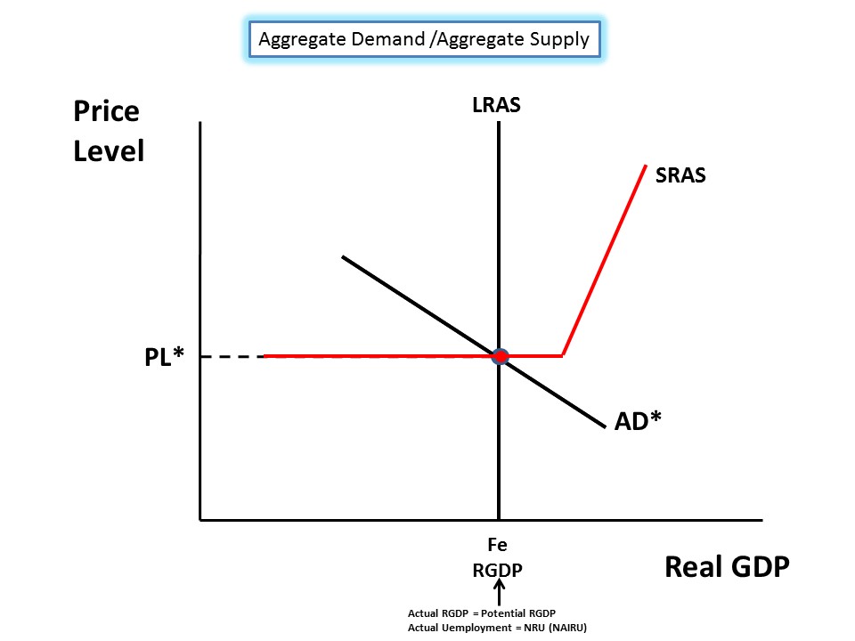
Here is the basic AD/SRAS/LRAS showing the economy at Full-Employment. All the curves intersect at the same sweet spot. This is what you draw if asked on the AP FRQ portion of the test. However....
If you are asked about the "Keynesian Range" of the SRAS curve then you have to look at it like the graph below. The Keynesian Model assumes "Sticky Prices and Wages" (this is usually a key phrase used on the test to give a clue as to what you need to answer).
This means that even if the economy enters a recession, prices of inputs and wages of workers will not adjust downward. This suggests the SRAS is HORIZONTAL over a long range of production.
So a recession will be the result of...
...deficient AGGREGATE DEMAND (AD). See the graph below. We now have a Recessionary Gap at "RGDP 1".
So what is the only way to get back to Full Employment?
Prop up AD with (1) automatic stabilizers that are already in place (unemployment compensation, food/housing assistance, etc) and (2) Fiscal Policy initiatives such as discretionary government spending and/or decreases in taxes. This would be considered "expansionary Fiscal Policy" intended to increase AD (shift to the RIGHT) in order to get back to Full Employment.
Full Stop on the Keynesian Model. Not lets look at the Classical Model.
Let's start over with our original model seen below. Here is where you need to concentrate because the graph gets unavoidably messy.
Notice the construction of the SRAS curve in this model. The sloping, intermediate range of the SRAS curve is essential in the Classical Model.
As you move along the Intermediate Range you notice Price Level changes are every level of RGDP.
This suggests that "Prices and Wages" are "FLEXIBLE" (Key word you are likely to see on the AP test is "flexible").
As with the Keynesian Model a recession can be caused by a deficiency in Aggregate Demand (AD).
This is shown in the graph below. We have a Recessionary Gap at "RGDP 1", Point "B".
Notice Price Level Decreases AND unemployment INCREASES.
Here is the reasoning as to what the Classical Model suggests will happen in, but in a LONGER time frame:
1. Input prices are flexible. When there is slack demand for available resources use in the production of goods, then those prices will DECREASE.
2. Wages are flexible. When Unemployment increases then wages workers are willing to work for DECREASE.
3. Input prices and wages are elements for the cost of producing goods. If input prices decreases then the cost of producing decreases.
4. When the cost of producing decreases SRAS curve shifts to the RIGHT (See Graph below).
5. When SRAS curve shifts Right, then the economy returns to Full Employment at a LOWER Price Level and a HIGHER level of RGDP---POINT "C".
6. This is a longer term solution to return to Full Employment than the Keynesian approach.
That is a simple as I can make it and it will, I believe, help you get the points on the AP test for this concept.
Good Luck.
Here are some slides and in-between them some explanation. Hope it helps someone out there.
Here is the basic AD/SRAS/LRAS showing the economy at Full-Employment. All the curves intersect at the same sweet spot. This is what you draw if asked on the AP FRQ portion of the test. However....
If you are asked about the "Keynesian Range" of the SRAS curve then you have to look at it like the graph below. The Keynesian Model assumes "Sticky Prices and Wages" (this is usually a key phrase used on the test to give a clue as to what you need to answer).
This means that even if the economy enters a recession, prices of inputs and wages of workers will not adjust downward. This suggests the SRAS is HORIZONTAL over a long range of production.
So a recession will be the result of...
...deficient AGGREGATE DEMAND (AD). See the graph below. We now have a Recessionary Gap at "RGDP 1".
So what is the only way to get back to Full Employment?
Prop up AD with (1) automatic stabilizers that are already in place (unemployment compensation, food/housing assistance, etc) and (2) Fiscal Policy initiatives such as discretionary government spending and/or decreases in taxes. This would be considered "expansionary Fiscal Policy" intended to increase AD (shift to the RIGHT) in order to get back to Full Employment.
Full Stop on the Keynesian Model. Not lets look at the Classical Model.
Let's start over with our original model seen below. Here is where you need to concentrate because the graph gets unavoidably messy.
Notice the construction of the SRAS curve in this model. The sloping, intermediate range of the SRAS curve is essential in the Classical Model.
As you move along the Intermediate Range you notice Price Level changes are every level of RGDP.
This suggests that "Prices and Wages" are "FLEXIBLE" (Key word you are likely to see on the AP test is "flexible").
As with the Keynesian Model a recession can be caused by a deficiency in Aggregate Demand (AD).
This is shown in the graph below. We have a Recessionary Gap at "RGDP 1", Point "B".
Notice Price Level Decreases AND unemployment INCREASES.
Here is the reasoning as to what the Classical Model suggests will happen in, but in a LONGER time frame:
1. Input prices are flexible. When there is slack demand for available resources use in the production of goods, then those prices will DECREASE.
2. Wages are flexible. When Unemployment increases then wages workers are willing to work for DECREASE.
3. Input prices and wages are elements for the cost of producing goods. If input prices decreases then the cost of producing decreases.
4. When the cost of producing decreases SRAS curve shifts to the RIGHT (See Graph below).
5. When SRAS curve shifts Right, then the economy returns to Full Employment at a LOWER Price Level and a HIGHER level of RGDP---POINT "C".
6. This is a longer term solution to return to Full Employment than the Keynesian approach.
That is a simple as I can make it and it will, I believe, help you get the points on the AP test for this concept.
Good Luck.
Subscribe to:
Posts (Atom)