Economics, civics, constitutional law, Supreme Court cases, AP Economics teaching resources, and classroom lessons by a retired social studies teacher.
Friday, August 12, 2016
Friday, August 5, 2016
Adjusting for inflation, how have 4 major Chicken Fast Food Restaurants fared since 1991?
I saw the graphic below on a twitter account I follow from Nations Restaurant News.
The numbers you see are in "millions"--put 6 zeroes at the end of the numbers (in front of the decimal) to get the full value.
It shows sales figures for 4 major chicken chains in 1992 (blue column is 1991 sales figures). These numbers are interesting as they stand, I suppose, but what do they represent in more current dollars?
I used the column in BLUE as it is a firm dollar amount from the prior year--1991. I used the Bureau of Labor Statistics calculator to adjust the numbers into 2014 dollars. Those numbers are in the box "2014 Dollars (Inflation Adjusted)".
The RED arrows point to the inflation adjusted sales figure. Example: For KFC, sales of $3,200,000,000 ($3.2 Billion dollars) in 1991 would be equivalent to $5,562,000,000 ($5.525 Billion dollars) in 2014 dollars.
I used 2014 because from HERE I was able to find the latest yearly sales figures for these 4 companies. Those numbers are in the box "2014 Actual Sales".
Now, this is the fun part! Look at the differences that occurred over time.
Actual Total Sales for all 4 chains are 71% higher than the inflation adjusted figure. It is good to be in the chicken business, right?
What other observations can you make about these 4 companies?
The numbers you see are in "millions"--put 6 zeroes at the end of the numbers (in front of the decimal) to get the full value.
It shows sales figures for 4 major chicken chains in 1992 (blue column is 1991 sales figures). These numbers are interesting as they stand, I suppose, but what do they represent in more current dollars?
I used the column in BLUE as it is a firm dollar amount from the prior year--1991. I used the Bureau of Labor Statistics calculator to adjust the numbers into 2014 dollars. Those numbers are in the box "2014 Dollars (Inflation Adjusted)".
The RED arrows point to the inflation adjusted sales figure. Example: For KFC, sales of $3,200,000,000 ($3.2 Billion dollars) in 1991 would be equivalent to $5,562,000,000 ($5.525 Billion dollars) in 2014 dollars.
I used 2014 because from HERE I was able to find the latest yearly sales figures for these 4 companies. Those numbers are in the box "2014 Actual Sales".
Now, this is the fun part! Look at the differences that occurred over time.
Actual Total Sales for all 4 chains are 71% higher than the inflation adjusted figure. It is good to be in the chicken business, right?
What other observations can you make about these 4 companies?
Wednesday, August 3, 2016
UK minimum wage pre and post-Brexit. How has it changed?
There is always a debate about the appropriate level at which the minimum wage should be set (or even if there should be one).
International comparisons are often used to see how other countries approach the use of it as a policy tool.
Here is how the U.K. deals with the issue. They have what is called a "tier" approach---a different minimum wage for different age groups and/or skill levels.
Of course the wages are in Sterling Pound, the currency of the UK. We know with "Brexit" the value of the Pound has taken a hit over the course of the last month or so.
For the purposes of understanding how making cross border comparisons can be tricky, let's put the a above numbers in the current exchange rate, exchange rate before Brexit and Purchasing Power Parity (PPP) exchange rate.
Before the effects of Brexit hit the market, the Pound was trading at roughly $1.45. So if you take the above wage rates and multiply them by $1.45 that will give you the US dollar value of the minimum wage for that particular age/skill group.
For 25 and over: $10.44. For 21-24: $9.72. For 18-20: $7.69. For under 18: $5.61. Apprentice: $4.79
Today, the exchange rate is 1 Pound = $1.33. Again, take the numbers in the chart above and multiply by $1.33.
For 25 and over: $9.58. For 21-24: $8.91. For 18-20: $7.04. For under 18: $5.15. Apprentice: $4.39.
Quite a difference! The only thing that changed is the exchange rate between the Dollar and the Pound in a relatively short period of time. You can see how using current exchange rates can present a misleading picture when presented in current exchange rates.
Fortunately we have a better, but not necessarily perfect, way to show the differences in currency exchange rates. It is called Purchasing Power Parity (PPP). PPP is the economists preferred exchange rate to use when making international comparisons because it takes country specific prices/price level into consideration.
In many cases the PPP exchange rate varies drastically in comparison to market exchange rates.
In the case of the UK, data from the OECD show the PPP rate to be almost identical (1 cent less) to the pre-Brexit market exchange rate: $.144 (See the data here). The numbers I calculated above for "pre-Brexit" will only be slightly less given the PPP exchange rate.
The US has minimum wage has some exceptions but for the most part, regardless of age and/or skill level, it is a blanket $7.25 per hour. You can see how this falls into the UK policy scheme.
So, when someone quotes a foreign country's minimum wage in dollars it is critical to know (1) if that it is in current dollars how has that currency faired lately in the foreign exchange market and (2) is that in market dollars or in PPP?
Then judge by the look on their face if they are as informed as you or not. :)
International comparisons are often used to see how other countries approach the use of it as a policy tool.
Here is how the U.K. deals with the issue. They have what is called a "tier" approach---a different minimum wage for different age groups and/or skill levels.
![]() |
| From UK.gov |
For the purposes of understanding how making cross border comparisons can be tricky, let's put the a above numbers in the current exchange rate, exchange rate before Brexit and Purchasing Power Parity (PPP) exchange rate.
Before the effects of Brexit hit the market, the Pound was trading at roughly $1.45. So if you take the above wage rates and multiply them by $1.45 that will give you the US dollar value of the minimum wage for that particular age/skill group.
For 25 and over: $10.44. For 21-24: $9.72. For 18-20: $7.69. For under 18: $5.61. Apprentice: $4.79
Today, the exchange rate is 1 Pound = $1.33. Again, take the numbers in the chart above and multiply by $1.33.
For 25 and over: $9.58. For 21-24: $8.91. For 18-20: $7.04. For under 18: $5.15. Apprentice: $4.39.
Quite a difference! The only thing that changed is the exchange rate between the Dollar and the Pound in a relatively short period of time. You can see how using current exchange rates can present a misleading picture when presented in current exchange rates.
Fortunately we have a better, but not necessarily perfect, way to show the differences in currency exchange rates. It is called Purchasing Power Parity (PPP). PPP is the economists preferred exchange rate to use when making international comparisons because it takes country specific prices/price level into consideration.
In many cases the PPP exchange rate varies drastically in comparison to market exchange rates.
In the case of the UK, data from the OECD show the PPP rate to be almost identical (1 cent less) to the pre-Brexit market exchange rate: $.144 (See the data here). The numbers I calculated above for "pre-Brexit" will only be slightly less given the PPP exchange rate.
The US has minimum wage has some exceptions but for the most part, regardless of age and/or skill level, it is a blanket $7.25 per hour. You can see how this falls into the UK policy scheme.
So, when someone quotes a foreign country's minimum wage in dollars it is critical to know (1) if that it is in current dollars how has that currency faired lately in the foreign exchange market and (2) is that in market dollars or in PPP?
Then judge by the look on their face if they are as informed as you or not. :)
Sunday, July 31, 2016
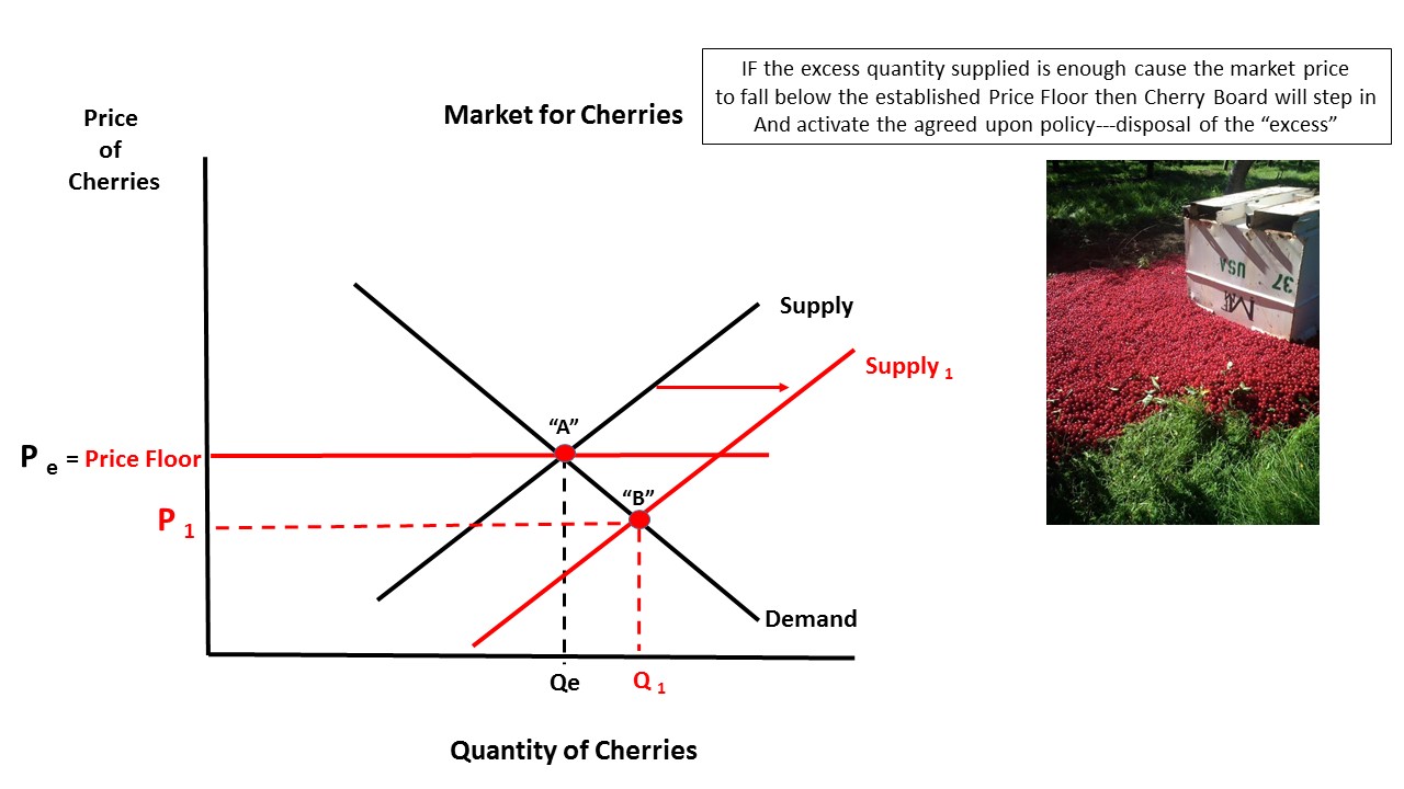
Cherry-picking the Cherry Pickers. Should this grower be angry?
A bit of a internet storm over a photo a Michigan cherry grower posted to Facebook.
He is lamenting the fact that he is required to destroy a portion of his cherry crop in order to meet supply requirements of the Cherry Industry Administrative Board. His method of disposal was to dump it on the ground (a common way).
The Cherry Board is charged with stabilizing the price growers receive for their cherry harvest. The main tool to accomplish this is controlling the supply of cherries that make it to market.
Here is a series of slides I created to explain in Supply and Demand terms what I believe is going on.
A Michigan tart cherry farmer is leaving 14% of his crop this year to rot on the ground to comply with an industry marketing agreement intended to keep cherry prices stable. And he's not happy about it.
A frustrated Marc Santucci, who grows about 30 acres of cherries on his 80-acre Traverse City farm, put a photo of the dumped cherries, thick on the ground, on Facebook Tuesday — and the photo had been shared nearly 38,000 times as of Thursday afternoon. (From USA TODAY)
He is lamenting the fact that he is required to destroy a portion of his cherry crop in order to meet supply requirements of the Cherry Industry Administrative Board. His method of disposal was to dump it on the ground (a common way).
The Cherry Board is charged with stabilizing the price growers receive for their cherry harvest. The main tool to accomplish this is controlling the supply of cherries that make it to market.
Here is a series of slides I created to explain in Supply and Demand terms what I believe is going on.
A new tax on home buyers in Vancouver. A speed bump or pothole?
The purpose of some types of targeted taxes is two fold. One is to raise revenue and one is to change the behavior of markets participants from doing something that is perceived as a societal negative.
The provincial government of British Columbia ("BC") has decided that the Vancouver housing market is a proper tax target:
However, with this posting I just want to look at the simple supply and demand issues the tax will/may create in the housing market there.
My overall sense is that the tax may slow down the increase in prices of house, at best. But because of things OTHER THAN the price of housing in Vancouver, such as economic growth and increasing jobs/income, the price of housing will simply continue to increase.
This is a supply issue for the most part (or all part).
Here are the slides with explanations.
The provincial government of British Columbia ("BC") has decided that the Vancouver housing market is a proper tax target:
The foreign buyer tax leaves us with the wrong kind of speculator
""This week, the B.C. government announced a new 15-per-cent property transfer surtax to be applied to all foreign buyers of residential property in the Greater Vancouver Regional District, effective on transactions closing on or after Aug. 2, 2016. The objective of the tax is to curb foreign speculators from investing in residential real estate in the GVRD and help to cool the rise of prices.""The focus of the article is to suggest that this tax will create wrong incentives for market participants and will make the market more volatile and higher-risk. It is a very interesting point and one I encourage you to read about.
However, with this posting I just want to look at the simple supply and demand issues the tax will/may create in the housing market there.
My overall sense is that the tax may slow down the increase in prices of house, at best. But because of things OTHER THAN the price of housing in Vancouver, such as economic growth and increasing jobs/income, the price of housing will simply continue to increase.
This is a supply issue for the most part (or all part).
Here are the slides with explanations.
Thursday, July 28, 2016
Qd greater than Qs--- San Francisco Area Edition
Just put this up on a projector and let students tell you what is going to continue to happen with housing prices in the San Francisco Bay Area.
| From WSJ HERE |
Tuesday, July 19, 2016
Negative Externality Example: The cost of methane damage to the environment.
This graphic comes from a study I found on the National Bureau of Economic Research (NBER) website. It is a study that suggests producers and consumers of natural gas do not cover the "true cost" of delivering natural gas for consumption. The concern is the climate unfriendly methane from the gas that is lost to the environment through unrepaired and/or neglected pipelines.
If those costs were internalized within in the market, then the cost of producing natural gas would be considerably higher. This would be reflected in a Supply Curve that includes the private cost of producing AND the social costs as well.
These "external costs" (Blue Bar) are not borne by producers nor consumers of natural gas but none the less are imposed on society in the form of environmental degradation.
The result would be a product that has a market price that is higher and a market quantity that is less than the market would produce.
Below are a series of graphs that illustrate "what SHOULD be" (the "Socially Optimal") in terms of the market outcome if those external costs were internalized in the market.
Because those costs in "real life" are not internalized, then the market creates "Dead Weight Loss"---a quantity of the good that is produced where the marginal cost is greater than the marginal benefit, as noted by the price consumers are willing to pay. This is denoted by the Red Triangle in that last slide .
The fountain of youth: Pomegranates and the Demand Curve
A nice example to use with a basic Demand Curve lesson.
Two of the Determinants of Demand are a "change in consumer tastes/expectations" and "change in the number of buyers". This article suggests research shows pomegranates have some anti-ageing properties:
This new information, once widely disseminated, will likely have an impact on the current market for pomegranates.
The current market for pomegranates has a specific price ("Pe") and market quantity demanded ("Qe"). See graph:
With this new finding it seems reasonable that at that same price a higher/larger quantity demanded ("Q1") will emerge as people who previously were not interested in pomegranates become intrigued by this potential fountain of youth:
Ceteris Paribus, what happens at "Pe" and "Q1" will also happen at ALL other points along the "Demand*". Without plotting those additional points, we can intuitively see a new Demand Curve is created that lies wholly to the RIGHT of the previous one.
Note: the impetus for the change in demand was NOT the price for pomegranates. The price stayed the same but a larger quantity was demanded at that price because something OTHER than the price occurred in the market for pomegranates ("miracle fruit!).
Subsequently there will likely be a change in price which in turn WILL affect the Quantity Demanded until we reach a new equilibrium price.
Two of the Determinants of Demand are a "change in consumer tastes/expectations" and "change in the number of buyers". This article suggests research shows pomegranates have some anti-ageing properties:
"...The humble pomegranate may old the secret to a long and healthy life.
Scientists say the Middle Eastern fruit contains a ‘miracle’ ingredient that strengthens ageing muscles and extends life.
With experiments in worms and mice producing results that ‘are nothing sort of amazing’, they are now testing the fountain of youth supplement on people.
Even something as simple as keeping muscles young could reduce the number of falls among the elderly and increase independence, allowing people to live in their own homes for longer.
The Swiss scientists said: ‘We believe this research is a milestone in anti-ageing efforts.’
Their excitement centres on the pomegranate’s ability to keep mitochondria, the tiny 'battery packs' that power our cells, charged up...."---The Daily Mail
This new information, once widely disseminated, will likely have an impact on the current market for pomegranates.
The current market for pomegranates has a specific price ("Pe") and market quantity demanded ("Qe"). See graph:
With this new finding it seems reasonable that at that same price a higher/larger quantity demanded ("Q1") will emerge as people who previously were not interested in pomegranates become intrigued by this potential fountain of youth:
Ceteris Paribus, what happens at "Pe" and "Q1" will also happen at ALL other points along the "Demand*". Without plotting those additional points, we can intuitively see a new Demand Curve is created that lies wholly to the RIGHT of the previous one.
Note: the impetus for the change in demand was NOT the price for pomegranates. The price stayed the same but a larger quantity was demanded at that price because something OTHER than the price occurred in the market for pomegranates ("miracle fruit!).
Subsequently there will likely be a change in price which in turn WILL affect the Quantity Demanded until we reach a new equilibrium price.
Thursday, July 7, 2016
Gasoline prices and how they affect many markets. Nice practice!
Here is a terrific article from the WSJ (I think it is ungated) that illustrates a bunch of introductory microeconomic concepts within the Supply and Demand unit.
This paragraph speaks mostly to the Demand-side:
Happy graph drawing!
This paragraph speaks mostly to the Demand-side:
“Households had the potential to save $630 at the pump, of which they spent the majority—58%. This spending provided more than a $200 boost to spending on non-gas goods and services, primarily restaurants and retailers. The lower gas prices also caused significant changes in household transportation choices, leading people to spend $150 more at gas stations and spend less on transit.”---WSJ Real Time EconomicsSubstitutes, Complements, movement along and a shifting of various Demand curve(s).
Happy graph drawing!
Monday, July 4, 2016
Theme Park Price Index and the Disney Effect.
I saw this line graph on my Twitter feed from the FRED data bank. It shows the change in the price index for "Amusement and Theme Parks" admission ticket prices.
They started at the beginning of 2006 with an index of 100. As of May, 1 2016 the index was just a touch over 180. This means that theme park ticket prices overall have increased by 80% in that time span.
My first thought when I saw this was what is the impact of Disney on the price of tickets. I found this website which tracks their price changes.
I inserted RED bars (month and year on top) that show all of the Disney price increases (they had no price decreases) in this time period.
At the beginning of 2006 a single one day ticket to a Disney park was priced at $63.00 (see link above). Today a single day ("regular" price) is $110.00. That is a 75% increase!
Remember, theme park (Six Flags et al) tickets increased by 80% overall. Disney accounts for a disproportionate amount of that change.
If Disney admission tickets had just kept up with inflation during that time (using the CPI), ticket prices should only be $75.05, a 19.1% increase.
Seems clear that Disney is a "Price Maker" as opposed to a "Price Taker" and they are a "Price Leader" as well. However, the latter is harder to discern without doing the math.
When Disney raised prices did other theme parks follow suit at the same time? If you look at the times in-between Disney price increases (gotta look really close) there seems to be a bump up in the line indicating a lag (sometimes short, sometimes longer) when other theme parks followed with price increases.
I did find it interesting that Disney elected to increase prices in the dead middle of the Great Recession (noted on graph in gray area).
Pricing power, indeed!
They started at the beginning of 2006 with an index of 100. As of May, 1 2016 the index was just a touch over 180. This means that theme park ticket prices overall have increased by 80% in that time span.
I inserted RED bars (month and year on top) that show all of the Disney price increases (they had no price decreases) in this time period.
At the beginning of 2006 a single one day ticket to a Disney park was priced at $63.00 (see link above). Today a single day ("regular" price) is $110.00. That is a 75% increase!
Remember, theme park (Six Flags et al) tickets increased by 80% overall. Disney accounts for a disproportionate amount of that change.
If Disney admission tickets had just kept up with inflation during that time (using the CPI), ticket prices should only be $75.05, a 19.1% increase.
Seems clear that Disney is a "Price Maker" as opposed to a "Price Taker" and they are a "Price Leader" as well. However, the latter is harder to discern without doing the math.
When Disney raised prices did other theme parks follow suit at the same time? If you look at the times in-between Disney price increases (gotta look really close) there seems to be a bump up in the line indicating a lag (sometimes short, sometimes longer) when other theme parks followed with price increases.
I did find it interesting that Disney elected to increase prices in the dead middle of the Great Recession (noted on graph in gray area).
Pricing power, indeed!
Friday, July 1, 2016
Brexit and exchange rates. A simple example.
Another short example of the effect "Brexit" has on trade in terms of the export and import of a finished goods from the UK .
The British Pound Sterling just before Brexit was trading at $1.45 (approx)---To "buy" one Pound you had to "pay" $1.45US for it.
So, if you wanted to buy a good in the UK that was priced at 100 Pounds, you had to give up $145.00US dollars to purchase it.
Today post-Brexit the exchange rate is $1.33. So to buy that same good for 100 Pounds, you would only have to give up $133.00. Due to the change in the exchange rate, the UK is "on sale"---you save $12.00 or 8.3%.
Ceteris Paribus, this will serve to INCREASE imports to the US from the UK (vice versa, exports will INCREASE for the UK) for those holding US dollars---Law of Demand--as price goes down, quantity demanded increases.
So, how about in the other direction? Before Brexit, for Brits to "buy" one US Dollar they had to "pay" .69 of Pound to purchase it (this is the reciprocal of the $1.45 from above).
If a Brit wanted to buy a good in the US that was priced at $100 Dollars, they would have to give up 69 Pounds to buy it.
Today, post-Brexit the exchange rate is .75 pounds (reciprocal of $1.33). To buy that $100 Dollar good now costs the Brit 75 Pounds. Due to the exchange rate, the US is now more costly. Brits pay 6 Pounds or 8.7% more.
Ceteris Paribus, this will serve to DECREASE exports from the US (and DECREASE imports to the UK) for those holding Pound Sterling---Law of Demand---price increases, quantity demanded decreases.
Bottom line: British Jaguars are less expensive so the US may/will IMPORT more of them and the British may/will EXPORT more of them. US Cadillacs are more expensive so the US may/will EXPORT less of them and the British may/will IMPORT fewer of them.
Trade as illustrated by changes in the exchange rate(s). Hope this helps!
The British Pound Sterling just before Brexit was trading at $1.45 (approx)---To "buy" one Pound you had to "pay" $1.45US for it.
So, if you wanted to buy a good in the UK that was priced at 100 Pounds, you had to give up $145.00US dollars to purchase it.
Today post-Brexit the exchange rate is $1.33. So to buy that same good for 100 Pounds, you would only have to give up $133.00. Due to the change in the exchange rate, the UK is "on sale"---you save $12.00 or 8.3%.
Ceteris Paribus, this will serve to INCREASE imports to the US from the UK (vice versa, exports will INCREASE for the UK) for those holding US dollars---Law of Demand--as price goes down, quantity demanded increases.
So, how about in the other direction? Before Brexit, for Brits to "buy" one US Dollar they had to "pay" .69 of Pound to purchase it (this is the reciprocal of the $1.45 from above).
If a Brit wanted to buy a good in the US that was priced at $100 Dollars, they would have to give up 69 Pounds to buy it.
Today, post-Brexit the exchange rate is .75 pounds (reciprocal of $1.33). To buy that $100 Dollar good now costs the Brit 75 Pounds. Due to the exchange rate, the US is now more costly. Brits pay 6 Pounds or 8.7% more.
Ceteris Paribus, this will serve to DECREASE exports from the US (and DECREASE imports to the UK) for those holding Pound Sterling---Law of Demand---price increases, quantity demanded decreases.
Bottom line: British Jaguars are less expensive so the US may/will IMPORT more of them and the British may/will EXPORT more of them. US Cadillacs are more expensive so the US may/will EXPORT less of them and the British may/will IMPORT fewer of them.
Trade as illustrated by changes in the exchange rate(s). Hope this helps!
Subscribe to:
Posts (Atom)