Tuesday, April 1, 2014

What is the price of a Lime in your neck of the woods? Photos welcome if you happen to be out shopping!

Lot's in the news about the current lime shortage in the US.  Most limes we consume come from Mexico. Due to weather AND gang activity, the price of limes has shot up in a very short period of time.  HERE and HERE you will find excellent reviews of what is happening.

According to the US Dept of Agriculture, the price of limes last week (Friday, March 28th) was $.37 cents each (a "weighted average price") and the week before that they were $.53 cents each.
Cobbled together from USDA data HERE
I just went to a Krogers in my neighborhood (northern burbs of Columbus, Ohio) and here is what a lime was selling for (4/1/2014):

Displaying photo.JPG

How about where you live?  If you are out shopping take a picture and I will add it to this posting and we can see how it plays out in different areas of the country.

Thanks!

Friday, March 28, 2014

Nice short video about the progress the world has made in the past 50 years (20 for that matter). Louie Armstrong was right...

It's a wonderful world....Feeling down about the state of the planet and its inhabitants?  Here is a little pick me up that will put things in context.

The world is a far more wonderful place than in any time in history.  I believe that is true if you really think about it.

Explain-er with real life example: The difference between accounting costs and "economic" costs. This is why every one hates economists but love their accountant.

Here is a graph (HT: Big Picture Agriculture) that shows the relationship over time (1972-2012) between the Average Total Cost ("ATC") of producing a bushel of corn  (RED line) and its Market Price (BLUE line).

You can see at various times the ATC exceeds the price and vice versa.  Sometimes they make a profit, sometimes they lose money...So goes the agricultural commodities market and the roller coaster that is farming.

Look at the year 2006.  I inserted a dotted line to show in 2006 the price of a bushel of corn equaled the Average Total Cost of Producing a bushel of corn  The lines intersect at $2.50.  So, the farmer is "breaking even"...right?


Not so fast.  I believe I am making a correct assumption in assuming the creator of this chart included cost data that is ONLY comprised of "Accounting Costs" or "Money Costs".  This simply means explicit costs that are paid for with cash (or credit).  Accountants care only about accounting costs when they tally up the numbers and then subtract them from Revenue to obtain "Accounting Profits".

Economists, on the other hand, care about explicit accounting costs and IMPLICIT opportunity costs---are you surprised? Probably not...

Economists believe that the farmers accountant UNDERESTIMATES the cost of being a farmer because opportunity costs are not added to the the total cost of farming.

Simple example.  Lets say I make $50,000 per year as a teacher but decide to quit teaching and become a farmer.  In the first year I make enough in farming to pay myself $40,000.

This $40,000 is an accounting cost (real money paid to me!). However, economists take it one step further and suggest that I have to account for that lost $10,000 income I experience when I choose to farm.  

My total cost to farm is not $40,000, but $50,000.  Economists add in that $10,000 in foregone income as an implicit cost for me and my farming operation.

Once I add in the additional implicit cost of $10,000 that accountants do not, then my ATC of producing is going to be HIGHER than what you see at ANY POINT in the above graph.

The RED line will shift UP at every given price. 

So, for the most part, profits will be LESS in economic terms as opposed to accounting terms because of the inclusion of implicit opportunity costs.

Go back to 2006 on the graph. If we add in the opportunity cost then the ATC of producing corn will be something MORE than $2.50 and instead of breaking even as accounts would figure. The farmer will experience "economic losses".

My labor is not the only implicit cost economists like to account for.  Go here for a more comprehensive look at the topic.

There has to be an accountant vs economist joke in here somewhere. Because I teach economics I don't have much of a sense of humor, so you tell me a good one.  :)


A short lesson on the difference between a "Constant Cost" and "Increasing Cost" Production Possibilities Frontier. A must know for AP Econ!!

Understanding the difference between a "Constant Cost (Straight Line)" and an "Increasing Cost (Concave)" Production Possibilities Frontier (PPF) is not necessarily a difficult concept, but it one that does seem to be-devil the student in an introductory economics class.

I put together a series of slides that takes you through the differences step by step.

The main purpose for the PPF is to illustrate the principle of Opportunity Cost when it comes to resource allocation. If an economy is at Full-employment to get more of one thing then something has to be given up.

Sometimes that trade-off may be "constant"--the resources taken away from the production of one good are "perfectly adaptable" to produce more of another good.  A simple example is a farmer who has land where he can grow Corn and/or Soybeans. The land suitable for growing corn is the same as the land for growing soybeans (I live in Central Ohio--I see this just down the street). One the same acre of land, the farmer can get a maximum yield in corn or soybeans. Switching from one to the other entails virtually no cost in resource allocation for the farmer.  How it affects society is another question.

However, if the crop mix is different and the resources used are NOT easily adaptable for a different use, then the opportunity costs are not constant but "increasing".

I use Corn and Rice as an example below.  The land use for either is not identical.  If I want to grow Corn where I once grew Rice then it may take 2 acres of rice field acreage in order to get corn yield equivalent to what I would get out of land perfectly suitable for corn production.  My opportunity cost for more rice is not just one acre or rice production (Constant Cost) but two acres (Increasing Cost).

If the farmer persists in converting more of the rice field into corn production, then it may take 3 acres to get the equivalent in Corn. So on and so forth.

TINSTAAFL!   Corn and Rice---now I am hungry.  My opportunity cost of doing this blog entry is a delayed breakfast. You gave up eating lunch to read it.   I hope it was worth it to you.  Was for me.  :)


Saturday, March 22, 2014

Full-employment, Progressive Era style. Nice photo of bowling pin setters in 1910.

This photo accompanies a nice article on "The Rise and Fall of Professional Bowling". 

It was taken in 1910.   From Wikipedia, here is the description of it:
1:00 A.M. Pin boys working in Subway Bowling Alleys, 65 South St., B'klyn, N.Y. every night. 3 smaller boys were kept out of the photo by Boss. Location: New York--Brooklyn, New York (State) Hine, Lewis Wickes, 1874-1940, photographer. April, 1910
Child Labor in action.  Nice illustration for a history class.

I am 53 years old and I remember watching bowling on TV in the late 60's.  I was a big deal! But I missed its real heyday long prior to that (pre and post WWII).

If you are interested in the subject or just like reading about historical cultural niches that people have mostly forgot, then this may be for you.

Source: Priceonomics

See how the price and quantity sold of the simple i-Pod as changed over time since its introduction in 2003. The i-Pod is Dead, Long Live the i-Pod...

Ok, it is not really dead, but it is on its way to becoming an impulse buy in line at the grocery store.

The iPod will go down in history as a breakthrough technology that lead to the "i"-everything revolution in consumer electronics.

When it debuted in 2003 (yes a short 11 years ago) its introductory nominal price was $400.00 (see left scale, blue line. Using the BLS inflation calculator for overall changes in prices, in today's dollars that would be equivalent to $510.30.

Following the BLUE line you can see the price dropped rapidly as more units were sold (GOLD line using the Right Hand scale).

In 2006 the price stabilized at its longer term price floor of just over $150.00 regardless of the number of units sold (with some seasonal fluctuations). Those seem to coincide with the very high peaks that center on the Christmas shopping season. Pretty consistent, eh?

For an additional reference point, I put the price of an i-Pod today (estimated at $155.00) in 2003 dollars: $121.47.  That is a 70% reduction in price using 2003 prices ($121.47-$400.00 = -$278.53/$400.00). Or you could use 2014 prices.

During that time, the general level of all prices, as measured by the Consumer Price Index, increased 28%.

Wish we could innovate with the cost of gas and or electricity to this extent so our heating bills would be lower by 70%.  :)
Source: Twitter Tweet via Quartz

Wednesday, March 19, 2014

A survey suggests businesses won't reduce staff, maybe slow hiring of new workers BUT raise prices if the minimum wage goes to $10.10. Let me show you how this is possible.

The Wall Street Journal had this graphic based on a recent survey regarding business sentiment towards a potential increase in the Federal minimum wage to $10.10 per hour.

Sixty-one percent of businesses won't cut their existing workforce (Red means NO, Blue means YES), which is good. About 52% say they won't reduce hiring in the future. Not a ringing endorsement going forward, but we will take it. About 63% say they would raise prices.  THAT doesn't sound good.

So, good for low wage workers who have a job. This is easy to quantify. Not so good for low skilled workers not in the labor force now but may/will be in the future. Not so easy (impossible?) to quantify.  Not good for people who purchase goods/services produced from low wage/low skilled labor. This is VERY easy to quantify.

Source: Wall Street Journal
In AP Microeconomics we have a unit called "Factor Markets" in which we use a very simplified model to graphically illustrate the "Profit Maximizing Number of Workers" a firm will hire given the changing market conditions, such as it described in the graphic.  

According to what you will learn below (all the relevant info is embedded in the slides) the ONLY way the conditions above can be met (no cut in workforce and possible reduced hiring) is if PRICES INCREASE.

The highly competitive industries that employ lots of low wage/low skilled workers AND is dealing with a relatively slow economy, this seems very difficult.  

But I am going to go with it and show you how it is possible for everything to work out just as the graphic suggests.  

Let me know if you spot any mistakes in content. Constructive criticism always welcome.


Which is the most and least expensive city to attend an NBA game for you and 3 friends? For once, geography does not seem to matter. See interesting data here...

Here is an interesting survey of NBA (National Basketball Association) teams and how much it costs to attend a game.  Lots of interesting data on individual costs for various items, from tickets to parking.

This report compiled a "Fan Cost Index".  It shows how much a "basket" of items costs for you and 3 friends to attend a game in all the cities that have a franchise. I highlighted that in YELLOW and they are in descending order from most expensive to least.

Here is how the report characterizes the components of the Fan Cost Index (FCI):
The Fan Cost Index® comprises the prices of four (4) average-price season tickets, two (2) cheapest draft beers, four (4) cheapest soft drinks, four (4) regular-size hot dogs, parking for one (1) car, two (2) game programs and two (2) least-expensive, adult-size adjustable caps. Costs were determined by telephone calls with representatives of the teams, venues and concessionaires, along with information provided on the teams’ official Web site, or through outside sources. Identical questions were asked in all interviews.
Source: 2013 Team Marketing Report via PRICEONOMICS

Tuesday, March 18, 2014

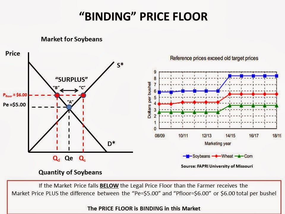
Nice real time data and graphs to illustrate a Price Floor. A must know concept for the AP Microeconomics test!

Agricultural commodities are produced in technically what is called a “Perfectly Competitive” Market. .  

The prices are established in commodity exchanges, like the Chicago Mercantile Exchange (CME), based on world-wide demand and supply.  Farmers simply have to accept what is offered.  In economics, these producers  are termed “Price-Takers”.

Agricultural markets are relatively stable over time, but because of many endogenous and exogenous variables that can and do affect farming, prices fluctuate.  Sometimes the price is higher than normal, sometimes lower.

In order to smooth out this pricing volatility nations often employ various polices to make the price a farmer receives for their crop more predictable over time.  The Unitied States does this within the context of the US Farm Bill.

One such policy the government uses to aid farmers is called a “PRICE FLOOR”

Price Floors legally establish a MINIMUM PRICE that the Farmer will receive per bushel of crop harvested. 

If the market price falls below the Price Floor, the government makes up the difference so the farmer receives the pre-determined Price Floor price.  This is what is termed a "BINDING PRICE FLOOR". 

If the market price rises ABOVE the legal Price Floor then the farmer receives the market price and the Price Floor becomes irrelevant. This is termed a "NON-BINDING PRICE FLOOR".

Below is a series of graphs I made to illustrate both binding and non-binding price floors.  For labeling purposes, I used Soybeans BUT it could apply to any of the commodities.

Within the slides I inserted a graph that shows the ACTUAL price floors past, present and future for Soybeans, Corn and Wheat as established in the recently passed US Farm Bill.  I got this from HERE via Agricultural Reader.

This is a MUST know concept for the AP Microeconomics test! Hope it helps.


Sunday, March 16, 2014

A grade earned in an introductory college course is a pretty good predictor as to whether someone is going to major in that subject. HOWEVER, men and women respond very differently to that grade. Nice graphic with an example here.

This graphic comes from a study by Harvard professor Claudia Goldin (click for an article by her on this topic).

It shows, by grade attained in an introductory economics class, which gender is more likely to continue on and major in Economics.

When BOTH men (blue bar) and women (red bar) receive an "A" in the class, women are slightly more likely to go on and major in the subject.  However, as the grade earned gets lower women flee the major at a much higher rate than men do.

In other words, men are undeterred by a lower grade in deciding to major in economics and women quickly have second thoughts and move on to something else.

Economics suffers from a deficit of females in the major similar to the STEM majors.

This excellent analysis HERE at the Washington Post goes deeper into the potential reasons.  I highly recommend it if you are interested in the issue.
Source: Washington Post

Friday, March 14, 2014

Not in my area of expertise but here is what I think happened to Malaysian Flight 370.

I want to go on record with my theory of what happened to Malaysian Flight 370.

I just saw a profile of the pilots on CNN.  The co-pilot is a young-ish man and has been photographed smoking AND carousing with ladies in the cockpit.

The plane seems to have exhibited a pattern of flying that is intentional (sharp turns and a gain/loss/gain/loss in elevation) and under the control of SOMEONE.

In a 777 flight simulator, CNN reporter Martin Savidge sitting in the co-pilot chair, easily turned off  the transponder beacon.  Could do it with little notice from the pilot. 

I think the co-pilot was under pressure (real or imagined) and in fear for his job/career as a result of "indiscretions".  He cracked, folded, went crazy, choose your descriptor.

Well, that is what I think at 6:07pm Eastern on March 14.  


TurboTax e-mails price increase threat without giving ANY details. Not cool, Turbo Tax, not cool...

Just received this e-mail a few minutes ago from TurboTax, which I use for doing my Federal and State tax returns.

The yellow highlight is mine.

If I don't finish my return by March 21st they are going to increase the price for their so-called "Valued Customers".

Checked their website and could not find any pricing information in regards to this specific e-mail.  The message itself does not provide a clue as to how much it will increase.

Bad marketing move, Turbo Tax, in the middle of tax season.  Why make this "threat" on your customers at this point?

Did I say bad marketing move yet?

Give me a break...


Wednesday, March 12, 2014

More evidence the Federal government is a book-keeper and not a doer.

Here is some isolated data from the just released 2015 Budget Outlook by the White House.

Once again I find myself staring at numbers that demonstrate the Federal Government has become more of an entity that writes checks ("Transfer Payments") to people and less of one that "does things".

Below you see blocks of decades and a high lighted portion that shows transfer payments as a percent of ALL Federal government outlays for that last year of the decade (it is NOT an average for the decade).

Less of the budget spent on transfers, more available for "fun stuff" like defense, roads, bridges, education, space program, etc ad infinitum...sort of.

In 1950 we could spend 68% of the budget on all those fun things.  In 2014 we have only 30% to spend.

I am not saying this is a good thing or a bad thing, but it IS a thing.

I think most people don't give this much consideration on either side of the political spectrum when debates about the Federal budget take place.  Did I say "debates"?  Oh, I meant shouting matches. My bad.


One observation.  I do not know what happened in the 1950's that almost doubled private transfer payments (before dipping again in the 60's) but if I had to guess I would say it was a result of the GI Bill and the various benefits conferred on WWII vets.

Anyone else have any idea(s)???

If you are a "salaried manager" making MORE than $455 per week but LESS than ??, you will want to read this. Your paycheck may be changing in the near future.

Today the Obama Administration will direct the Department of Labor to revise an important regulation on the payment for overtime as it pertains to workers classified as "managers/supervisors" who are paid a fixed salary instead of an hourly wage, regardless of the number of hours worked.

There is a VERY low threshold under the Department of Labor regulations that allows employers to classify someone as a manager. It can be as few as TWO workers that the manager manages or if they have some day to day control over functions of a business. See HERE for more on that.

Right now, a business is required to pay someone in a management position at least $455.00 per week in salary to avoid paying over-time.  The Department of Labor has some defined parameters for who is considered a manager HERE.

At this point, it is not known exactly what the Administration will propose as a new threshold BUT with a tiny bit of research it seems like there is a consensus that it will be around $650.

This means if you are now paid somewhere BETWEEN $455.00 and $650.00 (tentative!) for your management expertise, then your employer will have to consider ANY overtime hours you work and pay you accordingly for them OR they can bump you up to at least $650.00 per week.

Or they could decide you are not worth that much at that pay level and cut your position and consolidate your duties with a manager already making over $650.00 per week.  Ouch.

Implementation of this won't happen any time soon, though.  It has to go though regulatory approval.

I will provide more details when they are released.

Tuesday, March 11, 2014

A single mom with two kids will get a 39% pay increase if the minimum wage goes to $10.10, right? She will be the first one to tell you NO, not even close! See the numbers here.

Here is a table (I modified it a little) from The Economix that shows how an increase in the minimum wage from $7.25 to $10.10 per hour will affect different peoples NET INCOME. That is income after taxes are subtracted and benefits are added in.

Two things (at least 2) happen when your income increases: (1) the payroll taxes owed increases and (2) government benefits tend to decrease because they are "means tested". This means the amount a person receives depends on the level of income earned AND the benefit decreases as income increases.

I high-lighted the "Single Mother with Two Children" category because these families tend to have higher poverty rates than the other categories.  And we care about the poor, right?

The first table shows the minimum wage at its current level of $7.25. The wage earner would pay no income tax on that level of income, but pay $1,154 in mandatory payroll taxes (6.2% in Social Security and 1.45% in Medicare tax(es)).  They would receive tax credits (a "refundable tax credit") in the amounts of $5,460 and $1,812.  They would also be eligible for $2,898 in a food stamp (SNAP) benefit.

If you take the persons total income, subtract payroll taxes, then add in the tax credits and the SNAP benefit, their effective "take home pay" is $24,069.

Using this number we can calculate the "effective hourly wage rate" ($24,069/2,080 hours (40 hours per week times 52 weeks) or $11.57 per hour in wages/tax credits and benefits. Remember that number.
Source: Economix at The New York Times

But what happens to the single mother's effective wage rate when the minimum wage increases to $10.10 per hour (a 39% increase)?  Will here total compensation rise by that much?  See the 2nd table.

Wage income increases.  Payroll taxes increase (the more you earn, the more you pay).  Income tax at that level of income is still $0.  However, there are changes in the mix of tax credits and SNAP benefits. On net, those are LOWER than they were before.

When all totaled together NET INCOME is now $28,200.  Certainly higher than it was before, but how much higher? As much as the minimum wage increase, as I think most people would believe?

If we divide $28,200 by 2080 hours worked in a year we get an effective wage of $13.56.

If we compare the change AFTER we include all the relevant numbers we can see that the single mom with two kids is making $13.56 per hour instead of $11.57.

That is an increase of 17%.  Far cry from the 39% increase in the minimum wage.

So, when discussing the minimum wage and the magnitude of help it will give a single mother, we need to include more than the nominal increase in it.

It tells only half the story.  BUT a hardworking single mother will probably already be able to tell you that things are not always as they seem.


View My Stats