Wednesday, February 19, 2014

Half of the US GDP is produced in very small geographic sections of the country. What is up with the rest of the US?

Not a fair question, as I will address below...

This graphic has been passed around the Twitter-sphere so much I do not know its origin.

Quite amazing if accurate. Roughly 20 metropolitan areas in the US are responsible for 50%, or about $8.4 Trillion of the US GDP in 2013 ($16.8 Trillion nominal dollars).  

One the one hand it makes sense because these areas have very high population densities and much of the US is relatively rural.  

Still, kinda looks unbalanced to look at it like this.


Should the Community College System be a part of the Social Safety Net in the US? I think so. What say you?

For a long time I have felt the Community College system in the US is a resource that is under-utilized and under-appreciated.  The latter probably more so than the former, unfortunately.

Seems like IF we accept the premise that we have multi-millions of the Long Term Unemployed who are not in the workforce, but would like to be, then we should do something to make obtaining additional education/skills much easier.  Otherwise, the problem will persist and ancillary social problems will arise from this involuntary idleness.

This short analysis of the Community College system by EMSI give credence to the value of doing so.  I excerpted part of it and highlighted what I think is the key point:

The Economic Impact of America’s Community Colleges

EMSI’s nationwide economic impact study, released this week by the American Association of Community Colleges, shows the net total impact of community colleges on the U.S. economy was $809 billion in 2012. That’s equal to 5.4% of the nation’s gross domestic product. Put another way, the added income created in the U.S. through increased student productivity and the spending of international students supported the equivalent of 15.5 million jobs in 2012. 
How do colleges contribute so much added income? Think of it this way. Anyone who has studied at a community college enters or re-enters the workforce with new skills. Millions of these students are working across the country today, and when they apply those skills, they’re rewarded with higher incomes than they would have otherwise (e.g., a home health aide who becomes a licensed practical nurse). They also raise business profits through their increased productivity. Together, these higher incomes and increased profits create even more income as they are spent in the U.S. economy.
I ain't no genius but this seems like a no-brainer.  The idea is easy, however, the devil is in the details of how to finance it and get people to take advantage of the opportunity.  Seems like it could be integrated into the existing social safety net.  We either pay for people today to become more self-sufficient or we will pay for them to be dependent for, well, a long time.

Any ideas??

AP Micro Example: Perfect Competition and a change in cost AND Market Price. Does not get better than this!!

For Teachers and/or Students of Microeconomics here is an excellent article you can use to illustrate how changes in variable costs and a change in market price affects a producer ("Firm") that operates in a "Perfectly Competitive" market.
Dairy farmers squeezing white gold from cows
Most milk manufactured in Wisconsin becomes cheese, but it’s also turning into white gold for dairy farmers in America’s Dairyland, because demand has never been higher and prices for it are rising at meteoric rates. 
A dramatic increase in dairy exports and limited milk production have combined to create the near-record high prices dairy farmers are receiving for their milk from customers like cheese producers. 
Combined with the near-record low prices they’re paying for corn to feed their cows, dairy farmers should see increased profits through this year, a leading dairy economist said.
“This is the dairy farmers’ year to enjoy,” said Mark Stephenson, the director of the UW-Madison’s Center for Dairy Profitability. 
Read more: http://host.madison.com/business/dairy-farmers-squeezing-white-gold-from-cows/article_c5ecf6f1-88a3-55e7-98b9-0a60be9857fb.html#ixzz2tm3OU2Mf
Let's go to the GRAPHS!  Each slide has has its own narration so I will let them speak for themselves.  If you see any errors or omissions please let me know. 

I hope this helps you understand changes in costs and prices in a Perfectly Competitive Market.


Tuesday, February 18, 2014

Jane Goodall releases a chimp into the wild. Your awwwwwweee moment of the week.

If this does not get to you then you are not human! :)

If you cannot watch the whole thing, start at 2:30.  Your awwwweee moment of the day. Your welcome. (HT: Sowing Agriculture Seeds)

Sunday, February 16, 2014

In 2012 China bought as many new cars as the US, Germany and Japan COMBINED. Surprised?

Quite astounding.  Since 2005 the sale of passenger cars (excludes SUVs'/Trucks) in the US, Germany and Japan have been level and/or declining.  Look at China starting in 2008.

In 2012 China bought as many new cars as the US, Germany and Japan COMBINED (my eyeball estimate).

They need gasoline, spare parts, tires, etc. The center of economic gravity is moving East, my friends.

Statistic: Sales of passenger cars in selected countries worldwide from 2005 to 2012 (in million units) | Statista
Find more statistics at Statista

Food coupon redemption before and after the recession. Buy 1 recession get 1 recovery free...

Sign of the times...

As of 2012 the dollar amount of food coupons redeemed returned to pre-recession levels. At the height of the recession $500 to $600 million dollars more were redeemed.

The use of coupons by stores and manufacturers is an example of 3rd Degree Price Discrimination by producers that have some pricing power.  It is a way to capture "Consumer Surplus" by segmenting consumers based on their willingness to pay. Some people (like me) dislike using coupons so I end up paying more for a particular good than someone who is willing to take the time to cut-out, save, and bring to the store the coupons.  The store captures a sale from the coupon-er that they might not have received before.

I suppose I subsidize people that do the coupon thing....Your welcome...

Well, anyway, seems like in terms of the use of coupons we are back to normal. Wonder what this says about the economy.  Any suggestions?
Statistic: Total number of redeemed food grocery coupons in the United States from 2007 to 2012 (in billions)* | Statista
Find more statistics at Statista

I can't even go to the movies and not observe an economics issue---See the picture I took in the parking lot today. Merica'...

I parked next to this car when we went to the movies today.

Noticed the bumper sticker that suggested buying this car, a Chevy Malibu, shows support for US auto manufacturing at the expense of a foreign auto producer. True enough.  Was this car assembled in the US with US labor?  Yes, it was produced in Kansas at a GM plant.  However....


If you are looking at a car in its entirety in terms of labor and PARTS, then perhaps a better choice could have been made.

Cars.com does an annual survey of vehicles to determine the TOTAL US supplied labor and parts that went to producing it.

Here is the latest one from 2013.  Each of these vehicles has at least 75% US sourced labor and parts.

If the owner of the above car wanted to buy a comparable car that was MORE Made in the USA than his Chevy he would do better to buy a Toyota Camry.

I bought American---I own a Camry myself.  :)


Federal Government Spending in two must see charts/graphs. It has increased BUT it depends on what the definition of "spending" is. It ain't as easy as it sounds...

Nice, concise visuals of the metamorphisis that the Federal government has undergone in the past 40 years (from a report from the Cato Institute)

This first graph shows, in trillions of dollars, federal spending from 2000 to 2013 in the 5 categories spending can be categorized (see the box for descriptions).

Transfer payments are simply moving money from one entity (taxpayers) to a second entity (government) to a third entity (recipients of entitlements).  The major entitlement programs are Social Security, Medicare, Medicaid.  Interest on the national debt is another big transfer payment (about $290 billion last year).

You can see that at about $2 Trillion transfer payments are the majority of the Federal Budget and subject to the most growth since 2000.


The data below puts the growth of Federal government spending since 1970 in the context of national in come, or GDP.  Notice that transfer payments have almost doubled!  The other categories are relatively stagnant.

Conclusion:  The Federal Government has become a check writer---moving money from one place to another.  "Doing things" has moved down the list of things the Federal government might accomplish.

Some say that is a good thing. Some say it is a bad thing.  Either way, it is a thing.  I report, you decide.
Source: Cato Institute

Saturday, February 15, 2014

Nice chart showing cable TV prices since 1995. Found an interesting nugget that shows you are getting a deal! See it here.

Found the link to this chart the Federal Communications Commission (FCC)  from Money Box at Slate.

Shows the prices for cable TV in nominal dollars (just the price in that particular year not adjusted for inflation) from 1995 to 2012.

The price of just the basic level of service in 1998 (don't know why they don't have it for the earlier years) was $12.06.  Adjusted for inflation that would be equivalent to $16.99 today.  The actual price in 2012 was $20.55.  We can say that the price of the very basic package increased by +21% more than inflation in general.

The price of the "Expanded Basic Service in 1995 was $22.35 for 44 channels.  The per channel price would be $22.35/44 = $.51.  Put those two numbers in 2012 dollars would be $33.67 and $.77, respectively.

In 2012 the "Expanded Basic Service" was $61.63 for 150 channels. The per channel price would $61.63/150 = .$41.

So, the Expanded Basic Service has increased +83% above the general rate of inflation. OUCH!

However, the per channel price of cable (adjusted for inflation) has DECREASED by 48% since 1995.

I guess that last statistic is something to hang your hat on in terms of value to you from your cable bill. :)


Source: FCC via MoneyBox

Friday, February 14, 2014

Wondering why your Netflix downloads/streaming have been slower as of late? Nice graph showing you are not crazy...

From Quartz which has a nice write up about this and other issues with streaming Netflix.  If you are interested in the topic it is a must read.

Netflix-download-speeds-in-the-United-States-Time-Warner-Cable-Verizon-FiOS-Charter-Comcast_chartbuilder (2)

Chart of pizza consumption by age and gender. Can anyone explain to me why guys stop eating so much pizza after the age of 19?

Here is a bar chart (from Reason who got it from the USDA) showing the US daily consumption of Pizza by age group and gender.

The distribution seems right to me by age and gender.  The only thing I am curious about the large percentage drop-off for males past age 19 into the next category, 20-39.

Female consumption drops off 28% (18% to 13%) but males drop 38% (26%-16%).

Any guesses as to why?


pizza chart
Source: Via Reason

Nice pie charts showing the consolidation in the Telephone/Wireless business since 2003. Not many wagons in the circle anymore...

Yesterday I posted a graphic showing the consolidation since 1990 of the TV cable provider industry.

Today Quartz has a graphic showing consolidation of the Telephone/Wireless industry since 2003.

Consolidation implies economies of scale will make providing service less expensive good for consumers.

Consolidation implies increased pricing power for the companies over consumers good for the business.

Consolidation implies costs go down, prices go up and economic profits increase.  Doubly good for the business.  I think we have found a winner! :)

Source: Quartz

Nice article teachers and students can use to analyze Perfect Competition. Corn vs Soybeans. May the be best crop win.

In AP Microeconomics one of the types of market structures we study is of firms that operate in a "Perfectly Competitive" market.  This means: (1) there are many producers, (2) they produce an identical product, (3) there is easy entry and exit from the market, (4) low barriers to entry into the market, (4) the firm is a "price taker". Each individual farmer has no control over the price they receive for what they produce.

Farmers in the agricultural industry are the best (and closest) example to illustrate a Perfectly Competitive Market.

In the article excerpted below (Bloomberg)  a farmer is looking at the price he can receive for growing either corn or soybeans ("Price Taker").  His land is suitable for producing either corn or soybeans ("easy exit from corn, easy entry into soybeans") and it is not costly to switch from one to the other (low barrier of entry--he has the equipment and know-how to grow either).

He has no particular love for either crop.  He is simply measuring what he can receive for each acre planted and harvested against the his cost of planting and harvesting each acre.  The difference is his profit per acre.

This is a great article for teachers and students to show with the two graphs necessary to analyze the perfectly competitive market:  The Firm Graph and the Market Graph.  Both are taken into consideration here.
Soybean Switch on U.S. Corn Farms Expanding World Surplus
Corn is no longer king on Todd Wachtel’s 5,500-acre farm inIllinois. After prices fell to a three-year low in January, he will cut planting by 20 percent in 2014 and devote half his land to soybeans, which are cheaper to grow and just as profitable for the first time in four years. 
Across the Corn Belt, growing the biggest U.S. crop had been an easy choice for farmers since 2009. Annual revenue was $150 per acre more than soybeans on average for Wachtel, who sowed 3,450 acres of corn in 2013, or 63 percent of his land. This year, lower prices mean both crops will earn $10 to $20 an acre, so Wachtel is reducing his risk by sowing more soybeans, which cost $220 less per acre to grow than corn. 
“You are putting less money at risk for the same profit,” Wachtel, 42, said by telephone from Altamont, about 220 miles (354 kilometers) south of Chicago.
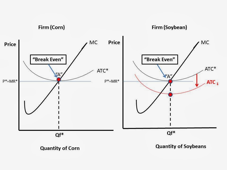
Here are the firm graphs I made to illustrate what is happening.  For simplicity, I am assuming all cost associated with the switch are "Fixed Costs" and will only affect the Average Total Cost ("ATC") of producing.  I did not want to shift the Marginal Cost curve too because it complicates things.  If I did it would show the MC curve shifting to the RIGHT and the Quantity of Soybeans would increase, just as the article states.

The Price the farmer receives is the same for either crop (as mentioned in the article) at "P*=MR*) but his cost of producing soybeans is LESS than the cost of producing Corn per acre.

Ceterus Paribus, the ATC curve for soybeans shifts DOWN and the farmer is now making some economic profits in soybeans as compared to "Breaking Even" when he produces Corn.


Thursday, February 13, 2014

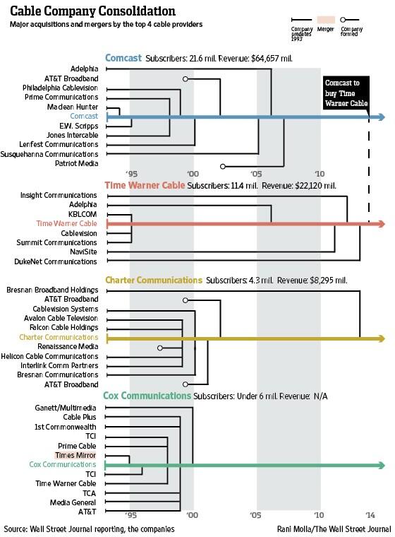
Nice graphic showing the consolidation of the Cable TV provider market since 1990. Is this a good thing? Bad thing? Or just a thing that we have to accept?

In AP Microeconomics we are discussing the various forms firms can take in terms of market concentration: Perfect Competition, Monopolistic Competition, Oligopoly, and Monopoly.

Here is a graphic from the Wall Street Journal that shows the consolidation of the cable TV industry since 1990. There is a nice Q&A regarding some of the details and ramifications of the deal.  If the recent move by Comcast to purchase Time Warner Cable (TWC) goes through there will be 3 main cable providers in the US.

The market is clearly one operating in the mode of an Oligopoly:
Oligopoly is a common market form where a small number of firms are in competition. As a quantitative description of oligopoly, the four-firm concentration ratio is often utilized. This measure expresses the market share of the four largest firms in an industry as a percentage--Wikipedia
 The key question will be how this affects the price of cable.  They would say scales of economies and efficiencies (fancy way of saying duplication of tasks will reduce labor and administrative costs) will keep prices from rising. Economic theory suggests less competition gives the firm more pricing power. There are some substitutes for it, such as satellite, but a significant part of the market is still hardwired for cable.

Now I see why people stockpile supplies in bunkers. The rest of us cannot control ourselves in times of crisis. See the empty shelves here

Quantity Demanded is greater than Quantity Supplied.  A problem across the South and Southeast.

Much higher prices would served to limit peoples purchasing at the margin.  That is a fancy way of saying pay more so you will leave some for the rest of us, please.

Limits on quantities do not work.  You start a revolving door of the family going in an out to buy stuff or having the kids stand in line with your purchases.

Higher prices might be distasteful but you might actually GET a taste-full (or a full taste)  if people left some food on the shelves.

We can feel good that prices are still low but we do it with hunger pangs or we can complain about high prices while snacking on a bag of chips.

View image on Twitter

View image on Twitter

View image on Twitter
View My Stats