Friday, February 14, 2014

Chart of pizza consumption by age and gender. Can anyone explain to me why guys stop eating so much pizza after the age of 19?

Here is a bar chart (from Reason who got it from the USDA) showing the US daily consumption of Pizza by age group and gender.

The distribution seems right to me by age and gender.  The only thing I am curious about the large percentage drop-off for males past age 19 into the next category, 20-39.

Female consumption drops off 28% (18% to 13%) but males drop 38% (26%-16%).

Any guesses as to why?


pizza chart
Source: Via Reason

Nice pie charts showing the consolidation in the Telephone/Wireless business since 2003. Not many wagons in the circle anymore...

Yesterday I posted a graphic showing the consolidation since 1990 of the TV cable provider industry.

Today Quartz has a graphic showing consolidation of the Telephone/Wireless industry since 2003.

Consolidation implies economies of scale will make providing service less expensive good for consumers.

Consolidation implies increased pricing power for the companies over consumers good for the business.

Consolidation implies costs go down, prices go up and economic profits increase.  Doubly good for the business.  I think we have found a winner! :)

Source: Quartz

Nice article teachers and students can use to analyze Perfect Competition. Corn vs Soybeans. May the be best crop win.

In AP Microeconomics one of the types of market structures we study is of firms that operate in a "Perfectly Competitive" market.  This means: (1) there are many producers, (2) they produce an identical product, (3) there is easy entry and exit from the market, (4) low barriers to entry into the market, (4) the firm is a "price taker". Each individual farmer has no control over the price they receive for what they produce.

Farmers in the agricultural industry are the best (and closest) example to illustrate a Perfectly Competitive Market.

In the article excerpted below (Bloomberg)  a farmer is looking at the price he can receive for growing either corn or soybeans ("Price Taker").  His land is suitable for producing either corn or soybeans ("easy exit from corn, easy entry into soybeans") and it is not costly to switch from one to the other (low barrier of entry--he has the equipment and know-how to grow either).

He has no particular love for either crop.  He is simply measuring what he can receive for each acre planted and harvested against the his cost of planting and harvesting each acre.  The difference is his profit per acre.

This is a great article for teachers and students to show with the two graphs necessary to analyze the perfectly competitive market:  The Firm Graph and the Market Graph.  Both are taken into consideration here.
Soybean Switch on U.S. Corn Farms Expanding World Surplus
Corn is no longer king on Todd Wachtel’s 5,500-acre farm inIllinois. After prices fell to a three-year low in January, he will cut planting by 20 percent in 2014 and devote half his land to soybeans, which are cheaper to grow and just as profitable for the first time in four years. 
Across the Corn Belt, growing the biggest U.S. crop had been an easy choice for farmers since 2009. Annual revenue was $150 per acre more than soybeans on average for Wachtel, who sowed 3,450 acres of corn in 2013, or 63 percent of his land. This year, lower prices mean both crops will earn $10 to $20 an acre, so Wachtel is reducing his risk by sowing more soybeans, which cost $220 less per acre to grow than corn. 
“You are putting less money at risk for the same profit,” Wachtel, 42, said by telephone from Altamont, about 220 miles (354 kilometers) south of Chicago.
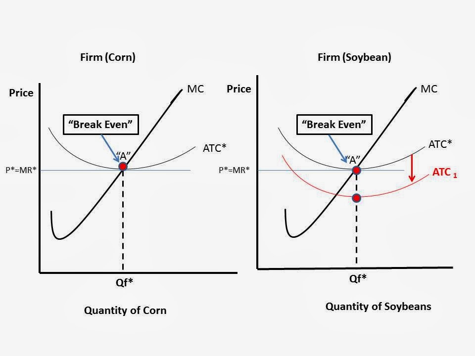
Here are the firm graphs I made to illustrate what is happening.  For simplicity, I am assuming all cost associated with the switch are "Fixed Costs" and will only affect the Average Total Cost ("ATC") of producing.  I did not want to shift the Marginal Cost curve too because it complicates things.  If I did it would show the MC curve shifting to the RIGHT and the Quantity of Soybeans would increase, just as the article states.

The Price the farmer receives is the same for either crop (as mentioned in the article) at "P*=MR*) but his cost of producing soybeans is LESS than the cost of producing Corn per acre.

Ceterus Paribus, the ATC curve for soybeans shifts DOWN and the farmer is now making some economic profits in soybeans as compared to "Breaking Even" when he produces Corn.



Thursday, February 13, 2014

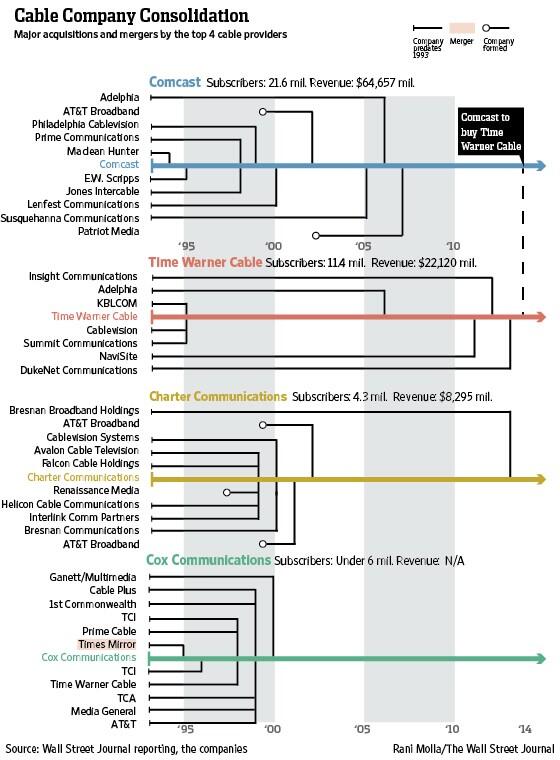
Nice graphic showing the consolidation of the Cable TV provider market since 1990. Is this a good thing? Bad thing? Or just a thing that we have to accept?

In AP Microeconomics we are discussing the various forms firms can take in terms of market concentration: Perfect Competition, Monopolistic Competition, Oligopoly, and Monopoly.

Here is a graphic from the Wall Street Journal that shows the consolidation of the cable TV industry since 1990. There is a nice Q&A regarding some of the details and ramifications of the deal.  If the recent move by Comcast to purchase Time Warner Cable (TWC) goes through there will be 3 main cable providers in the US.

The market is clearly one operating in the mode of an Oligopoly:
Oligopoly is a common market form where a small number of firms are in competition. As a quantitative description of oligopoly, the four-firm concentration ratio is often utilized. This measure expresses the market share of the four largest firms in an industry as a percentage--Wikipedia
 The key question will be how this affects the price of cable.  They would say scales of economies and efficiencies (fancy way of saying duplication of tasks will reduce labor and administrative costs) will keep prices from rising. Economic theory suggests less competition gives the firm more pricing power. There are some substitutes for it, such as satellite, but a significant part of the market is still hardwired for cable.

Now I see why people stockpile supplies in bunkers. The rest of us cannot control ourselves in times of crisis. See the empty shelves here

Quantity Demanded is greater than Quantity Supplied.  A problem across the South and Southeast.

Much higher prices would served to limit peoples purchasing at the margin.  That is a fancy way of saying pay more so you will leave some for the rest of us, please.

Limits on quantities do not work.  You start a revolving door of the family going in an out to buy stuff or having the kids stand in line with your purchases.

Higher prices might be distasteful but you might actually GET a taste-full (or a full taste)  if people left some food on the shelves.

We can feel good that prices are still low but we do it with hunger pangs or we can complain about high prices while snacking on a bag of chips.

View image on Twitter

View image on Twitter

View image on Twitter

Tuesday, February 11, 2014

Stay in school kids. It is more important than ever. MUST SEE GRAPHICS that support this view. Ignore at your own peril!

The Pew Research Center has a nice report on the importance of education as a source of personal economic stability.
The Rising Cost of Not Going to College
"...On virtually every measure of economic well-being and career attainment—from personal earnings to job satisfaction to the share employed full time—young college graduates are outperforming their peers with less education. And when today’s young adults are compared with previous generations, the disparity in economic outcomes between college graduates and those with a high school diploma or less formal schooling has never been greater in the modern era...."
The underlining is my emphasis.  Read that again!

Here are a couple of graphics that support this view. There are more at the link above and an extensive discussion of the subject. I encourage you to take a look at it.


CVS's decided to stop selling cigarettes....OR DID THEY?

CVS, the large pharmacy and other dry goods chain, recently announced that it would cease selling cigarettes and all other related tobacco products. However, in that they did not include Electronic Cigarettes or "E-Cigarettes" in that decision.  Here is an article in TIME that goes into more detail.

Regular tobacco based cigarette smoking has been on a downward decline for some time now.  But the sale of e-cigarettes have grown significantly.

Perhaps it was a stroke of public relations genius on CVS's part to cease selling a product that they believe is on the long term decline but leave open the possibility of selling a similar product that is on the rise.

It will be interesting to see what they do.


50 years ago today the Beetles played their first concert in the US. How much do you suppose a ticket cost? See it here and how a minimum wage worker is 64' could get a ticket with little effort.

Here is an print advertisement for the first appearance of the Beetles in the US.

The RED circle marks the price of a ticket to this epic event exactly 50 years ago today.

In 1964 the minimum wage was $1.15 (increased to $1.25 in Sept 1964), so it would take 5.2 hours for a working stiff to buy himself and his significant other two medium priced tickets to the concert.

Usually at this point I would take today's minimum wage and divide it into the price of a similar concert in scale and scope in order to compare the purchasing power of the minimum wage in each time period.  However, I think it is not necessary in this case. It would take far more hours of work to buy a mid-priced ticket to a big time, one of a kind concert today.

The minimum wage worker in 1964 wins.  Hope they had a good time.


Edit: Here is the ticket for the Final Concert for the group.

It cost $6.50 in 1966.  The minimum wage in 1966 was $1.25.  It would have taken 10.4 hours to earn enough for two tickets. (note: not sure if this ticket is comparable to the one above in location or quality).

To purchase 2 of the expensive tickets ($4.00) for the first concert at the 1964 minimum wage of $1.15 it would have required 7 hours of labor.  In terms of Beetles concerts, the minimum wage still had more purchasing power in 1964.  However, the quality of the show in 1966 may have been better and it was in the middle of the hippie years in San Francisco.  I am guessing fun quotient was much higher so that might compensate for some of the decline in actual purchasing power.  :)


"The Sky is Falling (on low wage jobs)!!". Chicken-Little should now. She has seen it happening down at the processing plant..

If you are teaching or learning about how the adoption of technology by industry is changing the labor force, here is a short article that nicely illustrates the point.  It stretches far and deep.  Even in the chicken raisin' business.
Technology aiding poultry industry
"Technology has changed the way the processing plants work just as much as it's affected the live operations side of the industry. Mike Tirrell, vice president of human resources and business services for Mountaire, remembers in the early 1980s, when the processing of a chicken was done entirely by hand. Today, machines handle the work that was once done by employees. 
Burly workers no longer stack boxes onto pallets — machines do. Low-level laborers don't wrap the yellow trays of chicken in plastic — machines do. The job of processing plant employees these days is to supervise and assist those machines. Tirrell says that has enabled the company to grow without adding many employees. 
That has helped keep the price of chicken down for the consumer, he said. 
"The price of chicken is static," Tirrell said. "That's the result of efficiency in business."
I underlined the key parts as it applies to labor. This trend is a silent killer of jobs on the low skill/low end of the labor market. While I fully understand this process creates jobs elsewhere in the economy, the workers in the chicken killin' business are not likely to be the designers and producers of the technology that replaced them.

The hope is their children will someday.

Stay in school, kids.  Some jobs are just destined to fly the coop....Thank God.  :)


Read more here: http://www.modbee.com/2014/02/08/3177314/technology-aiding-poultry-industry.html#storylink=cpy

Saturday, February 8, 2014

Nice resource on trade balance in the US. Or I should say trade imbalance.

If you are teaching or learning about trade here is a nice concise resource for the year 2013.

It shows the dollar values of exports and imports from and to the US.  It also shows the general categories of goods that the US trades in with the rest of the world.

I highlighted Exports in yellow, Imports in red and the overall trade numbers in green.

The US had a merchandise (this DOES not include trade in services) trade deficit $650.857 Billion with the rest of the world. In other words, we bought $650.857 Billion dollars more in "stuff" than we sold to the rest of the world.

We love foreign made stuff!  Is this a good thing, bad thing, or just a thing?


We all know "education pays" in terms of income but it also pays in employment consistency. Interesting graphs here that make this important point.

It is clear that "education pays" in terms of absolute income people earn over their lifetime---the more you learn the more you earn.

But another benefit of more education is the likely-hood of having gainful employment on a continual basis.  If you lose your job you are more likely to find another one in a relatively short period of time.

This graph from the Census Bureaus American Community Survey illustrates this nicely.

I inserted a RED line at the age of 60 to show the difference between years of work experience a person would have at the various levels of education.

You can see clearly someone with less than a high school diploma fares the worst by far with only about 27 years of work experience on average. Those with a college degree (or more) and those with some college trend together with 40 years of experience.  High school graduates lag by less than 5 years.

Stay in school, kids...


For more support here is a graph from the same American Community Survey that shows median monthly income by education level and years of experience.  I put a RED line at the end of the data lines at 35+ years of experience. Dramatic, is it not?

I repeat. Stay in school, kids!


Friday, February 7, 2014

Inflation is not a boring topic. It is a thief in the night and the root cause of rebellion around the world. Can't get more exciting than that! See here why...

When I introduce the concept of  inflation in class I teach it from two angles. 

I tell students it is like a thief in the night.  It does not actually take money away from you but it makes the money in your pocket worth less (not to be confused with worthless) than it was worth yesterday.

Example:  A bottle of water costs $1.00 today.  I exchange one dollar for the water. Assume tomorrow the water is $2.00.  We certainly can say that the price has increased by a dollar, but I think it is more powerful and meaningful to say yesterdays dollar is worth half of what it was 24 hours earlier. I now have to give up two one dollar bills to get the bottle of water OR I can only buy half a bottle!

Another point I like to make is inflation creates social instability, especially for people in poorer, developing countries where a higher proportion of cash money is spent on "needs"---food, water, shelter, etc.

In many places where social instability or outright rebellion is happening if you rewind the events to the root cause it often started with rising prices on basic staples in the marketplace.

You can get students and other young people to protest in the streets for "democracy, freedom, etc" BUT you can get moms, dads and grandparents to join them if prices rise unexpectedly.  Movies are made about fights for freedom from oppression. Not so much about the real cause--loss of purchasing power due to inflation.

Do the research.  I think you will find this is true.  Look for it going forward.

Oh, wait, you don't have to!  Just read about this VERY THING here in the WSJ:
Inflation may lead to social unrest in developing countries because rising prices are especially painful for households that rely heavily on cash as a store of wealth, according to recent research from the Federal Reserve Bank of St. Louis. 
Yi Wen, an assistant vice president in the St. Louis Fed’s research division, wrote in a new working paper that in developing nations, “liquid money [cash and checking accounts] is the major form of household financial wealth and a vital tool of self-insurance [precautionary saving] to buffer idiosyncratic shocks because of the lack of the well-developed financial system.” 
Mr. Wen also noted “historical evidence” that “moderate inflation [around 10% to 20% a year] may be significant enough to cause widespread social and political unrest in developing countries.

My salute to "Multiple Job Holders" in the US. Their numbers have increased significantly over the last year. This can't be good, can it??

The monthly jobs report has a lot of interesting data on employment/unemployment that is seldom reported on in the general media.

Here is one I find interesting: "Multiple Jobholders".

Highlighted in YELLOW are people whose primary and secondary jobs are BOTH part time.  There are 1.892million of them in January 2014.  That is a 6% increase over January of 2013.

Highlighted in RED are people whose primary and secondary jobs are BOTH full-time! There are 236,000 of them.  That is a 12% increase over January of 2013.

This means over the past 12 months there are 131,000 more people who gained at least one additional job (or both of them).  That is equivalent to the number of jobs created in the month of March of 2013.

Payin' the bills....


Your first look at January's Jobs Report. 113,000 new jobs created. Way below estimates from Left AND Right economists. Tepid at best.

Businesses created a total of 113,000 new jobs in January.  This is way below the general consensus of economists on the Left AND Right that about 185,000 were expected.

Highlighted in YELLOW are the areas where the jobs created in January 2014 were above the past two months level and higher than one year ago (Jan 2013).

Highlighted in RED are the areas where the the jobs created are below the past two month level and lower than one year ago.]

Highlighted in GREEN are the total for the overall "Goods Producing" sector which is higher than in prior periods, and "Private Service Producing" sector which is much lower than in prior periods.

"Government" at the bottom is down significantly.  This category includes Federal, State and Local employment.  The BLS reports that 9,000 of the job losses come from the US Postal service alone.

Source: BLS


Thursday, February 6, 2014

US Gross State Product vs a Nations Gross Domestic Product.

A neat map that matches a US States Gross State Product (GSP) with the Gross Domestic Product (GDP) of country that with a similar dollar value of the production of goods and services.

For instance, the dollar value of output produced by Texas alone is roughly the same as the dollar value of output produced by ALL of Canada.

A nice perspective on the just how the US is STILL a powerhouse in producing "stuff".

View My Stats