Monday, January 27, 2014

My take on the Big Mac Index---the Big Mac Inflation Index. Am I onto something???

The Economist is out with its latest update on the Big Mac Index.  It is a playful illustration of the exchange rates and Purchasing Power Parity given just one commodity--McDonald's Big Mac.  Find out more about it HERE.

When I looked at the historical data available with the index I noticed in some countries the price of a Big Mac had changed quite a bit.

So I took the posted prices in the countries own currency from January 2012 (3rd column) and January 2014 (2nd column) and calculated the percent change in price of Big Mac (4th column).

The numbers are in descending order, from highest to lowest change in price.

I highlighted in RED the countries where the percentage price change was higher than the world wide average change in price of 9.28%.

Here is an assignment for you.  Check a few of the countries ACTUAL inflation rates and see how they correlate to the change in prices of Big Macs.   Maybe we have discovered a new fun measure of inflation---The Big Mac Inflation Index.  Just  send me some royalties. That's all I ask for.  :)


Sunday, January 26, 2014

I compare the cost of a cook-out in 2013 with one in 1968 at average hourly wages and minimum wages for the two time periods. You won't believe the results!

I came across this grocery store advertisement from 1968 and decided to use it for a lesson on purchasing power. It is nice to have actual prices from a primary source.

In the red square I isolate the meat products.  Let's assume we are stocking up for a killer cook-out!

To simplify assume we will purchase 5 pounds of each meat (a 20 pound turkey is the exception AND I won't buy oysters as they are not a meat).

Now I shop...I buy all the other items and put them in my "market basket" and pay for them. You are going to have to take my word that I did the math correctly OR feel free to double check me.

Total:  $61.95 in nominal dollars in 1968.

Source HERE
According to the Bureau of Labor Statistics and its measure of the Consumer Price Index, the broad category of meat has increased in price by 6.3 times.

That means to purchase the same meat items today would cost about ($61.95 X 6.3) $390.00.

In 1968 the average hourly wage for a production worker in December 1968 was $3.11.

That means it took that worker 19.9 hours at $3.11 (pre-tax) to earn enough to purchase the market basket.

In December 2013 the average hourly wage for a production worker was $20.35.

That means it took a 19.16 hours at $20.35 (pre-tax) to earn enough to purchase the market basket.

Conclusion?  I suppose we can say that in terms of the purchase of meat for a cook-out, the purchasing power of a worker earning the average wage in 1968 and in 2013 was roughly the same.

How about applying the same analysis to the respective minimum wages?

In 1968 the minimum wage was $1.60. It would take a minimum wage worker 38.72 hours to earn enough for the meat.

In 2013 the minimum wage is $7.25.  It would take a minimum wage worker 53.79 hours to earn enough.

WOW!  That is pretty dramatic.  At least in terms of purchasing power, the minimum wage worker in 1968 was better off than his or her counterpart in 2013.

Maybe that is why I remember having so many more cook outs in the neighborhood when I was a young lad (born in 1960).

Note: Here are the price index information for 1968 and 2013 that I used.  I divided 237.576 by 37.8 to get the 6.3 times increase in the price of meats.


Monday, January 20, 2014

My small contribution: Something to make you think about "Privilege" as we mark MLK Day...

At church yesterday we had a visiting pastor and his topic was Injustice.  Apropos on this day we reflect on the life of MLK Jr.

He quoted some passages for a book by Andy Crouch: Playing God: Redeeming the Gift of Power.

The two passages below are secular and define the concept of "privilege" in terms even I could understand. I have been thinking about them since yesterday.  So I bought the book on Kindle and re-read the passages the pastor quoted and then some.
"Privilege is a special kind of power. It is a form of power that requires no effort. Indeed, only in unusual circumstances do we become conscious of it at all. Most of the time, privilege just works on behalf of those who have it, never making the slightest demands of them. The best way I know to define privilege is the ongoing benefits of past successful exercises of power. Privilege is the name for all the good things we do not need to try to acquire, because they simply flow to us as a result of past exercises of power.' (underlining mine)
This next one relates to an incident Mr Crouch had at the airport in Mumbai. where an airport worker moved him to the front of the line ahead of a group of men who were going to Saudi Arabia to work as laborers. It explicitly put the esoterica of privilege in front of him and required him ponder how much of his life, by virtue of who he is and what he looks like, is predicated on a privilege never earned.
"And privilege is dangerous because of how easily it becomes invisible. The incident in the Mumbai airport has haunted me ever since. There was nothing I had ever done to deserve to be put in line in front of these hard-working men. If anything, quite the reverse. I was simply the beneficiary of privilege, of rent— a free pass in excess of anything I deserved or even wanted. But what really has haunted me is this question: How many times have I been put at the front of the line without even knowing there was a line? How many times have I walked through a door that opened, invisibly and silently, for me, but slammed shut for others ? How many lines have I cut in a life of privilege?"
What was interesting about this encounter is the reaction of the men in line.  This is what they expected to happen.
"But as I walked off toward the boarding gate, flushed with surprise and embarrassment, I could not detect the slightest surprise or discomfort in that line of men. It gradually dawned on me that not only were they not surprised that I had been ushered to the front of the line— they had expected it the moment I arrived. They had understood what was happening long before I did. They knew about something I was only beginning to understand: the power of privilege."
As you go about your day look for explicit and implicit examples of the power of privilege and whether you (or others) are the grantee or the grantor of that privilege.

Book source:   Crouch, Andy (2013-09-09). Playing God: Redeeming the Gift of Power (p. 154). InterVarsity Press. Kindle Edition.


Inequality down on the farm. This explain a lot regarding the power of Big Agriculture.

Big versus Small Agriculture in one graph.

Look at the 2 left most dark and light blue bars.  Approximately 50% of US farms are between 1 and 49 acres in size, representing about 4% of cropland in the US.

Look at the 2 right most dark and light blue bars. Approximately 5.6% of US farms are 1,000 acres or more in size, representing 53.7% of US cropland.

Source: USDA ERS
The data below from the US Census puts a broader face on the graph above even though it is from 2007.  The numbers are different but that could be because of the way each agency measures the data or from 2007 to 2011 the market could have changed.  Probably a little of both explains the different numbers.

However, the point remains the same:  There is a huge gap between small(ish) and Big Agriculture.

Source: US Census

Saturday, January 18, 2014

US government pays-off Brazilian Cotton Farmers so they don't complain about subsidies the US govt pays to wealthy US farmers. Got that? See here how much...

Your government at work.  This is how easy it is to spend other peoples money.

In order to keep Brazil from retaliating with trade sanctions over subsidies to US cotton farmers,  the US Dept of Agriculture paid them $174 million dollars to, well, not do that.

From NPR:

Why U.S. Taxpayers Started — And Stopped — Paying Brazilian Cotton Farmers

When he says "the rules," he means the rules of the World Trade Organization, which govern global trade. Back in 2002, Camargo went to the WTO with his complaint, arguing that the U.S. was illegally subsidizing its cotton farmers. He won. The U.S. appealed the decision, and lost again.
As the fight went on, Brazil threatened to retaliate with trade sanctions if the U.S. didn't stop subsidizing cotton.
And finally, in 2010, U.S. representatives made Brazil an unusual offer. They said: The subsidies to U.S. cotton farmers are part of U.S. law, and will continue for as long as the current Farm Bill is in place. So, the negotiators said, until the next Farm Bill passes, the U.S. will pay Brazilian cotton farmers $147 million a year.
"For Brazilian farmers, it's a lot of money," Camargo says. The Brazilians took the deal. And, every month, the U.S. sent over $12 million to Haroldo Cunha, president of the Brazilian Cotton Institute.

Friday, January 17, 2014

See video of a skateboarder stealing a 32" flat screen from Target. I found a picture of the one his Dad stole 20 years ago. Kids have is SOOO much easier today...

Here is a video of a young man stealing a 32" flat screen t.v. from Target and making his getaway via skateboard.  You see a crime, well I do too, but I also see the marvel of technological advancement that made this crime likely unsolvable.

He could easily tuck that television under his arm.

My question is, could his Dad have done the same thing 20 years ago around the time his son was born?
(yes, I am casting an aspersion).

Here is a 32" Sony Trinitron from 1994.  I had one of these.  Must have weighed 50-60 pounds, at least. Maybe more.  One most certainly could not ride a skate board with it in your arms.

Today's Big Screen TV:  Better quality, less expensive, fewer resources needed to build it, more efficient...oh, and MUCH easier to steal on your own...

Nice graph showing how college students get poorer and colleges get richer through subsidies.

Everyone knows the cost of college has increased dramatically in the last 30 years. But by how much?

The graph below is from a study at the Mercatus Center at George Washington University.  It show the difference in the publicly posted LIST TUITION PRICE that colleges charge and the NET TUITION PRICE that students actually pay after grants (Federal and/or State), scholarships, and other aid provided to students by various entities.

I doctored the original graph and put some numbers to it.  The BLACK line to the left indicates the year 1993/94 and the RED lines to the right indicated 2012/13.  I wanted to show a 20 year change.

All prices you see below are in 2012 dollars.

In 1993/94 the average list price for in-State tuition for a US Public college was $4,000 but students only ended up paying $2,000.  That is a subsidy of $2,000 or 50% of the list price.

In 2012/13 the average list price for in-State tuition was approx  $8,800 but students only paid $3,000. That is a subsidy of $5,800 or 66% of the list price.

The list price of tuition increase by 120% in 20 years but the net price paid by students increased by only 50% (from $2,000 to $3,000).

While students are paying more, the subsidies they receive (or I should say received by the colleges on the students behalf), is increasing at a faster rate.


Thursday, January 16, 2014

Sacrifice: Americans decreased the number of meals eaten out in order to buy pet food for their pets during the recession. OR DID THEY? The Gumment' says yes, but I am not so sure. Tell me where I am going wrong...

Here is a quick lesson on elasticity AND how deceptive data can be.
From 2007 to 2011, spending on pets stayed close to 1 percent of total expenditures per household, despite the recession that occurred during this time. Spending on pet food stayed constant or increased during the recession, even while spending at restaurants fell.
OR DID IT??

The chart below (from BLS) the average yearly spending on Pet Food (Left Axis) and "food away from home"(Right Axis).  The yellow area represents the time span of the recession (Dec 2007 to June 2009)

It appears spending on our pets dietary needs stayed relatively constant throughout the recession, whereas spending on meals away from home took a nosedive.  One could conclude that the income elasticity of demand for pet food is relatively INELASTIC (quantity demanded did not change much relative to the decrease in income during the recession) and the income elasticity of demand for meals away from home is relatively ELASTIC (quantity demanded changed A LOT  relative to the decrease in income during the recession).  In other words, people did not buy less pet food but bought fewer meals out of the house.

But is this TRUE??
Source: Bureau of Labor Statistics
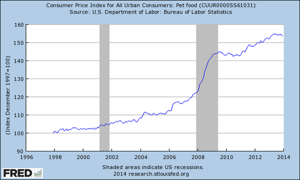
Look at this chart  below from economist Justin Wolfers via Twitter.  It shows how much the price of Pet Food as a category in the Consumer Price Index (CPI) changed over time.  Notice the even during the recession the price of pet food increased dramatically.

The chart above does not say it adjusts for inflation.  So, it is possible (likely) that the quantity of pet food purchased DID actually decrease but the higher price for the smaller quantity makes it appear that the same amount of pet food was sold.  The numbers in the chart are nominal. To adjust for inflation to find the real value we would have to know the quantity of pet food.

I think it is safe to say that Americans bought less of BOTH goods during the recession.

Do I have it right???

Embedded image permalink


Nice graphic showing all the items in the Consumer Price Index. Lots of numbers but I see something else...

Here is a graphic (Business Insider) that presents the latest Consumer Price Index (CPI) for November (2013) in a very helpful way. It orders the change in prices of the items in the "market basket" of goods and services the Bureau of Labor Statics tracks on a monthly basis from high to low.  There are 175 items listed below.  The numbers are small because they represent the percentage change from a year earlier (November 2012).

If you were to add up all the positive numbers that extend to the right and subtract all the negative numbers that extend to the left  you would come up with a year over year percentage change of 1.2%.

Relatively low inflation, indeed.

Observation:  What you see is a bunch of numbers.  What I see is globalization.  Compare the change in prices of the top and bottom 10 items. The goods and services at the top of the list are considered "Non-Tradable" items. They are produced domestically and are virtually impossible to "off- shore". They are not so much subject to global competitive price pressure. These prices tend to increase consistently.

The goods at the bottom are "Tradable" and subject to the competitive price pressure of being produced off-shore.  These prices tend to decrease, or at least remain stable, over time.

Source Business Insider (go here for larger image)

Wednesday, January 15, 2014

A scene from "Wolf of Wall Street" plays out in real life (sort of). See the daily chart of the penny stock that went through the roof because of mistaken identity.

Opps! Here is a nice example of "Animal Spirits" on steroids.

Google recently announced it was going to purchase a company called Nest,  that makes high tech thermostats and fire equipment, for $3.2 billion dollars

However, it looks like the biggest (in the short term anyway) beneficiary is a company called NESTOR that is traded in the stock market under the tracking name "NEST".  See the confusion?  However, Nestor makes and sells traffic control equipment to cities.

Prior to Google's purchase NEST was traded on the stock market for, get this, $.0020 cents PER SHARE. Yes you read that right.

Below is a screen shot of the stock from Yahoo Finance I took a few minutes ago.  You can see the price is invisible until yesterday afternoon.  It had a meteoric ride up to $.10 cents.

So, if you bought $1,000 dollars of NEST at $.0020 per share you would own 500,000 shares.  If you were able to sell at the high point you would have ($.10 X 500,000 shares) $50,000.

That is quite a rate of return.

Note: you can see the price I snapped on is $.0021 (in blue near the time and date).  I could not get the cursor to settle on the low point of $.0020)

How to smartly use the Community College system to reduce the cost of getting a 4 year degree. It is important to choose your classes wisely


Unless you are rich, a star athlete, or your parents were able to fund a 529 educational savings plan, then you are going to be concerned about paying for college.  There are several well established ways to help reduce the cost of going to college, but I would like to discuss one, Community College, that is often recommended but the improper use of them could pose problems for students as they move to their chosen university.

All classes are not created equal.  While there are absolutely some exceptions, core subject classes at 4 year universities are more rigorous than the equivalent class at a Community College.  I know, that is not polite to say, but it is important to acknowledge so correct decisions can be made.

Here is what I suggest to students to economize on the cost of college by taking advantage of the Community College system.  Take the core classes at a local Community College that DO NOT directly pertain to your prospective major. For instance, if you are going to be a math major do not take math classes at a Community College.  Instead take the English, Social Studies or Theater classes that are required of you even if you are a math major.  Take ALL your math classes when you get to your chosen university because, for the most part, they are going to be classes that build upon themselves as you move through the universities math department.  I believe this will ease the transition to the upper level junior and senior level classes.  Not having establishing that solid base by taking the introductory core classes within your major’s department will put you at a disadvantage.


Bottom-line:  Save money by taking classes at a Community College that are not within your chosen major.  Resist the temptation to do otherwise.  I hope you will be thankful for this advice because (1) you reduced the cost of college for yourself and (2) you excelled in your major because you took the right classes at the right time.


Having fun with the Consumer Price Index. Can you spot the goods produced domestically? Internationally? Good times!

Economist Tim Taylor posted this chart on his blog.  It shows how prices, as calculated by the Bureau of Labor Statistics (BLS) through the compilation of the Consumer Price Index (CPI), have changed over time

The BLS calculates the CPI by surveying a "basket of goods and services" that a typical consumer might purchase on a daily, weekly, monthly or yearly basis.  They then determine a Price Index that results in number in base 100 form. The base year CPI is always 100. If in a subsequent period the Index is different from the base year Index then we can say the price level has increased or decreased.  This gives us some measure of inflation or deflation in the economy.

Currently the BLS uses the time period of 1982 to 1984 as the base year for the index for most of the goods and services in "the basket".

So, using 100 as our base we can see how the prices of various goods and services have change over time.

For instance, the category of "College Tuition and Fees"  has a current price index of 706.  This means that it is 606 index points higher than it was in its base year of 100.  We can infer from this that the price of college and it various fees has increased by 606% since the 1982-84 time period.


Every Index number you see that is OVER 100 means the prices of those things have increased over time. Every one under 100 means the prices of those things have DECREASED over time.  To find the percentage change just take the Index number you see in the chart and subtract 100.

Observation:  There are many things going on here and Professor Taylor writes of several.  I would like to add one more that he did not.  Look at the items at the bottom of the list.  Notice Toys and Televisions have actually DECREASED in price A LOT.  Durable Goods (cars, wash machines, etc) and Apparel have increase only marginally since 1982-84.  I see the effect of globalization on the bottom few categories. Production of those items have increasingly moved to low(er) cost production countries.  The categories as you move to the top are goods or services that are not easily, if at all, mobile in terms of where they can be produced.

Here is the link to the most current Consumer Price Index.  Go to it and see if there are other goods or services that conform to my observation (or not).  Really, go do it. IT IS FUN!!

Tuesday, January 14, 2014

Understanding the difference between credit and debt. One makes us happy and the other doesn't, right? Why are we so dumb when it comes to this distinction? Find out here!

My cyber friend over at The New Arthurian has a posting (HERE) I think is very important for students and young adults. It will make your financial life much better if you understand the distinction between "Credit" and "Debt".
No debt produces anything. New uses of credit can sometimes be for productive purposes. But after that money is spent, nothing remains but the evidence that it was credit we were spending: Nothing remains but the debt.  
Debt is evidence of credit use. Debt is the cost associated with credit use. 
Borrow a dollar today, spend it today, and boost the economy today. Tomorrow, nothing remains but a dollar of debt, the cost of interest on that debt, and the cost of repayment. These costs do not boost the economy. Just the opposite, in fact. This is true no matter who borrowed the money. It is true, no matter what the money was used for. 
In the short term your income is fixed.  After you pay taxes what you have left over is termed your "disposable income".  All of that disposable income will go towards meeting "needs" and "wants".

Going outside of our disposable income to buy something with credit to meet a need and/or want leads to a debt that requires us to pay, not only the amount we borrowed, but the interest for the privilege of having that credit extended to us. That principal and interest did not exist to us before.

It WILL exist going forward and BOTH will have to be paid for out of your fixed disposable income.

When you pay interest on a debt it means an amount of money comes out of your disposable income that you COULD HAVE used to buy something else.  But you can't. Probably not for a long time. You committed future earnings to pay for this past purchase when you accepted the credit. I repeat: a part of every paycheck going forward is committed to a past purchase.

The original amount you borrowed PLUS the interest payment is the present opportunity cost of using credit.  It prevents you from new consumption this month, next month, next year...

Better be happy with what you bought on credit.

Here is the litmus test:  Does what you bought in the past on credit bring you the same satisfaction TODAY as what you could purchase with that principal and interest tomorrow?

Perhaps that is a false choice.  However, when I think about it in these terms AT LEAST it makes me pause and consider if that purchase is something I want to serve as a drag on my future consumption.

Hope this helps you make better financial decisions!

Sunday, January 12, 2014

NOW I know why trucks and SUV's are Top Sellers in the US. It is tax rather than a "Bubba" factor. And Bubba knows taxes...

Once in a while I will post the monthly and/or yearly car and truck sales data as a point of interest in an economic activity, auto manufacturing that is important industry in the US. (See HERE and HERE)

Without fail trucks and SUV's have been the top sellers for quite sometime.  I think it you asked most people they would say passenger-type cars (2 door and/or 4 door) were by far the best-sellers.

We underestimate the value of trucks/SUV's as a family vehicle AND one used for business purposes. From personal observation, I believe the two are mixed quite often and the US government through the tax code is very helpful in this regard.

I came across this link from an accountant informing clients of the advantageous tax benefit from the purchase of an truck/SUV for businesses purposes (link courtesy of Economix).  The accountant gives a nice example of how this works to the vehicle owners advantage:
"...For example, if you bought a new SUV over the 6,000 pound limit for $70,000 and use it 100% for business, you would be able to expense the $25,000 immediately under “section 179” and $22,500 immediately under the 50% bonus depreciation rules. The remaining adjusted basis of $22,500 is then eligible in 2013 for a depreciation deduction of $4,500. This brings your total 2013 deduction on a $70,000 purchase to $52,000..."
So, the owner the vehicle will be able to reduce their taxable income by $52,000 in the year they purchase the vehicle.  If they were in the 25% tax bracket (could be a lower or higher bracket) that means their income tax bill will be reduced by $13,000.  

This particular tax "break", created by the political system and administered through the tax code, has two goals.  One, it lowers the cost of purchasing a work vehicle that allows a business to presumably be more productive.  Two, it helps the auto manufacturers (and dealers) to produced and sell more trucks and SUV's.

This is a tax break that has been subject to lots of abuse.  A person who buys a truck/SUV and uses it for at least 50% of the time for business purposes is eligible for a tax deduction as well (around $11,500).  Go HERE for a simple explanation of how this works.

That would amount to several thousand dollars in income tax savings for someone who can justify using the vehicle 51% of the time for a business purpose.  The other 49% can be for personal use.

Remember that the next time you see a work truck/SUV (blue collar OR white collar) parked at the ball field or some place other than a work site and used for personal reasons.  

I am not judging this (or am I?). Only suggesting this COULD BE a contributing reason trucks and SUV's are top sellers.


Saturday, January 11, 2014

Made you look. Made another chart showing the change in the number of people claiming disability benefits. Now, this one REALLY perplexes me...

This is a follow up to my last post showing the change in Social Security claims by "Retired Persons" from 2005 to 2013 and how it impacts the labor force participation.  See that HERE.

Another variable that affect the participation rate is the number of people that exit the labor force via disability. Using the data base from the Social Security Administration (HERE) I charted the quarterly claims for disability benefits from January 2005 to December 2013.

The RED BARS represent the 1st quarter of each year. The YELLOW area represents the official time span of "The Great Recession".

Observations:

(1)  The large spike in disability claims in the midst of the recession was not unusual.  You can see similar one time increases took place in prior years when the economy was doing well.

(2) Post official recession (after June 2009) there was a consistent average quarterly increase up to the 1st quarter of 2012.

(3) After the 1st quarter of 2012 up to December 2013 the average decrease significantly.

(4) If you look at the averages pre-recession and post official recession you will see they are similar, 74,020 versus 74,020.  There was approx a 12% increase in average quarterly claims during the official recession.


There are STILL more people exiting the labor force than we can account for with disability claims and workers retiring.

The puzzle remains.  Where are those 100's of thousand ADDITIONAL people?
View My Stats