Tuesday, December 3, 2013

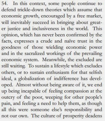
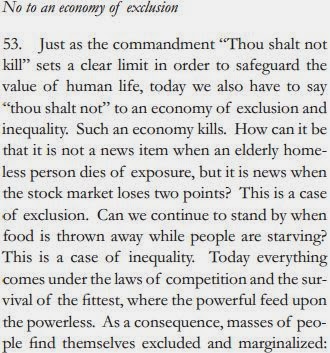
Primary Source link to The Popes comments on Economics and "Free" Markets. See what he says before and after the now famous passage...

Here is the link to the document that contains the Popes commentary on contemporary economics and, in his view, the what "Free Markets" have wrought on the world, for better or worse. (I put quotation marks around "Free Markets" as a qualifier---There Ain't No Such Thing As A Free Market (TANSTAAFM) )

The document is VERY long and has some interesting tidbits other than the one that relates to economics. If you go to the document it starts on Page 45 and goes to 51.

I thought it interesting that he believes the Church needs to decentralize and become less bureaucratic so that it can serve communities and people better---sort of like what "Free" Markets (absent Cronyism)  do.  But I digress...

I excerpted the relevant parts before and after the specific quote that is making the rounds in blogs and the talking heads on TV.  The one that refers to the "Trickle-Down Theories" is in Passage 54.


Passage 54 is the one that is being referred to: 


Saturday, November 30, 2013

Nice graphic showing Top 10 States that are recipients of Farm Subsidies and SNAP (aka Food Stamps) benefits. Shows how one political party speaks out of both side sides its ideological mouth.

A terrific graphic from the WSJ showing the recipients of Farm Subsidies and SNAP (formerly known as Food Stamps) benefits by State and Presidential candidate from the 2012 election (this suggests the overall political leanings of the State).  Both programs are funded within the context of the Farm Bill passed by Congress every 5 years and it is administered by the US Dept of Agriculture.

Focus on the "Top 10" in each category.  Notice that States in RED, indicating Republican leaning States, are heavily represented in the Top 10 of BOTH programs.  There is nothing notable about the farm subsidies and the States they go to BUT what observation can you make about SNAP subsidies in the form of food assistance?  Interestingly enough, THOSE States lean Republican as well.

The article that accompanies this graphic points out that these States don't have large urban areas and really illustrates the level of rural poverty that exists in the US.

Source: Wall Street Journal

"We lose money on every sale, but make up for it in volume"---See chart here that shows profit margins of major retailers during the holiday season vs the rest of the year...

Are Black Friday "deals" just an illusion or is there something else going on?

Here is a chart I found at Bloomberg.  It shows various major retailers (horizontal axis) and 2012 "Operating Profit Margin (OPM)" for those retailers.  Here is link to a very short and very helpful video that explains Operating Profit Margin.  In a nutshell, it is what is left over from revenues to pay taxes, interest on debt and other fixed costs AFTER all variable costs (wages, cost of the goods sold, etc) are paid.
 For example, look at the Walmart.  For the first 9 months of the year (bar with cross hatches) its OPM was a little bit below 6%--lets call it 5.8%.  This means that Walmart paid 94.2% of its Net Revenues in operating costs and has 5.8% left over to pay taxes, interest on debt and other fixed costs it incurred.

In last quarter of 2012 is OPM was OVER 6%, lets call it 6.8% (the solid BLACK bar).  So, Walmart had a HIGHER OPM during the Christmas season than during the rest of the year! It is the law of averages, I guess.  

Throughout the year it is "Every Low Prices" but during the holiday they can obscure the pricing landscape with blowout prices on some things then higher average prices ("regular prices) on complementary or select other goods.

Use this analysis to view the other retailers pricing scheme during this selling season.

Home Depot and Lowes are the only ones who have a lower OPM during the last quarter compared to the rest of the year.

All the others seem to conform to the humorous observation often made regarding retail...

"We lose money on every sale, but make it up in volume".

At least that is what we are lead to believe.
Friday, November 29, 2013

What companies comprise "The Dow" and how they have changed over time. I see Creative Destruction, globalization and division of labor. What do you see?

On the nightly news (and throughout the day on cable new stations, i.e. CNN, Fox Business, CNBC) there are  updates as to how the stock market is faring.  The most quoted measure is the Dow Jones Industrial Average (DJIA). It is also referred to as "The Dow".

What most people don't know it that this oft quoted measure comes from the performance of 30 companies. Yes, that is right, just 30.  They are generally regarded as bellwether companies that represent a large/dominant presence in their particular market sector.

This graphic below (from HERE) illustrates how the composition of the DJIA has changed over time.  Because of the shifting nature of economic due to the forces of Creative Destruction the companies that make up the Dow change as well.

Note differences from the the first column to the third.  The list on the left is heavy on mineral extraction and manufacturing.  The list on the right still has some of that but there is clearly a shift to soft manufacturing (pharma, healthcare), technology and retail. Finance/Banking/Insurance is present today where there was none in the early days.

Another observation.  The companies on the left were much more vertically integrated. Meaning they owned more of the supply chain from beginning to end (inputs to outputs). They relied less on the cooperation of others to produce their product.  The companies on the right  depend more on a globalized supply chain of outsourced and/or off-shored inputs to produce their outputs.

Source: The Conversable Economist

Wednesday, November 27, 2013

The producers of Sriracha Hot Sauce are in some Hot Water. The sauce produces a foul odor. No, it is not what you think...

Apparently the production of Sriracha Hot Sauce is imposing a non-monetary cost on the residents of the nearby factory:

Sriracha hot sauce factory production partially halted (From BBC)

""A California judge has temporarily curbed production of the popular Sriracha Asian-style hot sauce after residents of a Los Angeles suburb complained of the factory's odour.
The fumes emitted from Huy Fong Foods' factory in Irwindale are "extremely annoying, irritating and offensive to the senses", Judge Robert O'Brien said.""
In the Social Welfare unit of Microeconomics we learn how some costs, whether they be monetary or non-monetary, are imposed on parties not directly involved in a transaction between sellers (producers) and buyers.  These costs are external to the actual production of the good and are not captured in the cost of producing the good. If the producer was absorbing, or "internalizing" the cost of the nuisance, then the cost of producing Sriracha sauce would be higher.  The producer would either have to pass on the cost to the consumer with a higher price or reduce the quantity supplied at the market price.

The producer could be forced to internalize the smelly cost imposed on nearby residents:
(1) by installing scrubbing or filtering equipment to clean the refuse before it leaves the factory
(1) with a lump sum fine by the government.
(2) with a per unit tax levied by the government on each unit of production of the sauce.
(3) by paying the residents of the neighborhood a fair market value for their willingness to put up with the bad smell.

The trick is to make sure the method of internalizing the cost is equal to the cost of the externality itself.  If not then there is some social welfare lost to society.

Tuesday, November 26, 2013

Nice Map showing the intensity of economic activity in the US. The Good, The Bad and The Ugly.

Business Insider has a terrific map giving a quick, albeit shallow, geographic overview of the US economy. Green means hot economic activity, yellow average and red, well, not so good.

economics map
Source: Business Insider

Monday, November 25, 2013

Who is going to pay for the ACA ("Obamacare")? Nice graph here showing the age group that the Act is depending on to finance it. Is that a middle finger I see from you 27 year olds?

This is courtesy of the US Census.  It shows the percentage (vertical axis) of uninsured by age group (horizontal axis).  A couple of observations.

(1) the middle blue bar that shoots up over the rest represents a portion of 27 year olds who likely lost their parental coverage.  In 2010 one of the first parts of the Affordable Care Act (ACA---"Obamacare") to kick in was the requirement that a dependent child could stay on the parents insurance until age 26.  Booted off after that.

(2) the whole age group represented by the blue bars represents what is termed "The Invincibles--- Young people who have relatively few health issues and forgo purchasing health insurance because they believe the costs outweigh the benefits.  THIS is the group that the financial success of the ACA is dependent upon and the individual mandate is primarily aimed at this demographic ( I don't THINK that is in dispute).  They are going to either purchase coverage OR pay the penalty (or Tax, if you will).  Their contribution will go towards subsidizing the health care of those on the right AND left of the distribution.


Note: I added the YELLOW highlighted area as "spillover" Invincibles up to the age of 40.  Notice the drop off after 40....Guess it is time to get real for those folks!! :)

How has the "Nominal" and "Real" price of a Thanksgiving Meal changed over time? I am glad you asked. See the answer here...

Here is a handy-dandy topic you can use on Thanksgiving Day when you run out things to say to your relatives.

The American Farm Bureau has released its annual update as to the cost of a Thanksgiving meal.

Here are the items in the market basket for the "average meal" on the Big Day (not inclusive of EVERYTHING we might have for dinner) and the price change from last year to this year.  This is an informal survey of prices nationally and they certainly will vary from region to region, urban to rural, etc.

Source: American Farm Bureau
Of course there HAS to be a deeper economic lesson and I am happy to provide that for you.

This graph shows, over time, the nominal price of the ingredients (just the prices in the particular year measured) in GOLD and the inflation adjusted prices in BLUE/GREEN.

The BLUE line is relatively flat, at least since post-1990, and hugs the $20.00 level.  This suggests that the "Real Cost" of a Thanksgiving meal has not change that much in 20+ years.  Only recently has it remained over $20 in real terms for consecutive years.  On an inflation adjusted basis we have enjoyed a relatively price stable Thanksgiving feast.
Source: American Farm Bureau
 Here is a chart with the nominal prices since 1986.

Source: American Farm Bureau
Here is a link specific to Texas. A nice graphic there as well...


Thursday, November 21, 2013

We are at the same level of beef consumption per person as we were in the 1940's. Good for people, bad for cows...

Here is a graph (which I modified a bit) from The Big Picture Agriculture blog that shows Meat Consumption from 1900 to 2012 by type of meat.  It shows that on a per person basis we are back to early 1940's level of consumption of beef, about 52 pounds per person per year.  BUT down considerably for a high of 91 pounds around 1978.  I wonder what happened in the late 70' to cause the rapid descent in consumption never to recover. I am of age to know but do not remember.  Maybe Mad Cow disease first emerged???

This is good for people is terms of health, but it is not good for the health of cows.

In 1942 the US population was 135 million.  Which means Americans consumed 7,020,000,000 (7.02 billion) pounds of beef.

In 2012 the US population was 314 million. Which means Americans consumed 16,328,000,000 (16.328 Billion) pounds of beef.  That is a 132% INCREASE in the total consumption meat.

Each cow produces, on average (in 2005), 585 pounds (I am taking this sites word for it) of beef.

That means approx. 16,000 more cows are needed to satisfy the demand for beef today compared to 1940-ish.  (Math---16.328M-7.020M divided by 585).

Isn't your life better for knowing this. To celebrate I am going to eat a cheeseburger.


Gift Cards are NOT a friend to GDP accounting during the Christmas shopping season. See here why.

A little known fact to keep in mind as you think about economics while shopping this holiday season: 

How Gift Cards Could Ruin the Holidays

According to the NRF (National Retail Foundation), a record 80.6% of shoppers plan to give gift cards as presents. The average shopper plan to spend about $163 on gift cards, up from $157 spent last year. 
Retailers, however, don’t book a gift card as a sales until the recipient spends it, usually in January. That means gift-givers might think they are being very generous, even as retailers report lackluster sales for November and December. 
That suggests the correct way to measure holiday sales is averaging November through January sales. (Consequently, we may not know the success of holiday shopping season until Valentine’s Day.)
If I buy you a $50 Gift Card for Chili's that amount is not counted as a sale until it is redeemed for real goods and/or services at a later time. If it is after Dec 31st then it would not be counted in 4th quarter GDP.

However, what the retailer paid for the ACTUAL card (the "plastic") and any fee you paid to buy the card would be included in current sales as a new good or service, hence current period GDP.

Otherwise trading money for a gift card in the same amount is considered a "private transfer payment".
"These payments are considered to be non-exhaustive because they do not directly absorb resources or create output. In other words, the transfer is made without any exchange of goods or services"
If you were to include in GDP that amount PLUS what it was redeemed for in goods/services you would be "double counting" production.  

No economics degree will be offered at a University in Washington D.C. Think about that for a moment...

The irony.  This is happening at The University of D.C. (as in District of Columbia, you know, the nation's capitol) INSTEAD of cutting (or EVEN considering cutting) athletic programs.

UDC trustees keep athletics for now, but cut 17 academic programs

"One by one, with a few exceptions, the trustees terminated a series of academic degree programs the other night at the only public university in the nation’s capital.
Any discussion on economics?” asked Elaine Crider, chairwoman of the Board of Trustees of the University of the District of Columbia. “If not, all in favor vote ‘aye.’” And so the board voted Tuesday night to discontinue the undergraduate major in economics."
Hmmm....No one will be able to get a degree in economics at a college in Washington D.C. where is it needed THE MOST.

Think about that...

Tuesday, November 19, 2013

The Chicago MSA should look just like Sweden in terms of economic and social outcomes in theory. Why doesn't it in practice?

The WSJ has a nice chart ranking countries Gross Domestic Product (GDP) and inserting the Gross Metropolitan Product (GMP) for various regions in the US.  In other words, they are comparing a whole countries value of their production to the value of production for specific geographic regions in the US.

For instance, the GMP for the Metropolitan Statistical Area ("MSA") for Chicago and its environs (Joliet, Naperville, Il-In-WI)  in 2012 was $571,000,000,000.

The Gross Domestic Product for Sweden in 2012 was $525,700,000,000.  

Pretty close to each other in output value. I wondered how this worked out on a per capita (per person) basis.

The population in the Chicago MSA was 9,522,434 in 2012
The population of Sweden was 9,577,000 in 2012. (Wow! Almost identical populations)

The Gross Metropolitan Product PER PERSON the Chicago MSA was $57,695
The Gross Domestic Product PER PERSON in Sweden was $54,892

The dollar value of output per person is actually HIGHER in the Chicago MSA.

BOTH get lots of snow in the winter. Both have pretty good hockey teams.

But that is where most of the similarities end when it comes to the way people think about the two places, especially in terms of social outcomes.

Why would that be?

Monday, November 18, 2013

Only in the ObamaCare discussion: Numbers are difficult. When some = millions and when millions = some. Math is hard for ideologues.

I read A LOT of stuff from the different perspectives regarding the "Obamacare" official roll-out.

Language is important and here is something I find curious, but not surprising.

Liberal commentators/writers refer to the number of people getting cancellation notices as "some" or "JUST 5% of the population!!!", which is, of course, millions of people (are we not "equal"?)

Conservatives commentators/writers emphasize the "MILLIONS!!" who may (or may not) lose their current policies and pretty much ignore the millions of uninsured and/or un-insurable. (Opps, where did they go??)

It is a minor point but just something I picked up on in the discussions.  Put your ideology aside and listen for yourself.  I believe you will hear it a MILLION TIMES (or 5% or the time).  Choose your quantity.   :)

I like sports that produce winners and losers, but I don't like Federal polices that do the same thing.

Can't we do stuff that merges one-sides "Millions" with the other sides "5%"?  Rhetorical question....

Saturday, November 16, 2013

US production of oil exceeds the import of oil for the first time since 1994. This is either "Fracking" good news or bad news...

Depends on your opinion of Fracking.

The RED line represents imports of oil. The BLUE line represents domestic (US) production of oil.

The  RED line and the BLUE line cross circa 1994 and 2013.

In between these two time periods,  imports of oil are greater than the domestic production of oil.  It is hard to see, but 137,000 more barrels a day the U.S. produced than it imported in the week ending Nov. 8, 2013.  (the tips of the lines cross on the far right).  There are 42 gallons in a barrel.

Source: Wall Street Journal
If you were to add domestic production and imports at each of those two intersect points you would have roughly 14 million barrels per day in 1994 and  about 16 million barrels per day in November of 2013.

We are producing more ourselves (good and bad there) and consuming more overall on a daily basis (good and bad there, too). In fact, 14.3% more.

FRACK!! (insert your own tone and emphasis).

List of the 50 Greatest Breakthroughs the world has seen and why they become insignificant as time passes.

The Atlantic has compiled a terrific list of "The 50 Greatest Breakthroughs Since the Wheel". 

I encourage you to read the article associated with the list. The author does nice job of creating over-arching categories that each of the breakthroughs fall into. Notice a common word?:
1. Innovations that expand the human intellect 
2. Innovations that are integral to the physical and operating infrastructure of the modern world 
3. Innovations that enabled the Industrial Revolution 
4. Innovations extending life 
5. Innovations that allowed real-time communication beyond the range of a single human voice 
6. Innovations in the physical movement of people and goods 
7. Organizational breakthroughs that provide the software for people working and living together in increasingly efficient and modern ways
All/most of the breakthroughs identified came about as a result of MANY small innovations and discoveries aggregated over time and allowed the  "Big Idea/Product" to eventually emerge. This is an under-appreciated aspect of the process by which these game-changing ideas and products come about.

While all the items of the list stand prominent by themselves, they pale in comparison to the "spin-off" ideas and innovations that were spawned as a result of the initial breakthrough.

Think of electricity and its eventual democratization ("cheapened",or scaled, so it is available to the masses) and how it allowed the proliferation of seemingly infinite new ideas and products.  Electricity is now an afterthought and its significance is virtually lost in the process as time passes.

If you look at the list you can substitute anyone of the identified 50 breakthroughs with the word "electricity" in the above paragraph and come to the same conclusion.

Eerie, isn't it?
View My Stats