Friday, September 20, 2013

Nice set of maps (and article) illustrating where job growth in the US has occurred and the shifting of the Economic Center of Gravity

Here are 3 maps that show Job-Growth Change from 2009 to present (HT: EMSI).

They are from a TERRIFIC article you will find HERE by economist Richard Florida.  I highly recommend reading this to deepen your knowledge/awareness of the national employment situation.

It is non-political and shows how the economic center of gravity is moving from production of physical goods to the production of energy (an input) and knowledge/ideas.

The crux of the article states that this has been an Energy and Knowledge/Idea based economic recovery. It suggest these separate and distinct industries are more complementary to each other rather than substitutes and that there is a multiplier effect on job creation (my words, not his) in some areas where these two converge.


\High wage jobs are considered any wage over $21.00 per hour.


 Low wage jobs are ones that pay below $14.00 per hour.


Wednesday, September 18, 2013

In Egypt bread is cheap but there is none to buy. See here how subsidies without resources created this situation that has the potential for creating civil unrest.

What Egypt Wants: Cheaper Bread  Demand for Subsidized Food Vexed Ousted President and Pressures Interim Government

"...Egypt's Islamist government, during its brief reign, couldn't satisfy public demand for subsidized food and fuel—spurring discontent that helped the military drive it from power. 
The military-backed leadership that took over this summer is now wrestling with the same challenge, trying to make sure there is enough cheap bread for the country's poor..."
The purpose of a subsidy is to lower the price of a good so people can buy more of it AND to give producers an incentive to produce more.  The implication is the market place is under-producing the good and charging too high a price for the intended consumer.  However, to make it work, the resources needed to produce the extra units of the good need to be available for conversion.

In Egypt the subsidy along with the lack of available resources, in this case wheat, are wreaking havoc on the domestic economy.

Let's look at it in graphs!

Here is the Market for Bread in Egypt at some equilibrium "A" with a Price of $1.00.  Any number you see I made up for simplicity.  Insert the equivalent in Egyptian currency and it still works the same way.  
If a subsidy is offered to consumers to buy bread at a lower price than the current market price, then consumers will want to buy more bread.  The Demand for Bread will increase and the Demand Curve will shift to the Right:
Notice that the Price increased to $1.50 (Point "B"). Producers responded to the increase in demand by increasing the QUANTITY SUPPLIED (movement ALONG "S*), assuming the availability of wheat, because of  the change in price driven by the demand side.

But hold on! Remember Demand only increased because of the presence of a subsidy.  Assume that subsidy is $1.00.  So, we have to subtract $1.00 from our market price (Point "B" to Point "C"):
The Price of Bread to the consumer is now $.50, $.50 LESS than before the subsidy (HAPPY CONSUMER!). The producer receives $1.50, $.50 MORE than before the subsidy (Happy Producer!).  While the TOTAL subsidy is $1.00, because of relative elasticities (another lesson) the subsidy is split between the consumer and the producer.

The end result is the consumer gets bread for less than what they know is the true market price, thanks to the government.

However...All is not well with this arrangement. Remember I said this hinged on resources being available to increase the market quantity supplied? This is the problem in Egypt:
Since the military-backed interim government took over, it has focused on maintaining supplies of wheat. Egypt's own farms can't meet demand; governments have imported wheat for years, and the country remains the world's No. 1 importer, according to the U.S. Department of Agriculture. 
Egypt's government says it has enough wheat to last until the end of the year. Yet each month, frustrated families who rely on subsidized goods say the state-owned shops that provide basic items for cheap prices often run out of food.
So, local producers do not have the resource/input, wheat, most needed for making bread. This messes up the "increase in Quantity Supplied in response to a higher  price" formula.

Instead of moving up and to the right on "S*" producers are moving down and to the left!  See point "D" in this graph:
At Point "D" at $.50 the Quantity Supplied is "Q supplied" BUT at $.50 the Quantity Demanded is "Qdemanded".  We have a shortage of bread.
Over the past four months, when Mrs. Ibrahim's state-run bakery runs out of bread—which happens often, she said—her only choices are to buy bread at a private bakery where each loaf costs three times as much, at 0.75 piasters (11 cents), or not to buy at all.
 Private bakeries are adequately stocked—but increasingly unaffordable. 
That last sentence is an interesting one. How do private bakeries have bread (unsubsidized and more expensive) and the State owned bakeries have none (subsidized and less expensive)?

Extra credit for giving the right answer.

I hope this helped you understand, using a real life example, how subsidies without adequate resources can distort the marketplace in very harmful ways.

The NFL is doubling ticket prices for some seats to Super Bowl 2014. Economists would say yes. Public Relations experts would say no. What do you think?

The National Football League (NFL) has announced the ticket prices for seats to the 2014 Super Bowl taking place in New Jersey:
Super Bowl fans can prepare to pay double for the best seats. The NFL expects the most expensive tickets for its championship game will be about $2,600 each for 9,000 premium seats for the Feb. 2 game at MetLife Stadium in East Rutherford, N.J.  
That's more than twice the $1,250 cost for similar tickets at last season's Super Bowl in New Orleans. 
According to the BLS the "Admission price to Sporting Events" increased by only 2.6% in the last year. The NFL is more than doubling the price to its marquee game for these premium seats. What is going on?
"We are looking to close the gap between the face value of the ticket and its true value as reflected on the secondary market," NFL spokesman Brian McCarthy said Tuesday.
Now it makes sense. The NFL is incensed that "secondary sellers" like StubHub or individuals on E-Bay are buying tickets AT THE PRICE the NFL offered for sale ("Face Value") to the public and then reselling them at a higher price to someone "willing and able" to purchase them at a higher price ("Secondary Market").

Using a basic Supply and Demand graphs, we can easily illustrate what is going on:
There are only 9,000 premium seats available in the stadium. This number is fixed regardless of the price of the ticket.  The market supply curve will be vertical ("Inelastic") at 9,000.

We can insert a market demand curve to establish an equilibrium price for the tickets and the price the NFL is expected to charge for the premium seats.
How did they arrive at this price?  They learned from last years Super Bowl in New Orleans.  The price of a premium ticket on the Secondary Market last year ended up around $2,600 (could have been less, or more).  The NFL representative suggests that THIS was should have been the actual price of the ticket.

The NFL offered those tickets for sale at a Face Value of $1,250.  In the graph below, you can see $1,250 is much less than the scalped price.  This suggests that at $1,250 the "Quantity Demanded" (12,000) for the tickets was greater than the "Quantity Supplied" (9,000).  I just made up the number (12,000) to use as a reference.
So, 9,000 people were able to get tickets for $1,250 and 3,000 fans were left without.  Because the market did not "clear" at 9,000 there will be some fans, not all, willing and able to purchase tickets at a higher price. This is where the Stub Hub's of the world take over.
Recognizing there is a shortage of tickets to meet demand an exchange is set up to entice at least 3,000 of the people that bought tickets at $1,250 to resell them.  Let the bidding begin.
The the scalped price, and ultimately the "true value as reflected in the secondary market", emerges from the scrum.

The NFL's pricing strategy is to side-swipe the secondary market and reap windfall from what they project will be the true price for a premium ticket to the Super Bowl.

When this becomes more widely publicized, the NFL will come under lots of criticism for charging such a high price.

According to Economics 101 they are doing the right thing. According to Public Relations 101 they are probably doing the wrong thing.

What do you think???

Tuesday, September 17, 2013

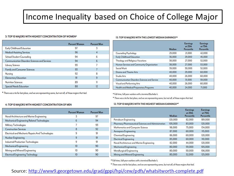
"Men are from Hard Sciences, Women are from Soft Sciences". How the differences show up in level of compensation...

There is a lot of interesting data on the demographics of college degree holders in this study found HERE.

There is much discussion on wage inequality between men and women.  While this does not settle the issue of the source any inequality, it does help point us in the right direction.  See the graphic below.

Choice of college major and its earning power in the marketplace are linked.  I say its "earning power" and not real or perceived "social value".  Two different things for the most part.

Correlate the data on the left with the data on the right.

The marketplace values "hard sciences", i.e. engineers and math degree holders much more than the "softer science" degree holders.  That is not controversial.  What actually surprised me (a bit) was the imbalance between men and women who hold those respective degrees.  I really had no idea it was that vast.

Saturday, September 14, 2013

Has "King Dollar" been demoted to a Prince? Nice chart showing all major currencies and their ranking in terms of use in international transactions....

Here is a chart showing a list of currencies and their ranking in terms of use to facilitate a whole host of international transactions, such as the buying and selling of goods and services, or physical and/or financial assets. (The chart is from HERE with a HT from The Conversable Economist.)

The US dollar is still by far the most desired "medium of exchange" for engaging in international trade.

With most major commodities such as oil and agricultural products, US dollars are used to between the countries trading, even if the countries themselves do not use the US dollar as the currency of record.

In other words, if Russia sells oil to China the transaction is conducted in US dollars, not Rubles or Renminbi.

One interesting note from the chart is since 2001 the share of US dollars used in international transactions has decreased a bit but the use of the Chinese Renminbi has increased dramatically, moving from 35th place to 9th place in a relatively short period of time.

Source: TriennialCentral Bank Survey Foreign exchange turnover in April 2013: preliminary global results 

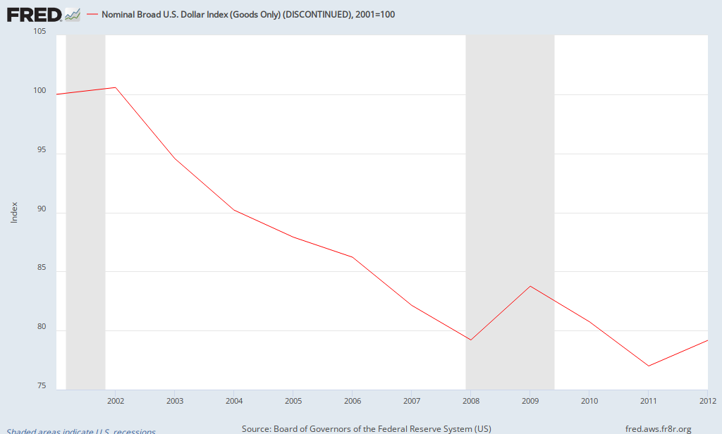
If the use of the US dollar in international transactions has declined since 2001, we might expect the value of the dollar to fall as well.  Not to imply correlation is causation, but the graph below shows how the value of the US dollar has changed compared to a "basket of other major currencies".

Using 2001 as a base year, the dollar has declined in value roughly 21%.

Has "King Dollar" been demoted to "Prince"? Not yet, but he should be looking over his shoulder.

FRED Graph


Monday, September 9, 2013

Nice graph showing the change over time in High, Medium and Low Skilled employment in the US. I see a major reason for income inequality. What do you see?

There are lots of reasons stated for income inequality in the US, and for that matter, around the world (it is not a problem solely with the US)---greed, unbalanced tax code, globalization, etc.

The one that does not get enough serious attention is the argument that the returns from education and high skills acquisition by INDIVIDUALS is a significant culprit.

I copied and pasted and modified a couple of graphics from HERE that show in the US the change, in millions, the number of workers engaged in either "High Skilled", "Medium Skilled" or "Low Skilled" employment.  Below the graph I calculated the percentage change in each category since 1995 to 2008.
(I left off 2009 for the calculation to leave out one year of the recession).

If we believe that "Education = Earning Power" then this seems to be some supporting evidence for increasing income inequality.

High Skilled employment increased 36% from 1995 to 2008.  Medium Skill employment edged up 6.10%. Low Skilled employment actually DECREASED by 4.20%.

The number of total net jobs created over that time is 17.7 million (151.7-134.0), or an increase of 13%.  So, a preponderance of those those jobs have gone to the High Skilled workers---13.3 million  (50.7-37.4) of the 17.3 million!
Source: www.KNOEMA.com

From 1995 to 2009 who Internationally is winning the "High Skilled Worker War" compared to the US? Looks like just about everyone. See the graphic here...

In the first days of introductory Economics we discuss the resources a society has available to combine to create goods and services that contribute to  a high standard of living.  I emphasize the phrase "Quantity and Quality" in regards to these resources.

One of the vital resources is "Labor".  Investment in "Human Capital" is vital to maintaining or moving to a high standard of living.

Here are a couple of graphics I combined from HERE that illustrate the change in High Skilled Employment in 13 countries (see more countries at the site) that results from investment in human capital.

The graphic on the left shows the number of people, in millions, engaged in high skilled labor in 1995.  The one on the right shows the number in 2009.  I calculated the percentage change for each country on the far right (the percentage change corresponds to the country listed on the right (2009).  China has increased the number of high skilled workers by 222%, the US by 34%, India by 92%, Brazil by 96% and so on...

Are we (the US) behind? About right? Or OK?  What am I leaving out in looking at these numbers that might mitigate (lessen) the impact of seemingly slow growth in the number of high skilled workers in the US?


Friday, September 6, 2013

Where did the missing 312,000 people from the Labor Force go last month? I know where 80,000 of them went but not the rest. I am worried about them. See here why.

In July and August the latest jobs report shows 312,000 FEWER people counted as a part of the labor force (either were working and retired or were not working and exited the labor force, or became "disabled" and started collecting benefits).  The number is highlighted in yellow.

Much has been made of the fact that this is due to demographic trends---aging baby boom population retiring in large numbers and as that same group gets older they are susceptible to work related injuries. 

I have not doubt this is true. Just wondered how many of those 312,000 were a part of this demographic group?

Took a screenshot of the data from the Social Security Online database of the data isolated just for people who officially retired or started collecting disability benefits.

Look at the highlighted numbers for July and August. Subtract the two and you get 79,813. Subtract that from 312,000 and you have 232,187 people who exited the workforce for reasons OTHER than the ones stated above.

That's a lot of people.  Why did they exit and where did they go?  Have not seem any solid  analysis from real economist yet on that question.  

Wednesday, August 14, 2013

The Sales Tax Holiday for back to school shopping is nice, but the real money is in tariffs levied on imported back to school items. How about a "Tariff Holiday". See here how much that adds up to.

Here is a nice graphic showing common back to school items parents purchase and the tariffs, in percent, that are embedded in the price you pay for these items.

A tariff is the same thing as a tax and is levied on an item when it is imported into the US.  The over-all goal of a tariff is increase the price of the imported good in order to make it more comparable to the price of the same (or similar) domestically produced good.  The assumption is the price of the imported good is too low for domestic producers to match.

While the State you live in might give you a break during the Sales Tax Holiday, the Federal government keeps on charging you.  A "Tariff Holiday" would REALLY help low income parents buy what they need for their kids.  How about it, Congress?

It really adds up, doesn't it?
Source: The Foundry (Heritage Foundation)

Note: Tariffs are applied to the cost of the good at the time of import, not on the retail price.

Example: Tennis shoes.  If the import price of the shoes is $10 then the 20% tariff is applied on the $10 not, say, a $20 retail price at Payless Shoes.

Saturday, August 10, 2013

The way GDP is calculated has been revised. See this graph and explanation as to how much has been added and why...Good Stuff!!

My blogosphere friend The New Arthurian Economics has this graph comparing the old method (Blue Line) of calculating GDP to the new one (Red Line).  The biggest change is classifying Research and Development spending (in business and entertainment ) from an expense, which is not counted in GDP, to "fixed investment" This mostly mostly affects the "I" in our GDP equation = C+I+G+N(x), but there is some impact on "C" as well. This recalculation results in a new, higher level of GDP than previously calculated.

In short, some things, tangible and intangible, that used to be considered as a one time expense and not counted in GDP are now considered to be an integral part of the on-going value of the finished good or service.
Source: The New Arthurian  Economics

Here is the link to the Bureau of Economic Analysis breakdown of the changes. It is in PPT form so it is relatively easy to scroll through to get the gist of the changes.

Here are the major changes as mentioned in the above link:
1. Expenditures by business, government, and nonprofit institutions serving households (NPISH)for research and development (R&D) are recognized as fixed investment. The new treatment improves BEA’s measures of fixed investment and allows users to better measure the effects of innovation and intangible assets on the economy. 
2. Similarly, expenditures by private enterprises for the creation of entertainment, literary, and artistic originals are recognized as fixed investment, further expanding BEA’s measures of intangible assets. 
3. In the NIPA fixed investment tables, a new category of investment, "intellectual property products," consists of research and development; entertainment, literary, and artistic originals; and software.


Wednesday, August 7, 2013

Great video here of a modern TESLA auto manufacturing facility. Time to play "I spy with my little eye an auto worker"...

Terrific video showing the manufacturing process for the Tesla.  Any worker you see appears to be more facilitator than craftsman.

I see lots of jobs here but they are largely unseen.  They are behind the scenes programming and maintaining the real labor force that largely builds cars--the robotics.  Jobs that need (for the most part) brain/analytical skills as opposed to physical/skill tradesman skills.

Manufacturing is healthy, but manufacturing jobs are transforming from a tool based economy to an i-pad based one.  A bit of exaggeration...OR IS IT???

Tuesday, August 6, 2013

Economy, Indiana..Firewood, Rabbits and Corn and Corn and Corn....

Here I am in Economy, Indiana.  It is just Northeast of Indianapolis.  Most definitely Corn Country.  The only businesses I saw as I passed through was a place that sold firewood ("Firewood For Sale: Govt Approved") and one that advertised "Rabbits for Sale".
20130805_191239.jpg

Here is my daughter, Laura, standing at the edge of a field.  Think it is about harvesting time.

20130805_174619.jpg

From Wikipedia: 2010 census 

As of the census[2] of 2010, there were 187 people, 73 households, and 47 families residing in the town. The population density was 1,870.0 inhabitants per square mile (722.0 /km2). There were 89 housing units at an average density of 890.0 per square mile (343.6 /km2). The racial makeup of the town was 98.4% White and 1.6% from two or more races. Hispanic or Latino of any race were 2.1% of the population.

There were 73 households of which 31.5% had children under the age of 18 living with them, 50.7% were married couples living together, 11.0% had a female householder with no husband present, 2.7% had a male householder with no wife present, and 35.6% were non-families. 28.8% of all households were made up of individuals and 15.1% had someone living alone who was 65 years of age or older. The average household size was 2.56 and the average family size was 3.17.
The median age in the town was 38.6 years. 25.1% of residents were under the age of 18; 7.5% were between the ages of 18 and 24; 27.3% were from 25 to 44; 27.4% were from 45 to 64; and 12.8% were 65 years of age or older. The gender makeup of the town was 48.1% male and 51.9% female.

Sunday, August 4, 2013

Coming and Going: The number of retirees exiting the labor market is greater than the number of people entering the labor market. This can't be good, can it???


Highlighted above are the number of "Retired Workers" (only) in January 2012 and in June 2013. If you subtract the two, this will give you the number of people who officially retired and may or may not have left the workforce between those two dates.  I will presume they left the work force for this exercise.

37,504,073 minus 35,752,299 = 1,751,744.  To get a monthly average, divide that by 18.

This means 97,320 people, on average, are exiting the labor force each month to retire.

From January 2012 the Labor Force went from 154,356,000 to 155,798,000 (see highlighted numbers below) ---an increase of 1,442,000.  To get a monthly average, divide by 18.  The Labor Force is the sum of the number of employed PLUS the number of unemployed, as defined by the BLS.

Source: BLS
Divide that by 18 months and the average increase in the labor force each month was 80,111.

This means 80,111 new people, on average each month, entered  the Labor Force in the past 18 months.

Just using these two major pieces of data on labor market movement, we can easily see more people are exiting the Labor Force, on net, than are entering.

This is one of the contributing factors to the decline of the unemployment rate in the past 18 months. The job creation alone we have experienced is not enough to credit the decline.

I hope this helps provides some clarity regarding this important issue.

Nice current event example illustrating a Negative Externality. Water treatment plants in England are polluting the waterways


Outlet Pipe on beach at Bexhill on Sea, East Sussex

Here is a current and relevant example of a market not taking into account "Negative Externalities" in the production of a good.

If the production of a good imposes a cost on others that is not paid for by the producers and/or the consumers of that good, then it is said to have created a negative externality..  To correct for this externality the government can internalize that cost by imposing taxes or penalties on either the producers or consumers of the good.  This will "internalize the external cost" of production and consumption of the good.

In the example below, water treatment plants are pouring refuse into the public waterways for "free" instead of paying for proper clean up of that refuse by installing the equipment necessary to clean it.  The dirty water is polluting areas that others use for recreational or other purposes.

The article suggest the fines are not high enough for the polluters to changer their behavior.  The fines are cheaper to pay than installing the necessary equipment.
""The most persistent and frequent polluters of England's rivers and beaches are the nation's 10 biggest water companies, an Observerinvestigation has revealed. 
The companies, which are responsible for treating waste water and delivering clean supplies, have been punished for more than 1,000 incidents in the past nine years, but fined a total of only £3.5m. 
The revelations have raised concern that the financial penalties are far too low to change the behaviour of an industry that generates billions of pounds in profits and shareholder dividends. The charge is backed by the Sentencing Council for England and Wales, which is proposing major hikes in penalties. 
Pollution incidents, which have included sewage illegally pouring into a harbour for more than a year, and managers destroying records, show no sign of declining, according to data obtained from the Environment Agency (EA) under freedom of information rules. Only a third of the 1,000 incidents led to a fine (of an average of just £10,800); the rest resulted in cautions.
"In law, the 'polluter pays' principle is supposed to deter companies from damaging the environment, but in this case the penalties appear to be so pitiful that water companies seem to be accepting them as the price of doing business," Joan Walley MP, chair of the Environmental Audit Committee (EAC), told the Observer. "The sentencing council must ensure that courts take into account the profits made from environmental crimes, and that fines have a sufficient deterrent effect."""

Here is a PowerPoint I created to show how this plays out in a supply and demand graph.  Key concept in AP Microeconomics!!

Wednesday, July 31, 2013

Nice graph showing the declining US manufacturers ("The Big 3") share of the car/truck market. I am looking for help to explain the 1980's and half of the 90's.

The first graph (from Carpe Diem) shows the change in market share for the US auto market between "The Big Three" and foreign producers from 1961 to 2012.  From start to finish, the steady decline in US share and the rise of the foreign share is quite dramatic.  The US producer share of vehicles produced went from over 80% to about 44%. Almost half as much.


However, upon closer inspection I noticed 3 distinct segments that were not prominent before I doctored the graph (apologies to Dr Perry).  I put directional arrows to show these segments. Don't confuse these arrows with mathematically correct trend-lines---I just eye-balled them.

I found the center segment to be a curious one.  From 1981 to 1996 the respective market shares stayed remarkably constant. On either side of this 16 year segment US share decreased significantly, more so post-1996.

Why the pause?  I am too lazy tonight to Google it.  Any educated/informed guesses?

View My Stats