Thursday, July 25, 2013

Want to know how much you will have to pay for an insurance policy under "Obama-care"? Or how much of a fine you will pay if you DON'T? See it here!!

The Wall Street Journal has an excellent article and interactive that uses Oregon as an example of what it is going to cost young people (up to age 35)  to purchase health insurance as mandate by the Affordable Care Act (aka "Obamacare").  Your State will likely have different prices, maybe higher or lower.

If you are not covered by your employer (or don't want to be) and you are NOT exempt for the provisions of the Act, then here is an example of how much you will be required to pay or face a fine (second graphic below).

I picked "Restaurant Server", but it could be ANY job paying about $12.71. I picked age 22 just as a reference.  You can go to the site and change the variables as they pertain to you.   The hourly wage/annual income is what is important.  You can see for yourself that you would not qualify for any subsidy help with your premiums at that income (assuming you are single, no kids) and what your premium might be for the coverage you choose.

FYI: A "deductible" is the amount you must pay BEFORE insurance kicks in.  Any medical costs you incur OVER the stated deductible is covered by insurance.  There are some exceptions to this as you can see under each policy description.  Basically, the more premium you pay, the better the policy terms are, i.e. a lower deductible you are responsible for paying.

Source:Wall Street Journal
Don't want to pay?  Remember, unless you qualify for an exemption this is an either/or proposition.
Here is the penalty you will have to pay for not doing so starting in 2014. The cost of not buying insurance will escalate in subsequent years.  This is what the IRS will be responsible for collecting from you at tax time.

[image]

Wednesday, July 24, 2013

See here how the number of new movie releases AND their MPAA ratings have changed since 1997. Can you guess which rating is trending up?

It is hard for me to enjoy a movie.  My mind wanders.

I wondered how the number of movies has changed over time and their assigned ratings.  Many suggest movies have become coarser, more violent, more sexual, etc.  The rating system is suppose to give us some guidelines as to the nature of the content of each movie. Not a perfect system, but let's go with it here.

Using historical data from THIS WEBSITE  I plotted, going back to 1997, the number of movies released at the different ratings we are all familiar with.  You can see the color-coding for each one with the key on the right.

I connected the beginning data point and the last one (dotted line) to give you are reference.

In absolute terms, R-rated movies dominate.  I was surprised by the relative flat lining for G and PG rated movies.  Notice any trends??

Here is the data I used to create the graph above.


Empirically, it appears PG-13 rated movies have grown the most consistenly over that time period.  Here is a table that  may shed some light as to why (source HERE)


R-Rated  are produced, BUT  PG-13 rated movies are where the money is made.  With a combined market share of 74% for both ratings  over 17, I expect it to continue.

Tuesday, July 23, 2013

Why prices of consumer goods rise (or could rise) when a disaster or other "extraneous" event occurs.

Most producers of a good do not maintain excess capacity to produce and supply a particular good.  It would be costly to maintain facilities and to stock extra inputs/materials over what is necessary to make the good on a daily basis.

If I produce bottled water I maintain just enough machinery, inputs and transportation capacity to make my current production goals. I can make small adjustments here and there, but I try to have my costs as fixed and predictable as possible.

If there is a major, unexpected disruption in the supply chain my cost structure can be altered.

Example.  A looming (or just occurred) natural disaster increases the quantity demanded for bottled water. Stores are screaming at me to get them more water!!

The only way for me to produce what I already produce PLUS additional bottles AND deliver it in the short term is to add a production shift (overtime costs!), order more inputs (plastic bottles,etc) which I likely will have to pay a premium to get quicker, and get additional contract trucks to deliver the water (I likely don't have trucks sitting idle). Or I can have my drivers make additional runs in my trucks but that will incur more transportation costs as well.

All these things increase my costs of producing those additional bottles of water that I NORMALLY don't produce on a daily basis.  The Marginal Cost of those bottles is going to be higher than the ones I usually produce. Hence, I should receive a higher price for those bottles.

But will I?  I may not pass on the cost to the retailer for a variety of reasons.  I may require the retailer to pay me more for the bottles but they may or may not charge their customers more for them. It gets complicated.

But what does not get complicated is the increase in cost associated with producing additional units of a good, assuming no/little excess production capacity.

This posting was inspired by this article.  While it is not about the event of a disaster, the principle still holds.

Monday, July 22, 2013

Are people not dining out hurting box office revenues or is a poor box office hurting the restaurant industry? See the data then you tell me...

I have been reading where the movie box office for the summer has been down.  Bad movies? Bad economy? Sequestration?  Effect of January's payroll tax cut finally kicking in?

I don't know which reason makes the most sense, if any of them

I read today where monthly retail sales were down from the previous month.  I started thinking about the relationship between these two measures.

Going to a movie and dining out seem to go hand in hand for many/most people, right?  It makes for a nice day/evening.

The Commerce Department report on Retail Sales has a nice breakdown of each sector of retail and the category "Food and Drink" is one of them.  LUCKY ME!!

I created this crude graph with historical data from the Commerce Dept and only went back to January of 2012.  Figured that was far enough to see a trend.

The line looks like a bull-whip. From January of 2013 (first red dot on left) to present the tail of the whip is unstable. Prior to that is was pretty smooth and trending up.

The erratic trend might/should set off some alarm bells.  Employment in "Food and Drink" has been a savior in the last couple of months.  Is that about to come to an end?

So what do you think.  Is not dining out hurting the movie industry or are crappy, lackluster movies hurting the food and drink industry?  Probably neither, but they are both tethered together for better or worse.

Wednesday, July 17, 2013

Minimum Wage in historical terms. Has it or has it not kept up with inflation? I show you the numbers. You decide...

It is always a dicey proposition to use the Bureau of Labor Statistics inflation calculator.  One can question its accuracy and value as a tool in comparing one time period to another. I get that. But it seems it is the best we have AND it is used to provide justification for an increase in the minimum wage.

The issue centers around the lost purchasing power of the minimum wage as inflation erodes its value over time.

Using the BLS inflation calculator, I entered the actual nominal dollar value of the minimum wage in the year it was changed, going back to 1981, and showed what the purchasing power of that wage is in today's dollars (I duplicated 1981 and 1989 because of the long time span in between changes and to illustrate the drastic reduction in headline inflation had on the purchasing power of the MW).

Example: in 1981 (slide "1") the MW was $3.35. In today's dollars that would be equivalent to $8.61.  So, in order to have the same purchasing power as a MW worker in 1981 a MW worker today would have to earn $8.61 (highlighted in yellow).  The actual MW today is $7.25.  This suggests that the MW today is too LOW by 19%!

But wait a minute.  If we choose to look at 1989 the minimum wage (slide "2") is still $3.35 but that is equivalent to $6.31 in today's dollars. This suggests the MW should be 13% LESS than $7.25!!

Inflation in 1980 was about 14%. In 1989 it was about 4%. Big difference!

See how deceptive this can be? Depending on which year you choose to be your base year can  distort the overall picture and present support or non-support for your position.

The long term average of ALL the adjusted numbers highlighted in yellow is $7.26. The MW is $7.25.

For the long(er) term that is about right.

Having said all that, the minimum wage probably needs to be raised. By how much I don't know.  But using more realistic data and analysis would be a start.


Monday, July 15, 2013

Do hospitals take the weekend off? If you have a newborn it might be true. See here why...

Saw this HERE (read the whole article for more detail than I am providing).

This study looks at what happens to newborns admitted to a hospital under the non-emergency "failure to thrive" category.  The baby experienced a rapid weight loss prior to admission and the parents brought them to the hospital.  Not an emergency, but certainly understandable from the parents perspective.

The graph below shows the cost (left axis) and the length of stay (right axis)

It appears the hospital essentially warehouses the infants until the weekend is over and regular staff takes over.  This is costly and does not lead to improved health comes, but longer stays and higher costs.

Try telling that to parents! Seems like more rigorous pre-screening could eliminate this but I am just guessing the hospital accommodates and charges (1) the insurance company or (2) the government for the space.

Part of the problem in controlling medical care costs right there...

Source: The Incidental Economist

Why "Price Gouging" is desirable and should be re-branded "Sustainable Pricing". A name is everything!

Here is a very nice summation of why "price gouging" should not be discouraged by the government imposed price ceilings (a price, by law, is not allowed to go above a certain level).  Businesses, for the most part, are not going to raise prices in normal times above the market price because competition will restrain them.

 However, if people expect those prices to go up considerably in the event of a disaster created shortage then the anticipation of "gouging" can actually have a positive affect.

From: ANTI-DISMAL
  1. Without price increases, many people buy extra supplies “just in case”, regardless of what they have tucked away at home already. If too many people do this, supplies run out and people who need them much more urgently miss out. With price increases, people who don’t really need supplies will leave them on the shelf, not out of the goodness of their heart, but out of concern for their wallet.
  2. Price increases encourage conservation of resources people already have. Those who can most easily adjust their consumption will do so, leaving resources free for those who can’t. People might, for example, use their cars more sparingly to avoid having to fill up while prices are inflated.
  3. The ability to raise prices encourages businesses to stock excess reserves. Space in stores and warehouses is limited and products (even water) go off over time. If they’re not allowed to raise prices on those items, they’ll use that limited space for other products that have higher profit margins the rest of the time.
  4. Allowing price gouging actually encourages citizens to be more prepared for disasters. Do you have enough food and water and other essentials stored at home for you and your family if disaster strikes your town? Or do you just assume you’ll be able to go to the store and buy what you need when something goes wrong? Knowing that prices might double, triple, or more during a disaster is a pretty big incentive to go and stock up now instead of waiting — even for that person who lives right next door to the store!
  5. Finally, rising prices attract more resources from outside of the disaster area, where prices are lower. Nearby businesses, small or large, can easily profit by shipping essential supplies in and selling them at a premium. Without the ability to charge that premium, they would actually end up losing money through shipping costs, overtime wages, and inherent risks of operating is a disaster area. Without the profit motive, many don’t take the risk.

I also find the new name branding he gives "Price Gouging"---he calls it "Sustainable Pricing", a more accurate description:
“Price gouging” is a derogatory term meant to belittle. A more accurate description would be “sustainable pricing” — pricing that ensures supplies are sustainable to meet the demand of future customers.
Hope it catches on!


Sunday, July 14, 2013

Dorothy may not be in Kansas anymore, but our wheat supply is... and it is threatened. See here why..

Here are 2 maps showing where wheat is grown (on left) and where drought is occurring in the US (on right).  I got both of these from The Big Picture Agriculture blog and put the side by side with some minor editing.

Kansas grows 22% of the US wheat crop AND it is experiencing "extreme" to "exceptional" drought conditions.  Both of these are within the yellow circles.

Depending of how much of the harvest is salvaged plus harvests in wheat growing locales throughout the world, the price of wheat may increase.  As it moves through the supply chain as an input the price of finished goods made from wheat might increase in price as well.

Dorothy, please tap your heels together not so you can return to Kansas, but so it can rain.  That is needed much more...

Thursday, July 11, 2013

Is there a strong case for raising the minimum wage because of lost purchasing power due to inflation? Maybe...but maybe not. I report, you decide...

There is much ado in political circles about the purchasing power of today's minimum wage compared to some point in the past.  The case is made that the minimum wage has not kept up with inflation and workers earning that wage today have lost ground relative to those who came before. As with many things in economics, the answer seems to be "it depends".

Here is a graph from Mark Perry that I tricked up a little. The RED line tracks the minimum wage in actual dollars terms from 1938 to the present. In 1938 it was $.25 cents and today it is $7.25. All the increases are shown between those two points.

The BLUE line is a little tricky to understand. It represents, in inflation adjusted terms, what a minimum wage  worker would have to earn TODAY to have the SAME purchasing power as a minimum wage worker at some time in the past.

Example:  See the $10.66 per hour at the high point of the BLUE line? This means that a worker today would have to earn a minimum wage of $10.66 to have the same purchasing power as a worker in 1968 at that years actual minimum wage.  That's not good, is it?
Source: Carpe Diem
Look at the gold horizontal dotted line and read it from right to left starting at the green dot. As you move from right to left and encounter a RED DOT this means  today's minimum wage has the same purchasing power as the actual minimum wage at that time.  In other words, all else is equal in terms of the purchasing power of the minimum wage today relative to the past.

If the BLUE line falls below the Gold line then today's minimum wage, in inflation adjusted terms, is HIGHER than than the purchasing power of that years actual minimum wage.  If the BLUE line is above the Gold line then today's minimum wage has LESS  purchasing power than that years actual minimum wage.

In terms of purchasing power the current minimum wage of $7.25, it has been relatively stable over time. The obvious exception is a relatively short time span between the mid-1960's and the late 1970's.

This was a freakish period of high, abnormal inflation. If I was going to pick a time period to make a historical case that the minimum wage is too low, then this small window is what I would choose.

But would it be accurate?

I report, you decide...

Having said that, I personally believe it should be raised but in small-ish increments to make it more seamless and less disruptive for businesses.  I don't think that is unreasonable.

Wednesday, July 10, 2013

Why you should not be hopeful for a clean energy future in one easy US Dept of Energy Graphic...

This is from an April 2013 report from the US Dept of Energy (HT: Carpe Diem).  The report is full of projections (always a dicey proposition) on energy production and consumption.

This one caught my eye and I have posted on this topic recently (here).  It shows energy consumption by source from 1980 to 2011 (black line in center) then projects out to the year 2040.

Look closely at 2011 levels of consumption and 2040's.  Natural gas on net replaces 2 percentage points of petroleum and coal essentially stays flat.

Renewables (Green section) and Biofuels (sliver of yellow) grows by 3 percentage points. As a percentage change that is pretty good (+38%) but for a time span of 27 years I am not sure that is impressive.

Even by the current Administrations reckoning we are going to be dependent on fossil fuels for our enormous  energy requirements for some time into the future.

When making energy policy seems like we should consider "what is" along with "what might be".  That would be sensible, right???

Source: Dept of Energy
Here is a different breakdown emphasizing the role coal, the dirtiest of the dirty energy source, will continue to play in the near and far term in keeping the lights on and powering our i-pads and other electricity dependent doo-dads.   Kinda depressing, isn't it???


Saturday, July 6, 2013

Nice chart showing where the jobs were lost during the recession and where they have been regained. Thank God for Fast Food, Bars and an aging population...

This chart is from the terrific blog EMSI. It shows the change in the number of jobs during the official time span of the recession (light blue bar) and the change in the number of jobs after the official end of the recession (dark blue bar).

If a bar swings to the left of the center line it shows the number of jobs lost in that time period. If it swings right the number of jobs gained.

"Information" and "Government" are the only two sectors that lost jobs during the recession AND continued to do so AFTER the recession.

Interestingly enough, "Healthcare and Social Services", "Educational Services (Private)" and "Utilities" are sectors that added jobs during AND after the recession.

The glaring sore spots are Manufacturing and Construction (mostly residential construction).  In nominal terms, those sectors lost the most jobs and have not come close to making them up.

Those sectors are not likely to regain there lofty status anytime soon.  Construction is more likely to recover to at least parity, but manufacturing will continue to transition from a labor intensive industry to a capital/technology intensive one.

Friday, July 5, 2013

Interesting data point from the Unemployment Report put today--Multiple Job Holders I salute you. However, I think you might be distorting the economic picture. Maybe you should back off. :)

I am always on the look out for new twists on the employment report that comes out monthly.  Here is one I have never looked at and thought interesting. This data comes from the latest Employment Report from the BLS.

The highlighted portions show the number of Multiple Job Holders and the change from June 2012 to June 2013. There are 283,000 more people doing this today than 1 year ago.  That works out to a monthly average of 23,538.

In the last year the average number of jobs created each month was approx 170,000 (data here).

This means that people with jobs ALREADY account for taking 14% of the additional jobs created each month. Perhaps not the full 14% because some of the those jobs may have already existed.

Seems like a lot. What do you think...


Thursday, July 4, 2013

Buying a "Foreign" Car or Truck likely means you are "Buying American". My economics lesson for the Fourth of July!!

Here are the top selling vehicles for the month of May (2013).  As has been for quite some time the sale of pick-up trucks has outpaced the sale of other vehicles. But that is not what I find fascinating about this list.

Notice the presence of so many "foreign" producers of vehicles in this Top 15 (7 out of the 15).  I put foreign in quotes because a cursory Google search of assembly plants of those foreign name plates I found all of them have plants in the US dedicated to producing these particular vehicles.

So, many/most of these manufacturers use US labor and/or US sourced parts to produce their vehicles to sell to Americans.

For the most part, buying "foreign" means buying American.  Below this list is another list compiled by cars.com that shows vehicle content, US and Foreign, by the percentage of US sourced labor and parts.

Happy Fourth of July!!!


Source: Cars.com

Sunday, June 30, 2013

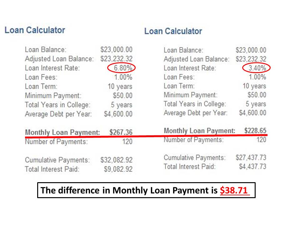
How much will it cost you going forward to take out a SUBSIDIZED Stafford Loan to pay for college? I do the numbers for you here.

Here is a side by side comparison of the difference in the monthly payment a SUBSIDIZED Federal Stafford Loan will be on July 1st, 2013 when the current law regulating the rates expires. The interest rate on this type of loan is schedule to double from 3.4% to 6.8%.This is on loans going forward NOT retroactive on previous loans you may have taken out. I chose a 10 year payback----could be longer BUT DON'T!!  Lots of consternation about this change.  Thought I would bring a little perspective to the discussion.

The maximum a student can borrow in subsidized Stafford loans is $23,000 (for an undergraduate).  This will represent only a portion of total college costs.  My understanding is the average college student does not borrow up to the limit on this type of loan, so the amount is likely to be less.  The rest will be in grants, scholarships, own money AND NON-subsidized Stafford/"other" loans.  The rate on non-subsidized Stafford loans is already 6.4% and is NOT scheduled to change.

How you will be affected in the future depends on how deep into the subsidized loans you are in.  However, the financial impact will not be devastating, as reported in the media, and will be a negligible blow to your future standard of living.

You may feel different. I am open to be convinced otherwise.

(Calculator I used HERE)

What do Volkswagen Beetles and how much earth has to be moved to mine the gold and diamond for a 1 carat engagement ring have in common? You may never buy a ring again after seeing this...

I clipped this from a larger info-graphic on the economics of Gold Mining.

The amount of earth that had to be moved to mine a gram of gold kinda startled me.  Got me to thinking, How much earth, in terms of Volkswagen Beetles, has to be moved to produce a 1 carat diamond engagement ring?

To mine a 1 carat diamond requires the moving of 250 tons of earth (best estimate I could find Googling--could be more...or less). Using the numbers in the infographic, that is the equivalent of 218 Beetles (500,000lbs/2,295lbs per Beetle)

The gold portion of ring will only set you back a fraction of the Beetle (a fender?).

Next time you drive by a Volkswagen dealership think about this---all the cars in the lot represent the amount of earth that had to be displaced to produce the diamond ring on your finger.  Is it worth it?


Source: Business Insid
View My Stats