This chart is from the terrific blog EMSI. It shows the change in the number of jobs during the official time span of the recession (light blue bar) and the change in the number of jobs after the official end of the recession (dark blue bar).
If a bar swings to the left of the center line it shows the number of jobs lost in that time period. If it swings right the number of jobs gained.
"Information" and "Government" are the only two sectors that lost jobs during the recession AND continued to do so AFTER the recession.
Interestingly enough, "Healthcare and Social Services", "Educational Services (Private)" and "Utilities" are sectors that added jobs during AND after the recession.
The glaring sore spots are Manufacturing and Construction (mostly residential construction). In nominal terms, those sectors lost the most jobs and have not come close to making them up.
Those sectors are not likely to regain there lofty status anytime soon. Construction is more likely to recover to at least parity, but manufacturing will continue to transition from a labor intensive industry to a capital/technology intensive one.
Economics, civics, constitutional law, Supreme Court cases, AP Economics teaching resources, and classroom lessons by a retired social studies teacher.
Saturday, July 6, 2013
Friday, July 5, 2013
Interesting data point from the Unemployment Report put today--Multiple Job Holders I salute you. However, I think you might be distorting the economic picture. Maybe you should back off. :)
I am always on the look out for new twists on the employment report that comes out monthly. Here is one I have never looked at and thought interesting. This data comes from the latest Employment Report from the BLS.
The highlighted portions show the number of Multiple Job Holders and the change from June 2012 to June 2013. There are 283,000 more people doing this today than 1 year ago. That works out to a monthly average of 23,538.
In the last year the average number of jobs created each month was approx 170,000 (data here).
This means that people with jobs ALREADY account for taking 14% of the additional jobs created each month. Perhaps not the full 14% because some of the those jobs may have already existed.
Seems like a lot. What do you think...
The highlighted portions show the number of Multiple Job Holders and the change from June 2012 to June 2013. There are 283,000 more people doing this today than 1 year ago. That works out to a monthly average of 23,538.
In the last year the average number of jobs created each month was approx 170,000 (data here).
This means that people with jobs ALREADY account for taking 14% of the additional jobs created each month. Perhaps not the full 14% because some of the those jobs may have already existed.
Seems like a lot. What do you think...
Thursday, July 4, 2013
Buying a "Foreign" Car or Truck likely means you are "Buying American". My economics lesson for the Fourth of July!!
Here are the top selling vehicles for the month of May (2013). As has been for quite some time the sale of pick-up trucks has outpaced the sale of other vehicles. But that is not what I find fascinating about this list.
Notice the presence of so many "foreign" producers of vehicles in this Top 15 (7 out of the 15). I put foreign in quotes because a cursory Google search of assembly plants of those foreign name plates I found all of them have plants in the US dedicated to producing these particular vehicles.
So, many/most of these manufacturers use US labor and/or US sourced parts to produce their vehicles to sell to Americans.
For the most part, buying "foreign" means buying American. Below this list is another list compiled by cars.com that shows vehicle content, US and Foreign, by the percentage of US sourced labor and parts.
Happy Fourth of July!!!
Notice the presence of so many "foreign" producers of vehicles in this Top 15 (7 out of the 15). I put foreign in quotes because a cursory Google search of assembly plants of those foreign name plates I found all of them have plants in the US dedicated to producing these particular vehicles.
So, many/most of these manufacturers use US labor and/or US sourced parts to produce their vehicles to sell to Americans.
For the most part, buying "foreign" means buying American. Below this list is another list compiled by cars.com that shows vehicle content, US and Foreign, by the percentage of US sourced labor and parts.
Happy Fourth of July!!!
| Source: Cars.com |
Sunday, June 30, 2013
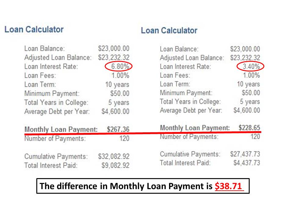
How much will it cost you going forward to take out a SUBSIDIZED Stafford Loan to pay for college? I do the numbers for you here.
Here is a side by side comparison of the difference in the monthly payment a SUBSIDIZED Federal Stafford Loan will be on July 1st, 2013 when the current law regulating the rates expires. The interest rate on this type of loan is schedule to double from 3.4% to 6.8%.This is on loans going forward NOT retroactive on previous loans you may have taken out. I chose a 10 year payback----could be longer BUT DON'T!! Lots of consternation about this change. Thought I would bring a little perspective to the discussion.
The maximum a student can borrow in subsidized Stafford loans is $23,000 (for an undergraduate). This will represent only a portion of total college costs. My understanding is the average college student does not borrow up to the limit on this type of loan, so the amount is likely to be less. The rest will be in grants, scholarships, own money AND NON-subsidized Stafford/"other" loans. The rate on non-subsidized Stafford loans is already 6.4% and is NOT scheduled to change.
How you will be affected in the future depends on how deep into the subsidized loans you are in. However, the financial impact will not be devastating, as reported in the media, and will be a negligible blow to your future standard of living.
You may feel different. I am open to be convinced otherwise.
(Calculator I used HERE)
The maximum a student can borrow in subsidized Stafford loans is $23,000 (for an undergraduate). This will represent only a portion of total college costs. My understanding is the average college student does not borrow up to the limit on this type of loan, so the amount is likely to be less. The rest will be in grants, scholarships, own money AND NON-subsidized Stafford/"other" loans. The rate on non-subsidized Stafford loans is already 6.4% and is NOT scheduled to change.
How you will be affected in the future depends on how deep into the subsidized loans you are in. However, the financial impact will not be devastating, as reported in the media, and will be a negligible blow to your future standard of living.
You may feel different. I am open to be convinced otherwise.
(Calculator I used HERE)
What do Volkswagen Beetles and how much earth has to be moved to mine the gold and diamond for a 1 carat engagement ring have in common? You may never buy a ring again after seeing this...
I clipped this from a larger info-graphic on the economics of Gold Mining.
The amount of earth that had to be moved to mine a gram of gold kinda startled me. Got me to thinking, How much earth, in terms of Volkswagen Beetles, has to be moved to produce a 1 carat diamond engagement ring?
To mine a 1 carat diamond requires the moving of 250 tons of earth (best estimate I could find Googling--could be more...or less). Using the numbers in the infographic, that is the equivalent of 218 Beetles (500,000lbs/2,295lbs per Beetle)
The gold portion of ring will only set you back a fraction of the Beetle (a fender?).
Next time you drive by a Volkswagen dealership think about this---all the cars in the lot represent the amount of earth that had to be displaced to produce the diamond ring on your finger. Is it worth it?
The amount of earth that had to be moved to mine a gram of gold kinda startled me. Got me to thinking, How much earth, in terms of Volkswagen Beetles, has to be moved to produce a 1 carat diamond engagement ring?
To mine a 1 carat diamond requires the moving of 250 tons of earth (best estimate I could find Googling--could be more...or less). Using the numbers in the infographic, that is the equivalent of 218 Beetles (500,000lbs/2,295lbs per Beetle)
The gold portion of ring will only set you back a fraction of the Beetle (a fender?).
Next time you drive by a Volkswagen dealership think about this---all the cars in the lot represent the amount of earth that had to be displaced to produce the diamond ring on your finger. Is it worth it?
| Source: Business Insid |
Friday, June 28, 2013
The discussion on levying a "Carbon Tax" to reduce green house gases is gaining momentum. I created a presentation on the issue just for you!!
The most effective why to reduce the consumption and/or production of a good is by way of the price mechanism. If you want to reduce the consumption of a good raise the price. If you want to reduce the production of a good then increase the cost of producing it.
Why would we want to do that?
If the production and/or consumption of a good results in uncompensated costs on others who are not producers or consumers of the good, it is is termed an "external cost". It is a not absorbed into the price consumers pay for the good or that producers incur by producing the good.
Goods consumed and produced with heavy doses of fossil fuels as an input are nice examples goods that impose significant external costs on society and are not reflected in the market price.
A "Carbon Tax" is one way to "internalize" the external, uncompensated costs that arise out of the use of fossil fuels in the production and/or consumption of goods.
Below I excerpted key paragraphs on a discussion of a carbon tax that puts in simple language the goal of the tax.
Why would we want to do that?
If the production and/or consumption of a good results in uncompensated costs on others who are not producers or consumers of the good, it is is termed an "external cost". It is a not absorbed into the price consumers pay for the good or that producers incur by producing the good.
Goods consumed and produced with heavy doses of fossil fuels as an input are nice examples goods that impose significant external costs on society and are not reflected in the market price.
A "Carbon Tax" is one way to "internalize" the external, uncompensated costs that arise out of the use of fossil fuels in the production and/or consumption of goods.
Below I excerpted key paragraphs on a discussion of a carbon tax that puts in simple language the goal of the tax.
The Myriad Benefits of a Carbon Tax
The beauty of a carbon tax is its market-based simplicity. Economists since Adam Smith have insisted that prices are by far the most efficient way to guide the decisions of producers and consumers. Carbon emissions have an “unpriced” societal cost in terms of their deleterious effects on the earth’s climate. A tax on carbon would reflect these costs and send a powerful price signal that would discourage carbon emissions.
Producers and consumers would adjust their behavior in response to this signal in ways that are most efficient for them. And these efficient micro decisions would support efficient societal outcomes.
There’s much debate about what the proper “social cost of carbon” might be, but there is no debate that carbon emissions are seriously underpriced. Any tax on carbon would be an important step in the right direction, and it could be gradually increased to give consumers and producers time to modify their decisions.
Here is my abbreviated PPT presentation I use for my AP Microeconomics class to illustrate graphically how the presence of a negative externality in the market place affects social welfare when the full costs of consuming and producing a good are not factored into the market price. I hope it is helpful in understanding the issue.
I recently created this. Any constructive comments are welcome regarding content and editing are welcome. Thank you.
Thursday, June 27, 2013
The Demise of the Horse and Mule Era and the Rise of the Automobile and Tractor Era---Part 2. I think history and econ buffs will enjoy this.
Between 1915 and 1960 the horse and mule population in the US decreased by 22,404,000 (yes, millions). Notice it increased prior to 1915.
The decrease over this time span was primarily due to the advent of the automobile for personal and commercial use (urban) and tractors for agricultural use on the farm (rural).
This period is also known as a golden age for agriculture and productivity down on the farm.
I would like to put a little different spin on this productivity miracle.
The passage below is from a Census Report from 1934. It gives an estimate as to how much acreage is needed to grow a variety of food commodities to feed a horse or mule for one year. Remember, at this time this was the "fuel" source for agriculture. Part of the yield from growing food HAD to be diverted to feed the livestock help produce the rest of the harvest.
The amount of acreage needed varies depending on the combination of commodities used. Let's just informally use a ratio of 5 arable acres to grow food for one horse or mule.
This means from 1915 to 1960, 112,020,00 (that is 112 Million!) FEWER acres of land were required to be used for horse and mule fuel (22.404 million fewer horses and mule X 5 acres).
Put in perspective, this is equivalent to the combined TOTAL acreage of the agricultural States of Nebraska, Iowa and Indiana, that did not go to the feeding of horses and mules but to people.
Note: I am assuming no change in technology and the horse and mule population would have stayed pre-1915 constant. Maybe, maybe not.
Physical land resources, especially in urban areas, were freed up for alternative uses and allowed those areas to progress at a different pace and on a different trajectory.
The untold story of advancement in technology is also reflected in the demise of the horse and mule powered economy.
Just thought that was interesting. Hope you do too.
The decrease over this time span was primarily due to the advent of the automobile for personal and commercial use (urban) and tractors for agricultural use on the farm (rural).
This period is also known as a golden age for agriculture and productivity down on the farm.
I would like to put a little different spin on this productivity miracle.
| Source: Humane Society |
| Source: Fifteenth US Census |
This means from 1915 to 1960, 112,020,00 (that is 112 Million!) FEWER acres of land were required to be used for horse and mule fuel (22.404 million fewer horses and mule X 5 acres).
Put in perspective, this is equivalent to the combined TOTAL acreage of the agricultural States of Nebraska, Iowa and Indiana, that did not go to the feeding of horses and mules but to people.
Note: I am assuming no change in technology and the horse and mule population would have stayed pre-1915 constant. Maybe, maybe not.
Physical land resources, especially in urban areas, were freed up for alternative uses and allowed those areas to progress at a different pace and on a different trajectory.
The untold story of advancement in technology is also reflected in the demise of the horse and mule powered economy.
Just thought that was interesting. Hope you do too.
Interest rates on loans are increasing. Here I show you how even a small change in interest rates will cost you money. You WILL be shocked!!
The buying and selling of a house for most people is the biggest personal financial transaction they will undertake in a lifetime. Because most people have to borrow the money it takes to buy one, the interest rate paid on that borrowed money is of utmost importance.
In the last few weeks interest rates on loans to buy house have spiked upward. Only a couple of months ago someone with excellent credit could borrow money to purchase a house at close to 3.5% interest rate on a 30 year loan. Today, that rate is around 4.6%. I know this because we are in the process of selling a house and buying a new one and I was quoted 4.67% for a new loan.
That may not seem like much of a change, but it is deceiving and an easy trap to fall into when you are quoted an interest rate. Small differences matter!!
Below I used an online loan calculator to give you some examples of how changes in interest rates affect how much you pay back to the lender. For each scenario I assumed a loan for $200,000 for 30 years, a 2% total property tax rate (could be higher or lower depending on where you live) and home insurance of $1,000 (again, could be higher or lower).
The only thing I change is the interest rate for each loan. I use 3.5%, 4.5% and 5.5% respectively. I highlighted the change in the monthly payment and the TOTAL in interest payments you would make over the 30 year life of the loan.
See the difference every 1% change in the interest rate makes? Pardon the pun, but it is in your interest to seek the lowest interest rate you can on a loan of any sort. Higher interest rates means more money transferred to the lender and less for you to use for savings or present consumption.
In the last few weeks interest rates on loans to buy house have spiked upward. Only a couple of months ago someone with excellent credit could borrow money to purchase a house at close to 3.5% interest rate on a 30 year loan. Today, that rate is around 4.6%. I know this because we are in the process of selling a house and buying a new one and I was quoted 4.67% for a new loan.
That may not seem like much of a change, but it is deceiving and an easy trap to fall into when you are quoted an interest rate. Small differences matter!!
Below I used an online loan calculator to give you some examples of how changes in interest rates affect how much you pay back to the lender. For each scenario I assumed a loan for $200,000 for 30 years, a 2% total property tax rate (could be higher or lower depending on where you live) and home insurance of $1,000 (again, could be higher or lower).
The only thing I change is the interest rate for each loan. I use 3.5%, 4.5% and 5.5% respectively. I highlighted the change in the monthly payment and the TOTAL in interest payments you would make over the 30 year life of the loan.
See the difference every 1% change in the interest rate makes? Pardon the pun, but it is in your interest to seek the lowest interest rate you can on a loan of any sort. Higher interest rates means more money transferred to the lender and less for you to use for savings or present consumption.
Wednesday, June 26, 2013
Would you like that in Paper or Electronic form? Paper industry getting beaten to a "pulp" by the digital bullies...
While we will likely always have a want for paper, it is an industry on the decline because of the rise of a suitable substitute---digital technology in every form.
For the paper manufacturing/producing sector this decline has been gradual but inevitable. My father worked in paper mills in the Northeast all his life and growing up I saw first hand its demise.
Creative Destruction is a cold, cruel process for those on the declining end of an industry but exciting, vibrant and forward looking for those in the emergent industries. Those who focus on maintaining the status quo for the former group only impede the inevitable progress made by the latter group.
For the paper manufacturing/producing sector this decline has been gradual but inevitable. My father worked in paper mills in the Northeast all his life and growing up I saw first hand its demise.
Creative Destruction is a cold, cruel process for those on the declining end of an industry but exciting, vibrant and forward looking for those in the emergent industries. Those who focus on maintaining the status quo for the former group only impede the inevitable progress made by the latter group.
"...It’s easy to understand why the companies might be upping their presence in Washington: The Internet age has devastated traditional paper products, with newspapers, magazines and print advertising at historic lows. At the same time, e-commerce has boosted demand for packaging, so they’ve pressed for things like reform of the United States Postal Service, to keep it as cheap as possible for vendors like L.L. Bean and Pottery Barn to send large volumes of glossy mailers. Paper manufacturers were even active on the Farm Bill, asking for wood pulp to be included in the bill’s priority purchasing programs for bio-based products..."
Tuesday, June 25, 2013
President Obama wants to turn out the lights on the coal industry. The problem is the coal industry GIVES us that light in the first place. See the facts here...
President Obama in a speech today pretty much threw down the gauntlet in the direction of the US coal industry. Rightly or wrongly, we ARE dependent on the stuff.
Here are the facts---you decide for yourself the proper course of action.
This graphic is from 2009 so it may be a little dated as far as the numbers. But if I had to make an un-educated guess (all I have) I would say the percentages are still in the ballpark.
I modified it to isolate coal, which supplies 20% of our overall energy needs (gray box on left). BUT it powers 48% (18.30/38.19 X 100) of our electricity needs/wants (box in upper middle). Read that again.
Nothing else (based in reality) comes close to meeting that power need/want.
Rational debate and policies based on what "is" (positive) and not what "ought to be" (normative) will be more helpful in getting to where we need to be. Coal is not the fuel of the future but it is of the here and now and many tomorrows.
UPDATE: Just found this at the Energy Information Agency:
Here are the facts---you decide for yourself the proper course of action.
This graphic is from 2009 so it may be a little dated as far as the numbers. But if I had to make an un-educated guess (all I have) I would say the percentages are still in the ballpark.
I modified it to isolate coal, which supplies 20% of our overall energy needs (gray box on left). BUT it powers 48% (18.30/38.19 X 100) of our electricity needs/wants (box in upper middle). Read that again.
Nothing else (based in reality) comes close to meeting that power need/want.
Rational debate and policies based on what "is" (positive) and not what "ought to be" (normative) will be more helpful in getting to where we need to be. Coal is not the fuel of the future but it is of the here and now and many tomorrows.
UPDATE: Just found this at the Energy Information Agency:
In 2012, the United States generated about 4,054 billion kilowatthours of electricity. About 68% of the electricity generated was from fossil fuel (coal, natural gas, and petroleum), with 37% attributed from coal.
Energy sources and percent share of total electricity generation in 2012 were:
- Coal 37%
- Natural Gas 30%
- Nuclear 19%
- Hydropower 7%
- Other Renewable 5%
- Biomass 1.42%
- Geothermal 0.41%
- Solar 0.11%
- Wind 3.46%
- Petroleum 1%
This gets interesting now. Natural Gas met 18% of our electricity needs/wants in 2009 and now it is 30%. Coal has decreased from 48% to 37%.
In 3 years we already have transitioned from coal to a much cleaner (and abundant) burning fossil fuel natural gas.
Environmental goals being met without any additional policies. Go figure...
Monday, June 24, 2013
Year over Year spending per worker in direct travel and tourism sector is down but up in the indirect, support sector. Is this a good sign or bad?
Just how important is the economic impact of tourism in the US(from BLS current release)?
However, factoring out the indirect sector we find that total (direct) average spending per worker DECREASED by 0.80% from the same time period.
Seems like a vote of confidence if employers directly serving tourism are willing to hire more workers at a lower customer spending per worker threshold. However, the flip side is in the indirect support supply side they seem less willing to hire as increased spending per worker flows to them.
Any other thoughts??
In the first quarter of 2013, total current-dollar tourism-related spending was $1.5 trillion and consisted of $888.5 billion (59 percent) of direct tourism spending — goods and services sold directly to visitors — and $606.2 billion (41 percent) of indirect tourism-related spending — goods and services used to produce what visitors purchase.
Total Tourism-Related Employment was 7.9 million jobs in the first quarter of 2013 and consisted of 5.7 million (71 percent) direct tourism jobs — jobs where workers produce goods and services sold directly to visitors — and 2.2 million (29 percent) indirect tourism-related jobs — jobs where workers produce goods and services used to produce what visitors purchase.
Total direct and indirect spending on and tourism for the months of January, February and April of 2013 was $1.5 Trillion dollars and it help sustained 7.9 million jobs (both in RED). If you divide $1.5T by 7.9M each job was supported by $189,873 in average spending on tourism/travel for the 3 months.
If you just look at direct spending and direct jobs, if you divide $888.5B by 5.7M each job was supported by $155,877 in average spending on tourism/travel for the 3 months.
Just to give some perspective and consistency, lets look at the First Quarter period from 2012. It is common to compare year-over-year changes to see what the seasonal trend might be.
In the first quarter of 2012, total current-dollar tourism-related spending was $1.4 trillion and consisted of $848.6 billion (59 percent) of direct tourism spending — goods and services sold directly to visitors — and $577.9 billion (41 percent) of indirect tourism-related spending — goods and services used to produce what visitors buy.
Total Tourism-Related Employment was 7.6 million in the first quarter of 2012 and consisted of 5.4 million (71 percent) direct tourism jobs — jobs where workers produce goods and services sold directly to visitors — and 2.2 million (29 percent) indirect tourism-related jobs — jobs where workers produce goods and services used to produce what visitors buy.
If we do the same calculations using the numbers in RED and BLUE we see that an average total spending (direct + indirect) worked out to $184,210 ($189,873 in 2013) per worker and the average total direct spending was $157,148 ($155,877 in 2013) per worker.
Total (direct + indirect) average spending per worker increased by 3.07% from 1st Quarter 2012 to 1st Quarter 2013.
However, factoring out the indirect sector we find that total (direct) average spending per worker DECREASED by 0.80% from the same time period.
Seems like a vote of confidence if employers directly serving tourism are willing to hire more workers at a lower customer spending per worker threshold. However, the flip side is in the indirect support supply side they seem less willing to hire as increased spending per worker flows to them.
Any other thoughts??
Friday, June 21, 2013
Here is my short admonishment against smoking. I put it in simple dollar terms. How many hours do you have to work to earn the money for those cigs? I do the calculation for you HERE
Data from CDC HERE
An estimated 44 million Americans smoke. Of that 44 million an estimated 30%, or 13.2 million live at or below the poverty line.
The price of cigarettes varies significantly around the US. A low of $4.84 in West Virginia to a high of $12.50 in New York. Prices include a significant tax. The median price is about $7.00.
If a person smokes 3 packs a week at the median price of that is $21.00 per week spent on cigarettes. At a minimum wage of $7.25 per hour (MINUS payroll taxes of 7.65% that would be $6.73 per hour) it takes just a little MORE than 3 hours to earn the money to buy cigarettes PER WEEK. 3 HOURS!
There are 4.3 weeks in an average month. A 3 pack a week smoker working at minimum wage will work 13 hours a month in order to spend $90 on a cigarette habit.
Opportunity Cost. What ELSE could a minimum wage worker spend their money on instead of cigarettes? Yes, I know, it could be on worse things. But it could be on better things as well.
Notice I am not taking the nanny state approach and telling you what you should or should not do.
I am doing what economists do: Putting a cost to an action then letting people decide.
However, on personal note, students: DON"T SMOKE!! It is harmful to you and to society (what good could you do with that $90 extra PER MONTH!!). I watched my father die a terrible death as a result of a lifetime of smoking.
Thanks!
An estimated 44 million Americans smoke. Of that 44 million an estimated 30%, or 13.2 million live at or below the poverty line.
The price of cigarettes varies significantly around the US. A low of $4.84 in West Virginia to a high of $12.50 in New York. Prices include a significant tax. The median price is about $7.00.
If a person smokes 3 packs a week at the median price of that is $21.00 per week spent on cigarettes. At a minimum wage of $7.25 per hour (MINUS payroll taxes of 7.65% that would be $6.73 per hour) it takes just a little MORE than 3 hours to earn the money to buy cigarettes PER WEEK. 3 HOURS!
There are 4.3 weeks in an average month. A 3 pack a week smoker working at minimum wage will work 13 hours a month in order to spend $90 on a cigarette habit.
Opportunity Cost. What ELSE could a minimum wage worker spend their money on instead of cigarettes? Yes, I know, it could be on worse things. But it could be on better things as well.
Notice I am not taking the nanny state approach and telling you what you should or should not do.
I am doing what economists do: Putting a cost to an action then letting people decide.
However, on personal note, students: DON"T SMOKE!! It is harmful to you and to society (what good could you do with that $90 extra PER MONTH!!). I watched my father die a terrible death as a result of a lifetime of smoking.
Thanks!
The Dollar is Appreciating in value in the FOREX. That HAS to be good, right? Well, yes and no. Let me explain...
In an era of globalization, the value of one currency relative to another is no small thing. Any changes in relative values can have significant effects on an economy. This short article discusses the ramifications of an Appreciation of the US dollar in the Foreign Exchange Market on US exports---stuff we make and sell to foreigners.
Are U.S. exports about to get hammered by the rising dollar?
After Fed chairman Ben Bernanke’s press conference on Wednesday, the dollar started climbing against major developed nation currencies as well – rising nearly a percent against the euro and the British pound, and around 1.5 percent against the Japanese yen. The dollar index, measuring its value against six other major currencies, rose 1 percent Wednesday and was up another 0.5 percent Thursday.
If that global trend continues, it makes U.S. products – from soybeans to trucks and airplanes – more expensive overseas at a time when the Obama administration is banking on international sales of American goods to generate jobs.
Simple example. I sell widgets to Europeans at a price of $100.00. Assume the exchange rate is 1 Euro = 1 Dollar (reciprocal is true 1 Dollar = 1 Euro). So a European exchanges 100 Euros for 100 Dollars and buys my widget.
Assume the exchange rate changes such that 1 Euro = 80 US Cents (the reciprocal would be 1 Dollar = 1.25 Euros ). This means for Europeans to get enough US Dollars to buy my Widget they would need to exchange 125 Euros ($100 Dollars/the exchange rate of 80 US Cents = 125). That makes my widgets 25% more expensive for Europeans. I am likely to sell much less to them!!
Hold on. The article suggests this might not be quite that bad.
Exchange rates don’t have a one-to-one effect on the prices of final goods. Global companies use different strategies to protect against currency swings, and many firms rely on imported parts and other inputs – which get cheaper when the dollar is stronger, offsetting the impact of a rise in the value of the currency.If I happen to use a significant amount of European sourced INPUTS in my making my final OUTPUT of widgets, the outcome will be a little different.
Assume half of the cost of producing my widgets (50 Dollars) comes from materials I buy from Germany (imports to the US). Before the currency change I exchanged 50 Dollars for 50 Euros. AFTER the currency rate change I only have to exchange 40 Dollars to get 50 Euros (50 Euros/the exchange rate of 1.25 Euros = 40). So now my costs have decreased 10 Dollars.
If I am in a competitive market, then my price for widgets will decrease from 100 Dollars to 90 Dollars. At that price, Europeans will need to exchange 112.50 Euros to buy my widget (90 Dollars/80 Cents= 112.50).
Better than the 125 Euros we calculated before but more importantly it accurately reflects what happens with trade when currencies change in value relative to each other.
If a US business relies heavily on domestic sourced inputs then the effect of an appreciating currency is greater and can have a larger impact on exports. The Quantity Demanded for US goods/services will decrease.
The more a US business relies on imports for a significant amount of its inputs, then an appreciation of the dollar can have a less adverse effect on exports. The Quantity Demand for US goods/services will decrease, but by a lesser amount.
The Law of Demand is hard to defeat.
As with most things, the deeper you dig the less clear and complex they become.
Thursday, June 20, 2013
"Drill, Dig, Baby, Drill, Dig"...Not what many people want to hear BUT it has helped save our economy. Doubt it? Look at these numbers...
I copied this chart from the teriffic website EMSI and added some numbers based off of their data.
The EMSI data show how many jobs there are in certain sectors of the energy and mineral extraction industry and how many ADDITIONAL jobs down the supply chain are needed to support those jobs. From this, they calculate a "jobs multiplier" (This discussion is excellent--go read it!!!).
Example: In "Support Activities for Metal Mining" there were a total of 5,103 jobs in that specific category in 2013. EMSI estimates that for each of those jobs 7.09 additional jobs were created as supply chain support jobs. So, that category produced a total of 36,180 jobs---the 5,103 direct ones and 31,077 indirect ones created to support those 5,103. Hope that makes sense.
I was curious as to how many DIRECT jobs were created since 2010 (the end of the recession) and the number of supply chain support jobs created as a result. They did not have those numbers broken out, so I had to calculate them.
Those numbers are in columns "1" and "2" in bold.
Column 1 has the number of NEW jobs created in each category since 2010.
Column 2 has the number of NEW supply chain support jobs created in each category since 2010, using the same multipliers.
Add them all up. Since 2010 the number of new direct jobs created is 189,451 and the number of supply chain support jobs is 404,157.
Total jobs created in these categories in the last 3 years and 5 months was 593,608.
Using employment numbers from the BLS archives (Jan 2010 to May 2013) the economy has added 3,969,000 new jobs since January 2010.
So, jobs in the Energy and Mineral Extraction sector have accounted for a MINIMUM of 15% (593,608/3,969,000 X 100) of ALL new jobs since 2010.
Read that percentage again. That is significant.
"Drill, Dig, Baby, Drill, Dig". I am pretty sure this has helped save our economy...
The EMSI data show how many jobs there are in certain sectors of the energy and mineral extraction industry and how many ADDITIONAL jobs down the supply chain are needed to support those jobs. From this, they calculate a "jobs multiplier" (This discussion is excellent--go read it!!!).
Example: In "Support Activities for Metal Mining" there were a total of 5,103 jobs in that specific category in 2013. EMSI estimates that for each of those jobs 7.09 additional jobs were created as supply chain support jobs. So, that category produced a total of 36,180 jobs---the 5,103 direct ones and 31,077 indirect ones created to support those 5,103. Hope that makes sense.
Those numbers are in columns "1" and "2" in bold.
Column 1 has the number of NEW jobs created in each category since 2010.
Column 2 has the number of NEW supply chain support jobs created in each category since 2010, using the same multipliers.
Add them all up. Since 2010 the number of new direct jobs created is 189,451 and the number of supply chain support jobs is 404,157.
Total jobs created in these categories in the last 3 years and 5 months was 593,608.
Using employment numbers from the BLS archives (Jan 2010 to May 2013) the economy has added 3,969,000 new jobs since January 2010.
So, jobs in the Energy and Mineral Extraction sector have accounted for a MINIMUM of 15% (593,608/3,969,000 X 100) of ALL new jobs since 2010.
Read that percentage again. That is significant.
"Drill, Dig, Baby, Drill, Dig". I am pretty sure this has helped save our economy...
Wednesday, June 19, 2013
If you are interested in either the environment or national security in terms of energy consumption, my discussion (and graphic) here of the situation will interest you. The news ain't good...
Here is a graphic that appeared on the blog Conversable Economist regarding world fuel consumption. It is the clean version. Below I took the same image and did some calculations. Take a gander at what I did...
I was curious about how things have changed since EVERY political cycle we hear an earful about how we need to move to cleaner sources of energy. Whether it is for environmental and/or national security reasons.
I used 1994 (almost 20 years ago) as my base year ONLY because I did not have the hard data to do the calculations and relied on the eyeball method. So, my numbers may not be exact but I believe in the ballpark. Grant me some math grace, please.
In 1994 fossil based fuels accounted for 88% of world energy consumption. Nuclear, renewables and hydo-electric account for the other 12%. You can see the share each source of fossil fuel (coal is gray, natural gas is red and oil is green) was as a percent of the total in 1994. I did the same thing for 2012. Those numbers are smaller and in parenthesis. In 2012 the world economy was 86% dependent on fossil fuels. A 2-percentage point decline in 20 years.
Coal is a very dirty source of energy but it is cheap, cheap, cheap relative to the others (natural gas is second).
Whatever your concern is, environmental or security, we are not out of the woods yet in terms of providing for our energy needs.
Subscribe to:
Posts (Atom)