Friday, June 21, 2013

The Dollar is Appreciating in value in the FOREX. That HAS to be good, right? Well, yes and no. Let me explain...


In an era of globalization, the value of one currency relative to another is no small thing.  Any changes in relative values can have significant effects on an economy.  This short article discusses the ramifications of an Appreciation of the US dollar in the Foreign Exchange Market on US exports---stuff we make and sell to foreigners.

Are U.S. exports about to get hammered by the rising dollar?

After Fed chairman Ben Bernanke’s press conference on Wednesday, the dollar started climbing against major developed nation currencies as well – rising nearly a percent against the euro and the British pound, and around 1.5 percent against the Japanese yen. The dollar index, measuring its value against six other major currencies, rose 1 percent Wednesday and was up another 0.5 percent Thursday.
If that global trend continues, it makes U.S. products – from soybeans to trucks and airplanes – more expensive overseas at a time when the Obama administration is banking on international sales of American goods to generate jobs.
Simple example. I sell widgets to Europeans at a price of $100.00.  Assume the exchange rate is 1 Euro = 1 Dollar (reciprocal is true 1 Dollar = 1 Euro).  So a European exchanges 100 Euros for 100 Dollars and buys my widget.

Assume the exchange rate changes such that 1 Euro = 80 US Cents (the reciprocal would be 1 Dollar = 1.25 Euros ). This means for Europeans to get enough US Dollars to buy my Widget they would need to exchange 125 Euros ($100 Dollars/the exchange rate of 80 US Cents = 125).  That makes my widgets 25% more expensive for Europeans. I am likely to sell much less to them!!

Hold on. The article suggests this might not be quite that bad.
Exchange rates don’t have a one-to-one effect on the prices of final goods. Global companies use different strategies to protect against currency swings, and many firms rely on imported parts and other inputs – which get cheaper when the dollar is stronger, offsetting the impact of a rise in the value of the currency.
If I happen to use a significant amount of European sourced INPUTS in my making my final OUTPUT of widgets, the outcome will be a little different.

Assume half of the cost of producing my widgets (50 Dollars) comes from materials I buy from Germany (imports to the US).  Before the currency change I exchanged 50 Dollars for 50 Euros.  AFTER the currency rate change I only have to exchange 40 Dollars to get 50 Euros (50 Euros/the exchange rate of 1.25 Euros = 40). So now my costs have decreased 10 Dollars.

If I am in a competitive market, then my price for widgets will decrease from 100 Dollars to 90 Dollars.  At that price, Europeans will need to exchange 112.50 Euros to buy my widget (90 Dollars/80 Cents= 112.50).

Better than the 125 Euros we calculated before but more importantly it accurately reflects what happens with trade when currencies change in value relative to each other.

If a US business relies heavily on domestic sourced inputs then the effect of an appreciating currency is greater and can have a larger impact on exports.  The Quantity Demanded for US goods/services will decrease.

The more a US business relies on imports for a significant amount of its inputs, then an appreciation of the dollar can have a less adverse effect on exports.  The Quantity Demand for US goods/services will decrease, but by a lesser amount.

The Law of Demand is hard to defeat.

As with most things, the deeper you dig the less clear and complex they become.

Thursday, June 20, 2013

"Drill, Dig, Baby, Drill, Dig"...Not what many people want to hear BUT it has helped save our economy. Doubt it? Look at these numbers...

I copied this chart from the teriffic website EMSI and added some numbers based off of their data.

The EMSI data show how many jobs there are in certain sectors of the energy and mineral extraction industry and how many ADDITIONAL jobs down the supply chain are needed to support those jobs. From this, they calculate a "jobs multiplier" (This discussion is excellent--go read it!!!).

Example: In "Support Activities for Metal Mining" there were a total of 5,103 jobs in that specific category in 2013.  EMSI estimates that for each of those jobs 7.09 additional jobs were created as supply chain support jobs. So, that category produced a total of 36,180 jobs---the 5,103 direct ones and 31,077 indirect ones created to support those 5,103.  Hope that makes sense.


I was curious as to how many DIRECT jobs were created since 2010 (the end of the recession) and the number of supply chain support jobs created as a result.  They did not have those numbers broken out, so I had to calculate them.

Those numbers are in columns "1" and "2" in bold.

Column 1 has the number of NEW jobs created in each category since 2010.

Column 2 has the number of NEW supply chain support jobs created in each category since 2010, using the same multipliers.

Add them all up.  Since 2010 the number of new direct jobs created is 189,451 and the number of supply chain support jobs is 404,157.

Total jobs created in these categories in the last 3 years and 5 months was 593,608.

Using employment numbers from the BLS archives (Jan 2010 to May 2013) the economy has added 3,969,000 new jobs since January 2010.

So, jobs in the Energy and Mineral Extraction sector have accounted for a MINIMUM of 15% (593,608/3,969,000 X 100) of ALL new jobs since 2010.

Read that percentage again. That is significant.

"Drill, Dig, Baby, Drill, Dig".  I am pretty sure this has helped save our economy...

Wednesday, June 19, 2013

If you are interested in either the environment or national security in terms of energy consumption, my discussion (and graphic) here of the situation will interest you. The news ain't good...

Here is a graphic that appeared on the blog Conversable Economist regarding world fuel consumption.  It is the clean version.  Below I took the same image and did some calculations.  Take a gander at what I did...


I was curious about how things have changed since EVERY political cycle we hear an earful about how we need to move to cleaner sources of energy.  Whether it is for environmental and/or national security reasons.

I used 1994 (almost 20 years ago) as my base year ONLY because I did not have the hard data to do the calculations and relied on the eyeball method.  So, my numbers may not be exact but I believe in the ballpark.  Grant me some math grace, please.

In 1994 fossil based fuels accounted for 88% of world energy consumption. Nuclear, renewables and hydo-electric account for the other 12%.  You can see the share each source of fossil fuel (coal is gray, natural gas is red and oil is green) was as a percent of the total in 1994.  I did the same thing for 2012. Those numbers are smaller and in parenthesis.  In 2012 the world economy was 86% dependent on fossil fuels.  A 2-percentage point decline in 20 years.

The emergence of natural gas and coal is the energy story of the last 20 years.  We are using more oil in nominal terms but we are much less dependent on it as a fuel source---32% of the total as opposed to 44% 20 years ago.

Coal is a very dirty source of energy but it is cheap, cheap, cheap relative to the others (natural gas is second).

Whatever your concern is, environmental or security, we are not out of the woods yet in terms of providing for our energy needs.

Tuesday, June 18, 2013

Wanna help low income people? End a shoe tariff that protects NO US shoe industry jobs so shoes can become cheaper overnight. Why can't Congress and the President do this simple thing??

If Congress and the President were really serious about doing something easy, practical and HELPFUL for low income people they would eliminate the tariff (tax) on imported shoes.  This tax is highly regressive and would do wonders in boosting the purchasing power of those households.

It is a tax that was put in place in the 1930's to protect the US shoe manufacturing industry from low cost foreign producers.  There are NO mass low cost producers of shoes in the US anymore. This tax is protecting no US jobs in that sector  It is simply a revenue producer for the Federal Govt.

From an article at the BBC:

"From the importer to the distributor to the retailer, that price is marked up to create profit margins," says Matt Priest, president of the Footwear Distributors and Retailers of America (FDRA).
"So looking at a children's shoe at $9.99, $3-4 of that could be attributed to the tariff paid at the border."
By eliminating that barrier, put in place by the Tariff Act of 1930, prices will fall in the mass market, he says.
"If Walmart was to pass on that saving to consumers, the competitors will follow. If you're a single mum with three kids and you have to buy them shoes once a quarter you're talking about a decent saving just by eliminating this tax."

Offering a "Free" Class and the Tragedy of the Commons. The teacher becomes the student...

I recently offered a FREE week long class for home schooled that covered the basics of supply and demand.    I did this because I wanted a way to advertise my Fall semester AP Macroeconomics class  I offer online.  I also did it because I LOVE teaching the subject.  The class met for 1 hour and 15 minutes Monday through Friday.

Twenty-two students faithfully attended every day.  Sixty-eight students originally signed up.  Because of the initial interest signaled by those 68 I created two additional class period offerings each day so the one class would not be huge and to give those interested a choice of when to attend.

Four parents wrote me to say they could not attend as they planned.  The rest, well, simply did not care enough to respond---just did not show up.

Tragedy of the Commons---give away something for free and it is valued as such by most at the expense of the few.

For those who attended I would like to thank you all VERY much.  I hope the week was productive for you.  It was my pleasure to serve a terrific group of home-schoolers and your parents.

How does your income rank relative to everyone else in the US. You might be richer than you think.

Adjusted Gross Income (AGI) is the amount of your income (or combined household income) that is subject to Federal Income taxes AFTER you take all the tax deductions and/or credits your are entitled to.

Where do you (or your household) fall?

Look at the yellow highlighted row of numbers (for the latest year data is available--2010)

If you are a "1 Percenter" then your AGI is $369,691 or higher. You are in the top 6% of income earners if your AGI is $161,579 or higher (includes the 1%-ers too).

You are in the Top 10% of income earners if you AGI is $116,623 or higher (includes everyone above that too).

Are you surprised the threshold is so low?  You may be richer than you think!! :)


Monday, June 17, 2013

Interest group politics and how it affects the market price for sugar. Concentrated benefits and dispersed costs. THAT is how you lobby.

Here is an excellent example of government intervention in the market place to achieve a specific policy goal.  The goal is to protect sugar growers from projected lower prices due to a bumper crop of sugar this growing season.  

The U.S. Department of Agriculture plans to buy sugar from domestic growers, the government's first direct intervention in the nation's sugar market in 13 years. 
The move is aimed at helping to whittle down a surplus that has driven prices to four-year lows and is threatening to spark a wave of defaults on almost $700 million of government loans.
Producers took out loans guaranteed by the Federal Govt to finance the planting season.  Repayment of the loans was predicated on the anticipated market price at the time the sugar would be sold.  Because of the increase in supply, the price is expected to decrease well below the repayment terms. This means the growers will not have adequate revenues to pay back the loans.

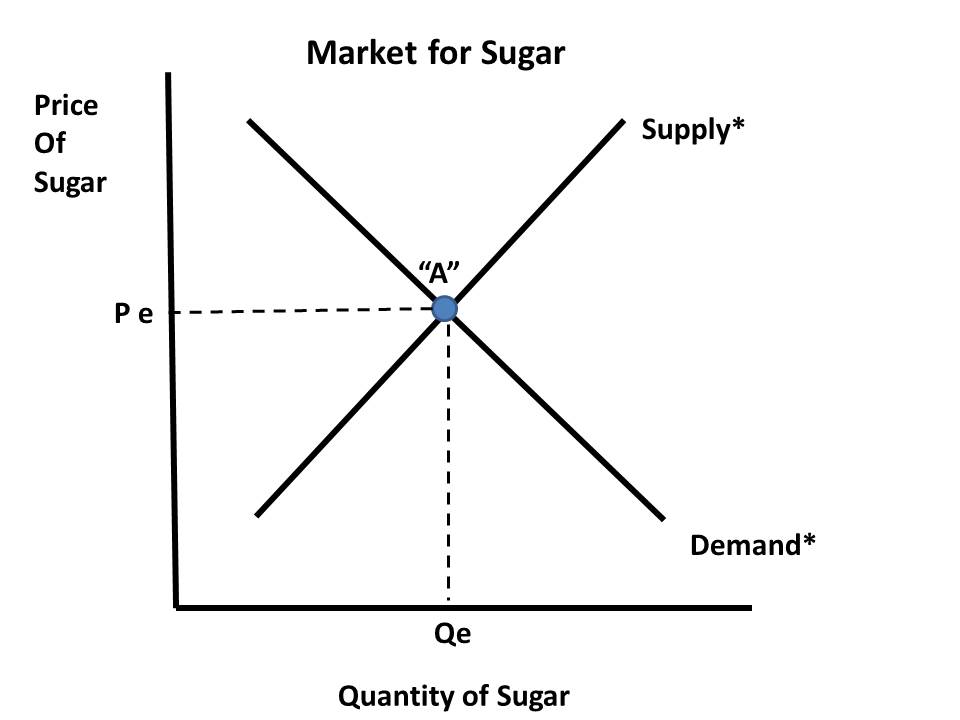
Here is my graphical representation of what is going on.

The first graph shows the market in equilibrium.

 This graph shows the surplus at "Pe".  Due to the bumper crop of sugar, the quantity supplied at Pe is now Qs at Point "B".

 Quantity Supplied is greater than Quantity Demanded (Qs - Qd--the difference between "B" and "A") so there is a surplus of sugar at "Pe".

If left alone, the market supply curve would shift to the RIGHT ("Supply 1") and the market price would drop to "P1" at Point "C" as it is anticipated to do. 

 Not so fast. As the excerpt above suggests the Fed Govt is going to purchase that SURPLUS before it has a chance to impact the market place.


 "Supply 1" will shift back to the original position "Supply*".


And we will be back to where the market was before, assuming no other variables changes.


Benefits accrue to a relatively small faction of the economy, sugar growers.  The costs are dispersed among all consumers and businesses that use sugar as an input to make many other products.  

Subsidies distort market prices and provide an incentive to over-produce.  


"Intentions should not be confused with results"---this logic does not apply to Farm Bill policy---Subsidies for water saving equipment results in MORE water usage. Sigh...Predictable...


A nice example of an un-intended (but predictable) consequence of a policy designed to address a specific problem but ends up making things worse.  As I have read elsewhere, "you don't want to confuse intentions with results".  However, seems like much public policy is determined this way.

Subsidies are public transfer payments from the government to producers.  Subsidies reduce the cost of production of a final good or service so we end up with more of that good or service.

As discussed in this NYTIMES article, subsidies to farmers to purchase more water efficient, hence water saving, irrigation systems has encouraged the use of MORE water overall:

Farm Subsidies Leading to More Water Use

From Wyoming to the Texas Panhandle, water tables have fallen 150 feet in some areas — ranging from 15 percent to 75 percent — since the 1950s, scientists say, because the subsidies give farmers the incentive to irrigate more acres of land. Other areas, including several Midwestern states, have also been affected.The Environmental Quality Incentives Program, first authorized in the 1996 farm bill, was supposed to help farmers buy more efficient irrigation equipment — sprinklers and pipelines — to save water.But the new irrigation systems have not helped conserve water supplies, studies show. And researchers believe that the new equipment may be speeding up the depletion of groundwater supplies, which are crucial to agriculture and as a source of drinking water.  
This an example of the "Rebound Effect".
In conservation and energy economics, the rebound effect (or take-back effect) refers to the behavioral or other systemic responses to the introduction of new technologies that increase the efficiency of resource use. These responses tend to offset the beneficial effects of the new technology or other measures taken. While the literature on the rebound effect generally focuses on the effect of technological improvements on energy consumption, the theory can also be applied to the use of any natural resource or other input, such as labor. The rebound effect is generally expressed as a ratio of the lost benefit compared to the expected environmental benefit when holding consumption constant. For instance, if a 5% improvement in vehicle fuel efficiency results in only a 2% drop in fuel use, there is a 60% rebound effect (since (5-2)5 = 60%). The 'missing' 3% might have been consumed by driving faster or further than before.
Seems to me the only way this policy would have been effective is if they did not allow farmers to grow more food than before---same fixed land use with less water use equals less water use per acre.
Subsidies for water conservation equipment encourage more production of food not less (or constant).
Good intentions, bad results.  Usually we re-think doing things that produce this outcome.  
Not with Farm Policy, apparently...

Sunday, June 16, 2013

Update on my Stock Market Activity I do for my Econ classes. See my results since 2006...

I just recently updated my simulated Stock Market activity I do along-side my students for the Personal Finance part of my Economics classes (Sometimes with my AP classes but usually just for my "regular" econ classes.

I have students invest $25,000 in the stock of 5 companies.  They choose from a limited list of 100 companies.  Students have to calculate all the information you see below and we follow the stocks for a good part of the semester.

As you can see, I started this in 2006 when the economy was doing well, tanked, then "recovered".

For the most part, this is nominal evidence for not giving up and to "Hold em', Not Fold em' "

Focus on my gain and/or loss(es) and Rate of Return.  I have only one bad one---Speedway Sports owns some of the most well known NASCAR race tracks.  I calculated the total Rate of Return on these stocks at the end.


Saturday, June 15, 2013

I am "egg-cited" to offer you this graphical explanation as to why the price of eggs has increased dramatically..."Umm-Let" me know what you think.


My demand for eggs is almost perfectly Inelastic. This means my quantity demanded pretty much stays the same regardless of the price (or within a pretty wide price range). I don't buy more as the price decreases or less as it increases.

However, I do recognize this is not the case with most people for individual consumption or businesses for commercial use as an input.

So, this article in the Wall Street Journal caught my interest and is game for a little graph-fest..

What Made Egg Prices Soar Nearly 42%?

"...A leading reason for the crack up: U.S. farmers are exporting more eggs to Mexico, eating into supplies for American consumers. The United States’ southern neighbor has been hit by avian influenza, forcing the slaughter of thousands of chickens...."
 Let's illustrate what is going on here.

First here is the US Market for Eggs in equilibrium before the change cited in the excerpt above.
"Supply*" represent domestic US supply.  If US egg producers export more eggs to Mexico, presumably because Mexican consumers and businesses are willing and able to pay a higher price, then there will be FEWER eggs at EVERY PRICE for US consumers:
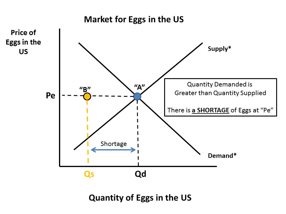
At the equilibrium price of "Pe" we no longer have an equilibrium market quantity of "Qe" where Quantity Supplied = Quantity Demanded.  We are in disequilibrium where Quantity Demanded is GREATER than Quantity Supplied.  What is true at "Pe" is going to be true at every other price Quantity Supplied combination on "Supply*".  Our market supply curve will shift to the LEFT---"Supply 1".
Our new equilibrium price is going to be "C"...But WHY?

Assume the market place does not immediately adjust and the price remains at "Pe".  A shortage in the market will emerge equal to the distance between "Qd" and "Qs". Will American egg producers sell all those eggs to citizens of Mexico?  No, but they WILL ask Americans to bid against them for the eggs.

In this next graph, look at the triangle formed by Points "A", "B" and "C".
It is important to understand what happens next to reach a new market equilibrium.  As the price is bid up, producers are willing and able to supply and larger quantity to US consumers.  However, at a higher price consumers are willing and able to demand a smaller quantity.
We move ALONG our respective Supply Curve ("Supply 1") and ALONG our respective Demand Curve ("Demand*") until we reach new market price "P1" and market quantity "Q1").

Here is our final graph, all cleaned up.
I hope this lesson was Egg-actly what you need to understand a little supply and demand.

Don't "poach" these graphs to use as your own.

"Ummm-Let" me know what you think.  :)


The Corn Belt is expanding at the expense of Wheat. If you are a teacher or student of economics you will be interested in my analysis of how this affects the PPF for Corn and Wheat...

Here is a nice example of how changing conditions ("exogenous variables") alter opportunity costs as they are illustrated on a Production Possibilities Frontier.  Read this excerpt and my discussion continues below.

U.S. Corn Belt Expands to North

Warmer Climate, Hardier Seeds Help Crop Gain on Wheat, North Dakota's Staple

"...Wheat has long dominated the windswept farm fields of the northern Great Plains. But increasingly, farmers here are switching to corn, reflecting how climate change, advancements in biotechnology and high corn prices are pushing the nation's Corn Belt northward.
The shift, which is occurring in northern Minnesota and Canada's Manitoba province as well, shows how warming temperatures and hardier seeds are enabling farmers to grow corn in areas once deemed inhospitable to the crop. As a result, North Dakota's farmers, who produced 4% of last year's U.S. corn crop and are benefiting from high prices for other crops, are invigorating the state's agricultural economy at the same time its energy sector is thriving...."
The general assumption in the PPF model is resources used for one purpose are not easily adaptable or convertible to alternative uses. Some land is more suited for wheat production and if a farmer tries to use some of that land for corn production instead, then it will be increasingly costly to do so in terms of the amount of wheat that land could have produced.

Example:  If I grow wheat on acreage more suited for wheat production and then try to grow some corn instead it might take 4 acres I used to grow wheat to get 1 acre equivalent yield in corn.  In other words, to get 1 acre yield in corn I gave up 4 acres yield in wheat.  That is pretty costly.

The highlighted and underlined portion of the above excerpt suggests that the listed factors have served to reduce the opportunity costs for planting more corn by making wheat resources MORE adaptable to the alternative use of producing corn.

Hey, look, I made some graphs to show this!!

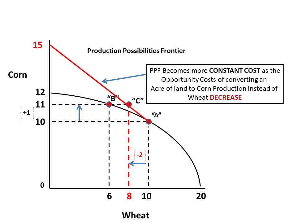
Currently this farmer is producing a bundle of corn and wheat at Point "A".
 Assume she wants to produce another acre worth of corn.  According to the PPF if she does this it is going to cost her 4 acres worth of wheat. We are at Point "B" now.
 Lets assume that the factors listed in the article reduce the opportunity costs of producing corn to just 2 acres worth of wheat. So instead of moving to Point "B" she moves to Point "C" on her PPF.
 The way I read this now is the PPF above Point "A" is going to be less "bowed" (indicating ever increasing opportunity costs as you move along it) and more "constant".
There will be MORE potential yield of corn per acre of wheat given up than there was before.  So, now every time the farmer gives up 2 acres of wheat production, the yield in corn will be greater than before. (I use 15 as an outlier). As the farmer moves along the Red section of the PPF they still give up bushels of wheat to get more corn but it is less costly than before ("ceteris paribus").
Note: Not built to scale so the numbers on the vertical and horizontal axis are not perfect.  Also, keep in mind the numbers reference potential yield in bushels of wheat and corn per acre.  I am not suggesting corn acreage is increasing from 12 to 15.

Sunday, June 9, 2013

"When you turn off your cell phone, does it dream?"---Is Freud working for the NSA now?

My mind wonders even at the movie theater.

In an effort to get people to turn off their phones they have this little PSA that asks "When you turn off your cell phone, does it dream?".

My snarky thought: I don't know. Why don't you ask the NSA.  They would know the answer to that question.

Saw "Now You See Me".  Did not really like it. How does a full-time FBI agent have all the free time to think that stuff up and carry out the details.  Oh, maybe it relates to my thought---he lets the NSA collect data and analyze it for him.

Now it makes sense.

Friday, June 7, 2013

Quick Snapshot of today's employment report. 175,000 net new jobs created. But are they "good jobs"? See the evidence here...

In May the BLS reports the number of new jobs created (net) was 175,000 (first yellow highlight).

Of those 175,000 jobs the big gainers were in the categories of Retail Trade (+27,700), Temporary Help Services (+25,500) and Leisure and Hospitality (+43,000).

These three sectors accounted for 96,200 of the jobs created, or 55% of the total.

Not sure what the breakout is, but I would say a good portion of these jobs are part-time, lower wage positions. No data to back that up having worked in those sectors in my lifetime, I think from experience I am safe in than conclusion.

It is great that we are creating these jobs.  But are we creating a healthy, vibrant economy.

I don't think when over 50% of the new jobs are in these categories we are.  What do you think?

Thursday, June 6, 2013

New revision to the number of jobs needed to maintain a steady unemployment rate. The change is dramatic and of consequence!

When the monthly employment report is published by the Bureau of Labor Statistics (BLS) it reports the number of new jobs created and lost during the month and the change in the unemployment rate.  In a seemingly odd quirk, when there is a net gain in jobs created sometimes the unemployment rate goes down (as it seems it should) OR up (as it seems it SHOULDN'T).  How does that happen?

Variables such as a change in population due to birth rates or aging, new entrants such as high school or college graduates, immigration, can affect the number of people classified as part of the labor force.

In a recovering economy the only way to bring down the unemployment rate is to have net job creation that is greater than the number of new entrants/re-entrants into the labor force PLUS some that are already in the labor force but are currently classified as officially unemployed.

 Net job creation can be positive but unless it at least EQUALS the change in labor force then the unemployment rate will stay the same.  If less, then the unemployment rate will increase (ceteris paribus).

Previously in the media and in the economic blogosphere, economist have suggested that we need anywhere between 150,00 to 225,000 net new jobs just to keep up with the increase in the labor force.

A new study from the Federal Reserve suggests this number is MUCH lower, about 80,000 per month!

Here is a short excerpt.  The paper is very short and has some interesting graphs. I encourage you to read it to keep up on this important trend in the labor markets!

Estimating the trend in employment growth
For the unemployment rate to decline, the U.S. economy needs to generate above-trend
job growth. We currently estimate trend employment growth to be around 80,000 jobs
per month,
and we expect it to decline over the remainder of the decade, due largely
to changing labor force demographics and slower population growth.

Tuesday, June 4, 2013

Did Disney raise its admission prices just to keep up with inflation? (Also a link to historical prices to the "Happiest Place on Earth")

This is an extension of a Disney post on the recent price increase. Here is that one.

Below is a single day ticket for entry into Disney World from 2003 (for a list of historical admission prices to Disney, go HERE). Note is says entry into Epcot for $52.00 but that was the price to get into any of the parks.

For the first time Disney has priced Magic Kingdom at a different price than the other parks.  Magic Kingdom now costs $95 for a one day ticket. It costs $90 for a one day ticket to the other theme parks.

I have read in several places that Disney has increased the price of admission well beyond the rate of inflation for the year. True enough. But what about longer term?  Maybe they are just making up for lost ground with not being able to raise prices enough in the past?

According to this BLS inflation calculator, $52 in 2003 in today's dollars would be  $65.72. Yikes! The ticket price today  is well beyond the 10 year rate of inflation. $95 - $65.72 = $29.28 divided by $65.72 = 45%.

I think they are doing fine on the keeping up with inflation front.

Source: HERE

View My Stats