The Wall Street Journal has two perspectives on "Entitlements" in the US Federal Budget. Read BOTH with an open mind as to the point of view.
The question posed is: "Are Entitlements Corrupting us?"
…..-Yes, American Character Is at Stake
…..-No, They’re Part of the Civic Compact
Sunday, September 2, 2012
Thursday, August 30, 2012
Here is what the Pres ACTUALLY said in reference to the "You did not build that" quote. See how I re-phrase it and ask why ANOTHER sentence in what he said is not talked about at all..
Below are some of the before and after sentences from the now famous off-teleprompter comments from President Obama that resulted in the "You did not build that" mantra.
Supporters of the President suggest that he was referring back to the previous sentence--"Somebody invested in roads and bridges" and the "you did not build that" refers to the fact that businesses did not actually physically build the roads and bridges.
Did he mean to say (my revisions and emphasis): "Somebody invested in roads and bridges. If you've got a business---you did not build THOSE roads and bridges. Somebody else made those roads and bridges happen".
This is STILL very inelegant to me! I don't really know what "somebody" refers to exactly---Government transportation workers? Wall Street Bond dealers who sell municipal construction bonds for construction projects? Private contractors who actually invest in the equipment to build roads and bridges? Voters who approve bond elections and PAY TAXES to fund the roads?
I think ANOTHER line in the Presidents statement is curious and not sure why it has not attracted more attention:
The only line with positive effect, in my opinion, is the last sentence. I can buy that---to an extent.
If you were successful, somebody along the line gave you some help. There was a great teacher somewhere in your life. Somebody helped to create this unbelievable American system that we have that allowed you to thrive. Somebody invested in roads and bridges. If you've got a business — you didn't build that. Somebody else made that happen. The Internet didn't get invented on its own. Government research created the Internet so that all the companies could make money off the Internet. The point is, is that when we succeed, we succeed because of our individual initiative, but also because we do things together.The fuss is what he actually meant. I don't really know, to tell the truth. If you take the highlighted sentence as a stand alone sentence and then it is confusing--and you have to put that at the feet of the President. Awkward phrasing at the minimum.
Supporters of the President suggest that he was referring back to the previous sentence--"Somebody invested in roads and bridges" and the "you did not build that" refers to the fact that businesses did not actually physically build the roads and bridges.
Did he mean to say (my revisions and emphasis): "Somebody invested in roads and bridges. If you've got a business---you did not build THOSE roads and bridges. Somebody else made those roads and bridges happen".
This is STILL very inelegant to me! I don't really know what "somebody" refers to exactly---Government transportation workers? Wall Street Bond dealers who sell municipal construction bonds for construction projects? Private contractors who actually invest in the equipment to build roads and bridges? Voters who approve bond elections and PAY TAXES to fund the roads?
I think ANOTHER line in the Presidents statement is curious and not sure why it has not attracted more attention:
"Government research created the Internet so that all the companies could make money off the Internet."Does it help to have the line preceding it for reference? Did the government researchers 50 years ago develop the internet with the expressed goal of creating a market for it in which companies will get fabulously rich? Emphatic no! Yes, you could say "You KNOW what he meant!!". True, but that is not what he said. This sentence is just as awkward as the other. I get hung up on the "so that" connector. If I was grading this as a test, I would put a question mark over/on it.
The only line with positive effect, in my opinion, is the last sentence. I can buy that---to an extent.
Federal Budget spending in stacks of $10,000 bills sitting on pallets. See the three towers of political gridlock right here. Here's your sign...
The 3 pillars of the Federal Budget illustrated here--Social Security, Health Care (primarily Medicare and Medicaid) and National Defense. The rest is commentary, in my opinion.
The stacks are composed of individual pallets with packets of $10,000 bills. Each pallet holds $100,000,000 (100 Million dollars).
The fastest growing of these is Health care. This is the reason this should be THE topic of discussion in the Presidential election, for better or worse.
More great visulazations like the HERE.
The stacks are composed of individual pallets with packets of $10,000 bills. Each pallet holds $100,000,000 (100 Million dollars).
The fastest growing of these is Health care. This is the reason this should be THE topic of discussion in the Presidential election, for better or worse.
More great visulazations like the HERE.
 |
| Source: DemocracyInfo |
Wednesday, August 29, 2012
Nice graph showing global Arms Sales. Instability has been very, very good for US companies that make things that go BOOM!
Here is one way to quickly meet President Obama's goal to double US exports before his first term is up.
This graph show military arms sales to various countries, primarily in the Middle East.. Notice the surge in 2010 (latest data). Yikes!
This is due to the various dust-ups in the region, lead by the real or perceived threat that is Iran.
You can see, the US is the leader in sales relative to other countries with well developed capabilities to make stuff for war/defense.
Instability is GOOD for making things that go BOOM!! :)
This graph show military arms sales to various countries, primarily in the Middle East.. Notice the surge in 2010 (latest data). Yikes!
This is due to the various dust-ups in the region, lead by the real or perceived threat that is Iran.
You can see, the US is the leader in sales relative to other countries with well developed capabilities to make stuff for war/defense.
Instability is GOOD for making things that go BOOM!! :)
 |
| Source: Mother Jones |
Nice Infographic showing the decrease in the size of packaging for some of your favorite products. Inflation without an increase in price. I feel ripped-off.
This infographic illustrates "hidden" inflation that may not adequately captured in the governments compilation of the Consumer Price Index (CPI)---what the Federal govt. uses to measure general changes in prices from one time period to another, resulting in a measure of inflation or deflation.
If from one CPI measuring period to another the contents of a good you purchase is sold in a smaller quantity (on a per ounce or per piece basis) BUT the price of the good remains the same, is isn't that an increase in the price of the good without, well, an increase in the price of the good?
I buy less quantity at the same price as before the "shrinkage"---My purchasing power has decreased.
The increase in the price of one good, or even a whole category of goods, is not considered inflation ("A general rise in prices"). BUT I do FEEL poorer after looking at the chart below and see how I am getting less for more.
How about you??
If from one CPI measuring period to another the contents of a good you purchase is sold in a smaller quantity (on a per ounce or per piece basis) BUT the price of the good remains the same, is isn't that an increase in the price of the good without, well, an increase in the price of the good?
I buy less quantity at the same price as before the "shrinkage"---My purchasing power has decreased.
The increase in the price of one good, or even a whole category of goods, is not considered inflation ("A general rise in prices"). BUT I do FEEL poorer after looking at the chart below and see how I am getting less for more.
How about you??
 |
| Source: Good Morning Inforgraphics |
Nice infographic showing Income by Religious Belief. .
Income distribution by religious belief. Click on image to make larger or go HERE to the site and see the original image.
 |
| Source: Pew Research via Chart Porn |
Monday, August 27, 2012
With hurricane Issac looming there are the inevitable cries of "Price Gouging!" with gasoline. Please read this to get some perspective before getting angry.

Most businesses, on a daily basis, do not stock more inventory than they can sell. This is especially true if the good is perishable or expensive to keep in stock. In other words, they try to not have any unnecessary excess inventory if they can avoid it.
If I am selling a good, say gasoline, that is both perishable and expensive to stock, I would like to time it so that the quantity of gasoline I supply in a 24 hour period (before the trucks come to re-supply me) equals the quantity of gasoline demanded by my customers. I have no or little excess gasoline in my tanks for the day. This is just good business practice, agreed??
Let's say I have studied my inventory spreadsheets and determine on average I need 1,000 gallons of gas in my tanks (my quantity supplied) to meet my daily average quantity of gasoline demanded by my customers.
For me, quantity supplied (1,000 gal) = quantity demanded (1,000 gal) at, say, $3.00 per gallon. I am at a relatively steady equilibrium on a daily basis. So far so good.
Now there is a hurricane or some other natural disaster looming. I notice not only are my customers for that day coming for gas, but so are some of the others who I know filled up the day before yesterday are coming in to "top off the tank". In addition, I also notice they have a gas can or two (or 5) with them.
Halfway through the day I check my gas inventory and see I am selling 20% more gas at that time relative to a normal day. I project I would need 1,200 gallons at $3.00 a gallon to meet the needs of my customers. At this rate my 1,000 gallon tank is going to be empty by late afternoon and my other, regular daily customers will not be able to buy ANY gas. I will be out!! The anger will be palpable.
How do I avoid this? My supplier can't get another truck to me in a timely manner because ALL the other gas stations in the area are experiencing the same thing I am (this more to this part of the story (the suppliers side) but I will leave it out for now).
Economic theory suggests if I raise the price for each gallon of gas then "at the margin" buyers will decrease their quantity demanded. But the question becomes, how much do I have to raise the price of each gallon to make sure I have enough gasoline to sell to anyone who wants some for the rest of my business day?
My goal is to get each customer to purchase a little less gasoline than they otherwise would, even in the face of the natural disaster. Maybe forgo filling one or two extra gas cans. As each person purchases less then the cumulative effect will be such that I will have gas for everyone (or most everyone) who comes in to get some throughout the day. That is admirable on my part, don't you think?
What increase in price would be enough to accomplish this? $.10 cents a gallon? $.20? $1.00? More?
People are getting out of town. Gotta have gas! Seems like it will take a significant increase in the price to incentivize them to think about each additional gallon of gas they are buying. Again, if I can stop them through aggressive pricing from buying "too much" then there will be some for the next person--so on and so forth.
Here is my dilemma: If I increase the price enough to sufficiently reduce quantity demanded to meet more needs/wants, people will yell "PRICE GOUGER!!" (But they are at least driving down the road). On the other hand, if I run out of gas my customers are going to be mad AND not have any gasoline to get down the road.
What am I to do?
Note: Here is an article written by a REAL economist on this topic. Much more academic in nature than my analysis. Worth a read.
Saturday, August 25, 2012
Dispelling the myth of the low US ranking in Infant Mortality. It depends on the definition of what a "Live Birth" is. See the distortion here...
Below you will see a chart with a partial list of the 2011 Global Infant Mortality Rates/Rankings . The US is ranked 41st (tied with Faeroe Islands!?) in the world. This has to be bad, right?
Click HERE to see chart in larger format.
It depends on what your definition of a "Live Birth" is. In this case it matters.
The World Health Organization (WHO) gives the following definition of a "Live Birth" for the purposes of collecting data on Child Mortality rates:
""Live birth refers to the complete expulsion or extraction from its mother of a product of conception, irrespective of the duration of the pregnancy, which, after such separation, breathes or shows any other evidence of life - e.g. beating of the heart, pulsation of the umbilical cord or definite movement of voluntary muscles - whether or not the umbilical cord has been cut or the placenta is attached. Each product of such a birth is considered live born.""
The US and a relatively small selection of other countries follow this definition closely, but many of the others on this list AHEAD of the US do not, to varying degrees.
In their comments section they add this caveat:
"The reliability of the neonatal mortality estimates depends on accuracy and completeness of reporting and recording of births and deaths. Underreporting and misclassification are common, especially for deaths occurring early on in life."
Here are some examples of the LOWER BOUNDS of what many counties ahead of the US use as standards for reporting "Live Births". In other words, infants born alive and then die that are LESS than these time and weight (i.e "Preemies") requirements are NOT counted in the statistic. The US records ALL live births no matter how short lived and small in stature. In this chart, the US would have "No Limit" in both categories.

I cannot find reliable definitions of Live Births that some of the other countries on the list ahead of the US might use. But I have to guess many/most of them are not as strict as the US and other developed countries.
Bottom line: If ALL countries used the same standard, the US would not be anywhere near a tie for 41st place. Can there be any doubt about that???
Click HERE to see chart in larger format.
 |
| Source:Kaiser Foundation |
It depends on what your definition of a "Live Birth" is. In this case it matters.
The World Health Organization (WHO) gives the following definition of a "Live Birth" for the purposes of collecting data on Child Mortality rates:
""Live birth refers to the complete expulsion or extraction from its mother of a product of conception, irrespective of the duration of the pregnancy, which, after such separation, breathes or shows any other evidence of life - e.g. beating of the heart, pulsation of the umbilical cord or definite movement of voluntary muscles - whether or not the umbilical cord has been cut or the placenta is attached. Each product of such a birth is considered live born.""
The US and a relatively small selection of other countries follow this definition closely, but many of the others on this list AHEAD of the US do not, to varying degrees.
In their comments section they add this caveat:
"The reliability of the neonatal mortality estimates depends on accuracy and completeness of reporting and recording of births and deaths. Underreporting and misclassification are common, especially for deaths occurring early on in life."
Here are some examples of the LOWER BOUNDS of what many counties ahead of the US use as standards for reporting "Live Births". In other words, infants born alive and then die that are LESS than these time and weight (i.e "Preemies") requirements are NOT counted in the statistic. The US records ALL live births no matter how short lived and small in stature. In this chart, the US would have "No Limit" in both categories.

I cannot find reliable definitions of Live Births that some of the other countries on the list ahead of the US might use. But I have to guess many/most of them are not as strict as the US and other developed countries.
Bottom line: If ALL countries used the same standard, the US would not be anywhere near a tie for 41st place. Can there be any doubt about that???
Sunday, August 19, 2012
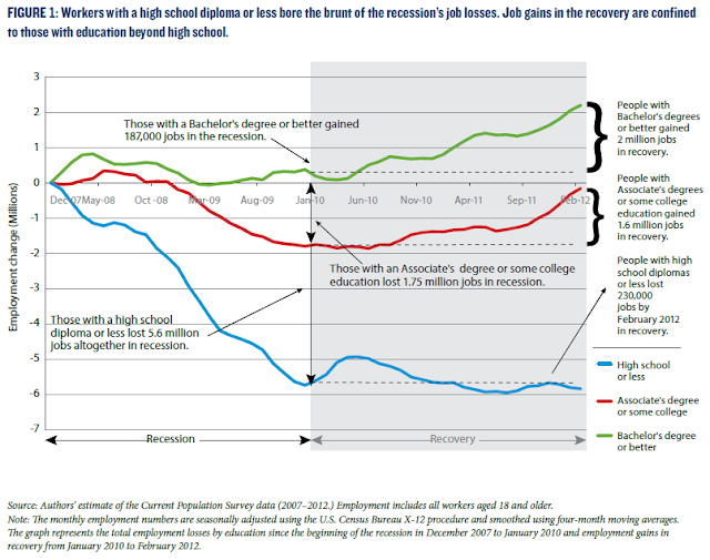
Teachers: If you need a quick visual to emphasize to students the link between education and employment show them these graphs. Students: If you need a reminder as to the importance of education and future employment, PLEASE look at these too.
There is a lot going on in this first graph, but it is important to know what is happening.
The vertical axis shows the percentage change in employment (jobs gained) since the official start of the Great Recession, through the official end of the recession (everything to the left of Jan 2010) and finally through the "recovery" to the present (everything in blue).
Note the bold brackets to the right showing the numerical change in jobs based on the level of education a worker has.
More education does not guarantee you anything but statistically you are more likely to (1) find a job, (2) not lose your job, (3) if you do lose your job you are more likely to find another one in a shorter period of time.
This second graph shows the value of education over an extended period of time--since 1989.
Dropping out or even finishing high school is not enough. ANY type of additional education will help you gain skills that make you more valuable to employers.
The vertical axis shows the percentage change in employment (jobs gained) since the official start of the Great Recession, through the official end of the recession (everything to the left of Jan 2010) and finally through the "recovery" to the present (everything in blue).
Note the bold brackets to the right showing the numerical change in jobs based on the level of education a worker has.
More education does not guarantee you anything but statistically you are more likely to (1) find a job, (2) not lose your job, (3) if you do lose your job you are more likely to find another one in a shorter period of time.
 |
| Source: KPC |
This second graph shows the value of education over an extended period of time--since 1989.
Dropping out or even finishing high school is not enough. ANY type of additional education will help you gain skills that make you more valuable to employers.
 |
| Source: KPC |
Saturday, August 18, 2012
Another chart showing the growth in energy consumption in the developed vs developing world from 2000 to 2011. Wow!
I just this one after the one I just previously posted.
The change in energy use JUST since 2000 is quite amazing. The BRIC countries, Brazil, Russia, India and ESPECIALLY China have all increased their consumption of energy (from a variety of sources, mostly carbon based) and developed countries for the most part consume a smaller share.
This can be good, bad, or ugly---depends on which side of the economic development scale you reside in.
The change in energy use JUST since 2000 is quite amazing. The BRIC countries, Brazil, Russia, India and ESPECIALLY China have all increased their consumption of energy (from a variety of sources, mostly carbon based) and developed countries for the most part consume a smaller share.
This can be good, bad, or ugly---depends on which side of the economic development scale you reside in.
 |
| Source: BusinessInsider |
Nice infographic showing the growth in carbon emissions in China. We can congratulate ourselves on our efforts to reduce emissions, but does it matter?
If you are interested in the topic of carbon emissions, this graphic is for you. It shows the changes in carbon emissions primarily in China and secondarily in other parts of the developing world.
I have seen a recent graph that shows carbon emissions in the US have dropped dramatically in the last few years. Some due to efficiencies, some due to the wider use of natural gas, BUT I would venture to guess MOST of the decrease is due to the recession and high(er) gas prices.
Do we have global carbon emission reductions (lead by the US) or has it just shifted to other places?

I have seen a recent graph that shows carbon emissions in the US have dropped dramatically in the last few years. Some due to efficiencies, some due to the wider use of natural gas, BUT I would venture to guess MOST of the decrease is due to the recession and high(er) gas prices.
Do we have global carbon emission reductions (lead by the US) or has it just shifted to other places?
Friday, August 17, 2012
Nice graph breaking down voting by age group over time. I guess it is easier to get to the polls using a walker as opposed to a skateboard. Go figure...
Hard to see the colors, but the line in the middle (58.2% on the right) is the"Total Voting Age Population" trend line. The top line (68.1%) represents "65 years and over". The other age groups are above or below the Total Voting Age Population line.
If you follow the 65 years and over line from right to left, you will see it is pretty steady over time.
While there is a decline in every other age group along the way, they show back up in the golden years.
If you were running for national office, which group would you target for votes and which group would you pay lip service to? Yeah, me too.
If you follow the 65 years and over line from right to left, you will see it is pretty steady over time.
While there is a decline in every other age group along the way, they show back up in the golden years.
If you were running for national office, which group would you target for votes and which group would you pay lip service to? Yeah, me too.
 |
| Source: Conversable Economist |
Thursday, August 16, 2012
There is a scourge 3 times larger than the drought affecting food prices. See it here in one easy chart...
The drought of the summer of 2012 is expected to result in the loss of 13% of the corn corp. This is widely reported as a disaster in need of immediate compensation.
Forty percent (40%) of the corn crop will lost due to the Federal Ethanol Mandate (3 times as much as the drought). This is narrowly reported as a problem and is ignored by politicians and policy-makers.
Why is this mandate still around, or at least modified? Just askin'...
Forty percent (40%) of the corn crop will lost due to the Federal Ethanol Mandate (3 times as much as the drought). This is narrowly reported as a problem and is ignored by politicians and policy-makers.
Why is this mandate still around, or at least modified? Just askin'...
 |
| Source: Coyote Blog |
Supply and Demand Extravaganza---Having fun with Lobster...
Nice blog entry from Business Insider on the price of Lobster in Maine.
There are LOTS of microeconomics concepts embedded in this short discussion, i.e. basics of supply and demand, perfect competition (lobster men are "price takers", restaurants in competitive markets), monopolistic competition (restaurants in tourist areas), and there is even a little "opportunity cost" thrown in for good measure.
Excellent resource for students to dissect, draw graphs, and discuss. Good times...
The Price Of Lobster Has Dropped To A 40-Year Low
There are LOTS of microeconomics concepts embedded in this short discussion, i.e. basics of supply and demand, perfect competition (lobster men are "price takers", restaurants in competitive markets), monopolistic competition (restaurants in tourist areas), and there is even a little "opportunity cost" thrown in for good measure.
Excellent resource for students to dissect, draw graphs, and discuss. Good times...
The Price Of Lobster Has Dropped To A 40-Year Low
Nice graph showing Total Government jobs now exceed Total Private Sector Goods producing jobs. Is this the new normal? I think so...
Nice graph showing where jobs have been concentrated since 1940.
On the vertical axis are the jobs in "thousands", which means you add 3 zeroes to the end of the number you see and read it as "10 million or 20 million" as you move up the axis.
Jobs can be divided up into 3 major categories--Private sector service-providing, Private sector good-producing, and Government sector jobs (Federal, State, and Local).
 |
| Source: The Big Picture Blog |
It is also interesting to note the private goods producing line relative to the government jobs line. They converge for the first time in 2002 and as of 2008 there are more government sector jobs than there are goods producing jobs.
It is a fact that, in real terms, we are producing more manufactured goods than ever--even TODAY, factoring in the recession!! Why is this?
""The falling cost of automation, globalization, relative wages, productivity increases, consumer/worker preferences, the rise of the internet, and political forces, are just a few of the many causes of the shift to service jobs, which now make up almost 70 percent of nonfarm payrolls.""---Source HEREIncreases in productivity in manufacturing occur external to what is happening with population. It is much more difficult to get the same productivity from government with increases in population. I am not saying you can't get better productivity in government, but you can't expect the same gains relative to private manufacturing. OR CAN YOU?
What do you think??
Subscribe to:
Posts (Atom)
 View My Stats
