 |
| Source: Carpe Diem |
Thursday, August 2, 2012
Sunday, July 29, 2012
The NY Times is catching on---Nice article on the impending Physician shortage in the US. Oh, you did not know that was going to happen? Econ 101...
The Affordable Care Act largely forgot about the "Supply-side" of "Demand and Supply". Here is an article in today's NYTIMES regarding the inevitable doctor shortage that will result. I included a couple of graphs I have used previously to show how this would be a predictable outcome.
The question we have to ask (looking at the first graph) is why has the number of graduates from US medical schools been constant since 1980?
Econ 101 question: If you increase demand without an increase in supply, what happens to price (absent price controls)?
Doctor Shortage Likely to Worsen With Health Law (NY TIMES)
The question we have to ask (looking at the first graph) is why has the number of graduates from US medical schools been constant since 1980?
Econ 101 question: If you increase demand without an increase in supply, what happens to price (absent price controls)?
Doctor Shortage Likely to Worsen With Health Law (NY TIMES)
""Health experts, including many who support the law, say there is little that the government or the medical profession will be able to do to close the gap by 2014, when the law begins extending coverage to about 30 million Americans. It typically takes a decade to train a doctor....
“We have a shortage of every kind of doctor, except for plastic surgeons and dermatologists,” said Dr. G. Richard Olds, the dean of the new medical school at the University of California, Riverside, founded in part to address the region’s doctor shortage. “We’ll have a 5,000-physician shortage in 10 years, no matter what anybody does...
The pool of doctors has not kept pace, and will not, health experts said. Medical school enrollment is increasing, but not as fast as the population. The number of training positions for medical school graduates is lagging. Younger doctors are on average working fewer hours than their predecessors. And about a third of the country’s doctors are 55 or older, and nearing retirement...""Here is what this situation looks like graphically.
 |
| Source: Carpe Diem |
 |
| Source: Carpe Diem |
Nice graph showing the change in how we communicate and get information since 1900. We REALLY don't talk to each other anymore...
Technology is rapidly changing the way we spend time communicating with each other and how we connect to the outside world.
It shows time in hours per day Americans, since 1900, have spent engaging in the above two activities. The various categories of activities are stacked on the right side. Notice the bottom 5 activities (from E-mail down to Social Networks) were virtually non-existent in the year 2000---only 12 years ago!
It shows time in hours per day Americans, since 1900, have spent engaging in the above two activities. The various categories of activities are stacked on the right side. Notice the bottom 5 activities (from E-mail down to Social Networks) were virtually non-existent in the year 2000---only 12 years ago!
 |
| Source: McKinsey and Company |
Notice how flat (and even descending) the lines are from 1980 to 2000---pretty stagnant, then BOOM! Those technologies take-off and rapidly start to consume our time.
What happened during this time-span to make this all possible? What are some of the economic, social and political costs and benefites to society?
Extra credit for good answers with details.
Wednesday, July 25, 2012
Side by side comparison of drought conditions---today and 1934, a Dust Bowl year....
Here are side by side comparisons of drought conditions today and 1934, a Dust Bowl year.
A stark reminder of how bad the conditions really were back then. Keep in mind how much MORE the average person depended on agriculture (directly or indirectly) as compared to today. I look at this and can feel their fear!!
A stark reminder of how bad the conditions really were back then. Keep in mind how much MORE the average person depended on agriculture (directly or indirectly) as compared to today. I look at this and can feel their fear!!
 |
| Source: USA Today |
Tuesday, July 24, 2012


This is what I thought about on my commute last week on public transit to downtown Chicago ...
Last week I rode the train from the Northwest Suburbs of Chicago to downtown Chicago to attend the AP US Govt and Politics College Board Summer Institute (AP Econ is next week). It takes about 45-60 minutes. After arriving at the train station I walked 2.25 miles to Northwestern U.
Along the way I see lots of large, abandoned manufacturing facilities and other buildings that were built sometime at the beginning-to-middle of the last century.
I have read lately that this represents under-utilized infrastructure/capital and is indicative of the decline in the US manufacturing base. "They say" if we could just revive the manufacturing sector we could put these idle resources back to work.
I don't see it. I see these buildings as "spent" capital/infrastructure. They served the old way of production---lots of labor relative to capital and technology. The capital/machines used were large and bulky and required large spaces. Most of those factories produced many of the inputs that went into a final good. Today, firms specialize and "out-source" the production of inputs. Capital/machines are much smaller and more productive. These buildings will never serve current or future manufacturing of any kind.
It is not under-utilized infrastructure--it is dead infrastructure.
When something dies, it should be buried or otherwise disposed of properly.
Why not spend "stimulus" funds to eliminate this dead infrastructure to make way for new uses for the land---whether it is for new construction or green areas. It would improve property values and have many other positives consequences for the blighted areas.
I think this is a relatively rare case where you can have addition though subtraction.
Any thoughts?
Note: I am a devotee of Basitiat. I don't think I am violating the principles of "The Broken Window"--the buildings are not "bringing enjoyment" to anyone, as far as I can tell. Could be wrong.
Also, I do acknowledge the "opportunity costs" of using resources for this purpose as opposed to something else. From a policy making position, I think it can legitimately be on the "to do" list.
Along the way I see lots of large, abandoned manufacturing facilities and other buildings that were built sometime at the beginning-to-middle of the last century.
I have read lately that this represents under-utilized infrastructure/capital and is indicative of the decline in the US manufacturing base. "They say" if we could just revive the manufacturing sector we could put these idle resources back to work.
I don't see it. I see these buildings as "spent" capital/infrastructure. They served the old way of production---lots of labor relative to capital and technology. The capital/machines used were large and bulky and required large spaces. Most of those factories produced many of the inputs that went into a final good. Today, firms specialize and "out-source" the production of inputs. Capital/machines are much smaller and more productive. These buildings will never serve current or future manufacturing of any kind.
It is not under-utilized infrastructure--it is dead infrastructure.
When something dies, it should be buried or otherwise disposed of properly.
Why not spend "stimulus" funds to eliminate this dead infrastructure to make way for new uses for the land---whether it is for new construction or green areas. It would improve property values and have many other positives consequences for the blighted areas.
I think this is a relatively rare case where you can have addition though subtraction.
Any thoughts?
Note: I am a devotee of Basitiat. I don't think I am violating the principles of "The Broken Window"--the buildings are not "bringing enjoyment" to anyone, as far as I can tell. Could be wrong.
Also, I do acknowledge the "opportunity costs" of using resources for this purpose as opposed to something else. From a policy making position, I think it can legitimately be on the "to do" list.
Nice graphic showing drought conditions each year in the US since 1899. Is there a pattern??
Go HERE for a larger image of the graphic and article at NYTIMES.
Each line of maps represents a decade of drought conditions in the US. Can you see a pattern of worsening conditions over time? Or is it inconsistent enough to not be able to draw any conclusions?

Each line of maps represents a decade of drought conditions in the US. Can you see a pattern of worsening conditions over time? Or is it inconsistent enough to not be able to draw any conclusions?
Sunday, July 22, 2012
Find out how your city/region would fare in terms of GDP if it was its own country.
Here is a world GDP (Gross Domestic Product) ranking by country AND with the added twist of including the dollar value of production of goods/services in US cities/metropolitan areas.
To look at this properly, DO NOT include the US GDP number. This is because the overall US GDP number INCLUDES the city/metropolitan area number. It is there for reference and scale. In your mind, bump up every country/city on the list one spot.
If you look down the list, you see "New York/Northern New Jersey-Long Island, NY-NJ-PA". This represents a regional geographic area that produces $1.287 TRILLION dollars in final goods and services.
If this geographic area were its own country, it would be the 13th (remember, you have to bump up one spot) largest economy in the world in terms of the dollar value of goods and services it produces.
Go down the list and find your city/metropolitan area and see how it ranks relative to the rest of the world. The US is STILL a production machine. We often forget that.
Note: The screen shots I took here are not the entire list. Go HERE at the Wall Street Journal to find the rest, if you don't see your area here.


To look at this properly, DO NOT include the US GDP number. This is because the overall US GDP number INCLUDES the city/metropolitan area number. It is there for reference and scale. In your mind, bump up every country/city on the list one spot.
If you look down the list, you see "New York/Northern New Jersey-Long Island, NY-NJ-PA". This represents a regional geographic area that produces $1.287 TRILLION dollars in final goods and services.
If this geographic area were its own country, it would be the 13th (remember, you have to bump up one spot) largest economy in the world in terms of the dollar value of goods and services it produces.
Go down the list and find your city/metropolitan area and see how it ranks relative to the rest of the world. The US is STILL a production machine. We often forget that.
Note: The screen shots I took here are not the entire list. Go HERE at the Wall Street Journal to find the rest, if you don't see your area here.


Nice graphic showing the decline over time in the number of teenagers getting drivers licenses. WHY is this the trend?
Why don't young people want to drive anymore? Is this a good or bad thing?
As you move from left to right on this graphic, focus on the difference in the BLUE line (1983) and the GREEN line (2010). The bars represent the percentage of that age group in those particular years that have drivers licenses given that year. In other words, the number with licenses in that age group divided by the number of people in that age group in that particular year (1983, 2008, 2010).
Example: In 1983 approx 70% of 17 year olds had licenses. Fast forward to 2010 and approx 47% did. That is around a 33% decrease. Certainly not insignificant.
The article this graphic comes from points out the statistically significant decline between 2008 (the RED bar) and 2010 (the GREEN bar) and asks what is driving this decline in the desire to get a license.
On the negative side I can see this affecting used cars sales, a big business for car dealers.
On the positive side I see fewer accidents, hence injuries and deaths. Use of less gasoline. Parents don't have to pay high car insurance premiums.
I can come up with more positives than negatives. Extra credit for good responses at to how this trend may negatively impact the economy as a whole today and in the future.
As you move from left to right on this graphic, focus on the difference in the BLUE line (1983) and the GREEN line (2010). The bars represent the percentage of that age group in those particular years that have drivers licenses given that year. In other words, the number with licenses in that age group divided by the number of people in that age group in that particular year (1983, 2008, 2010).
Example: In 1983 approx 70% of 17 year olds had licenses. Fast forward to 2010 and approx 47% did. That is around a 33% decrease. Certainly not insignificant.
 |
| Source: The Atlantic |
On the negative side I can see this affecting used cars sales, a big business for car dealers.
On the positive side I see fewer accidents, hence injuries and deaths. Use of less gasoline. Parents don't have to pay high car insurance premiums.
I can come up with more positives than negatives. Extra credit for good responses at to how this trend may negatively impact the economy as a whole today and in the future.
Wednesday, July 18, 2012
Was Romney right in saying we need fewer Fire Fighters? See the graphs/data here before yelling at me...
Here are a couple of graphs showing some interesting information regarding firemen (and women).
The first one shows the decrease in the number of fires since 1980 (the RED line and look at the left hand scale) of about 40% and the increase in the number of firefighters (BLUE line and look at the right hand scale) of about 40%. We have many more firemen fighting fewer fires.
The second graph is pretty self-explanatory. The left scale shows the number of calls to the fire department for medical calls (BLUE line), actual fire calls (Solid RED line) and false alarms (dotted RED line).
In most cities we have firehouses that support BOTH ambulance service and firefighting equipment/trucks. The trend in the graphs seem to show we need fewer, expensive full service firehouses and more ambulance based houses with less capital requirements (trucks, etc) that would be less expensive.
Having said this, I LOVE MY FIRE DEPARTMENT!! :)
The first one shows the decrease in the number of fires since 1980 (the RED line and look at the left hand scale) of about 40% and the increase in the number of firefighters (BLUE line and look at the right hand scale) of about 40%. We have many more firemen fighting fewer fires.
 |
| Source: Marginal Revolution |
The second graph is pretty self-explanatory. The left scale shows the number of calls to the fire department for medical calls (BLUE line), actual fire calls (Solid RED line) and false alarms (dotted RED line).
 |
| Source: Marginal Revolution |
Having said this, I LOVE MY FIRE DEPARTMENT!! :)
Batman vs Spiderman--nice income inequality info-graphic.
Equal opportunity does not guarantee equal outcomes. :)
Click image to see a larger versionSuperhero Economics: Bruce Wayne vs. Peter Parker via H&R Block

Friday, July 6, 2012
UN calls for a billionaires tax to help the world's poor. Thought I would re-write the headline so it actually solves the problem...
Saw this headline on Yahoo!News:
UN calls for 'billionaires tax' to help world's poor.I thought this is what the headline should really be to actually produce some positive results:
"UN calls forJust sayin'...'billionaires tax'government reforms in under-developed countries to help world's poor become billionaires (or millionaires, thousand-aires, or whatever they would like to be)"
Quick Snapshot of todays Employment Report---Not good...
The significant gainers for the month are in BLACK and the losers are in RED. Numbers are in thousands, so add 3 zeroes behind the number. Be careful to not include the headline category number when you look at these. Look at the sub headings for the job number.
Temporary help, Leisure and Hospitality, and Healthcare jobs are NOT going to lead a robust recovery.
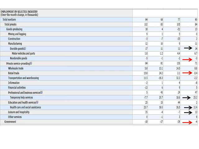
Temporary help, Leisure and Hospitality, and Healthcare jobs are NOT going to lead a robust recovery.

Thursday, July 5, 2012
"You should drive a car "Made in America"! Well, I do in fact drive the car with the MOST US sourced parts and labor--- Toyota Camry. See more here...
Cars.com comes out with this list every year. It is a ranking of cars made in the USA, regardless of ownership of the automaker, based on the source of parts and final assembly. Turns out that some of the most popular cars produced by the Japanese are more "Made in America" than some of the US manufacturers of cars.
5 of 10 models of cars with high (more than 75%) US sourced parts and labor are either Toyota or Honda models...(HT: Carpe Diem---as always)

5 of 10 models of cars with high (more than 75%) US sourced parts and labor are either Toyota or Honda models...(HT: Carpe Diem---as always)
Subscribe to:
Posts (Atom)
 View My Stats