Wednesday, June 13, 2012

Update to my graph on Federal Employment...See what those people were hired to do during the recession. Surprising results...

I did not want to appear flippant in my last post on Federal Employment suggesting that additional Federal employees added to the Federal payroll were "Zero Marginal Product" employees. 

Using Census data I found the general categories of  employment for Federal employees and the change in employment from December 2007 (start of recession) to March 2010 (the latest data available).  These numbers are for FULL-TIME employees. There are substantial numbers of part-time workers but I choose to leave those out for now.

In the far right column I calculated the change in employment for each category.  I put an asterisk next to the numbers that stuck out from the rest.


Observation: "Health and Hospitals" added a combined 43,000+ jobs and "National Defense/International Relations" added 72,000+.  Together these two categories account for 115,000 full-time positions, or 62% (est.) of the total jobs "created" in the Federal Govt during this time span. Were these areas in such deficit that they needed this type of "pumping up"?  I honestly don't know.

The relatively large number of new Federal "Police" is curious to me. I am no conspiracy theorist, so don't go there, please. 


How about your observations.  What do you see?

Tuesday, June 12, 2012

Fact: Federal Govt employment has increased 125,000 since Inaguration Day. Allegation: Federal spending has remained almost flat since Inaguration Day. Question: What are those 125,000 people doing? See graph here...

Below is a graph that measures the change in Federal employees (NOT counting Postal employees) since 2007 (Pre-Recession).  The gray area represents the the time span of the recession.  The vertical Red Line shows when Pres Obama took office (Jan 2009).

At Point "A"  when the Pres took office the number of Federal employees was 2.075 million.

The big spike in 2010 represents massive, temporary hiring to do the Constitutionally mandated Census that occurs every 10 years. Ignore this spike.

Point "B" represents the number of Federal employees, 2.2 million, in May 2012 (latest measure).

The difference between "A" and "B" is the increase in the number of Federal employees since the Pres took office. This number is approx. 125,000.

If you want to extend the timeline back a bit to the beginning of the recession (left edge of the gray area) you will see that Federal govt employment increased 100,000 from that point to Inauguration Day 2009.  The total change in Federal employees since the beginning of the recession is 225,000

Just ball-parking AVERAGE Federal employee TOTAL compensation (wages + benefits) of $80,000 that is an INCREASE in the Federal Payroll of at least $18 billion dollars each fiscal year

If government spending is relatively flat and there are 225,000 additional employees added to the payroll since 2008, my question is "What are these people doing?"--- More payroll  means less spending on programs those employees are hired to administer...I THINK that is a fair question, isn't it?

Tell me where I am going wrong. Thanks!

Nice graphics showing the change in prices in the last 30 years of foods we commonly purchase. Do you think it is more or less today?

Here are some quick to read graphics (ALL from NPR) that will give you "food for thought" when, well, you have thoughts for food. 

The first one compares the percentage of money the average household spent on the various major food categories in 1982 and 2012. Amazingly consistent EXCEPT for we spend 31% LESS on meats (driven by subsidies?) and slightly MORE  than 100% on processed foods/sweets (driven by technology?).


In regards to the category "Meats" this does not mean that we eat less meat. The next chart shows we can consume more of it because a broad range of meats are significantly  CHEAPER today relative to 1982 (Prices are adjusted for inflation).  The same can be said for many other food items as well.


Here is the same data in bar graph format.


Lots of foods considered healthy have become less expensive over time. However, they have to compete with the category "processed foods/sweets"---tastes good, more filling... 

I can tell you from personal experience, the latter category wins every time over the former.

Monday, June 11, 2012

Will Tacos be delivered by flying Drones in the near future? If so, I know who is ready to be the first delivery driver. He is a purrrfect fit for the job


Here is an idea that will probably never take-off, figuratively and literally---Tacos delivered by a flying drone (like the military uses to kill terrorists or patrol the border or....).  If is does work, I know who can be the first delivery driver---he even has his own built-in transportation (see video below)...

Tacocopter Aims To Deliver Tacos Using Unmanned Drone Helicopters
""It's an unmanned drone helicopter shooting a taco from space down at you and your colleagues during lunchtime!
The Internet is going wild for Tacocopter, perhaps the next great startup out of Silicon Valley, which boasts a business plan that combines four of the most prominent touchstones of modern America: tacos, helicopters, robots and laziness.
Indeed, the concept behind Tacocopter is very simple, and very American: You order tacos on your smartphone and also beam in your GPS location information. Your order -- and your location -- are transmitted to an unmanned drone helicopter (grounded, near the kitchen where the tacos are made), and the tacocopter is then sent out with your food to find you and deliver your tacos to wherever you're standing.
You pay online, so the tacos are simply dropped off at your feet by the drone helicopter, which then flies back to the restaurant to pick up its next order....""

Sunday, June 10, 2012

Nice graphic showing the powerhouse that is Amazon.com. Why is the 'Gumment' not all up in their grill? (which you can buy at amazon.com, by the way)...

How does Amazon reach this level of market penetration without raising the hackles of federal regulators?  Seems like their time will come in the House and/or Senate hotseat to answer for their success ( I know, that sentence seems a little strange to me too)...


Source: The Big Picture

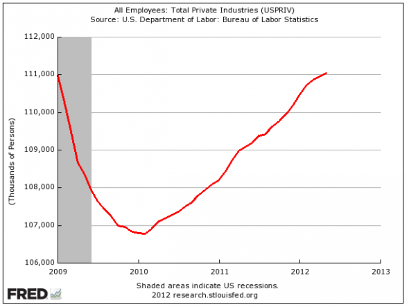
Obama claims 4.3 million jobs created. Romney claims no new jobs created. Who is right? Well, both are correct. See graph here as to why.

The first graph shows what has happened to PRIVATE sector employment (number of people WITH jobs) since Pres. Obama took office (Jan 2009). 

The gray area represents the period of official recession. I included a second graph that extends the time period back to 2001 so you can get some perspective.

Here is where the politics of this first graph comes in.

When the President states, as he did this week, that we have "created" 4.3 million jobs in the last 27 months he is starting at the lowest  point of the graph, conveniently ignoring the time in office before the low point.

Candidate Romney looks at this graph and sees no new "net" job creation since the Pres. took office---the line ends where it started at about 111,000 jobs.  We lost 4.3 million jobs then gained them back, conveniently ignoring the accelerating rate of job loss that started before Obama officially took office.

This begs the question: What does it mean to "create a job"?  The answer is not as easy as it sounds.

Seems like BOTH are correct in their assertions.  It is just how you look at the data and how it fits into your own political narrative.   Don't you love economics---"On the one hand..."


Tuesday, June 5, 2012

See my question to the author of "Garbology: Our Dirty Love Affair with Trash" and his response. His answer was more than I could hope for!

At the Freakonmics blog they asked people to submit questions for Edward Humes the author of Garbology: Our Dirty Love Affair with Trash.  Go here to see all the questions and his answers.  My question was one of many he answered (I edited my question here to correct for bad grammar in the original question):


Q. In your opinion, what (if anything) do we recycle now that after all the costs and benefits are weighed we would be better off just putting in a landfill and be done with it? -Gene Hayward 

A. Your question turns reality on its head. We don’t recycle anything where the costs outweigh the immediate profitability of the reclaimed material — that’s the problem! The manufacturers of wasteful products get a free ride — the cost of the waste they create is born by taxpayers and consumers (junk mailers are the obvious example here, subsidized at every turn, yet freed of having to deal with the tidal wave of waste they create). If the makers of wasteful products had to share in the costs of cleaning and recycling the waste they create, they would begin to make less wasteful products, and the economics of recycling would shift in a more favorable direction. 

Meanwhile, I would argue that we are putting things in landfills that should not be there, such as:

  • Items that are still useful, such as furniture, construction materials, clothing, all sorts of durable and still useful intact products. You’d be shocked if you spent time at a landfill, as I did to write Garbology, or see the masterpieces produced by the artists in residence at San Francisco’s dump, who find treasures every day in the trash.
    • Immense amounts of edible food that could have gone to food banks, and food scraps that could be composted
    • Plastics and paper that could be recycled or used as fuel in waste-to-energy plants.
His answer to my question helps explain an important AP Microeconomic concept---"Negative Externalies".  Negative Externalities occur when the production of a good imposes an explicit (regardless of how remote) cost on a third party that the producer and/or consumer of the good DONT pay for in the market price charged for the good. 

He uses the example of junk mail.  When businesses have junk mail printed up and mailed they are only paying for the productive resources and profit that go into making the mailer (land/natural resources, labor, capital and entrepreneurship) and the postage paid to send it out.  Once it hits my maibox, they are done with it.

The costs of the junk mail have stopped for the producer and consumer BUT have they stopped for "society" (the Third Parties in our story)? No!

Worst case scenario, the paper goes into the trash and to the landfill.  Are there costs associated with this? Yes! Who pays those costs? We can start a list BUT we know for sure it is not the producer of the mailer or even the business that sent it out--they are no where to be found at this point!

Humes suggests that the total cost of the mailer from creation to destruction/disposal should be borne by the producer and consumer--the two most interested parties to the transaction. In other words, the negative external costs created by junk mail need to be internalized (included in the market price) between the producer and consumer. 

One way to internalize (between producer and consumer) this external cost is to impose a tax equal to the cost of disposing junk mail. So the true cost of the mailer will include the cost of the private resources used AND the compensation for the social costs imposed on society by the mailer.

What do you think. Would a tax be beneficial? Detrimental? Can you think of other third parties who would benefit and ones that would be hurt?


Sunday, June 3, 2012

Hardball politics in Wisconsin. How would YOU like to receive this in your mailbox?

I don't live in Wisconsin, but I think I would really be bothered to get a mailer like this, REGARDLESS of which side of the issue I was on. 

It lists your name, address and whether you voted or not in the last two elections.  It shows what your  neighbors did as well.  It also leaves a blank for the next election on Tuesday .  The red circle is mine for emphasis.  The tone of this line bothers me.

Info like this should be public knowledge but it makes me queasy in the way it is used in this case.  What do you think?

Source: Milwaukee Sentinel Journal

"Paving" our way into the future. Is this the answer to our unemployment problem? Only "concrete" answers, please.

Robert Frank of the NYTIMES offers this commentary on the benefits of "infrastructure refurbishment".  Fancy way of saying if we are not going to embark of full-fledged new public works projects then perhaps a little maintenance around the edges will do. 

Whether you agree or disagree with his message/policy prescription, he DOES mention "Capital Stock", which is key vocabulary in AP Economics.  Might help put some context to the concept for students.

Source: NY TIMES:
DEMOCRATS and Republicans share less common ground than at any point in living memory, and they are especially divided about our still-ailing economy. When Democrats propose additional economic stimulus, Republicans call for more cuts in government spending and regulation. And even though the effects of the Great Recession are still with us, political gridlock seems set to continue.
Yet recent public statements by both President Obama and his probable Republican challenger, Mitt Romney, suggest a way forward. The president has long advocated infrastructure investment as a way to put Americans back to work. For his part, Mr. Romney recently warned that government spending cuts would “slow down the economy,” so he, too, has acknowledged the clear link between spending and employment.       
Both men should thus be willing to take the one politically feasible step that could help mend the economy quickly: an accelerated program of infrastructure repairs. People in both parties already agree that these improvements are needed — even apart from their impact on employment.       
In its 2009 assessment of the nation’s roads, bridges and other infrastructure, the American Society of Civil Engineers identified more than $2 trillion in long-overdue repairs. Of course, when maintenance is postponed, its cost rises rapidly. If Interstate highway repairs are delayed even briefly, damage from heavy trucks and winter weather can cause costs to rise several fold. According to the American Association of State Highway and Transportation Officials, substandard roads also cause $335 in annual damage per vehicle on the road. Still more troubling, those roads cause many easily preventable deaths and injuries. What could possibly justify further delay?       

Friday, June 1, 2012

Quick-look data from the JUST RELEASED jobs report for May. Not good---only 69,000 net job change. See where the strenghts and weakness were HERE

For the current month measured (May) look at the data to the far right.  Read the numbers in "thousands".  The first number shows 69,000 job gain. The losses are denoted with the negative sign in front of the number.  Be careful reading the chart. Notice the indentations on some of the sub categories.  This is to drill down a bit to show job sectors within jobs sectors and how they are performing.  GO HERE  for the complete report and summary.

Source: BLS

Thursday, May 31, 2012

NY City is proposing a ban on sugary drinks sold in containers over 16 oz. Take one last Big Gulp of your Slurpee, City dwellers. It might be your last. (Nice graphic showing what is and is not acceptable HERE)

The powers that be in New York City are proposing a ban on certain  types of sugary drinks in quantities over 16 oz's.  This is in response to health concerns, especially for children. 

Here is a chart that illustrates what is and is not a qualified drink and the allowable quantity is can be sold in.  Good idea? Bad idea? How do you think interest group politics will affect this proposal? Will it pass and become local law?

Source: NYTIMES

Tuesday, May 29, 2012

Interesting survey on EU countries attitudes regarding each other. Without looking, guess which country is in the most denial about its work ethic?

 Greeks think they are the Greek God Ponos but are perceived as the Goddess  Aergia.  This survey of European attitudes about their fellow EU members is interesting and pretty telling.  Greeks self-assess themselves as being the hardest workers but they "get real" when assessing their own corruption.  Germany is obviously widely respected by their peers on the continent. 
Source: The Economix

Monday, May 28, 2012

Link to a study on Household Production and how much it would add to GDP if it was counted.

When we cover the basics of Gross Domestic Product (GDP) in Economics we learn that "Household Production" is not included in the official measure of GDP. Household production is classified as work (labor performed) you do yourself that does have a market value but since you perform it yourself the value is not counted in GDP. 

Examples:  I can clean my own house (value of labor not counted) or I can hire someone to do it for me (value of labor counted). I change my own oil in my car (value of labor not counted) or I can hire someone to do it for me (value of labor counted).  I can tutor my own child in Math (value of labor not counted) or I can hire someone to do it for me (value of labor counted). I can fix a leaky faucet or hire a plumber to fix it.  So on and so forth.

Here is a recent study from the Bureau of Economic Analysis (BEA) that attempts to determine how much GDP would be if household production was included in the official measure.  Below I copied and pasted only the basic conclusions from the paper. 

Summary of Findings

This paper develops a satellite account that adjusts gross domestic product (GDP) for household production between 1965 and 2010. The primary findings are as follows:
  • Incorporating the value of non-market household production raises the level of nominal GDP 39 percent in 1965 and 26 percent in 2010. The decline reflects the steadily decreasing number of hours households spent on home production.
  • In 1965, men and women spent an average of 27 hours in home production, and by 2010, they spent 22 hours. This overall decline reflects a drop in women’s home production from 40 hours to 26 hours, which more than offset an increase in men’s hours from 14 hours to 17 hours.
  • The downward trend in the hours spent on non-market household production appears to be unaffected by the 2007–2009 recession, despite the increasing number of unemployed household members.
  • Including the value of household production lowers measured GDP growth by accounting for the losses in home production associated with increases in women’s labor force participation and in market wages between 1965 and 2010. Over this period, adjusting nominal GDP for home production lowers growth from 6.9 percent to 6.7 percent.
  • Home production reduces measured income inequality. Although households engage in a similar number of hours in home production regardless of income, adding a relatively constant value of home production to all households proportionately raises the income of low-income households more than that of high-income households.
Applications of this can be significant. One in particular comes to mind.  In poor, developing countries people, in general, do a lot more things for themselves. Most notably in the production of food and securing the everyday necessities of life. LOTS of production they do themselves that is not compensated for monetarily. 

Thus, on national level the official GDP statistic would UNDERESTIMATE the value of production in that country.  This can lead to a misunderstanding/misrepresentation of the actual standard of living in the developing nation. 

I lived HERE for two years. I have seen the disconnect up close and personal.

Note: Additional analysis of this study can be found at The Economix. I just noticed this morning they did a post on this study as well. 

Sunday, May 27, 2012

Of these 3 people with fake tans which one has been the MOST fiscally responsible and created the MOST private sector jobs for other people? Yes, we ARE in trouble.

Couple of graphs showing college grade distribution over time. Grade inflation or are we getting smarter? You be the judge...

No real commentary from me.  Just thought it was interesting the change over time.

Both of these are from Carpe Diem---go there to read the commentary/conslusions.

The first graph shows the general distribution of grades given at the college level.  It is combined private and public universities/colleges.  "A's" have been on an upswing for a long time, "B's" relatively constant and "C's" are almost a mirror image to "A's". 
The second graph shows the break out between private and public universties/colleges. 
View My Stats