Monday, June 20, 2011

Nice Interactive so you can solve the Social Security problem...Try it out and compare to what I did.

Using the parameters in this interactive provided by the Wall Street Journal, this is how I would go about solving the Social Security problem that looms on the horizon.  The selections I made create a bit of a surplus (the triangle shape to the right of the "0.0"-- +.33%).  After each   ection, I offer explanations and rationales. This is not a prefect simulation, but it is a start.

Seems to me that the problem can only be solved by a mix of tax increases and benefit decreases, that will be progressive in some situations and regressive in others. I tried to do this as sensibly as possible and with some thought...


Source: WSJ


 First, Social Security has to move to a "means tested" entitlement program (the first box checked above).  This means that a retiree's OTHER income (savings, investments, 401K's, physical assets, etc) would be taken into consideration in determining how much in Social Security they would receive. The more you have in other independent assets, the less you get in Social Security you would be entitled to receive.  The problem comes in as you move down the income scales where the government determines the cut-off points for the level of benefit received. Formulas will have to be created and there are lots of pitfalls there.  EVERYONE should receive something (yes, even the rich guys/gals) because if someone contributes all their lives and gets nothing in return, then the program is not an entitlement but a welfare-type program.  This IS an important distinction.

Second, the retirement age has to increase from 67 to 68 (the next box checked above). This is not a huge jump, given the increased life expectancy of the average American.  This is a regressive policy, however.  Statistically, lower income/poor people have shorter life expectancies relative to high income/rich people---wait longer and receive less benefits is regressive in nature.  I soften the impact of this in my last point a little bit down the page.

Third, a payroll tax increase over an extended period of time, from a total of 12.4% to 14.4%. This is a 16% increase in payroll taxes over 20 years.  Currently, workers pay 6.2% of their gross earnings in Social Security and the employer pays 6.2% on your behalf as well, for a total of 14.2%.  This is regressive in that lower income people pay a higher percentage of their total income in payroll taxes than do higher income people.  Currently, the maximum income that is subject to the 6.2% Social Security tax is $106,000.  Any income OVER that amount is not subject to SS Tax.  The interactive does  not give an option for a moderate increase over the $106,000, but I would be in favor of increasing it, but not to the $200,000 level suggested in the interactive. 

Lastly, as mentioned above I would make provision for the "very poor" elderly population amongst us (box checked above).  This is a progressive policy.  Do I really need to explain/justify that one?  Pretty self-explanatory, in my opinion.

I believe my choices reflect a political "Moderates" approach to solving the Social Security problem.  Liberals will not like that I don't put more of the burden on the "rich" and Conservatives won't like that I means tested the program AND raised taxes.  However, I do not know of a better way out of our predicament.  Do you? 

Please try the interactive yourself but really think about what (1) you would do and (2) what could actually be implemented. Two very different things...

Nice Graphic: What happens on the internet in a minute...

 HT: Carpe Diem

Source:MSNBC

""Let's say that it takes you exactly one minute to read through this post. In that time, over 6,600 photos will be uploaded to Flickr, about 70 new domains will be registered, over 1,200 new ads will be created on Craigslist, and more. Here's what happens on the Internet every 60 seconds.


Now keep in mind that the data below and the infographic above come from the Shanghai Web Designers team. We have done our best to confirm that the statistics provided line up with known data, but you should still take everything with a hefty serving of salt.


That disclaimer aside and without further ado, here's what's happening each minute:


•Search engine Google serves more that 694,445 queries


•6,600+ pictures are uploaded to Flickr


•600 videos are uploaded to YouTube, amounting to 25+ hours of content


•695,000 status updates, 79,364 wall posts and 510,040 comments are published on social networking site Facebook


•70 new domains are registered


•168,000,000+ emails are sent


•320 new accounts and 98,000 tweets are generated on social networking site Twitter


•iPhone applications are downloaded more than 13,000 times


•20,000 new posts are published on micro-blogging platform Tumblr


•Popular web browser FireFox is downloaded more than 1,700 times


•Popular blogging platform WordPress is downloaded more than 50 times


•WordPress Plugins are downloaded more than 125 times


•100 accounts are created on professional networking site LinkedIn


•40 new questions are asked on YahooAnswers.com


•100+ questions are asked on Answers.com


•1 new article is published on Associated Content, the world’s largest source of community-created content


•1 new definition is added on UrbanDictionary.com


•1,200+ new ads are created on Craigslist


•370,000+ minutes of voice calls done by Skype users


•13,000+ hours of music streaming is done by personalized Internet radio provider Pandora


•1,600+ reads are made on Scribd, the largest social reading publishing company


Impressive? Scary? Overwhelming? We're not sure. But we do know that a lot happened in the few moments it took to look at this blog post — so you better rush to catch up.

Saturday, June 11, 2011

For my 2 or 3 loyal blog readers in the US and around the world, I will be on vacation for a week. See the videos of where I will be...

We are going to spend a week in Olympic National Park in Washington (the State). I have never been to the Pacific Northwest, so I am looking forward to it. We are staying 3 days at Lake Quinault in the rainforest and 3 days at Kalaloch Lodge on the coast.  Not flashy, but cool temperatures and hopefully small crowds this early in the season.

Lake Quinault Lodge:

Kalaloch on the coast:

Friday, June 10, 2011

Where does your State rank in a Freedom Index...If you would prefer to "Live Free OR Die" then move to the head of the line..

US States ranked on several measures and given a Freedom ranking.  Always important to look at "who" is measuring "what", so take the outcome below as you will.  The results are interesting none-the-less. I spent my formative years New Hampshire so I am biased in favor of this ranking.  If you want more information on the metrics of this study, go HERE...

Mercatus Center


A nice graphic showing Skilled Immigrants out number Un-skilled immigrants in the US. This is a GOOD thing for us. Now we don't have to do math and science if we don't "feel like it"...

For the first time, immigrants classified as "skilled" outnumber those classified as "un-skilled" in the US.  This graphic shows where in the country this is taking place.  I saw this and immediately thought of two maps I posted a couple of weeks ago.The first one is the wage differential around the US and the second one for job postings relative to the areas population. Both are posted below... Notice a pattern? If you step back and look at them all together it i fairly obvious what is going on.  Skilled immigrants "appear" in places where there are lots of job openings relative to the population AND the average wage in those areas is higher relative to other areas of the country.  I believe many (most?) of these jobs are of a technical  nature and require math and science knowledge at the highest levels. The demand simply cannot be satisfied domestically. What do you think?  Please, REALLY think about this before you respond. Looking for thoughtful answers, not arrow slinging...Thanks!
Source: Chartporn

Nice graphic on the short history of the cost of computing---Pause and think about the power you have at your finger tips...

The data for the graph from CARPE DIEM is HERE...You "techies" who appreciate the history of computing will appreciate the information there.  Another reason to stop, look at your computer, and smile at all its glory. I am amazed that a schmuck like me has access to this power...

Source: Carpe Diem

Thursday, June 9, 2011

Part 1 of my analysis of KISD finances vs Mansfield, Irving and Richardson ISD's. I hope I don't get fired...or promoted...it could go either way...

One of the biggest criticisms taxpayers have of school districts is the amount of money spent on the salaries of different categories of employees. I have been known to voice this concern myself.  I am going to use my amateur social science skills and do a PER STUDENT analysis of KISD and 3 other school districts---Mansfield ISD, Irving ISD and Richardson ISD.   I choose Mansfield ISD because the student enrollment is almost identical to KISD and they have a similar feeder school alignment that KISD has--meaning they have an Intermediate School level. I have found this is unique in Region 10 and Region 11, both cover the D/FW Metroplex. I choose Irving and Richardson based on similar student populations as well. I DID NOT look at any specific data before choosing these districts, so I did not cherry-pick districts to obtain any pre-determined outcome.

I am going to look at the student to employee ratio AND the student to employee salary ratio.  Assigning a per student cost relative to salaries makes a cross-district comparison valid.

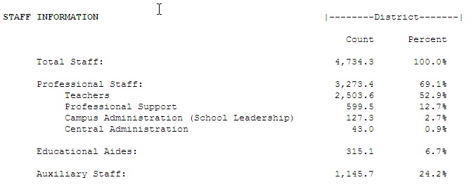
 In this part I calculate the Student Population-to-Employee Ratio. It is a rough indicator or how many employees a district believes it is necessary to serve the student population. Below you will find the districts and their student populations.

I put screen shots of the data below and the links to the district specific data are below each screen shot. You can go and verify the data your self, if you feel the need. The numbers are from the latest AEIS data from the TEA.

To find the student to employee ratio I took the districts enrollment number and divided it by the number of employees in the particular category.  I highlighted the district that has the more favorable ratio--The higher the number the more students this employee "serves". Now, this could be good or bad depending on how you perceive it. Presumably, the higher the ratio the more cost effective this employee is. Again, relative, but when talking about "fiscal responsibility" (as opposed to "educational responsibility") it is an important indicator.

Student Populations for the school districts:

Keller ISD--31,450
Mansfield ISD---31,614
Irving ISD--33,563
Richardson ISD---34,736

1. Total Student to Total Staff Ratio (Student Population/Total Staff)
Keller = 8.94 students per total staff member
Mansfield = 8.43 students per total staff member
Irving = 7.80 students per total staff member
Richardson = 7.33 students per total staff member

2. Total Student Population to Teacher Staff Ratio (Student Population/Total Teachers)

Keller = 16.11 students per teacher
Mansfield = 16.39 students per teacher
Irving = 13.82 students per teacher
Richardson = 13.88 students per Teacher

3. Total Student Population to Professional Staff Ratio (Student Population/Professional Staff)
Keller = 88.09 students per professional support member
Mansfield = 119.75 students per professional support member
Irving = 103.91 students per professional support member
Richardson = 57.98 students per professional support member

4. Total Student Population to Campus Administration Ratio (Student Population /Total Campus Admin)

Keller = 308 students per campus administrators
Mansfield = 295
Irving = 277
Richardson = 274

5. Total Student Population to Central Administration

Keller = 898.57 students per central administrator
Mansfield = 987.93 students per central administrator
Irving = 621.54 students per central administrator
Richardson = 807.81 students per central administrator

6. Total Student Population to Educational Aides

Keller = 111.92
Mansfield = 103.99
Irving = 74.91
Richardson = 110.27

7. Total Student Population to Auxiliary Staff

Keller = 40.01 students per auxiliary staff
Mansfield = 28.37 students per auxiliary staff
Irving = 28.37 students per auxiliary staff
Richardson = 30.33 students per auxiliary staff


For Keller ISD some good and some bad.  The glaring negatives are numbers 3 and 5. Mansfield ISD ratios are higher so you would expect their costs to be lower. But are they?  For that we will have to now look at the salaries each district pays for the positions examined above.  The data directly below is for the numbers calculated above. Scroll down past these to get to the second part...

KELLER ISD

MANSFIELD ISD


IRVING ISD


RICHARDSON ISD


The second part of this analysis is to take the per student information from above and use it to calculate the per student dollar amount that the particular category of employee costs taxpayers.  I am only going to use the categories of employees that are, in general, the most expensive and the ones that are the target of most criticism.  Here are the salaries for the 4 school districts...I will meet you down the screen...:)  

Keller ISD


Mansfield ISD


Irving ISD


Richardson ISD

1. Student cost per Teaching position. Take the salary and divide it by the student per teacher ratio.

Keller = $51,060/16.11 students per teacher = $3,169.45 per student
Mansfield = $51,411/16.39 students per teacher = $3,136.73 per student
Irving = $48,557/13.82 students per teacher = $3,513.53
Richardson = $51,411/13.88 students per Teacher = $3,703.96

Mansfield by has an edge on KISD of $32.72 per student in teacher salary per student.  Virtually a wash.  KISD has an advantage over Irving ($344.08 LESS per student) and Richardson ($534.51 LESS per student).  These are significant amounts!

The positions with the largest dollar variance for KISD relative to the others are Professional Support, which per position is $4,000 to $5,000 LESS than the other 3 districts and Central Administration, which per position varies from $8,000 to $18,000 LESS per position.

2. Student cost per "Professional Support" position. Take the salary and divide it by the student per professional support position ratio.

Keller = $53,475/88.09 students per professional support = $607.04
Mansfield = $58,624/119.75 students per professional support = $489.55
Irving = $57,003/103.91 students per professional support = $548.58
Richardson = $58,624/57.98 students per professional support = $1,011.10

Mansfield's professional support serves its students for $117.49 less per student than KISD. If one is looking for "fiscal accountability" this is one area to look at in KISD.  Irving does in for less cost too ($58.46) and Richardson for significantly more than KISD ($404.06).
 
3. Student cost per Campus Administration position. Take the salary and divide it by the student to Campus Administrator ratio.
 
Keller = $73,103/308 students per campus administrator = $237.34 per student 
Mansfield = $74,803/295 students per campus administrator = $253.57 per student
Irving = $76,172/277 students per campus administrator = $274.99 per student
Richardson = $74,803/274 students per campus administrator = $273.00 per student

Keller's campus administration cost per student are $16.23 less than Mansfield's, $37.65 less than Irving's, and $35.66 less than Richardson's.  KISD and Mansfield ISD cost are close, relative to Irving and Richardson ISD's.

4. Student cost per Central Administration position. Take the salary and divide it by the student to Central Administration position.

Keller = $91,999/898.57 students per central administrator = $102.38 per student
Mansfield = $110,635/987.93 students per central administrator =  $111.99 per student
Irving = $100,028/621.54 students per central administrator = $160.94 per student
Richardson = $110,635/807.81 students per central administrator = $136.96

KISD's Central Administration cost per student is $9.61 LESS than Mansfield's, $58.56 less than Irving's and $34.58 less than Richardson's.  This effectively neutralizes the conclusion from part 1 (No 5) concerning the student to central administration ratio, which greatly favored Mansfield.  When salaries are taken into consideration KISD's Central Administration salaries are the least expensive to the other districts on a per student basis. 
 
Conclusion:
 
I took 3 school districts with similar numerical enrollments and calculated  a per student to employee ratio and a per student cost for each of the major categories of employees. The former indicates the number of employees a district figures it needs to serve students. The latter shows a per student cost for these same employees.
 
While number 5 in the first section showed a wide disparity between Mansfield and KISD in Central Admin on a per student basis, that gap was closed when the average salaries of the central administrators wher factored in.  This is a significant finding, I believe. 
 
KISD is open for examination on its"professional support" per student ratio AND per student cost for those support personnel. 
 
I think it is safe to say that KISD is as cost efficient in most of the metrics as the very similar Mansfield ISD, with the noted exception of the category of "Professional Support" and BOTH these districts are much more efficient than  Irving and Richardson ISD's. 
 
So, when it is suggested that KISD spends too much money on salaries I think the appropriate response would be "Compared to Who?" or is it "whom"?...That is why I am a Social Studies teacher...

Wednesday, June 8, 2011

How do we keep the elephant from becoming extinct? Easy! Let people shoot them, eat them and sell the ivory. Get over your squimishness. The elephants NEED you to support this!!

Below is a graphic (HT: Carpe Diem) comparing the elephant population of Kenya and Zimbabwe from 1970 to 2011.  You can see they run counter to each other. Why? It is the result of how each country dealt with the problem of "The Tragedy of the Commons"...Kenya banned hunting of elephants and Zimbabwe gave ownership rights to the elephants to local communities. It may be distasteful to many the way they went about saving the elephant from extinction but they, well, saved the elephant from extinction.  Please read the excerpt below and at least consider the effectiveness of this approach. The elephant population needs you to help them survive!   
Source: Carpe Diem
 The following is from Defining Ideas (HT: Carpe Diem)

In the 1970s, Kenya had about six times as many elephants as Zimbabwe, and today Zimbabwe has three times more elephants than Kenya (see chart). What happened that caused the dramatic reversal in elephant populations in the two African countries?


Terry Anderson and Shawn Regan of the Property and Environment Research Center (PERC) explain in their excellent article "Shoot an Elephant, Save a Community":

"Anti-hunting groups succeeded in getting Kenya to ban all hunting in 1977. Since then, its population of large wild animals has declined between 60 and 70 percent. The country’s elephant population declined from 167,000 in 1973 to just 16,000 in 1989. Poaching took its toll on elephants because of their damage to both cropland and people. Today Kenya wildlife officials boast a doubling of the country’s elephant population to 32,000, but nearly all are in protected national parks where poaching can be controlled.

In sharp contrast to Kenya, consider what has happened in Zimbabwe. In 1989, results-oriented groups such as the World Wildlife Fund helped implement a program known as the Communal Areas Management Program for Indigenous Resources or CAMPFIRE. This approach devolves the rights to benefit from, dispose of, and manage natural resources to the local level, including the right to allow safari hunting. Community leaders with local knowledge about wildlife and its interface with humans help establish sustainable hunting quotas. Hunting then provides jobs for community members, compensation for crop and property damage, revenue to build schools, clinics, and water wells, and meat for villagers.

By granting local people control over wildlife resources, their incentive to protect it has strengthened. As a result, poaching has been contained and human-wildlife conflicts have been reduced. While challenges remain, especially from the current political climate in Zimbabwe, CAMPFIRE has quietly produced results with strikingly little activist rhetoric.

Between 1989 and 2005, Zimbabwe’s total elephant population more than doubled from 37,000 to 85,000, with half living outside of national parks. Today, some put the number as high as 100,000, even after decades of legal, trophy hunting. All of this has occurred with an economy in shambles, regime uncertainty, and mounting socio-political challenges."

Looking to buy a Used Car? Flood damaged cars from the Mid-west are making their way into the marketplace. See how you can check for yourself if the car you want is a deal or not...

The chart below shows the dramatic increase in the price of used compact and midsized cars in the past year. The bump has really occured just in the last few months as gas prices spiked and the demand for these classes of vehicles increased. There is a huge incentive for dealers and other used car brokers to get cars and bring them to market as soon as possible. I would like to offer a warning to you: BE CAREFUL in purchasing a used car!

Source: Manheim Consulting
Tens of thousands (100's of thousands?) of cars that were damaged by the floods and other storms in the Mid-west this spring are hitting or will soon hit the market.  Insurance companies take possession of the vehicles after paying off the claims to customers and then sell them to salvagers. The cars are then cleaned up and made to look REAL good.  They make their way to auto auction houses and eventually to car lots across the country.

PROTECT YOURSELF!! Go HERE for a FREE vehicle history check on any used car you might purchase, courtesy of the Tx Dept of Motor Vehicles.  I have not used this and don't know how good it is compared to Carfax.  If you try it, let me know...


Texas Dept of Motor Vehicles

Weapons of War past and future (look closely)...


Source: HERE
 

US Military Spending relative to other major countries...Shouldn't we be charging SOME rent from SOME of these countries? Just sayin'...

Source: The Economist

Boys have more value than Girls. Don't blame me---How could 2 billion people be wrong???

Quite amazing is the social change going on in India, not in a postive way, in JUST the last 10 years. The ratio of boys to girls under 6 is increasing because of parental "selectiveness".  Boys are valued more than girls, and, well, you can guess what happens when parents find out they are having a girl.  Again I find myself asking the question "What is wrong with people?!?!?  Rhetorical question, there is no answer...I encourage you to read the article that accompanies this graphic and become more informed.   
Source: Christian Science Monitor
A similar thing is going on in China but, in my opinion, more hideous:

""XINRAN XUE, a Chinese writer, describes visiting a peasant family in the Yimeng area of Shandong province. The wife was giving birth. “We had scarcely sat down in the kitchen”, she writes (see article), “when we heard a moan of pain from the bedroom next door…The cries from the inner room grew louder—and abruptly stopped. There was a low sob, and then a man’s gruff voice said accusingly: ‘Useless thing!’

“Suddenly, I thought I heard a slight movement in the slops pail behind me,” Miss Xinran remembers. “To my absolute horror, I saw a tiny foot poking out of the pail. The midwife must have dropped that tiny baby alive into the slops pail! I nearly threw myself at it, but the two policemen [who had accompanied me] held my shoulders in a firm grip. ‘Don’t move, you can’t save it, it’s too late.’

“‘But that’s...murder...and you’re the police!’ The little foot was still now. The policemen held on to me for a few more minutes. ‘Doing a baby girl is not a big thing around here,’ [an] older woman said comfortingly. ‘That’s a living child,’ I said in a shaking voice, pointing at the slops pail. ‘It’s not a child,’ she corrected me. ‘It’s a girl baby, and we can’t keep it. Around these parts, you can’t get by without a son. Girl babies don’t count.’” Source: The Economist

Tuesday, June 7, 2011

Cool Infographic---US Education vs 12 Other Countries...

Source: Cool Inforgraphics

Would you rather have an economy with 100 people making $11,620 per year or one with 50 people making $53,591? If you own an I-Pod you have already chosen your answer...


Source: Carpe Diem
 This graphic is from Carpe Diem. I encourage you to go there and read the analysis.  I just did some back of the envelop calculations comparing the average wage paid to US workers vs "foreign" workers.

The inputs to that go into making an I-Pod are sourced from many parts of the world, with the final assembly is done in very large Chinese facilities. According to the graphic, the wage paid per US job is $53,591 ($746M/13,920).  The wage paid per foreign job $11,670 ($318M/27,250).  The US has half as many jobs devoted to the production of the I-Pod but each of those jobs pays 4.6 times as much ($53,591/$11,670) as each foreign job. 

On a per-job basis, why are US workers paid so much more?  You have to look at the types of jobs AND worker productivity:
""When innovative products are designed and marketed by U.S. companies, they can create valuable jobs for American workers even if the products are manufactured offshore. Apple’s tremendous success with the iPod and other innovative products in recent years has driven growth in U.S. employment, even though these products are made offshore. These jobs pay well and employ people with college degrees. They are at the high end of what might be considered middle class jobs and appear to be less at risk of vanishing from the United States than production jobs." Source: Innovation and Job Creation in a Global Economy: The Case of Apple’s iPod

Dr Perry's comment: ""Part of the current and future strength of America’s manufacturing sector could be explained by the global shift in manufacturing that has leveraged the relative cost advantages of shifting low-end production and assembly to low-wage countries like China, while advanced economies and companies in the U.S. like Apple have increasingly specialized in the research, design and marketing of products like the iPod. China’s focus on labor-intensive, low-skill, and low-value-added assembly of manufactured goods has allowed America to become even more competitive in the higher-end, higher-skilled manufacturing design and engineering in areas like electronics, aerospace, pharmaceuticals and medicine, industrial machinery, medical and scientific equipment and supplies, computers, software and semi-conductors, and oil and natural-gas equipment.

"" The case study of Apple's iPod illustrates the reality that U.S. manufacturing in the 21st century will be increasingly focused on the high-tech, high valued-added, high-skilled, research-intensive, high-paying aspects of manufacturing, with the production and assembly taking place elsewhere. U.S. manufacturing is alive and well, it's just strategically shifted higher up the value chain.""

Man tries to pay a bill with pennies and ends up with a disorderly conduct ticket for his efforts...Can a business refuse his pennies for payment? See why here...

A man in Utah tries to pay a medical bill in pennies but the doctors office refuses to accept it. The man gets a citation of disorderly conduct but more for the behavior than the actual transaction.  This question comes up once in a while in class. Can a business refuse cash in any denomimation to pay a bill? Why, yes they can...
But the incident does raise a legitimate question: Are businesses required to take your pennies? A penny is, after all, legal tender. Doesn't that mean they are good everywhere? From the Christian Science Monitor:


"Here's what the law says: The Coinage Act of 1965, specifically Section 31 U.S.C. 5103, states: "United States coins and currency (including Federal reserve notes and circulating notes of Federal reserve banks and national banks) are legal tender for all debts, public charges, taxes, and dues. Foreign gold or silver coins are not legal tender for debts."

All this means is that the US Federal Reserve system must honor all US currency. As the US Treasury points out, there's nothing in the law that says that private businesses have to accept it for all transactions. If a merchant wants to sell her products in exchange for gold bullion, nothing but dimes minted before 1946, Swedish fish, or Monopoly money, that's her right under the law.

The absence of such a law is how bus lines can legally refuse to accept your dollar bills, gas station clerks can turn their noses up at your $100s, and panhandlers near the Monitor's newsroom can yell at you after you drop a Sacagawea dollar coin in their cup, even though you were just trying to be nice.
Source: Christian Science Monitor
View My Stats