|
| Source: NY TIMES |
Monday, June 6, 2011
Sunday, June 5, 2011
10 Political Quotes that are accepted as fact but were never actually spoken by the person.
Some of these surprised me. Mostly the really old ones attributed to a historical figure. Pretty interesting how something not accurate can become accepted as historical fact. Click HERE to see the other 8 quotes and why they may not be true...
Source: Christian Science Monitor
10. "I can see Russia from my house!" – Sarah Palin
It was actually comedian Tina Fey, who was impersonating Ms. Palin on Saturday Night Live who uttered this line that is now widely attributed to the former Alaska governor.
The basis for this line comes from a September 2008 interview with ABC News's Charles Gibson, who asked Palin what insights she had from her state being so close to Russia. She responded: "They're our next-door neighbors, and you can actually see Russia from land here in Alaska, from an island in Alaska."
This is true. As Slate has pointed out, on a clear day, those on the Alaskan island of Little Diomede can see the Russian island of Big Diomede, located across the International Date Line some two and a half miles away. Given that Big Diomede has no permanent population, the amount of foreign policy experience one can gain from staring at it is debatable. But you can see Russian soil while standing in Alaska.
9. 'I invented the Internet.' – Al Gore
Everybody knows that Al Gore claimed to have invented the Internet. But like many things that everyone knows, it's not actually true.
So where did it come from? In a March 9, 1999 interview on CNN, Wolf Blitzer asked the candidate to describe what distinguished him from his Democratic challenger, New Jersey Sen. Bill Bradley. Here is how the exchange went:
Blitzer: "Why should Democrats, looking at the Democratic nomination process, support you instead of Bill Bradley?"
Gore: I'll be offering my vision when my campaign begins. And it will be comprehensive and sweeping. And I hope that it will be compelling enough to draw people toward it. I feel that it will be. But it will emerge from my dialogue with the American people. I've traveled to every part of this country during the last six years. During my service in the United States Congress, I took the initiative in creating the Internet. I took the initiative in moving forward a whole range of initiatives that have proven to be important to our country's economic growth and environmental protection, improvements in our educational system.
It's clumsy wording, to be sure. But it's clear from looking at Gore's whole statement that he never claimed to have invented the Internet, in the sense of writing code or laying fiber-optic cables. He meant only to take credit for the contributions that he made as a member of Congress, contributions that have been lauded by people like Robert Kahn and Vint Cerf, who wrote the code that serves as the foundation for the Internet.
Who is to blame for coming up with the "Al Gore claimed to have invented the Internet" meme? This guy.
Two days after Gore appeared on CNN, libertarian writer Declan McCullagh posted a story on Wired News mocking him for claiming to be the "father of the Internet." McCullagh never used the word "invented," but it took only a few days before it mutated into its current form, helping to cement the public perception of Gore as a serial exaggerator.
Source: Christian Science Monitor
10. "I can see Russia from my house!" – Sarah Palin
It was actually comedian Tina Fey, who was impersonating Ms. Palin on Saturday Night Live who uttered this line that is now widely attributed to the former Alaska governor.
The basis for this line comes from a September 2008 interview with ABC News's Charles Gibson, who asked Palin what insights she had from her state being so close to Russia. She responded: "They're our next-door neighbors, and you can actually see Russia from land here in Alaska, from an island in Alaska."
This is true. As Slate has pointed out, on a clear day, those on the Alaskan island of Little Diomede can see the Russian island of Big Diomede, located across the International Date Line some two and a half miles away. Given that Big Diomede has no permanent population, the amount of foreign policy experience one can gain from staring at it is debatable. But you can see Russian soil while standing in Alaska.
9. 'I invented the Internet.' – Al Gore
Everybody knows that Al Gore claimed to have invented the Internet. But like many things that everyone knows, it's not actually true.
So where did it come from? In a March 9, 1999 interview on CNN, Wolf Blitzer asked the candidate to describe what distinguished him from his Democratic challenger, New Jersey Sen. Bill Bradley. Here is how the exchange went:
Blitzer: "Why should Democrats, looking at the Democratic nomination process, support you instead of Bill Bradley?"
Gore: I'll be offering my vision when my campaign begins. And it will be comprehensive and sweeping. And I hope that it will be compelling enough to draw people toward it. I feel that it will be. But it will emerge from my dialogue with the American people. I've traveled to every part of this country during the last six years. During my service in the United States Congress, I took the initiative in creating the Internet. I took the initiative in moving forward a whole range of initiatives that have proven to be important to our country's economic growth and environmental protection, improvements in our educational system.
It's clumsy wording, to be sure. But it's clear from looking at Gore's whole statement that he never claimed to have invented the Internet, in the sense of writing code or laying fiber-optic cables. He meant only to take credit for the contributions that he made as a member of Congress, contributions that have been lauded by people like Robert Kahn and Vint Cerf, who wrote the code that serves as the foundation for the Internet.
Who is to blame for coming up with the "Al Gore claimed to have invented the Internet" meme? This guy.
Two days after Gore appeared on CNN, libertarian writer Declan McCullagh posted a story on Wired News mocking him for claiming to be the "father of the Internet." McCullagh never used the word "invented," but it took only a few days before it mutated into its current form, helping to cement the public perception of Gore as a serial exaggerator.
North Korea publishes it first "Global Happiness Index"...Guess who comes in first (not who you think) and who comes in last (who you think)? See the results here...
Here are the results of the 1st Annual "Global Happiness Index" produced by the North Korean government. Yes, it is in Korean, but tranlated Number 1 is China followed by North Korea (2), Cuba (3), Iran (4), Venezuela (5). Coming in at the end of the list is South Korea (152) and The USA (203). I guess we have some work to do...Get you some North Korea-style happiness, people! We need to catch up....(HT: Marginal Revolution)
 |
| Source: HERE |
North Korean "Global Happiness Index" ranks China no. 1, USA dead last
View this short video on Horizontal Drilling and the controversial technique called "Fracking". The video shows only the mechanics of how fracking works NOT the negative side effects.
I have heard alot of the controversial drilling technique called "Fracking" that takes place with a relatively new concept of Horizontal Drilling to get at either natural gas or oil. I have to admit I did not really know the physical process of how either of these techniques worked. This short video, produced by an energy company shows the actual process. They OBVIOUSLY leave out the negative externalities produced by this process (contaminated groundwater, etc). And they are numerous. The purpose for me posting this link is just so you can see how the drilling technique and fracking work in practice. You can see for yourself how this process can produce negative side effects on the environment.
I did not know about the little "explosions" that is the source of fracking. If anyone knows of a video that objectively shows the MECHANICS (not the politics) of horizontal drilling, I would appreciate the link and will post it.
CLICK HERE TO SEE VIDEO
Yes, I am familiar with the "documentary" Gasland...Here is the link to that site if you want another view of Fracking...
I did not know about the little "explosions" that is the source of fracking. If anyone knows of a video that objectively shows the MECHANICS (not the politics) of horizontal drilling, I would appreciate the link and will post it.
CLICK HERE TO SEE VIDEO
Yes, I am familiar with the "documentary" Gasland...Here is the link to that site if you want another view of Fracking...
Saturday, June 4, 2011
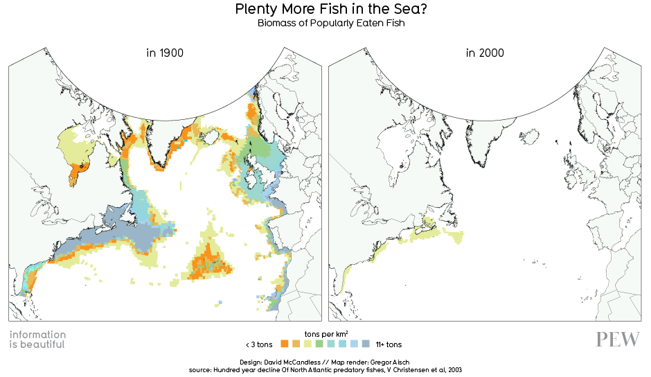
Tragedy of the Fishy's Part 2---Nice map showing the depletion of major North Atlantic fishing grounds...We can stop trying to Find Nemo now. He is gone...
Not exactly sure how they got the data from 1900 to make this map....but there is no question that the major fishing areas of the North Atlantic are getting fished-out. While many efforts have been tried to reign in commercial fishing, the "Tragedy of the Commons" is playing out in this situation.
 |
| Source: HERE HT: Paul Kedrosky |
Friday, June 3, 2011
The Tragedy of the Fishies and Bunnies...See how you can keep these critters alive!! (hint: give their hunters private property rights)...
This video uses commercial fishing as an example of the Tragedy of the Commons. When property rights are not clear, or don't exist at all, then when people compete for an economic resource they have no incentive conserve the resource, and every incentive to pillage the resource as much as possible. Property held "in common" will become subject to over-exploitation. It is a zero-sum game---if I don't get it, then you will. If acceptable ownership rights are established and enforced (the most important part) then all parties have an incentive to not pillage the resource, which ensures more will be available in the future.
This way of thinking has many applications. Can you think of a resource held in common currently that could benefit from private ownership? (HT: Division of Labour for the video)
Here is a link to an interactive game to teach the lesson of the Tragedy of the Commons. This one is called "The Tragedy of the Bunnies"...Get there quick to save the little fluffy things!!! :)

This way of thinking has many applications. Can you think of a resource held in common currently that could benefit from private ownership? (HT: Division of Labour for the video)
Here is a link to an interactive game to teach the lesson of the Tragedy of the Commons. This one is called "The Tragedy of the Bunnies"...Get there quick to save the little fluffy things!!! :)

Thursday, June 2, 2011
Terrific interactive timeline of the "Arab Spring" protest movement throughout the MiddleEast from Day 1. Worth a bookmark if you ever need background information.
Perhaps THE definitive interactive on the "Arab Spring" protest movements. Click HERE to go to the site. A great timeline with links to articles on the particular event. Great for a research paper or for background on the situation in the Middle East....HT: Chris Blattman
 |
| Source: The Guardian |
Wednesday, June 1, 2011
The best place to find a job is where there are lots of job postings per capita AND they pay above average wages...Look at these two maps then load up the moving van...
I came across these two maps at about the same time. Saw one and thought of the other. The first one shows national wage comparisons--green areas are where wages/salaries are above average and the red areas are below average. The second one shows job postings per capita. The bigger the bubble the more openings per person. If you look closely at the areas with large bubbles they are, in general, areas where lots of high tech (Washington, Oregon, San Jose CA) and high value manufacturing (i.e. pharmaceuticals) take place. Lots of white collar "clean" occupations. These are the hardest to fill positions because they require LOTS of skill and education. While not a perfect comparison, the two graphs correlate rather well between job postings and higher wages. Some geographical areas are gray areas. Austin, Tx has a large bubble but is not considered a high wage area. I think it is borderline. It is rapidly becoming a high tech hub. Maybe a little green is in its future...
 |
| Source: WSJ |
 |
| Source: HERE |
Can someone explain this to me after looking at this graphic why South Koreans consume so much of the internet traffic? No jokes, please...
How the world will use the internet in 2015
RELIABLE data about internet traffic is hard to come by. One of the better sources is Cisco's annual Visual Networking Index, which was published on June 1st. Internet traffic, the world's biggest maker of networking gear predicts, will quadruple and reach 80.5 exabytes per month (80 exabytes would fill 20 billion DVDs) by 2015. That year, for the first time, Asia will generate more traffic (24.1 exabytes per month) than North America (22.3 exabytes per month)—although Amercia still beats China (6.9 versus 5.6 exabytes per month). Yet if traffic figures are divided by population, a somewhat different (and more meaningful) picture emerges: South Korea is and will be the world's most data-hungry country in Cisco's sample. Even Canada and France (and, by 2015, Britain) will consume more gigabytes per month per person than America. As for China, it drops down the list and will be overtaken by Brazil, but remains way ahead of India.
 |
| Source: The Economist |
RELIABLE data about internet traffic is hard to come by. One of the better sources is Cisco's annual Visual Networking Index, which was published on June 1st. Internet traffic, the world's biggest maker of networking gear predicts, will quadruple and reach 80.5 exabytes per month (80 exabytes would fill 20 billion DVDs) by 2015. That year, for the first time, Asia will generate more traffic (24.1 exabytes per month) than North America (22.3 exabytes per month)—although Amercia still beats China (6.9 versus 5.6 exabytes per month). Yet if traffic figures are divided by population, a somewhat different (and more meaningful) picture emerges: South Korea is and will be the world's most data-hungry country in Cisco's sample. Even Canada and France (and, by 2015, Britain) will consume more gigabytes per month per person than America. As for China, it drops down the list and will be overtaken by Brazil, but remains way ahead of India.
DFW and Houston lead the nation is job growth...WHY is that? See how far above the national average we are...
 |
| Star-Telegram |
Dallas-Fort Worth again leads nation in job growth
Dallas-Fort Worth and Houston continue to lead the nation's largest metro areas in new jobs and the rate of job growth compared with a year earlier, the Bureau of Labor Statistics said Tuesday.
Total nonfarm employment in the 12-county North Texas area stood at 2,929,700 in April, up 83,100 over April 2010, said the bureau's regional commissioner, Stanley Suchman.
Job growth was up 2.9 percent, compared with 1.1 percent for the U.S.
D-FW and Houston also led the nation's largest metro areas in both categories in March.
North Texas has long been a leader in both job and population growth, and the trend has continued even in the economic downturn. That has helped keep unemployment below national and state averages.
In April, the Fort Worth-Arlington jobless rate dropped to 7.6 percent from 8 percent in March and also a year ago. U.S. unemployment stands at 9 percent.
Employment grew faster in Dallas-Plano-Irving in April, rising 62,900 jobs, or 3.1 percent. Fort Worth-Arlington added 20,200 jobs, up 2.4 percent.
Professional and business services, which were particularly strong in Dallas-Plano-Irving, added 24,700 jobs, up 5.9 percent. That was nearly double the U.S. increase of 3.2 percent.
Education and health services, including private but not public schools, added 19,600 jobs. Fort Worth-Arlington added 6.4 percent more positions in that category, and Dallas-Plano-Irving added 5.2 percent. The U.S. gain was 2.2 percent.
Trade, transportation and utilities in North Texas added 12,600 jobs, up 2.2 percent, compared with 1.2 percent for the U.S. Mining, logging and construction added 10,300 jobs, up 6.6 percent.
Financial activities added 9,600 jobs, up 4.2 percent, compared with a 0.4 percent loss nationally; leisure and hospitality, 7,500, up 2.7 percent, compared with 1.8 percent for the U.S.; and government, 4,000, up 1 percent, compared with a 1.7 percent U.S. drop. Government includes public schools.
Information lost 5,400 jobs, down 6.8 percent, compared with a U.S. loss of 1.2 percent. Fort Worth-Arlington was down 10.8 percent, and Dallas-Plano-Irving, 5.9 percent
A short and easy to understand video explaining the National Debt..
A very short video explaning the national debt. It is very simple and could serve as an introduction to learning about the national debt. (From the Washington Post)
Tuesday, May 31, 2011
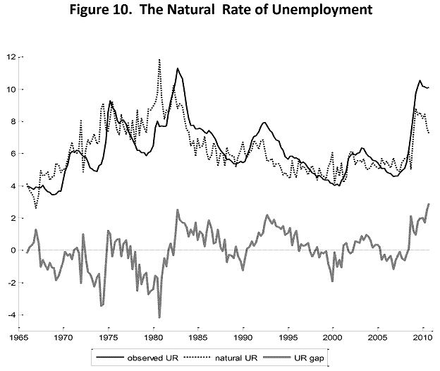
Nice graph showing the difference between the Actual Unemployment Rate and the Natural Rate of Unemployment---Don't fall asleep! This IS important!!!
Here is a graph showing the Actual Unemployment Rate and the Natural Rate of Unemployment (NRU). They are the two upper lines, and the NRU is the dotted line. The difference between the NRU and the Actual Unemployment Rate is the amount of Cyclical Unemployment present in the economy (the lowest line on the graph). Cyclical unemployment occurs when there is a down turn in the business cycle and we experience a recession. Businesses are selling/producing fewer goods/services so they need fewer people to sell/produce goods/services. This creates a downward spiral in the economy as the ring of layoffs/ business closures expands.
The spread between the actual unemployment rate and the NRU is as large as it has been since the recession of 1982-83. Too many people sitting idle and work skills eroding. Gotta get this economy moving again.
The spread between the actual unemployment rate and the NRU is as large as it has been since the recession of 1982-83. Too many people sitting idle and work skills eroding. Gotta get this economy moving again.
 |
| Source: Econbrower |
Monday, May 30, 2011
We had a BRIC thrown through our economic window. We need to learn more about BRIC's...
"BRIC" (Brazil, Russia, India, China) is a term that has been used for a few years to refer to this particular block of countries, but I don't think most people know exactly what it refers to. It is an informal term applied to these 4 rapidly developing nations. Collectively their economies are undergoing vast structural changes that for the most part are lifting their populations out of extreme poverty. It is a good thing that so many people are moving above subsistence existence and beyond. Is that not what we in the developed ("rich") world have wanted for 50+years?
The problem this creates in the short term is a tremendous increase in demand for all sorts of resources, primarily energy and food. As the poor gain more purchasing power they want better (and more) food of all types. They want to own a vehicle. They want to plug into the power grid as they gain access to the multitude of gadgets we seem to be able to not get along without.
Below is a brief description/profile of the BRIC countries. Go HERE for more in depth info.
Who are the BRICS?
The BRICS countries, five nations grouped together because of their burgeoning economies, are in the spotlight this week as their leaders meet in China. Made up of Brazil, Russia, India, China and, as of this week, South Africa, the BRICS countries are grouped together because while they are not yet economic powerhouses, they have the potential to become the world’s most dominant economies in the next few decades.
Brazil
Although not as talked about as India and China, there’s been no shortage of interest in Brazil’s $2.1 trillion economy. Although it exhibited slightly negative growth in 2009 (still far better than many other economies, whose negative growth was much greater), Brazil’s economy bounced back forcefully in 2010, showing 7.5 percent economic growth. It is the eighth-largest economy in the world, and economists project it will reach the No. 5 spot in the next few years. Years of growth have brought a majority of Brazilians into the middle class.
Brazil’s industrial and agricultural sectors drive much of that growth. Agriculture and agribusiness make up about 25 percent of the country’s gross domestic product and 36 percent of Brazilian exports, while the industrial sector – auto manufacturing, textiles, and machinery, to name a few – drives about a third of the country’s GDP. A privatization campaign and favorable trade policies have made Brazil a huge beneficiary of foreign investment.
Russia
Russia’s transition in the 1990s from a centrally planned economy to a free market was not smooth. Inadequate fiscal reforms and borrowing led to a financial crisis in 1998 that wiped out much of the foreign investment it gained. The situation was exacerbated by dropping prices for its major exports (oil and minerals) and spillover from the Asian financial crisis.
The country bounced back quickly, registering about 7 percent growth for the next several years – until the global financial crisis, which hit Russia hard once again and prompted a stock market collapse. In 2009, economic growth was a whopping negative 7.9 percent. Today, a rapid turnaround has brought growth back up to 3.8 percent in 2010.
Russia’s economy, the world’s tenth largest, is driven by oil and natural gas exports, as well as timber, furs, minerals, and metals.
India
The second most populous country in the world is another one of the world’s emerging economic powerhouses. India is the 12th-largest economy, with a gross domestic product of $1.21 trillion and a growth rate of 6.5 percent in 2009. However, this growth has not been evenly distributed – 700 million Indians live on $2 or less a day and the middle class, while growing, is still only 50 million of its 1.17 billion people. The middle class is expected to expand ten-fold by 2025.
India’s attempts at economic reforms – tariff reductions, financial modernization, and stronger intellectual property rights, to name a few – have been sporadic. Corruption is still a big problem, as are excessive bureaucracy, investment controls, and economic policies that undermine efforts at economic liberalization.
The services industry accounts for 54 percent of GDP, while industry makes up 29 percent and agriculture 18 percent. Outsourcing to India has become common practice in the US. The software sector in particular is booming, generating $35 billion in exports in 2009. The US is India’s largest investment partner.
China
The world’s most populous country recently surpassed Japan as the second-largest economy. Only the US (China’s top trading partner) still comes out ahead of China’s gross domestic product, which totaled $4.814 trillion in 2009 and grew at a rate of 8.7 percent.
China’s economic reforms over the past two decades led to the world’s most drastic reduction in poverty and a corresponding income increase. However, regulation has often not been able to keep pace with the country’s economic growth, leading businesses to cut corners in ways that endanger consumer safety.
Agriculture contributes 11 percent of China’s GDP and industry makes up 48.6 percent in areas such as mining and ore processing, coal, machinery, textiles, and petroleum. Despite its growth, the state-owned sector still makes up about 40 percent of GDP.
The problem this creates in the short term is a tremendous increase in demand for all sorts of resources, primarily energy and food. As the poor gain more purchasing power they want better (and more) food of all types. They want to own a vehicle. They want to plug into the power grid as they gain access to the multitude of gadgets we seem to be able to not get along without.
Below is a brief description/profile of the BRIC countries. Go HERE for more in depth info.
Who are the BRICS?
The BRICS countries, five nations grouped together because of their burgeoning economies, are in the spotlight this week as their leaders meet in China. Made up of Brazil, Russia, India, China and, as of this week, South Africa, the BRICS countries are grouped together because while they are not yet economic powerhouses, they have the potential to become the world’s most dominant economies in the next few decades.
Brazil
Although not as talked about as India and China, there’s been no shortage of interest in Brazil’s $2.1 trillion economy. Although it exhibited slightly negative growth in 2009 (still far better than many other economies, whose negative growth was much greater), Brazil’s economy bounced back forcefully in 2010, showing 7.5 percent economic growth. It is the eighth-largest economy in the world, and economists project it will reach the No. 5 spot in the next few years. Years of growth have brought a majority of Brazilians into the middle class.
Brazil’s industrial and agricultural sectors drive much of that growth. Agriculture and agribusiness make up about 25 percent of the country’s gross domestic product and 36 percent of Brazilian exports, while the industrial sector – auto manufacturing, textiles, and machinery, to name a few – drives about a third of the country’s GDP. A privatization campaign and favorable trade policies have made Brazil a huge beneficiary of foreign investment.
Russia
Russia’s transition in the 1990s from a centrally planned economy to a free market was not smooth. Inadequate fiscal reforms and borrowing led to a financial crisis in 1998 that wiped out much of the foreign investment it gained. The situation was exacerbated by dropping prices for its major exports (oil and minerals) and spillover from the Asian financial crisis.
The country bounced back quickly, registering about 7 percent growth for the next several years – until the global financial crisis, which hit Russia hard once again and prompted a stock market collapse. In 2009, economic growth was a whopping negative 7.9 percent. Today, a rapid turnaround has brought growth back up to 3.8 percent in 2010.
Russia’s economy, the world’s tenth largest, is driven by oil and natural gas exports, as well as timber, furs, minerals, and metals.
India
The second most populous country in the world is another one of the world’s emerging economic powerhouses. India is the 12th-largest economy, with a gross domestic product of $1.21 trillion and a growth rate of 6.5 percent in 2009. However, this growth has not been evenly distributed – 700 million Indians live on $2 or less a day and the middle class, while growing, is still only 50 million of its 1.17 billion people. The middle class is expected to expand ten-fold by 2025.
India’s attempts at economic reforms – tariff reductions, financial modernization, and stronger intellectual property rights, to name a few – have been sporadic. Corruption is still a big problem, as are excessive bureaucracy, investment controls, and economic policies that undermine efforts at economic liberalization.
The services industry accounts for 54 percent of GDP, while industry makes up 29 percent and agriculture 18 percent. Outsourcing to India has become common practice in the US. The software sector in particular is booming, generating $35 billion in exports in 2009. The US is India’s largest investment partner.
China
The world’s most populous country recently surpassed Japan as the second-largest economy. Only the US (China’s top trading partner) still comes out ahead of China’s gross domestic product, which totaled $4.814 trillion in 2009 and grew at a rate of 8.7 percent.
China’s economic reforms over the past two decades led to the world’s most drastic reduction in poverty and a corresponding income increase. However, regulation has often not been able to keep pace with the country’s economic growth, leading businesses to cut corners in ways that endanger consumer safety.
Agriculture contributes 11 percent of China’s GDP and industry makes up 48.6 percent in areas such as mining and ore processing, coal, machinery, textiles, and petroleum. Despite its growth, the state-owned sector still makes up about 40 percent of GDP.
A nice side-by-side graphic showing world-wide demand for oil in the last 10 years. Guess which way the demand is tilting...
The graphic below illustrates visually how the demand for oil has increased in the last 10 years and where the demand has shifted geographically--the tilt is towards Asia/Southwest Asia (graph on left is year 2000 and one of the right is year 2009. Go HERE to see the interactive and change the variables. The red circles indicates the country is a net importer of oil and the green circles a net exporter of oil. The RED arrow points to China, the PURPLE to India, the BLUE to South Korea (just behind Japan) and the GREEN to Australia. Quite dramatic, is is not?
 |
| Source: DATA DRIVEN (HT:PAUL KEDROSKY) |
Saturday, May 28, 2011
My back of the envelope analysis of why it makes Sense AND Cents to take AP classes and the AP tests seriously. By my count it is costing you AT THE MINIMUM $25,000 by not doing so! YES, that number is right...See my calculations...
How much is NOT taking AP classes and AP Tests costing you in REAL dollars? The calculation below will give you an idea of how much it costs you to forgo the rigor of Advanced Placement classes. It is difficult to account for all costs, explicit or implicit. I believe the bottom line number I arrive at is a LOW figure because of the particular number I use for tuition, room and board. Read it and let me know of any other "opportunity costs" I have left out that will either INCREASE the difference or DECREASE it. I am open to revision of these numbers...
Here is my step by step analysis of why you SHOULD take AP classes and the AP test in those subjects:
Skip AP classes in High School---Go directly to college
1. Go to college and take 5 classes, which equals 15 credit hours towards a degree.
2. Estimated cost of attending a Public University in Texas $8,000 (room, board, tuition, books,etc) to take 15 credit hours. This is an UNDER ESTIMATION!
3. To put this in perspective, if you had a job earning $8.00 per hour (net after taxes) you would have to work 1,000 hours to earn the money to pay a semesters tuition. This is probably an OVER ESTIMATION or your net hourly wage.
4. 1000 hours/40 per week = 25 weeks of work (almost 6 months) to earn the money to attend college for 1 semester!!
5. This assumes ALL your earnings went to pay for college and nothing else.
6. If you have to pay living expenses out of your paycheck, you may have to take out a loan, so add that to the cost of a semester. For simplicity, we will leave that out of the equation.
7. Your total cost for a semester of college for our purposes is $8,000, and most likely more.
Now assume you took AP classes in High School.
1. Take 5 AP classes in High School. Take 5 AP tests and get a score that your college will take for credit
2. Each AP test costs $56
3. Total cost for AP tests $280.00
4. Assume you study an extra 10 hours a week for AP classes relative to non-AP classes. We have 36 weeks of school X 10 hours per week = 360 hours of extra study time
5. Assume we account for the money you “lost” by not working and studying instead---$8.00/hr X 360 = $2,800 (your opportunity cost of not working)
Lets total up what we have so far.
Your total cost of a semester of college WITHOUT AP tests= $8,000
WITH AP tests =$3,080 ($280 AP tests + $2,800 forgone wages)
The difference/savings =$4,920 WITH AP CREDIT
ALSO—you took care of a semester of college while still in high school (where you have to be ANYWAY). You can finish college a semester earlier than normal. You can get a full time job after getting your degree. Assume you get a job paying $40,000 per year (depending on your degree, add some (or a lot) or subtract some. That extra semester in college is costing you about $20,000 in income!! You have to add that into the above calculations.
Lost income by attending an extra semester of college = $20,000
The Total Cost of NOT getting 15 hours (1 Semester) of AP credit = $24,920
Here is my step by step analysis of why you SHOULD take AP classes and the AP test in those subjects:
Skip AP classes in High School---Go directly to college
1. Go to college and take 5 classes, which equals 15 credit hours towards a degree.
2. Estimated cost of attending a Public University in Texas $8,000 (room, board, tuition, books,etc) to take 15 credit hours. This is an UNDER ESTIMATION!
3. To put this in perspective, if you had a job earning $8.00 per hour (net after taxes) you would have to work 1,000 hours to earn the money to pay a semesters tuition. This is probably an OVER ESTIMATION or your net hourly wage.
4. 1000 hours/40 per week = 25 weeks of work (almost 6 months) to earn the money to attend college for 1 semester!!
5. This assumes ALL your earnings went to pay for college and nothing else.
6. If you have to pay living expenses out of your paycheck, you may have to take out a loan, so add that to the cost of a semester. For simplicity, we will leave that out of the equation.
7. Your total cost for a semester of college for our purposes is $8,000, and most likely more.
Now assume you took AP classes in High School.
1. Take 5 AP classes in High School. Take 5 AP tests and get a score that your college will take for credit
2. Each AP test costs $56
3. Total cost for AP tests $280.00
4. Assume you study an extra 10 hours a week for AP classes relative to non-AP classes. We have 36 weeks of school X 10 hours per week = 360 hours of extra study time
5. Assume we account for the money you “lost” by not working and studying instead---$8.00/hr X 360 = $2,800 (your opportunity cost of not working)
Lets total up what we have so far.
Your total cost of a semester of college WITHOUT AP tests= $8,000
WITH AP tests =$3,080 ($280 AP tests + $2,800 forgone wages)
The difference/savings =$4,920 WITH AP CREDIT
ALSO—you took care of a semester of college while still in high school (where you have to be ANYWAY). You can finish college a semester earlier than normal. You can get a full time job after getting your degree. Assume you get a job paying $40,000 per year (depending on your degree, add some (or a lot) or subtract some. That extra semester in college is costing you about $20,000 in income!! You have to add that into the above calculations.
Lost income by attending an extra semester of college = $20,000
The Total Cost of NOT getting 15 hours (1 Semester) of AP credit = $24,920
ANY QUESTIONS???
Subscribe to:
Posts (Atom)
 View My Stats