Wednesday, December 14, 2016

Supply and Demand for Rubber, Tires and Cars. Graphs to Illustrate.


From: Financial Times:

China’s buoyant car sales boost rubber price

Expectations of robust demand from China boosted rubber to a three-year high after buoyant car sales data for November lifted expectations of higher tyre demand.
The China Association of Automobile Manufacturers reported vehicle sales of 2.9m in November, up 16.6 per cent year on year. Tax breaks introduced this year on small passenger cars have spurred demand and while the November figure was down from a September peak of 26.1 per cent, it marked the sixth straight double-digit rise in growth.


There are three different things going on here that we can graph. One affects the Market for Rubber, one the Market for Tires (or the British spelling "tyres") and the Market for Cars in China (and elsewhere, truth be told).

Here are a series of graphs that illustrate how each market could be affected by the change in market conditions.


Thursday, December 8, 2016

Opportunity Cost and migration back to city centers.

Here is a terrific analysis as to the reasons there is a nominal/notional increase in the movement people towards a central city.

While the info is extremely useful regarding this trend, I see it also as a lesson in Opportunity Cost(s).

Read it for the content but also for an economics lesson.

What's Driving Downtown Revitalizations?

Downtown areas across the country have been undergoing revitalizations in the last decade. While this has led to some concerns of bubbles, in reality it reflects a slower moving structural trend that extends back to the 1980s. New York City, for example, has come a long way. A 1981 film, Escape From New York, depicted the city's fictional near-term future, when a 400% increase in crime would lead the government to turn it into a giant prison. New research from the Census Bureau sheds some light on why the revitalizations that make Escape From New York seem less plausible today are occurring. 
First, it’s important to not exaggerate the extent of the downtown revival. As Jed Kolko has documented, as far as population and job growth go, the move toward more dense places is mostly about a relatively small number of higher-income, working-age, educated households. 
This is probably partly because of the inability of these places to get much denser, either because of regulatory or physical constraints. So instead of massively growing populations in downtown cores, we’re seeing slight population growth and significant price gains. 
The census research—from Lena Edlund, Cecilia Machado and Maria Sviatschi—swats down a few theories of urban revitalization. They point out that lower crime rates are an unlikely driver, as the start of the revitalization predates the drop in crime. In addition, downtown revitalizations have been occurring in European cities that never had much of a crime wave to begin with. Traffic congestion outside the core is also an unlikely explanation, as even cities with declining populations, such as Detroit, have experienced downtown revitalizations. 
They also point out that while amenities may play a role, many large urban downtowns have had a high level of cultural and other amenities for decades. Amenities are likely to amplify downtown revival, however, as increased purchasing power downtown increases amenities, which in turn draws in more high-income households that value the amenities. Amenities nevertheless are unlikely to be “ground zero," or a first mover, in the downtown revitalization trend. 
Instead, the authors argue that greater labor force participation and longer hours of work among high-skilled households are the main driver. In theory, they suggest, when work hours are short, the more affordable suburbs are desirable. But when work hours are long, leisure time becomes scarcer and more valuable, and the shorter commute makes the city more desirable. As a result, as hours worked have gone up for skilled households over time, they have come to prefer the city more. 
And indeed, hours worked have gone up for the rich. Educated women have entered the workforce in growing numbers, and skilled people are increasingly working long hours and consuming less leisure time. This scarcity of leisure time makes a shorter commute more important.The census analysis shows that house prices near the central business district of a city were lower than in the suburbs in 1980, but this has reversed over time. Since 1990, being close to downtown has had a stronger and stronger positive impact on prices. Their results also show that the value of being close to downtown has grown more in cities that experienced stronger growth in the demand for skilled labor. 
Overall, theories about the causes of downtown revitalizations are difficult to test and this study is unlikely to be the last word. This research at least suggests that the role of increasing work hours among the most-skilled deserves more consideration.


Monday, November 28, 2016

Don't be too cool for school...

Students that act too cool for school may earn a high social wage from their peers, but will only earn the minimum wage from employers after high school.

Friday, November 25, 2016

Keynes vs Classical Model to reach Full Employment in a Recession.

This AP Macroeconomic test topic is always a bit confusing for students AND teachers alike.  I struggled with it for a long time.

Here are some slides and in-between them some explanation. Hope it helps someone out there.
 Here is the basic AD/SRAS/LRAS showing the economy at Full-Employment.  All the curves intersect at the same sweet spot.  This is what you draw if asked on the AP FRQ portion of the test.  However....


If you are asked about the "Keynesian Range" of the SRAS curve then you have to look at it like the graph below.  The Keynesian Model assumes "Sticky Prices and Wages" (this is usually a key phrase used on the test to give a clue as to what you need to answer).

This means that even if the economy enters a recession, prices of inputs and wages of workers will not adjust downward.  This suggests the SRAS is HORIZONTAL over a long range of production.

So a recession will be the result of...


...deficient AGGREGATE DEMAND (AD).  See the graph below.  We now have a Recessionary Gap at "RGDP 1".

So what is the only way to get back to Full Employment?

Prop up AD with (1) automatic stabilizers that are already in place (unemployment compensation, food/housing assistance, etc) and (2) Fiscal Policy initiatives such as discretionary government spending and/or decreases in taxes. This would be considered "expansionary Fiscal Policy" intended to increase AD (shift to the RIGHT) in order to get back to  Full Employment.


Full Stop on the Keynesian Model. Not lets look at the Classical Model.
Let's start over with our original model seen below. Here is where you need to concentrate because the graph gets unavoidably messy.

Notice the construction of the SRAS curve in this model.  The sloping, intermediate range of the SRAS curve is essential in the Classical Model.

As you move along the Intermediate Range you notice Price Level changes are every level of RGDP.

This suggests that "Prices and Wages" are "FLEXIBLE" (Key word you are likely to see on the AP test is "flexible").


As with the Keynesian Model a recession can be caused by a deficiency in Aggregate Demand (AD).

This is shown in the graph below.  We have a Recessionary Gap at "RGDP 1", Point "B".


Notice Price Level Decreases AND unemployment INCREASES.

Here is the reasoning as to what the Classical Model suggests will happen in, but in a LONGER time frame:

   1. Input prices are flexible. When there is slack demand for available resources use in the production of goods, then those prices will DECREASE.
   2.  Wages are flexible.  When Unemployment increases then wages workers are willing to work for DECREASE.
  3.  Input prices and wages are elements for the cost of producing goods. If input prices decreases then the cost of producing decreases.
  4. When the cost of producing decreases SRAS curve shifts to the RIGHT (See Graph below).
  5. When SRAS curve shifts Right, then the economy returns to Full Employment at a LOWER Price Level and a HIGHER level of RGDP---POINT "C".
  6.  This is a longer term solution to return to Full Employment than the Keynesian approach.


That is a simple as I can make it and it will, I believe, help you get the points on the AP test for this concept.

Good Luck.

Wednesday, November 23, 2016

Wall Board (Sheet Rock) Tariffs Levied by Canada.

I am kinda bored on Thanksgiving Eve.  Read this article on tariffs Canada is going to levy on Wall Board (Sheet Rock) that is used to finish out walls in houses and other structures. Gotta have it if you want to build a house!

Canada accused US producers of Wall Board of "dumping" the product in Western Canada a prices "below cost".  The suggestion is that US producers are trying to out price Canadian producers and put them out of business.

"""A new trade dispute has broken out between Canada and the U.S. that threatens to raise prices in Canada’s already overheated housing markets. 
The Canada Border Services Agency imposed a provisional tariff as high as 277 per cent on U.S. drywall imports in September after ruling that manufacturers were dumping the product, or selling it below the price in their home market, undercutting local suppliers. 
The tariff has raised the price of drywall, or gypsum board as it’s also called, by as much as 30 per cent and is causing “chaos” and delays as contractors scramble for alternative sources. 
Some builders say the tariff could add as much as $13,000 to the cost of a new home, which would amount to a $2.6-billion increase to the roughly 200,000 homes built in Canada each year.""" (from Globe and Mail)
Here are some graphs I made to go along with the article.  Tariffs are a tested concept on the AP Microeconomics test so hopefully this will be helpful to someone.


Saturday, November 19, 2016

Cost of Thanksgiving Day Meal in Minimum Wage Terms...

The American Farm Bureau has published its "annual informal price survey of classic items found on the Thanksgiving Day dinner table" Found HERE.

This year the items on the market basket (you can find those as well at the link) totaled $49.87.

In 2016 the minimum wage is $7.25 per hour. This means it takes a minimum wage worker 6.9 hours of labor to earn enough to purchase the meal.

In 1986 when the the AFB started doing this survey the basket totaled $28.74.

In 1986 the minimum wage was $3.35 per hour. This means it took a minimum wage worker 8.6 hours of labor to earn enough to purchase the meal.

That is a difference of 1.7 hours less the current worker works to earn enough for the meal.

This is not to suggest that we should be satisfied with the current minimum wage.

It only is a comparison of purchasing power from one time period to another in terms of, in isolation, buying basic items to celebrate a widely celebrated US holiday.

Source: American Farm Bureau


Friday, November 18, 2016

Nice excerpt from the WSJ that illustrates Comparative Advantage.

The following is from a WSJ article on the automaker Ford's decision to produce a model in the US versus perhaps moving production to Mexico.  The article is about the politics of the situation, but the following excerpt caught my eye
"...Like many of its rivals, Ford is increasing production of more profitable trucks and sport-utility vehicles in the U.S. while investing to boost output in Mexico for lower-margin small cars...." (WSJ)
Without mentioning it by name, this nicely sums up the microeconomic concept of "Comparative Advantage" all students learn at the beginning of a semester of basic economics.

Ford can use its factories to produce either small lower profit margin cars or they can use them to produce larger higher profit trucks and SUV's.  They could conceivably do both but, assuming limited resources, the factories (and the workers) produce higher value with the larger vehicles.  

The Opportunity Cost of producing trucks and SUV's  (large profit margin) is what they give up in small car production (small profit margin).

The Opportunity Cost of producing small cars (small profit margin) is what they give up in trucks and SUV's (large profit margin).

Which is a more economically efficient allocation of a nation's scarce resources?

Monday, October 31, 2016

Keynesian Multipliers Made Easy. Ok, maybe a little less hard is a better way to put it.

The Keynesian Multipliers, both the Govt/Investment and Tax Multipliers, can be a tricky concept.  I am going to TRY to simplify it as much as possible.

The Government/Investment multiplier is used when either Government and/or a Business increases or decreases expenditures.  It will tell us by how much GDP will increase/decrease given the eventual multiplier effect.

The Government or Investment Multiplier is determined by the simple equation:

1/MPS.

MPS is the "Marginal Propensity to Save" each additional dollar.

Example: If the MPS is 25% (.25) then the MPC (Marginal Propensity to Spend) is 75% (.75).

Remember: MPC + MPS = 100% (or +1)

1/25% = 1/.25 = +4.  

This means each additional dollar spent by either the Government or a Business will create, by the multiplier effect, +$4.00 in GDP in total (this includes the $1.00 originally spent too).

So, if Govt or a Business increases spending by +$100.00 then the eventual impact on GDP will be +$400.00 (+$100 X +4).  Easy, right?

The Tax Multiplier formula is a bit different and this is the one that usually confuses students.

The Tax Multiplier equation is:
  -MPC/MPS.   

Using the same Propensity numbers from our first example, we plug them into the equation:

-75%/25% = -.75/25 = -3.  

This is where it gets tricky---Notice the negative sign in front of the 3.  

If the Government wants to INCREASE GDP through tax policy, then it wants to CUT or DECREASE TAXES.  This will be a NEGATIVE amount from the Government's perspective.

If we multiply and Negative by a Negative we get a Positive, right?

So, if Government cut or decreased taxes by $100, then -$100 X -3 = +$300 INCREASE in GDP.

IMPORTANT POINT #1:    Notice we use the same Marginal Propensities in both cases, MPC or 75% and MPC of 25%.  We also use the same initial amount for "stimulus"---$100.

But we produced 2 different outcomes in terms of increasing GDP.

Government Spending that $100 produced $400 in GDP but the Tax Cut to individuals produced only an increase of $300 in GDP.

If you are a policy-maker and your charge is to get the economy going as quickly as possible and you had to choose only one of the above, which option is optimal, ceteris paribus?

IMPORTANT POINT #2:  Why is there a difference between the two multipliers?  Notice the Government Multiplier is "4" and the Tax Multiplier "-3".  Ignore the "-" sign in front of the 3, it is not important for this part.

The difference between the two numbers is "1".  The Government Multiplier is ALWAYS going to be one more than the Tax Multiplier (go ahead, using the formulas above change the MPS to 1%, 10%, 20%, 50% try it. You will get a difference of 1 EVERY TIME).

The difference is derived in the FIRST ROUND OF SPENDING. In the first round of spending it is assumed the Government DOES NOT save any of the $100.  The economy benefits by $100 immediately.

In the case of the Tax Cut it is assumed that the individual will SAVE a portion of that $100---25%.

So, in that first round of spending the economy benefits by only $75. Twenty-five dollar less!

All of the above is predicated on the $100 being borrowed, whether it is for the government spending or for the tax cut.  Either way, it will create a BUDGET DEFICIT.

The "Third Leg" of the Keynesian Multipliers is something called the "Balanced Budget Multiplier". This is how Keynes suggested a balanced budget could be maintained AND the economy can be stimulated. FUN STUFF!!

I will let you digest the lesson above and get busy writing the lesson for that to come soon.

I hope this helps.

Nice resource for illustrating "Increasing Opportunity Costs" and the concave nature of the PPF

Here is a nice article on the great productivity slowdown in the US, and in the developed world for the most part.

The article is interesting throughout but the excerpt below caught my eye.

It goes to the edge but does not explicitly mention the important concept of "Increasing Opportunity Costs" and the reason the Production Possibility Frontier (or Curve) is "bowed", or concave from the origin.

While Services Sector Booms, Productivity Gains Remain Elusive 

“The changing distribution of workers might be able to explain up to one-half of the slowdown in labor productivity growth from 2.5% to 1.5% per year since the 1960s," said Dietrich Vollrath, a University of Houston economist. Indeed, this effect has accelerated since 2000, when workers, in aggregate, started to move from higher to lower productivity sectors. 
Services productivity, besides its natural disadvantage, may be facing an added headwind: The sector is absorbing millions of workers whose underlying skills may not be well suited to the jobs they take on. 
If people start doing work they are relatively good at, and if manufacturers shed their least efficient workers first, manufacturing productivity will improve as it downsizes but services-sector productivity will suffer as it absorbs workers who are a poor fit. (Sections in bold are mine).
All resources, including labor, are not "perfectly adaptable" to a alternative uses.  If you employ/deploy resources to such alternative uses they tend to be less productive, hence more costly.
Simple example.  The decline of steel manufacturing or coal production coincided with a increased demand for truck drivers.  While some unemployed steel workers/miners may make fine truck drivers, the "marginal" ones or additional ones after a certain critical mass, may not be so good. They may have more accidents or load mishaps and are more expensive (ceteris paribus) to employ.

I think this is an issue in many different industries/professions where there is a surge (short term or longer term) in demand for workers with certain skills.

It is discovering that point of inflection where the diminishing returns of labor start to turn negative and adding those workers becomes counter-productive. 

Saturday, October 15, 2016

Calculating a Price Index and Rate of Inflation.

Calculating a "Market Basket" for purposes of creating a "Price Index" is tough for many students.

I am going to try to make it as easy as possible here.

Imagine a trip to Walmart to buy groceries and other non-grocery items. Usually we make a list of the things we want in advance of the trip.

We go into the store and get an empty grocery cart.

We then make our way around the store and buy the things on our list.

We then go up to the checkout station and someone takes each item and scans them in.

We see a running total on a little screen in front of us.

After all the items are scanned in we obtain a grand total for the "Market Basket" we purchased.

Assume this total is $200.00US.  We pay and go home.

(Now an economist makes an entrance here to our story):

This person just bought $200.00 in stuff.  Let's use this first shopping trip as our base of comparison to construct a "Price Index".

To do this we use a simple formula:  The Current Value of the Market Basket divided by a Base Value of the Market Basket. Then Multiply that by 100 to put it in base 100 form.

So, our Current Value of the Market Basket is $200.00 and the Base Value of the Market Basket is also the same $200.00.  Divide $200.00 by $200.00 you get 1.

Multiply by 100 and you get a "Base Price Index" or 100.

(Now we re-enter the scene at a later time):

Time to go to Walmart again!  We take the EXACT SAME list with us.

We get get a cart and make our way around the store purchasing everything on our list.

We go to the checkout counter and get everything scanned in.
.
Now we see on the screen a total for our CURRENT MARKET BASKET for this trip of $220.00.

What is our Price Index now?  Use the same formula as above:  Current Value of the Market Basket divided by the Base Value of the Market Basket then Multiply by 100.

So: $220.00/$200.00 = 1.0 X 100 = 110.

Ok, so our Price Index went from 100 to 110. Easy enough.

But what we really want to know is what was the Rate of Change in Price Level between the time periods, or better known as the Inflation Rate (or it could be "deflation:)

For this we need to use another formula---the PERCENTAGE CHANGE formula. This will give us the percent change from the Base time period to the Current time period.

The Current Price Index minus the Base Value Price Index divided by the Base Value Price Index. Then take that number and Multiply by 100.

Read that formula again!

So, 110 minus 100 = 10. Divide 10 by 100 = .10. Multiply that by 100 and you have 10%.

The Inflation rate between the two time periods the Price Indexes were calculated was 10%.

Let's make the shopping trip one more time.

We buy the exact same things again and go to the checkout counter.

After all items are scanned in the total for this market basket is $250.00

What is our CURRENT PRICE INDEX?  Current value of the Market Basket ($250.) divided by the Base Value Market Basket ($200.00) equals 1.25.  Multiply by 100 and you get a Current Price Index of 125.

Now, there are TWO things you will be asked to calculate.

What was the Rate of Inflation from the Base time period (100) to the Current time period (125)?

Using the Rate of Change formula above: Current Price Index (125) minus Base Price Index (100) divided by Base Price Index (100) equals .25. Multiply by 100 equals an Inflation Rate of 25%.

HERE IS THE TRICKY ONE:

What was the Rate of Inflation from the Second time period (110) to the Current time period (125).

We need to make a slight but important change when plugging into the above formula.

The BASE Price Index is going to be the time period you want to calculate the percent change from. In this case it is the Second time period Price Index of 110.

So: Current Price Index (125) minus Base Price Index (110) equals 15. Divide 15 by Base Price Index (110) equals 13.6%.

The Rate of Inflation was 13.6% from the second time period to the third one.

That's it. Easy, right?


Saturday, October 8, 2016

Bobcat hunting permits and Basic Economics. Not sure which gets killed more cruelly.


Here is an interesting article that shows conflict between basic economic principles and a social policy that makes for a terrific lesson.  The following is an excerpt from a media source in the State of Illinois (any highlights are mine):
6,000-plus apply for 500 bobcat permits; some aren’t hunters
"""More than 6,000 people applied for the 500 permits available to hunt for bobcats this fall in Illinois, which is having its first legal bobcat hunting season in more than 40 years. 
The Illinois Department of Natural Resources received 6,416 applications, which it accepted throughout the month of September, for 500 available permits, according to the Carbondale Southern Illinoisan. 
A lottery will be held to determine who gets the 500 available permits. 
Some of the applicants apparently are opposed to bobcat hunting, and would not be using any permits they receive. Rockford resident Jennifer Kuroda started a Facebook group called Illinois Bobcat Conservation, on which she encouraged opponents of bobcat hunting to apply for permits, according to Chicago radio station WBEZ. 
“I don’t feel that badly about doing it because I feel strongly that these animals need to be conserved at some level,” Kuroda told the radio station. 
Kuroda said 11 of her friends have applied for permits. 
The fee to apply for a bobcat permit is $5. Hunters who harvest one are required to purchase a possession permit for another $5. 
The bobcat was once listed as a threatened species in Illinois, but the designation was removed in 1999.""""
Read more here: http://www.bnd.com/news/local/article105844877.html#storylink=cpy

The number of permits issued is fixed at 500. No more will be issued. We can assume the Supply of Permits is Perfectly INELASTIC---regardless of the price, only 500 will be available.

The State has set a price of $5.00 for each permit. We can assume there will be a demand for these permits at that price. This is how the "equilibrium" sets up---but not for long:


We know from the response there are at least 6,000 people who would like a permit at $5.00. Quantity Demanded is greater than Quantity Supplied.

There is a shortage in this market of 5,500 permits at $5.00.

 Ceteris Paribus, what is true at $5.00 and Point "B" is going to be true at every other point on along "D*"---at some price the Quantity Demanded is going to be greater than it was before. The market Demand Curve shifts to the RIGHT.
In this case the "true" market price would rise to some price higher than "Pe = $5.00"  to "P 1= ???" at Point "C".

However, Illinois does not seem predisposed to do this. They also do not allow the permit to be transferred from one person to another.

This, in effect, puts a "Price Ceiling" on the permits---the price is not allowed to rise above $5.00.

What are the costs of this policy?
 1. Lot's of people can't get a permit. Consumer Surplus is diminished.
 2. Right now the State gets a total of $2,500 for issuing the permits ($5 each X 500).  That CAN'T possibly cover the costs of permit issuing and enforcement, can it?
 3.  LOTS of foregone fee  revenue! Would 500 of that vast surplus of consumers/hunters be willing and able to pay $1,000 for a permit? $2,000? More?

Why only $5.00?  The only reason I can think of is the issue of "equity"---a low permit price allows low income people the opportunity to participate in the hunt.  That seems like a weak argument to me given what is at stake.

What are the benefits of this policy?

Any ideas?

POSTSCRIPT: I did not include in the calculation (but should have) in the total revenue the fact that anyone just APPLYING had to pay $5.00.  So the actual total revenue generated is greater than I posited.  However, my question still stands---why is the permit so cheap?

Monday, October 3, 2016

Take me out to the ballpark...but at 1950 prices, please.


Found this on my Twitter feed (I lost the exact source. Apologies).

According to the Bureau of Labor Statistics (BLS) inflation calculator, $.25 (25 cents) in 1950 would be equivalent to $2.50 today.


Thursday, September 29, 2016


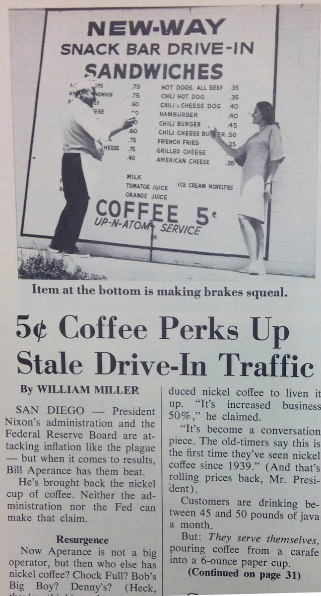
Found this on a Twitter account I follow---Restaurant News. (It has some great stuff for analyzing Microeconomic concepts from an industry students are very familiar with, one way or the other).

It is a menu board for a restaurant (as Restaurant News says) in 1969 and just the kind of thing that makes for a short economics lesson!

The price of a cup of coffee (does not say how many ounces it is) is 5 cents---a nickel.


Wednesday, September 28, 2016

Beef. It's what for dinner...before you run a half-marathon.

One of the Determinants of Demand is "a change in consumer tastes/preferences".  Advertisers and other advocacy groups try to promote their products in order to influence the buying decisions of consumers.

Here is an example from a Beef Industry lobbying group (from Morning Ag Clips):

The beef checkoff’s Northeast Beef Promotion Initiative in partnership with the South Dakota Beef Industry Council, the Pennsylvania Beef Council and the Kentucky Beef Council encouraged runners to “fuel up” with lean beef at the Rock ‘n’ Roll Philadelphia Half Marathon Health & Fitness Expo, Sept. 16-17.
Nearly 30,000 runners and their families toured the expo during the two-day event.  Visitors to the beef booth were challenged to test their beef knowledge through the ever-popular beef trivia spin wheel to win beef-related prizes. Attendees also learned the importance of fueling with high-quality protein through the checkoff’s Protein Challenge campaign. The checkoff’s Millennial-2-Millennial advocates and Team Beef members assisted checkoff by staffing the beef both.  After interacting with booth staff, an on-site event survey showed that 88 percent of attendees polled felt the positives of beef to outweigh the negatives.
- See more at: https://www.morningagclips.com/runners-fuel-up-with-beef/#sthash.Kb94esx8.dpuf

Below I created some slides to show students how this plays out on the Demand side of a Market.

Hope it helps!


View My Stats