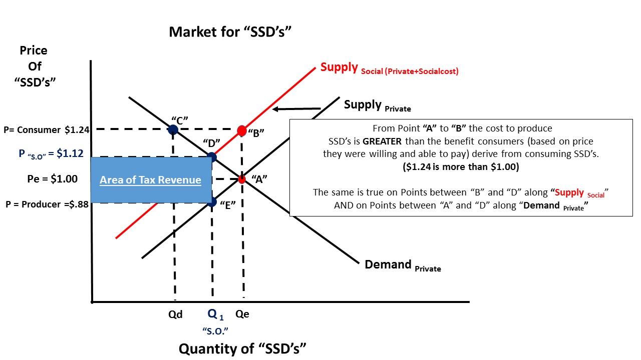
Recently the city of Philadelphia imposed a 1.5 cent per ounce tax on the sale of "Sugary Soft Drinks" or "SSD's" for short.
This means, for instance, a 16 ounce can/bottle of Coke will have an additional tax imposed totally $.24 (24 cents = 1.5 cents X 16oz).
The City believes this class of beverage causes health problems and costs that are not captured in the price of sugary soft drinks.
This is covered in AP Microeconomics in the unit on "Market Failure" where we learn how an external cost that is imposed on "third parties" specifically, or society in general, is not borne by the producer and/or consumer of the product.
Even though I might not consume soft drinks (or to the extent you do), I may have to pay for the health problems that stem from your consumption.
I put together a series of slides that explain with words and graphs how a government might address this issue through taxation to correct this "negative externality" and bring the market to a point where it produces SSD's at a more "socially optimal" price and quantity.
Hope it helps. Thanks.
Economics, civics, constitutional law, Supreme Court cases, AP Economics teaching resources, and classroom lessons by a retired social studies teacher.
Wednesday, June 22, 2016
Friday, June 10, 2016
Plastic Bag Tax in the UK. Correcting for a Market Failure.
An important unit in AP Microeconomics is the one on "Market Failure".
Specifically when there is the presence of a "Negative Externality"---a cost that occurs in the production and consumption of a good that is not included in the production and consumption of that good--but it imposes some harm on those not involved in the transaction.
Secondhand smoke from cigarettes is a good example. When cigarettes are produced and consumed only the market price of the inputs are included in the price---not the costs that they might impose on the rest of us.
Plastic bags you see in grocery stores is another example. It is suggested that these bags impose significant damage to the environment in a number of ways. And, heck, we get them "free" at the store.
This additional cost that is NOT borne by the producer or consumer of the good is called an "external cost". How can we capture this external cost and compel it to be "internalized" by the parties who care the most---the producers and/or consumers?
From HERE:
I put this to the test in a series of graphs and explanations. Look them over and I welcome any comments or constructive criticism.
Hope it helps. Thanks!
Specifically when there is the presence of a "Negative Externality"---a cost that occurs in the production and consumption of a good that is not included in the production and consumption of that good--but it imposes some harm on those not involved in the transaction.
Secondhand smoke from cigarettes is a good example. When cigarettes are produced and consumed only the market price of the inputs are included in the price---not the costs that they might impose on the rest of us.
Plastic bags you see in grocery stores is another example. It is suggested that these bags impose significant damage to the environment in a number of ways. And, heck, we get them "free" at the store.
This additional cost that is NOT borne by the producer or consumer of the good is called an "external cost". How can we capture this external cost and compel it to be "internalized" by the parties who care the most---the producers and/or consumers?
From HERE:
"""Last year shoppers in the UK used an astonishing 8.4 billion plastic bags. Per person this means a plastic bag is used and disposed of every three days.
Plastics have harmful effects and ecologists have singled out plastic bags as being particularly troublesome as they blow in the wind and can spread to remote environments. Governments are therefore trying to tackle plastic bag usage.
In 2002 Ireland became the first country to introduce a plastic bag levy and UK countries have followed suit with Wales (October, 2011), Northern Ireland (April, 2013) and Scotland (October, 2014) implementing their own charges. Today a plastic bag levy for England has come into effect.
The results of the plastic bag levies across UK countries, all starting from a similar point, are staggeringly successful. A 5p levy has seen plastic bag usage drop 78% in Wales and 80% in Northern Ireland while preliminary data from Scotland shows a remarkably similar 80% fall in use. The result also looks quite good, with marine litter surveys showing large declines in plastic bags."""One way to internalize the cost is a tax by the government. This will raise the price of the good and if our Laws of Demand and Supply are correct (even half-way so) then we should see a reduction in production and consumption. At the minimum we compel the users of the good to bear the "true cost".
I put this to the test in a series of graphs and explanations. Look them over and I welcome any comments or constructive criticism.
Hope it helps. Thanks!
Saturday, June 4, 2016
Beer prices at Atlanta Falcons games are going down 37.5%. I predict problems will increase by more than that...
The professional football team Atlanta Falcons are opening a new stadium this year and have announced a drastic cut in the price of concessions people can buy. Here is a link to the whole story.
The price of a beer will drop from $8.00 to $5.00. In Microeconomics we know when there is a decrease in the price of a good/service the Quantity Demanded will increase (Law of Demand).
We move along the existing Demand Curve down and to the right (ceterus paribus).
Businesses care about profits. Profits come from Revenues. A decrease in the price of beer from $8 to $5 is a minus 37.5%.
Now, business also care about elasticity of demand---the general slope of the Demand Curve.
In order for the vendor of beer at the stadium to get the SAME amount of revenue as before there must be, at a minimum, an increase of 37.5% in the quantity demanded for beer.
If it falls short of 37.5%, even though it increased, then Total Revenue will be less than before. Not a good strategy! This would suggest Demand is relatively INELASTIC.
If the quantity demanded is greater than 37.5% then Total Revenue will be greater than before. This would suggest Demand is relatively ELASTIC. A win for the beer vendor!
Anyone see a problem? Does a 37.5% + increase in the flow of beer in a closed stadium pose some "external problems" that are not factored into the price?
On the benign side, more visits to the restroom equals higher sewage/water use.
On the more serious side, well, more drunks and all that entails at a sporting event.
I think alcohol prices should stay high. Not for a personal preference, but for a better social outcome.
What do you think?
The price of a beer will drop from $8.00 to $5.00. In Microeconomics we know when there is a decrease in the price of a good/service the Quantity Demanded will increase (Law of Demand).
We move along the existing Demand Curve down and to the right (ceterus paribus).
Businesses care about profits. Profits come from Revenues. A decrease in the price of beer from $8 to $5 is a minus 37.5%.
Now, business also care about elasticity of demand---the general slope of the Demand Curve.
In order for the vendor of beer at the stadium to get the SAME amount of revenue as before there must be, at a minimum, an increase of 37.5% in the quantity demanded for beer.
If it falls short of 37.5%, even though it increased, then Total Revenue will be less than before. Not a good strategy! This would suggest Demand is relatively INELASTIC.
If the quantity demanded is greater than 37.5% then Total Revenue will be greater than before. This would suggest Demand is relatively ELASTIC. A win for the beer vendor!
Anyone see a problem? Does a 37.5% + increase in the flow of beer in a closed stadium pose some "external problems" that are not factored into the price?
On the benign side, more visits to the restroom equals higher sewage/water use.
On the more serious side, well, more drunks and all that entails at a sporting event.
I think alcohol prices should stay high. Not for a personal preference, but for a better social outcome.
What do you think?
GDP and Water...
Found this on Twitter so it must be true...
If true, it is interesting that 50% (about $9 Trillion dollars) of GDP is produced in concentrated areas close to ports/water. Historical patterns of trade are hard to break I guess could be an observation.
What do you see?
If true, it is interesting that 50% (about $9 Trillion dollars) of GDP is produced in concentrated areas close to ports/water. Historical patterns of trade are hard to break I guess could be an observation.
What do you see?
TSA-Pre Checks --- Quantity Demanded vs Change in Demand
Bloomberg has an article on TSA Pre-checks that provides another good example to illustrate a basic yet difficult to grasp Microeconomic concept: the difference between a change in Quantity Demanded when there is a change in price and a change in demand when something other than a change in price affects the market. Got that?
If you are reading this while standing in line to get through airport security, I hope it makes the wait more satisfying. :)
"""...The agency’s Pre-Check program is designed to fix that problem and move the lines—but only 2.77 million people have enrolled to date, far below projections. The TSA wants to have 25 million people signed up by 2019 for federal “trusted traveler” programs such as PreCheck, for domestic travel, and Global Entry, the program for international travelers run by the U.S. Customs and Border Protection.
"""...But according to the U.S. Travel Association, a lower fee and simpler application process would spur 7 million more people to enroll in the PreCheck program. In a statement Thursday, the group based its claim on a survey of 1,000 domestic travelers conducted March 7-10. Of the 1,000 people, 20.5 percent said they would likely enroll in PreCheck. Among the rest, half cited the $85 fee as the reason they would probably not enroll...."---(bold and underline are mine).Let's take both of the claims made in the first sentence of this last paragraph, separately and then together, to see how this plays out on a market demand curve.
Tuesday, May 3, 2016
Mexican Soda Tax and Change in Qd vs Change in Demand. FUN STUFF!
A couple of years ago, the Mexican government imposed a "soda tax" on soft drinks. Lots of controversy at the time but the goal was (1) to address the issue of obesity and (2) raise some revenue to combat obesity.
WSJ: "...Sales of soda are climbing two years after Mexico imposed a roughly 10% tax on sugary drinks—a bright spot for an industry that has feared it could be cast as the next tobacco.
Mexico’s tax was an attempt to cap alarming obesity and diabetes rates in a country where per-capita soda consumption is the highest in the world. It came at a time when then Mayor Michael Bloomberg was trying to limit sales of the beverages in New York City, and more countries are weighing a similar tax.
Purchases, however, are rising in Mexico after an initial drop, making the country a key-growth market again for soda giants Coca-Cola Co. and PepsiCo Inc. Underscoring the resiliency of sugary drinks, the tax of one peso per liter has raised more than $2 billion since January 2014, about a third more than the government expected...."The first sentence (actually first clause!) in that last paragraph caught my attention. I put it in bold. It is a nice opportunity to analyze these few, yet impactful, words with a market Demand Curve.
This first graph shows a downward sloping Market Demand Curve of soda in Mexico BEFORE the imposition of the tax at some price "Pe" and some market quantity demanded "Qde" at Point "A". Easy enough:
When the tax is imposed the price is going to be something higher than "Pe".
Key point: The only thing that has happened in this market is the price of soda has increased due to the tax. We will move ALONG the market demand curve UP and to the LEFT.
We are now at "Pe +Tax" and a lesser quantity demanded at "Qd1" at Point "B"
Price goes up, Quantity Demanded goes down. Sound familiar?---Law of Demand!
But our key phrase from the article says that the quantity of soda consumed is now increasing after the initial decrease. So what happened?
"...Anti-soda groups aren’t ready to declare the tax a failure and say sales got a boost from unusually warm weather..."--WSJ
So, something OTHER THAN THE PRICE of soda affected the Demand for Soda.
Now, at Pe+Tax the Quantity Demanded is GREATER than it was before ("Qd1"). For simplicity I use the new quantity demanded back at "Qde"---we move from Point "B" to Point "C".
Key Point: As shown below, the market demand curve shifts to the RIGHT indicating an increase in Demand for Soda in Mexico, relative to the prior condition.
This article contains MANY basic Microeconomic concepts but I really liked it because it nicely, if implicitly, illustrated the difference between a "Change in Quantity Demanded" and a "Change in Demand".
This is no small thing when trying to understand Microeconomics.
I hope it helps someone.
Monday, May 2, 2016
A Tale of Two Norwegian government bodies. Which side are they on?
These two stories appear side-by-side on the homepage of "The Nordic Page", a Norwegian media outlet.
Can you spot the contradiction?
![]() |
| Source: The Nordic Page |
Saturday, April 30, 2016
Burning Ivory Towers...
Quiz Question: What happens to the world price of Ivory?
Kenya Burns Ivory Stacks in Protest of Poaching
Burning of 105 metric tons of seized ivory aimed at highlighting scourge of illegal elephant poaching
"""Authorities set fire to 11 pyres and finished ivory goods representing more than 6,000 dead elephants Saturday to highlight the scourge of poaching that is driving the mammal to extinction on the African continent.
Some 105 metric tons of confiscated ivory was set alight in a national park on the outskirts of the capital, Nairobi, in what organizers say would be the largest-ever burning of the valued material.
The undertaking highlights both a renewed push by African nations to end poaching and the challenges faced by conservationists on a continent where the pressure to address urgent human needs often collides with efforts to preserve wildlife habitats."""
Monday, April 18, 2016
Can Economics Solve a Nazi Flag Problem?
This from USA Today.
This property owner has a right, under the 1st Amendment, to fly this flag on his/her property.
Southern Poverty Law Center senior fellow Mark Potok agreed.
However, if this person's right to free speech causes me significant economic harm do I have a right to be compensated?
What if I own a home next to this person and I want to sell it.
Seems likely/possible that this flag flying next to my house would negatively impact the value of my home and/or take me longer to sell it. This would be a significant cost to me that I cannot re-coop.
How can economics solve this? Calling Ronald Coase!
A very short Google search turned up nothing of significance in this regard. Are homeowners just out of luck?
If anyone knows the answer, please let me know.
This property owner has a right, under the 1st Amendment, to fly this flag on his/her property.
""Mark Moskowitz, Southeast regional director for the Anti-Defamation League , said that Spurgeon’s decision to display the flag on his property is “disappointing” but there’s nothing to stop him, legally.
“He is protected by the First Amendment,” Moskowitz said. “In America, there is nothing to say you can’t hate. Sometimes people just want attention, and that’s one way to get it.”
“A person who flies the Nazi flag in front of his house is clearly trying to be provocative,” he said. “Certainly, neighbors looking at that flag who are anything but purely white are going to be intimidated. That flag stands for the mass murder of millions of Jews and others worldwide.”
However, if this person's right to free speech causes me significant economic harm do I have a right to be compensated?
What if I own a home next to this person and I want to sell it.
Seems likely/possible that this flag flying next to my house would negatively impact the value of my home and/or take me longer to sell it. This would be a significant cost to me that I cannot re-coop.
How can economics solve this? Calling Ronald Coase!
A very short Google search turned up nothing of significance in this regard. Are homeowners just out of luck?
If anyone knows the answer, please let me know.
Friday, March 4, 2016
$10.10 - $7.25 Minimum Wage should equal a $2.85 pay raise but is actually only $1.92. See the funny math here...
I have written about this before but wanted to expand on it a bit.
What is the effect on a minimum wage worker, who claims SNAP benefits and the Earned Income Tax Credit--EITC (for the "working poor"), when the minimum wage is increased? Each of these benefits decrease as the reported income to claim the benefits increases.
Assumptions: single parent of 2 dependent minor children. Pays $600 per month in rent and $350 per month in child care (these could be high or low. I just picked two reasonable numbers).
Minimum Wage of $7.25 X 40 hours per week X 4.3 weeks in a month = $1,247.00 in monthly market income.
SNAP Benefits at this monthly market income = $453.00 per month (Calculator here)
EITC at this market monthly income = $462.00 (Calculator here)
Total market income and transfer payments = $2,162.00
Hours worked in a month at 40 hours per week X 4.3 weeks in a month = 172 hours.
Minimum Wage of $10.10 X 40 hours per week X 4.3 weeks in a month = $1737.00 in monthly market income.
SNAP Benefits at this monthly market income = $342.00 per month (Calculator here)
EITC at this market monthly income = $413.00 (Calculator here)
Total market income and transfer payments = $2,492.00
Hours worked in a month at 40 hours per week X 4.3 weeks in a month = 172 hours.
Notice what happened here. The minimum wage increased by $2.85 per hour (from $7.25 to $10.10), but this person's effective income to actually purchase stuff, market income plus transfer payments, increased only by $1.92 ($14.49 per hour - $12.57 per hour).
I rarely hear this talked about, especially by proponents of an increase in the minimum wage. While there is an actual increase in total compensation, hence potential consumption for this person, it is not as much as is touted.
The market income increases, but the transfer payments DECREASE as well which reduce the impact of the mandatory wage increase.
Anyway, I thought it interesting. I hope you do too.
What is the effect on a minimum wage worker, who claims SNAP benefits and the Earned Income Tax Credit--EITC (for the "working poor"), when the minimum wage is increased? Each of these benefits decrease as the reported income to claim the benefits increases.
Assumptions: single parent of 2 dependent minor children. Pays $600 per month in rent and $350 per month in child care (these could be high or low. I just picked two reasonable numbers).
Minimum Wage of $7.25 X 40 hours per week X 4.3 weeks in a month = $1,247.00 in monthly market income.
SNAP Benefits at this monthly market income = $453.00 per month (Calculator here)
EITC at this market monthly income = $462.00 (Calculator here)
Total market income and transfer payments = $2,162.00
Hours worked in a month at 40 hours per week X 4.3 weeks in a month = 172 hours.
Effective hourly wage ($2,162.00/172) = $12.57 per hour
Minimum Wage of $10.10 X 40 hours per week X 4.3 weeks in a month = $1737.00 in monthly market income.
SNAP Benefits at this monthly market income = $342.00 per month (Calculator here)
EITC at this market monthly income = $413.00 (Calculator here)
Total market income and transfer payments = $2,492.00
Hours worked in a month at 40 hours per week X 4.3 weeks in a month = 172 hours.
Effective hourly wage ($2,492.00/172) = $14.49 per hour
Notice what happened here. The minimum wage increased by $2.85 per hour (from $7.25 to $10.10), but this person's effective income to actually purchase stuff, market income plus transfer payments, increased only by $1.92 ($14.49 per hour - $12.57 per hour).
I rarely hear this talked about, especially by proponents of an increase in the minimum wage. While there is an actual increase in total compensation, hence potential consumption for this person, it is not as much as is touted.
The market income increases, but the transfer payments DECREASE as well which reduce the impact of the mandatory wage increase.
Anyway, I thought it interesting. I hope you do too.
Monday, February 1, 2016
A Loonie, A Dollar and an Apple. A nice story of fruit and currency exchange
The Canadian dollar has taken real hit over the past few years in terms of its value relative to the US dollar.
Here is an article on how the change is value has negatively impacted the price of fruit and vegetables in Canada. I did not know this, but it says that almost all fruit and vegetables consumed in Canada are imported. So, Canadians are VERY dependent on the value of their currency when it comes to this category of food.
I saw this and wondered how much of the price change could be attributed to the fluctuation in the exchange rate between the US Dollar and the Canadian Loonie:
In November of 2011 (November 11th to be exact--to pick a day in mid-month) the US dollar to Canadian Loonie exchange rate was $1.00 = 1.01 CD ("Canadian Dollar").
On November 13th, 2015 the exchange rate was $1.00 = 1.33CD. That is a 32% increase (1.33 - 1.01/1.01 x 100).
A couple of observations.
(1) the price of apples in Canada increased 23%, BUT not as much as the depreciation of the Loonie did over that time--- 32%. So something else held prices in check, but the depreciation of the Loonie certainly had a big impact.
(2) If the price of apples had mirrored the depreciation of the Loonie then apples would have cost consumers $4.45 Canadian, instead of $4.12---8% more.
Looking at the price of things priced in different currencies is interesting to me. The good itself, apples in this case, is the same regardless of where it is consumed but the price consumers pay might be drastically different primarily because of the value of the currencies traded to get the apples.
Here is an article on how the change is value has negatively impacted the price of fruit and vegetables in Canada. I did not know this, but it says that almost all fruit and vegetables consumed in Canada are imported. So, Canadians are VERY dependent on the value of their currency when it comes to this category of food.
I saw this and wondered how much of the price change could be attributed to the fluctuation in the exchange rate between the US Dollar and the Canadian Loonie:
"...In November 2011, one kilogram of apples cost an average of $3.35 in Canada, according to Statistics Canada. Four years later, the same amount cost $4.12..."The percentage change in the price of apples over the 4 years was 23% (4.12-3.35/3.35 X 100).
In November of 2011 (November 11th to be exact--to pick a day in mid-month) the US dollar to Canadian Loonie exchange rate was $1.00 = 1.01 CD ("Canadian Dollar").
On November 13th, 2015 the exchange rate was $1.00 = 1.33CD. That is a 32% increase (1.33 - 1.01/1.01 x 100).
A couple of observations.
(1) the price of apples in Canada increased 23%, BUT not as much as the depreciation of the Loonie did over that time--- 32%. So something else held prices in check, but the depreciation of the Loonie certainly had a big impact.
(2) If the price of apples had mirrored the depreciation of the Loonie then apples would have cost consumers $4.45 Canadian, instead of $4.12---8% more.
Looking at the price of things priced in different currencies is interesting to me. The good itself, apples in this case, is the same regardless of where it is consumed but the price consumers pay might be drastically different primarily because of the value of the currencies traded to get the apples.
Monday, December 14, 2015
Where did the jobs in education go during the recession? They moved downtown...
More fun with education data...
Below are data from the National Center for Education Statistics. I just highligted the data between 2005 and 2012 (last year available).
Much/Most of this tracks through the recession so the numbers are interesting to me.
Click on image to make a bit larger.
Through the budget cuts of the recession school level staffing, notably teachers, librarians, and counselors decreased in numbers, but Administrative staff "downtown" increased (probably lots of the "support staff" on the right side were downtown staff as well).
If you do the additions and subtractions you pretty end up with, not a net loss of jobs in education, but a relative status quo. School level jobs (with exception of principals) just morphed on over to the administration offices downtown.
Below are data from the National Center for Education Statistics. I just highligted the data between 2005 and 2012 (last year available).
Much/Most of this tracks through the recession so the numbers are interesting to me.
Click on image to make a bit larger.
Through the budget cuts of the recession school level staffing, notably teachers, librarians, and counselors decreased in numbers, but Administrative staff "downtown" increased (probably lots of the "support staff" on the right side were downtown staff as well).
If you do the additions and subtractions you pretty end up with, not a net loss of jobs in education, but a relative status quo. School level jobs (with exception of principals) just morphed on over to the administration offices downtown.
Number of Students at each grade level 2005-2014
Having fun with data and working on my excel skills which are at the most basic level.
I was looking at different categories of in the Census Bureau's "American FactFinder" (good stuff for research purposes!) and came across surprising data on the number of students in grades 9-12 from 2005 through 2014 (only years available).
I created some bar charts. Becareful in reading the vertical (Y-axis). They do not start at 0 but at the lowest millionth that the category falls under. Perhaps not good technique, but...
The vertical axis (left hand scale) starts at 16,000,000. Notice the rise in 2006 then a steady fall until we get back where we started (the actual numbers or on the horizontal axis below the corresponding year. I put the actual enrollment numbers along the bottom of the horizontal axis for reference.
Starting in 2012 the number flatlines. No growth in the secondary students in 10 years.
How about the younger grades?
No growth there either. Pretty flat from 2010 on.
Kindergarten has 236,792 or 5.97% more little ones.
Total enrollment K-12 increased 1,088,579 or 2.05%.
I was looking at different categories of in the Census Bureau's "American FactFinder" (good stuff for research purposes!) and came across surprising data on the number of students in grades 9-12 from 2005 through 2014 (only years available).
I created some bar charts. Becareful in reading the vertical (Y-axis). They do not start at 0 but at the lowest millionth that the category falls under. Perhaps not good technique, but...
The vertical axis (left hand scale) starts at 16,000,000. Notice the rise in 2006 then a steady fall until we get back where we started (the actual numbers or on the horizontal axis below the corresponding year. I put the actual enrollment numbers along the bottom of the horizontal axis for reference.
Starting in 2012 the number flatlines. No growth in the secondary students in 10 years.
How about the younger grades?
No growth there either. Pretty flat from 2010 on.
Now we are getting somewhere. Grades 1-4 show a growth from 2005 to 2014 of 849,262 or 5.46%
Kindergarten has 236,792 or 5.97% more little ones.
Total enrollment K-12 increased 1,088,579 or 2.05%.
Friday, November 6, 2015
Why is the US using all of Yellowstone National Park to grow corn for Ethanol?
Sort of...
This bar graph was derived from US Dept of Agriculture data. I found it on Twitter HERE. The numbers on the left are in "1,000's", so add 3 zeroes at the end of the numbers you see.
My perspective is Corn for Fuel is, on net, a bad policy.
Just to put the numbers in some perspective, in May the number of bushels to of corn used to produce fuel alcohol was 450,000,000 (450 million!).
US Dept of Agriculture estimates the average number of bushels of corn harvested in 2015 was 168 per acre.
To find the number of acres required for the corn used to make ethanol in May alone, divide 450,000,000 by 168.
That equals 2,678,571 acres. Yellowstone National Park is 2,219,000 for comparison.
This bar graph was derived from US Dept of Agriculture data. I found it on Twitter HERE. The numbers on the left are in "1,000's", so add 3 zeroes at the end of the numbers you see.
My perspective is Corn for Fuel is, on net, a bad policy.
US Dept of Agriculture estimates the average number of bushels of corn harvested in 2015 was 168 per acre.
To find the number of acres required for the corn used to make ethanol in May alone, divide 450,000,000 by 168.
That equals 2,678,571 acres. Yellowstone National Park is 2,219,000 for comparison.
Subscribe to:
Posts (Atom)