Showing posts with label Population Graphs. Show all posts

Saturday, August 2, 2014

Population Pyramids for Israel and Palestine. Whoa to the policy-maker who ignores this!

Demographics is seldom talked about when it comes to geopolitical issues but it is an important explicit and implicit variable that underlies many conflicts.

Here is what Israel and Palestine look like projected to 2015.

All is not equal in terms the age group 19 and under, especially.

Source: HERE

Monday, September 5, 2011

The problem with Social Security in one easy chart---too few "youngs" working for too many "olds"....

With all the political talk surrounding much needed reform of entitlement programs, mainly Social and Medicare, the graph below illustrates the heart of the problem.  These two programs are funded directly by payroll taxes levied on current workers wages (go HERE for a primer on these two taxes). Over the last 80 years, because of demographic changes in our population, there are fewer and fewer wage earners supporting an ever increasing number of retirees and other eligible recipients.

Strip away all the high flautin' political rhetoric on the issue you are left with this simple math---Workers must pay more in payroll taxes and/or we cut benefits to the "olds". 

Another option is we "grow" out of the problem---the economy recovers, we get back to full-employment and payroll tax revenues increase---that helps, but it does not reverse the numbers below.
Source: Carpe Diem

Saturday, June 25, 2011

This "Summer" we need to "Fall" for the Arab "Spring" or it will be a dark "Winter" for seasons to come for us. The issue in one chart here...

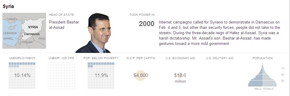
Further evidence (for me) that the underlying reason for the "Arab Spring" movement in the Middle East can be explained in economic terms.  The chart below shows the rate of unemployment for young(er) people in select Middle Eastern countries relative to other parts of the world.  Below that are snapshots of most of the countries represented in the chart.  Focus just on the population pyramids in each one.

There is a toxic mix of a lack of economic opportunity AND a demographic balance tilted toward the very young.  Also, as noted here, "In contrast to most of the world, joblessness in many Middle Eastern countries tends to increase with schooling: the unemployment rate among those with college degrees exceeds 15 percent in Egypt, Jordan, and Tunisia."

Hmmm...lots of young, educated people with access to technology, diffuse knowledge of the "outside" world and a lack of opportunity domestically---Change in the region is inevitable--regardless of the despots actions today...   

Source: The Conversable Economist


Tuesday, June 21, 2011

A very nice interactive map showing immigration patterns across/around the US from as far back as 1890...

HT: Microeconomics...The NYTIMES has a very nice interactive--Immigration Explorer. Select a particular country and see how this nationalities migration pattern has moved around/across the US. It goes as far back as 1890!  Very informative and may be helpful for a research project.

Friday, May 13, 2011

Another Population Pyramid...Longevity will be the death of us!!


Source: The Economist
  ""THE world’s population will reach 7 billion by the end of October, according to the latest projections from the United Nations. For the first time the UN has attempted to look as far ahead as 2100, using various assumptions about how fertility and mortality rates might change over the years. The average of these estimates suggests that the global population will cross 10 billion by 2085. By 2100, 22.3% of people will be aged 65 or over, up from just 7.6% in 2010. The bulk of population growth is expected to come from the developing world. Africa’s population will rise from 1 billion in 2010 to 3.6 billion in 2100. In 1950, 32% of the world’s people lived in today’s rich countries. By 2100, only 13% will.""

Nice interactive graph showing US population shift from 1790 to 2010...I think the invention of air conditioning can explain this...

Wednesday, December 1, 2010

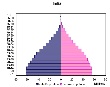
Population Pyramids for China and India compared to the US---Pictures are worth a thousand embedded economic concepts...

Two graphs comparing the size of different age groups in China and India, the worlds two most populated countries.  Together, they represent between 1/4 to 1/3 of the worlds population.  India is going to be young for a LONG time and China is going to face the problem much of the developed world is encountering now---an aging population with a relatively smaller replacement birth rate...I can see power and the economic landscape shifting in the coming decades....


Source: Business Insider

Source: Bussiness Insider

View My Stats