Showing posts with label Maps. Show all posts

Tuesday, August 23, 2016

"There is no profit in destruction***" said no media outlet ever. Louisiana Flood Edition...

***Frederic Bastiat.

Well, it has not happened yet, but wait for it...

Here is a satellite photo (from NYTimes) that shows "Louisiana at Night".  The bright white on the left shows the State as it normally is at night.  The one of the right shows it on August 15, 2016.

Notice the lack of electricity where it used to be plentiful?  Many areas have gone dark.  Devastation.


When damage is done to property, private or public, it has to be repaired or rebuilt. This will necessitate new/current purchases of goods and services.

This adds to Gross Domestic Product (GDP).  It looks like the economy is humming along.

But GDP accounting must include a subtraction to account for what was lost, right?  The added purchases are simply making us whole again, right?

Nope.  GDP includes only "new goods and services" purchased.

Now, businesses will sell less of some goods (demanded before the flood) and more of others (stuff to rebuild) so it could (not likely) come out even.

But you are likely to see a news report that suggests there is a "positive side" to this tragedy---employment and the buying of new stuff.  DON'T BE FOOLED!!

"""From which, by generalizing, we arrive at this unexpected conclusion: "Society loses the value of objects unnecessarily destroyed," and at this aphorism, which will make the hair of the protectionists stand on end: "To break, to destroy, to dissipate is not to encourage national employment," or more briefly: "Destruction is not profitable."""" Bastiat.


Friday, June 13, 2014

Updated map showing US Gross State Product (GSP) vs the Rest of the World. Students love this!

Mark Perry over at AEI has quickly put together the latest (2013) "Gross STATE Product (GSP)" data onto a map that students find interesting every time I have shown it in the past. It gives a great perspective as to just how large the US economy is and will continue to be (hopefully!).

In place of the name of the US State it puts a country whose dollar value of Gross DOMESTIC Product (GDP) is equal/similar to the dollar value of output of that State.

For instance, Australia's GDP is roughly the same of that of Texas's GSP. Brazil similar to California, so on and so forth.

USMap2013
Source: Carpe Diem at AEI

Here is the accompanying data in Excel form that show the numbers used for each State.


Tuesday, March 4, 2014

Maps of India, South Africa and the Korean Peninsula at night. One has more light, one has the same, and one has none. Economic progress in one blog posting...

One of my favorite maps is "The World at Night". It is composite map that shows the presence of artificial light or more specifically the presence of electricity to create that light.  It is an indicator of modern economic and social activity.

It makes a great lesson for an economics and/or geography class.


I came across these two maps below that show to specific countries and the difference in the presence of artificial light.  It is suggested that this tells a story of differing paces of economic progress.

The first is of India in 1994 (left) and 2010 (right).  A very noticeable difference.


The one below is of South Africa from 2000 to 2009.  I can't see an appreciable difference.  To be fair it is only a period of 9-10 years.


Here is another one that NEVER changes.  The Korean Peninsula.  Lights out for the North...


Tuesday, June 21, 2011

A very nice interactive map showing immigration patterns across/around the US from as far back as 1890...

HT: Microeconomics...The NYTIMES has a very nice interactive--Immigration Explorer. Select a particular country and see how this nationalities migration pattern has moved around/across the US. It goes as far back as 1890!  Very informative and may be helpful for a research project.

Friday, June 10, 2011

A nice graphic showing Skilled Immigrants out number Un-skilled immigrants in the US. This is a GOOD thing for us. Now we don't have to do math and science if we don't "feel like it"...

For the first time, immigrants classified as "skilled" outnumber those classified as "un-skilled" in the US.  This graphic shows where in the country this is taking place.  I saw this and immediately thought of two maps I posted a couple of weeks ago.The first one is the wage differential around the US and the second one for job postings relative to the areas population. Both are posted below... Notice a pattern? If you step back and look at them all together it i fairly obvious what is going on.  Skilled immigrants "appear" in places where there are lots of job openings relative to the population AND the average wage in those areas is higher relative to other areas of the country.  I believe many (most?) of these jobs are of a technical  nature and require math and science knowledge at the highest levels. The demand simply cannot be satisfied domestically. What do you think?  Please, REALLY think about this before you respond. Looking for thoughtful answers, not arrow slinging...Thanks!
Source: Chartporn

Saturday, June 4, 2011

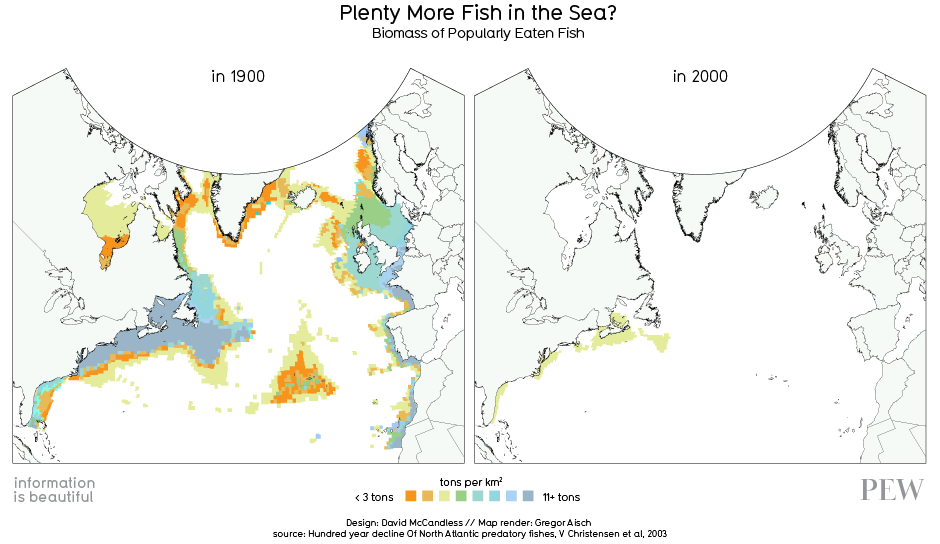
Tragedy of the Fishy's Part 2---Nice map showing the depletion of major North Atlantic fishing grounds...We can stop trying to Find Nemo now. He is gone...

Not exactly sure how they got the data from 1900 to make this map....but there is no question that the major fishing areas of the North Atlantic are getting  fished-out.  While many efforts have been tried to reign in commercial fishing, the "Tragedy of the Commons" is playing out in this situation. 


Source: HERE HT: Paul Kedrosky
 

Friday, January 28, 2011

Need a reason to personally fret about the situation in Egypt? Check gas prices in the next few days...

WSJ: Crude Jumps 4.3% on Egypt Protests

 ""Egypt produces roughly 673,000 barrels a day, according to the Joint Oil Data Initiative, a global oil database, ranking it 21st among the world's oil producers. Still, the country is home to two of the world's key energy supply routes: the Suez canal, a transit point for oil and fuel shipments from the Persian Gulf to the Western Hemisphere, and the 200-mile-long Sumed pipeline, an alternative transit route to the canal. About one million barrels of oil per day was shipped through each route in 2009, according to the U.S. Energy Information Administration.""


""The Suez Canal is located in Egypt, and connects the Red Sea and Gulf of Suez with the Mediterranean Sea, covering 120 miles. Petroleum (both crude oil and refined products) accounted for 16 percent of Suez cargos, measured by cargo tonnage, in 2009. An estimated 1.0 million bbl/d of crude oil and refined petroleum products flowed northbound through the Suez Canal to the Mediterranean Sea in 2009, while 0.8 million bbl/d travelled southbound into the Red Sea. This represents a decline from 2008, when 1.6 million bbl/d of oil transited northbound to Europe and other developed economies.""Source HERE

Tuesday, January 25, 2011

Map of the World at Night and of the Korean Peninsula...Quite dramatic.

The World at Night. One of my favorite visuals of all time.  There are many things to observe on this map that says alot about geography, culture, economics, politics, etc in a country and region.  What do you see when you view the first map? The second map shows the Korean Peninsula in two different time periods, 1992 and 2008.  The South has changed considerably and in the North it is pretty much status quo---quite sad. (Source Aidwatchers)

Aidwatchers
View My Stats