Showing posts with label Graphs. Show all posts

Tuesday, August 1, 2017

The most prominent determinant for a "change in supply" is a change in the cost of an input that goes into the production of an output (final good).

This article uses the example of the input cream that is used in the production of the output butter in the UK.

Rising price of cream squeezes Dairy Crest's margins

“Cream prices, which determine input costs for the butter business, have increased substantially during the first quarter,” the company said.
“This will put pressure on margins in our butter business. We have reduced our promotional activity on Country Life, which is adversely impacting volumes but mitigating some of the margin pressure.” (underlining mine)
Here are some slides to walk you through a basic demand and supply model to illustrated how this impacts the market for butter as described in the article.

Sunday, August 19, 2012

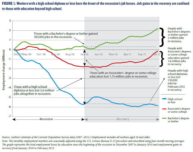
Teachers: If you need a quick visual to emphasize to students the link between education and employment show them these graphs. Students: If you need a reminder as to the importance of education and future employment, PLEASE look at these too.

There is a lot going on in this first graph, but it is important to know what is happening.

The vertical axis shows the percentage change in employment (jobs gained) since the official start of the Great Recession, through the official end of the recession (everything to the left of Jan 2010) and finally through the "recovery" to the present (everything in blue).

Note the bold brackets to the right showing the numerical change in jobs based on the level of education a worker has. 

More education does not guarantee you anything but statistically you are more likely to (1) find a job, (2) not lose your job, (3) if you do lose your job you are more likely to find another one in a shorter period of time.

Source: KPC


 This second graph shows the value of education over an extended period of time--since 1989.

Dropping out or even finishing high school is not enough. ANY type of additional education will help you gain skills that make you more valuable to employers. 

Source: KPC

Friday, August 3, 2012

Entitlement Spending and Public Investment in 3 easy graphs. Hey, this is not a flashy subject but none more important...

The following sets of graphs illustrate the "Emperor has no clothes" in terms of the Federal Budget. Everyone knows the problem but no one does much about it.
Mandatory, or non-discretionary, Federal spending is concentrated in 3 major areas--Social Security, Medicare and Medicaid (and its subprograms). As illustrated in the first graph, these programs over time have steadily consumed a larger part of the Federal budget---approx. 47%!


Other parts of the budget consist of non-mandatory, or discretionary, spending.  Within this category you have "Investment Spending" by the Federal government. The following is a definition of Federal Investment from HERE:
"Federal investment is the portion of Federal spending intended to yield long-term benefits for the economy and the country. It promotes improved efficiency within Federal agencies, as well as growth in the national economy by increasing the overall stock of capital. Investment spending can take the form of direct Federal spending or of grants to State and local governments. It can be designated for physical capital, which creates a tangible asset that yields a stream of services over a period of years. It also can be for research and development, education, or training, all of which are intangible but still increase income in the future or provide other long-term benefits."
The graph below shows the decline over time of Federal Investment as a percentage of the Federal budget.  The implication is that there is significantly less funding for public works projects that confer benefits on everyone that the private market does not supply.


The last graph puts these two areas of the Federal budget together.  Budget dollars are not unlimited.  Over time, mandatory transfer payments to senior citizens and the poor have significantly surpassed non-mandatory public expenditures/investment in infrastructure. 

The Federal government does not do much of anything anymore in terms of physical public goods. They pretty much just write checks.  Think about that.

How do we address this issue? I dunno, I am just a high school economics teacher.  You will have to ask the Emperor and the Court Jesters we call the Executive and Legislative branches.

Sunday, July 29, 2012

Nice graph showing the change in how we communicate and get information since 1900. We REALLY don't talk to each other anymore...

Technology is rapidly changing the way we spend time communicating with each other and how we connect to the outside world.

It shows time in hours per day Americans, since 1900, have spent engaging in the above two activities. The various categories of activities are stacked on the right side.  Notice the bottom 5 activities (from E-mail down to Social Networks) were virtually non-existent in the year 2000---only 12 years ago!

Source: McKinsey and Company

Notice how flat (and even descending) the lines are from 1980 to 2000---pretty stagnant, then BOOM! Those technologies take-off and rapidly start to consume our time. 

What happened during this time-span to make this all possible? What are some of the economic, social and political costs and benefites to society? 

Extra credit for good answers with details.


Wednesday, July 25, 2012

Side by side comparison of drought conditions---today and 1934, a Dust Bowl year....

Here are side by side comparisons of drought conditions today and 1934, a Dust Bowl year.

A stark reminder of how bad the conditions really were back then.  Keep in mind how much MORE the average person depended on agriculture (directly or indirectly) as compared to today.  I look at this and can feel their fear!!
Source: USA Today

Sunday, July 22, 2012

Nice graphic showing the decline over time in the number of teenagers getting drivers licenses. WHY is this the trend?

Why don't young people want to drive anymore? Is this a good or bad thing?

As you move from left to right on this graphic, focus on the difference in the BLUE line (1983) and the GREEN line (2010). The bars represent the percentage of that age group in those particular years that have drivers licenses given that year. In other words, the number with licenses in that age group divided by the number of people in that age group in that particular year (1983, 2008, 2010).

Example: In 1983 approx 70% of 17 year olds had licenses. Fast forward to 2010 and approx 47% did. That is around a 33% decrease.  Certainly not insignificant.

Source: The Atlantic
The article this graphic comes from points out the statistically significant decline between 2008 (the RED bar) and 2010 (the GREEN bar) and asks what is driving this decline in the desire to get a license.

On the negative side I can see this affecting used cars sales, a big business for car dealers.

On the positive side I see fewer accidents, hence injuries and deaths.  Use of less gasoline.  Parents don't have to pay high car insurance premiums.

I can come up with more positives than negatives.  Extra credit for good responses at to how this trend may negatively impact the economy as a whole today and in the future.

Wednesday, July 18, 2012

Was Romney right in saying we need fewer Fire Fighters? See the graphs/data here before yelling at me...

Here are a couple of graphs showing some interesting information regarding firemen (and women).

The first one shows the decrease in the number of fires since 1980 (the RED line and look at the left hand scale) of about 40% and the increase in the number of firefighters (BLUE line and look at the right hand scale) of about 40%.  We have many more firemen fighting fewer fires.
Source: Marginal Revolution

The second graph is pretty self-explanatory.  The left scale shows the number of calls to the fire department  for medical calls (BLUE line), actual fire calls (Solid RED line) and false alarms (dotted RED line). 
Source: Marginal Revolution

In most cities we have firehouses that support BOTH ambulance service and firefighting equipment/trucks.  The trend in the graphs seem to show we need fewer, expensive full service firehouses and more ambulance based houses with less capital requirements (trucks, etc) that would be less expensive. 

Having said this, I LOVE MY FIRE DEPARTMENT!! :)

Sunday, January 15, 2012

Nice chart showing gas taxes in various "rich" countries and an excellent graph showing the effect of these taxes on the quantity demanded for gasoline. Bet you can guess what the answer is.

One of the primary reasons for the differences in the retail price of gasoline in the "rich world" is the differences in the gas/fuel tax levied on each gallon of gasoline.

This first graph shows, in US dollars, the amount of tax various countries levy on gasoline and diesel fuels.  Quite a difference!
Source: Econbrowser
Here is a chart from a different source showing the pre and post tax price of gas and diesel in the coutries listed above and some others.  The blue line is pre-tax. You can see the price of fuel is basically the same in all areas

Source: HERE

The post-tax retail price of gasoline is going to be higher when the above taxes are added to the pre-tax price of gasoline, to state the obvious.

The Law of Demand in economics states that the price and quantity demanded of a good are INVERSELY related---price increases the quantity demanded decreases---price decreases the quantity demanded increases.  Makes sense, right?

The next graph illustrates this point explicitly.  Note the price on this graph is along the horizontal axis and the quantity demanded of fuel is on the vertical. This is the OPPOSITE of what is traditionally done in economics textbooks.  The inverse relationship between price and quantity demanded holds up rather well.

Source: Econbrowser

What are the implications?  If you want to seriously decrease the consumption of carbon-based fuels, the most effective way is through an increase in gas prices at the retail level.  Is this politically possible? Absolutely not.

To read more about this important topic go HERE for the source for this posting and/or go HERE for the original research paper that has more in detail. Worth a look if you are at all interested.
Sunday, November 6, 2011

New and improved US Debt charts with China---always stunning to see how it has changed in just 10 years...

Don't know why I like debt graphs/charts as they relate to China.  I suppose it is because of the shocking rise of it such a short period of time. 

The first one (smaller one with yellow bars) shows the dollar amount of US Treasury's owned by China ( I assume by the Govt and/or its citizens). The second part of the graph shows the total US PUBLIC debt of $10 Trillion. This excludes the portion of the total National Debt (approx $5 Trillion) that is called PRIVATE debt. This is the debt incurred by the Federal Govt as it borrows from various Trust Funds, such as Social Security, that the Federal Govt administers. In other words, money the Federal Govt borrows from itself (that is another story for another day).
Source: Christian Science Monitor
The next chart shows in the same time period, China's change in direct investment outside of its borders (the US and elsewhere). This could include other financial investments stocks, commodities, bonds (how much of YOUR house or student loans or car is owed to them??) or investments in physical properties (businesses, land, natural resources, etc).
Source: Christian Science Monitor

You might be asking yourself: "Where do they get all this money since 2001 to loan us or to invest?"

This chart shows the difference between what we EXPORT (BLUE line) and what we IMPORT (RED line) from China.  You can easily see US Net Exports ($$$ Exports minus $$$ Imports) is negative. We import much more from China than we export to them.

The net flow of dollars on merchandise and services between our two countries is we send many more dollars to China than they return back to the US to buy our merchandise and services.  What do they do with all those surplus dollars? Go back to the beginning of this posting and start again---it is a continous loop. Those dollars we send them don't just disappear. A good number of them come back to the US to buy our debt instead of our merchandise. Crazy system, ain't it??? :)

FRED Graph

Saturday, October 15, 2011

Nice population pyramid charts to remind us of the ticking fiscal timebomb awaiting the next generation. THIS is what the OWC's SHOULD be protesting...Go South protesters-- towards Capitol Hill...

Click on the video below to see the age-demographic change occurring in the US.  This is ground zero for a potential busted national budget in the coming decades.  Notice the shape of the pyramid in 1981, specifically the proportion of young working age adults to the retired population (65 and older).  It is a distinct triangle with a wide base and narrow top.  There are far more younger workers paying social security taxes and medicare taxes relative to the recipients, 65 and older.  This is ok---this entitlement program is solvent.

 As the decades pass, notice how the pyramid shape becomes more like a pear.  This is not so good.  The proportion of workers to retirees becomes more equal.  However, what does not become more equal is the tax revenue-to-tax expenditure ratio--expenditures will drastically increase relative to the tax revenues (at current payroll tax rates).  Retirees are living longer, there are more of them and their health care needs (read that "costs") will only increase. This is not ok---this will make these two retiree entitlement programs INSOLVENT, unless serious reform takes place--now.  Well, now is almost too late. Should have been done 15-20 years ago.


 Each of the graphs are below as well (Source for the Graphs HERE)


Friday, August 19, 2011

Results of a Gallup Poll on how people view their childs school relative to other schools around them.

Is this a case of cognitive dissonance?  People surveyed tend to rate their own childs school highly while the other schools in their area are viewed as a cut below (or many cuts below).  I think it is because we are more aware of what goes on in our schools and tend to take ownership of it because it is more personal.  Or is it simply more of a comfort thing---it HAS to be good/fine/ok because I trust them with my child. 

How can the public simultaneously like their own school, but not have a positive view of everone elses school?  This is similar to our views on politicians---everyone loves their own, but thinks Congress as a whole is broken.  How do we reconcile the two?  Maybe we ARE crazy....
Source: Gallup Poll

As an aside: Why did the percentage of people expressing a positive view of their childs school spike from 2007 to 2008? That is a 58% increase!  It was the first year of the recession.  I cannot think of a good reason, can you?

Thursday, August 4, 2011

Two nice graphs/charts showing the emergence of developing countries and their influence on resource demand. What an amazing 20 years...Are you preparing to serve these markets???

Both of these graphs/charts come from The Economist.  I continue to emphasize the rise of emerging markets around the world. We can see this as a problem or as an opportunity.  Businesses looking for opportunities for the future are increasingly looking outside the US. Are YOU on board with this in planning your future?

The decline and growth of respective world share of GDP in the graph below (left) since 1990 is quite dramatic.  If does not mean that our GDP has not increased but our share of global GDP has decreased.  Analogy: while our slice of the GDP pie is got bigger, the pie itself got larger too. Economic growth is not a zero sum game.  Wealth is not fixed, and through processes, technology and productivity it increases over time.


Wednesday, July 13, 2011

The nation's trade deficit increased in May. The "why" is shown in two easy line graphs...

The US trade deficit increased last month from the prior month. A trade deficit occurs when a nation's exports are LESS THAN its imports. This means its Net Exports (N(x)) are negative.  Look at the right-most tips of the lines on the graph below.  The BLUE line shows the US had a total trade (goods and services) deficit of roughly $52 Billion dollars just for the month of May. The import of crude oil (BLACK Line) is roughly $32 Billion of the total trade deficit, or 62% (32/52=.615)!! The difference between these two lines is represented by the RED line. What are we doing to minimize our dependency on this stuff? Rhetorical question--we all know the answer...
Source: Calculated Risk
It is not because of a lack of effort on the export side of the equation (goods and services we make and sell to foreigners), as shown in the graph below. Our exports are recovering nicely (RED line) and almost back to a historical high.  As we recover, we are either consuming more oil overall (domestic production + Foriegn imports) OR we are producing less domestically, hence importing more. I am not sure which it is, to be honest....Any ideas???

Source: Calculated Risk

Saturday, May 28, 2011

A couple of informative graphics on Oil Production and the revival of the Texas oil boom years...WTF! (With The Fracking)...What did you think I meant?

According to the graphic below, countries that are classified as democratic (relatively "free") produce about 16% (US 9%, Canada 4%, Norway 3%) of the world's output of crude oil. Collectively, countries deemed less democratic produce about 54% (rough estimate just eye-balling the graph).


Source: Bloomberg (HT: Carpe Diem)
 Here is a chart showing the country of origin for US imports of crude oil. Several of the same names appear on both illustrations. 

Source: EIA
 I do find it interesting that China is a big producer of oil in the marketplace BUT the US imports virtually no oil from them (only about 2,000 barrels a month according to the IEA).

According to the NYTIMES , in short order, the US could increase  production by 25%, moving the US from 9% to approx 11.25% of world production.
"The Texas field, known as the Eagle Ford, is just one of about 20 new onshore oil fields that advocates say could collectively increase the nation’s oil output by 25 percent within a decade — without the dangers of drilling in the deep waters of the Gulf of Mexico or the delicate coastal areas off Alaska. More than a dozen companies plan to drill up to 3,000 wells there in the next 12 months."
However, this would require "drill baby drill" and all the negatives that brings with it..

""There is only one catch: the oil from the Eagle Ford and similar fields of tightly packed rock can be extracted only by using hydraulic fracturing, a method that uses a high-pressure mix of water, sand and hazardous chemicals to blast through the rocks to release the oil inside.


The technique, also called fracking, has been widely used in the last decade to unlock vast new fields of natural gas, but drillers only recently figured out how to release large quantities of oil, which flows less easily through rock than gas. As evidence mounts that fracking poses risks to water supplies, the federal government and regulators in various states are considering tighter regulations on it.""
That is the bad news.  The good news is that it could bring prosperity to local and state governments...
"...The companies estimate that the boom will create more than two million new jobs, directly or indirectly, and bring tens of billions of dollars to the states where the fields are located, which include traditional oil sites like Texas and Oklahoma, industrial stalwarts like Ohio and Michigan and even farm states like Kansas..."
Opportunity Costs abound! What do states with declining revenues and high unemployment do?  How do local communities balance the need for more local revenue AND retain/maintain their quality of life? 

Bottomline: WE GOTTA GET OFF THIS CRUDE OIL STUFF!


HT: Carpe Diem---How could I live without this blogger!! :)

Sunday, May 22, 2011

Netflix customers collectively consume 30% of US bandwidth. Shouldn't they pay MUCH more for video stream?? See chart here...

I am very ignorant of how the "guts" of information technology works. Sort of like my car--I don't know HOW it works, I just want to turn the key and go.  Is the supply of bandwidth equal to the demand for it? Is supply greater than demand or can the supply be expanded with little extra cost? If I am not mistaken, this is one of the issues with net neutrality.  Can someone give me a middle-school intelligence level explanation of why I should not pay more for my Netflix subscription than I do...   
Source: Business Insider


""Netflix's streaming service is so popular that it's now consuming 30% of peak downstream internet bandwidth in North America, according to data from Sandvine, a broadband equipment company, via TechCrunch.""

Saturday, May 21, 2011

While the giant slept the world moved on to eradicate poverty...We just don't get what is happening in the rest of the world.


Source: CSM
  The world is changing rapidly and is becoming less dependent on the success of the US.  We are still very relevant but, in my opinion, the economic success of the rest/most of the world is eroding our status .  And, I fear, we are letting them.  1.4 Billion  Chinese, 1.3 Billion Indians, 190 million  Brazilians, AND the continent of Africa are rapidly developing middle-classes. These middle-classes are not to be confused with the US middle-class, which in dollar terms is way ahead of the aforementioned countries.  BUT the purchasing power of 100's of millions of people is increasing at an increasing rate.  Rising incomes around the world should not be seen as a problem for us, but an opportunity.  Instead of complaining about the "fairness" of trade with the rest of the world, I would prefer we as a nation welcome them out of poverty and ask if there is anything we can sell them (YES! We do make stuff!) that they would FREELY like to buy from us...THAT is what a competitive country does. 

Surging BRIC middle classes are eclipsing global poverty

The world will, for the first time in history, move from being mostly poor to mostly middle-class by 2022, the Organization for Economic Cooperation and Development projects. Asians, by some predictions, could constitute as much as two-thirds of the global middle class, shifting the balance of economic power from West to East. Already, some analyses of International Monetary Fund data suggest that the size of the Chinese economy could eclipse that of the United States in just five years.


By 2030, the global middle class is widely projected to at least double in size to as many as 5 billion – a surge unseen since the Industrial Revolution. This boom, however, is more global, more rapid, and is likely to have a far different – and perhaps far greater – impact in terms of global power, economics, and environment, say economists and sociologists.

But today's middle-class boom is unlike the Industrial Revolution, in which rising prosperity became a catalyst for increased individual and political freedom. Those in the emerging global middle classes – from an Indian acquiring a flush toilet at home to a Brazilian who can now afford private school to a Chinese lawyer with a new car in the driveway – are likely to redefine their traditional roles, and in doing so, redefine the world itself. 
 "I would expect that as the global middle class gets transformed by the entrance of hundreds of millions of Indian, Brazilian, and Chinese families, the concept of what we see as the middle-class values may change," says Sonalde Desai, a sociologist with the National Council of Applied Economic Research in Delhi (NCAER). "Historically, sociologists have defined 'middle class' as those with salaries…. I think 'middle class' is very much a state of mind."

Sunday, May 15, 2011

Informative Graphic on Rising Food Prices around the World...We need to do better...

Source: World Food Progarmme

Manufacturing jobs DOWN, Manufacturing Output UP! How can THAT happen?


Source: LA TIMES
 The above graphic shows the decline in manufacturing jobs in the US. This is only half the story.  True,  employment in this sector is decreasing, but our actual manufacturing output per person is INCREASING:

Souce: Carpe Diem

This is production domestically in the US, not including "off-shored" production.  How can we have more output with fewer workers?  The use of technology in just about all phases of production is the primary culprit. Have you ever watched an episode of "How It Is Made" on The Science Channel? View some of the clips at the site and look to see how many workers there are (relatively few) and at the technology/processes that are used to perform tasks that only a few years ago required many workers to do.  The jobs lost in American manufacturing in many cases were good paying jobs that allowed for a middle-class level standard of living for millions of Americans.   

Watch these two short videos and count the number of production workers...It won't take long.


View My Stats