Saturday, May 17, 2014

Regardless of your political persuasion..

I suppose it is inevitable that it plays out this way.  The Constitution is sort of like a book.  It provides a table of contents and the 3 branches of government write the chapters.  I guess the only discussion is do we want a War and Peace tome or an abbreviated e-book.

As always, at least for me, the answer lies somewhere in between--- a novel and preferably a non-fiction.  I think we are getting too much fictional government right now, don't you think?  :)

Source: Via AEI

Friday, May 16, 2014

Since 1994 we receive 150 more TV channels and but only watch an additional 7. Progress?

The number of TV channels the average person can receive in their homes has increased 375% (189.1-40.4= 148.7/40.4 X 100)

The number the average person actually watches has increased by 72% (17.5-10.2 = 7.3/10.2 X 100).

To put in in simpler terms, we get about 150 more channels but only watch an additional 7, since 1994.

Infographic: Many Channels, Few Watched | Statista

Where's the Beef? No, seriously, where is the beef!!

Here is a look at the past, present and future of the Supply Side of the meat industry. This data is from the USDA ERS for the years 2013, 2014 and 2015. Part of 2014 and all of 2015 are predictions based on known numbers in the herds, flocks, whatever. Numbers are in "millions".

Here are the percentage changes, from 2012 to 2015 in the potential "Quantity Supplied" (in millions of pounds of meat) of meat for consumption:

Beef:  -6.2%
Pork: +4.5%
Lamb/Mutton: -5.8%
Broilers (chickens): +6%
Turkeys: -.7%

Beef production has experienced a steady decline since 2012.  Pork is still below 2012 production levels but expected to rebound in 2015.  Chicken is a bright spot in that it has increased at a fairly steady rate.

While the supplies of chicken and pork will increase, prices will not likely decrease as you might expect.  As the price of beef is most assuredly going to be higher, the demand for chicken and pork as viable substitutes will increase and put upward pressure on the price of  both of those meats.

TANSTAAFL---Now I am hungry for lunch.  Will it be Chicken or Pork Fried Rice?

Thursday, May 15, 2014

My response to a Social Media posting regarding a restaurant owner who pays his workers $21.00 per hour.

There is a posting going around on Social Media (I have seen it on Facebook) about a restaurant owner and how much he pays his staff/waitstaff. It is a place called "Zingerman's Roadhouse" located in Ann Arbor, Michigan.

He is an advocate of increasing the minimum wage. His workers make about $21.00 in wages and tips and they get other benefits as well.  He calls this a "thrivable-wage" as opposed to a "livable wage".  I assume he believes all businesses in the food service industry should do the same.

I am not opposed to increasing the minimum wage.  What I do oppose are demagogues who think their opinion of how someone else runs should run their business is morally superior.  Especially when they don't walk in the same shoes.

Curious about his establishment, I went and looked at his menu.  It can be found HERE.

Below I clipped and pasted what a BBQ sandwich and an order of fries would cost me.

$18.50.  Guess I will have a glass of water with that---I am tapped out. Look at the menu.  That is one of the better deals.

Oh, and the Social Media posting does not mention this is an UPSCALE establishment nor does it mention the prices. And you have to make a reservation.

Show me a restaurant owner who sells me a sandwich and fries for half (or more) than what Zingerman's does and I will listen to him and his argument for raising the minimum wage. Zinger-meister is NOT in the same business as the former one is.

Why don't people get that?
Source: Zingerman's Menu Board

GUESS FIRST! Which State produces almost half of all rice grown in the US?? Ok, now you can read on...

After attending my daughters graduation from Texas A&M (economics!!) we drove from College Station to our home in the Columbus, Ohio area.

As much as time allows, I like to stay off the Interstate highways and drive the "country roads" to see places I have never been before.  This is where "America" happens.  Love to have those forehead thumping moments when I learn something I did not know before.

Rice.is.grown.in.Arkansas!  (Head Thump!) Hate to admit it but I did not know that.  I assumed Louisiana and Mississippi had the comparative advantage of the proper land resource needed to grow it on a mass scale.

Much to may amazement, I saw unfamiliar field after field like this:

Source: HERE (for some reason I did not bother to stop and take my own picture!!

I have been to Arkansas but never East of Little Rock.  The map below highlights in GREEN the areas of heavy concentration of rice production.  You can see lots of dark green that lies just to the West of the Mississippi River into Arkansas.

Source: Wikipedia
Below is data on rice production in the US by State from 2007 to 2013.

On average over that time span, Arkansas alone produced 46% of the US Rice crop.

Source: USDA ERS

It was not inevitable that Arkansas would become the rice capital of the US.

Here is the story of how it happened (from Arkansas Rice Facts):
Growers in the prairie lands of Arkansas were in need of a crop that could be grown dependably and profitably. Almost by accident, rice became a contender when in 1896, W.H. Fuller ventured southwest to Louisiana on a hunting trip. It was there that he first saw rice growing, which ultimately led to the development of a leading agricultural industry for the state. Fuller, along with his brother-in-law John Morris and John’s wife Emma, are generally credited with founding the Arkansas rice industry. By 1910, rice production, research and milling were established in the state. Today, the Museum of the Arkansas Grand Prairie in Stuttgart, Arkansas, showcases the history of this major center for U.S. rice production.
Now you know it too.

Guess it will be chicken fried rice for lunch today...

Wednesday, May 7, 2014

Purchasing power of money and McDonalds. Let's go back to the Disco Era

Embedded image permalink

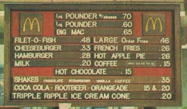
This menu board I posted yesterday gives me food for thought (pardon the pun).  It makes it easy to compare the purchasing power of wages in different time periods if you have actual prices people paid for things at the time.

Using these prices I can quickly show the purchasing power of the dollars in (1) the prevailing minimum wage and the average wage paid to workers (that data can be found HERE at the St Louis Fed Reserve)

In 1974 the minimum wage was $1.60 per hour (from HERE).  The cost in nominal (current) dollars to purchase a Big Mac, Large Fry and a Large Soft Drink in 1974 was $1.31 ($.65+$.46+$.20 from prices below).

It would take a minimum wage worker earning $1.60 per hour (NOT subtracting payroll taxes) 49 minutes to earn enough to purchase the meal.

Today a Big Mac Combo Meal costs $5.69 (Price HERE). At worker earning $7.25 would have to work 47 minutes to get the meal deal.

The average wage for a "production worker and non-supervisory" job in 1974 was $4.45. It would have taken this person 17 minutes to purchase the $1.31 meal.

In 2014 the average wage for the same class of worker was $20.49. It would have taken this person 17 minutes (16.8 actually) to purchase the combo at $5.69.

By EITHER measure the purchasing power of the minimum wage AND the average worker wage are about the same, 40 years apart.

So, the conclusion? No great shakes, but by this measure the purchasing power of wages, minimum and average, have not lost ground BUT it have not gained either.

What is that saying about Kissing Your Sister?


Tuesday, May 6, 2014

McDonalds menu board from 1974. Nice lesson on prices and selection change over time.

I saw this photo of an aged McDonald's menu on Twitter.  I spent about 2 minutes trying to confirm and the best I can find it is from 1974.

According the Bureau of Labors Statistics inflation calculator, $1.00 in 1974 is equivalent to $4.79 in today's dollars.  So, multiply the numbers you see below by 4.79 and you will get those prices in today's money.

For instance, a $.65 Big Mac would be $3.11 today.

Using pricing information HERE, a Big Mac today is priced at $3.99 (not as part of a combo meal). This means the price of the Big Mac has increased 28% over the general rate of inflation for the past 40 years.

A fun-ish class excercise could be to do like I just did above and look at how, after adjusting for inflation, prices have changed over time.

Questions to ask would be how has portion size changed?  Quality and composition of the food? Competition in the marketplace?

Embedded image permalink


Here is a recent one. Big difference, eh?  The simple life no more.


Monday, May 5, 2014

Short currency exchange rate lesson: Kia Motors and the Won

The trading of  goods and/or services internationally requires the exchanging of currencies to facilitate those transactions.  Consumers and producers are at the mercy of the prevailing exchange rates their currency has relative to another currency.

Any change in that exchange rate can have an impact on trade and the profits realized from that trade:

Kia Motor Profit Rises on High-End Sales Despite Challenge of Strong Won

Exports of Kia's key models, including the Sportage sport-utility vehicle and the Soul wagon, rose 13% in the first quarter from a year earlier, contributing to a 7% increase in average export prices for the period, the company said. 
Still, the company warned that the appreciating won could hurt earnings in the coming quarters. 
"The won is maintaining its upward trend, while competition is intensifying with aggressive marketing activities by rival auto makers and a series of new launches," said Kia Chief Financial Officer Park Han-woo. 
The won in 2013 reversed several years of weakness and has been on a steady rise against major currencies. It gained 1.5% against the U.S. dollar in the first quarter from a year earlier, and recently traded near a six-year high.
Korean Won is trading at 1030.14 Won (W) per US Dollar today.  This means the holder of $1.00 US who wishes to exchange it into Korean Won would receive 1030.14(W) for it.

If tomorrow $1.00 purchases 1020.14(W) then the purchasing power of the dollar has decreased ( I can buy 10 FEWER Won today than I could yesterday). This means that items in Korea price in Won will become MORE expensive for me to purchase--I have to now give up more than $1.00 to buy the same amount of Won as I purchased yesterday. With rounding that would be $1.01 US. It is only a penny but with BIG money a 1% difference adds up.

It can be said the Dollar has DEPRECIATED in value and the Won has APPRECIATED in value.

Kia can be hurt in 2 ways with an Appreciating currency.

(1) it makes a Kia produced in Korea MORE expensive for holders of dollars to purchase, as in the example above.  NOTHING regarding the vehicle made it more expensive ONLY the change in exchange rates between the two currencies did so.

Using the 1% example above, a Kia priced at $30,000 US would now cost $30,300 US ($30,000 X $1.01).

(2) any profits Kia earns in US dollars will now buy FEWER Won than it did before the Depreciation of the US dollar, so in profits in Won will be less than they other would have been.

Using the 1% again, profits of, say, $500 million dollars would be effectively reduced to $490.128 million ($1.00/1020.14 X $500M).

Bottom line: Exchange rates are another thing businesses have to account for in the course of doing trade across borders.


PPF illustration with maps of Corn and Soybean acreage. Nice real life example.

In the first week of an introductory Economics students encounter the Production Possibilities Frontier (PPF) as the first formal model used in both Micro and Macroeconomics.

The PPF illustrates the productive capacity of an economy if it were fully-employing all of its useful resources (Land, Labor, Capital, Entrepreneurship). The model is flexible and can be used in a Macro sense comparing the production of the broad categories of Capital and Consumer Goods or in a Micro sense comparing the production of two specific goods such as Corn and Soybeans.

If the economy is producing ON (does not matter where) the PPF it is achieving "Productive Efficiency". This means it is fully utilizing its productive resources in the the most efficient and lowest cost way.

WHERE on the PPF, or the particular bundle of the two goods, the economy produces is called "Allocative Efficiency".  That bundle a society produces and consumes is determined by the economic system (market vs socialist vs command) or some combination thereof.  In the US, the price mechanism and/or government policy determines the Allocatively Efficient bundle of goods in the market place.

Nowhere is this more evident than in Agriculture.

Let's look at the two-good model---Corn and Soybeans.

Both require roughly the same climate, terrain and soil to grow.  The Opportunity Cost of switching from growing one to the other is minimal--an acre of land for growing corn will produce a maximum yield in either corn or soybeans.

So, our PFF for Corn and Soybeans, shown below, illustrating the trade-off between growing one or the other would be a straight line representing "constant opportunity costs".  Assume our initial equilibrium point in the year 2001 was at combination of Corn and Soybean planted and harvested acreage---Point "A".


However, in the mid-2000's due to a policy change we had a relatively massive "Allocative Efficiency" change and a re-allocation of land resource from the production of Soybeans to Corn--Point "A" to Point "B".  How do I know this?

See the map below.  The RED areas on the map on the left show the DECREASE in acreage planted for Soybeans and the BLUE areas on the right map show the INCREASE in acreage planted to Corn.

Matches up pretty well, wouldn't you say?

Source:  From USDA Atlas Maps

What was the major the policy change that prompted this reallocation?  I will just leave you with a picture to ponder that one...


Saturday, May 3, 2014

My Informal Lime Report Update: A price increase!! According to reports, this should NOT be happening...

I have been chronicling the price of Limes at my neighborhood Kroger (Northern Burbs of Columbus OH) for the past month or so. 

Today (May 3rd) they are $1.59 each.  Just last week they were $1.49.  This article HERE suggests that the price is about to pop and decrease in time for Cinco de Mayo.  Apparently the supply chain has been replenished enough for supply to align more closely with demand.
""This week's sharp move lower comes amid increased supply from Mexico, where the majority of fruit consumed in the U.S. originates, experts said. Falling demand has also contributed to the recent easing.""
This may be a nice illustration of prices being flexible upward but "sticky"on the way down.  Retailers may be capturing some lost profit as they lagged in raising prices in fear of alienating customers.

The supply certainly was adequate at this store on a Saturday afternoon.   :)

Displaying photo.JPG


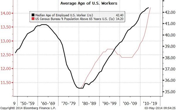
Nice graph showing Median Age of workers and an aging population. Is there something to see here?

Via Twitter and Micheal McDonough.

"Median" age means half of workers are older than 42.40 years of age and half are under (read that on the RIGHT SCALE).

The percent of the population that is over 65 is 14.2% (LEFT SCALE).

Both these numbers are all time highs, as you can see.

During the late 50's and part of the 60's we had a high in median age just a year or so below the current one but the percent of the population over 65 was significantly less (assumption--the graph does not show it).

So, we have an increasingly aging workforce taking care (in terms of entitlements) of an increasingly aging population.

Not sure my back can take it and my feet really hurt.  Hope we start trending young again sometime soon.
Embedded image permalink
Source: Twitter via Michael McDonough

Nice graphic on revised employment reports from the St Louis Fed

This graphic comes from the St Louis branch of the US Federal Reserve Bank.

It is a nice illustration of (1) why we should pay only mild attention to INITIAL employment reports and (2) the importance of looking for longer terms trends in economic data reporting.

However, both might be of scant use because the employment report is a "lagging indicator".  It reports on what has already happened and may or may not be useful in assessing the current state of the economy.  But we have to dance with the partner we came with.

As the Bureau of Labor Statistics gathers more data about a particular time period they can revisit and update the number of jobs created

According to the numbers below, there was a +23% difference in the average number of new jobs reported initially and what an updated revised average number 3 or so months later.  That seems significant to me.

Does that mean you can just go ahead and add 23% more jobs to the next jobs report to extrapolate that out to a longer term trend? Nope. Only a good politician or a bad statistician would do that...

The revision could be biasd upward OR downward:
The pattern of the revisions shown in the chart is consistent with the evidence showing that revisions tend to be procyclical. That is, during an expansion, revisions to payroll employment tend to be positive; and, during periods of slow economic growth and recessions, the revisions tend to be negative.--St Louis Fed
Employment Revisions

Friday, May 2, 2014

Electric Car buying and subsidies. Who REALLY benefits?

Electric Cars are considered a net positive for a lot of reasons.  I know this can be a point of contention, but that is not what this posting is about.

The article link below is about a proposal to increase the Tax Credit for people who elected to purchase an Electric car.  The thinking is this will in effect make buying one less expensive and, at the margin, people would purchase more of them.

The suggestion is the market fails to supply enough of this type of car at a low enough price.

A subsidy, in this case at tax credit for buyers, is one way to correct for the "externality".

Electric cars tax credit should rise to $10,000, says Congressman:  
Electric cars: New legislation would increase the tax credit for the purchase of electric vehicles from $7,500 up to $10,000 as a way to make it easier for people to buy electric cars.
Here are my series of slides that illustrate how this might work AND how it is not as simple or effective as it is intended to be.  Things never are in Economics!

What do you think?  Constructive comments or corrections are welcome.  Feel fee to steal.


Wednesday, April 30, 2014

Latest GDP report out. I see heating bills and transfer payments. What do you see?

The latest Gross Domestic Product report for the 1st Quarter of 2014 just came out.  Not a good one at all---GDP grew at a .1% pace (yes, POINT 1 percent!).  Stagnant for the most part.

However, I have seen commentary in a few places that suggest a bright spot is "Personal Consumption Expenditures" or "PCE" for short---spending by regular folk like you and me.  It is up 3%.

The US Bureau of Economic Analysis (BEA) has a nice interactive graph that more information can be obtained than is generally reported in the media.  See it HERE.

I wanted to see how the components within PCE's performed relative to each other.

This first graph show "Goods", broken down into Durable and Non-Durable categories, and Services.  You can see the GOLD line representing the broad category Services did very well compared to material good expenditures. YAY Services!!


Ok, this is good information. But if expenditures on Services as a category carried the economy, what exactly are those services that we collectively splurged on?  Glad you asked.

The graph below breaks down the category of Services into further broad categories BUT at least it is winnowed down a bit.

The BLUE line represents Services as a whole (just like the GOLD one did above).

The light-greenish line below the BLUE line represents "Health Care" spending as a category. You can see spending on health care related expenses was the majority of spending that occurred in the first 3 month of this year.

It was followed by expenditures on "Housing and Utilities".

Those two categories of expenditures carried the economy in the 1st Quarter.


Considering about 50% of health care dollars are "government transfer payments" and many/most of the dollars spent on Housing and Utilities were spent on heating bills that spiked in January and February, it seems like we pretty much did not do anything else.

Not a broad based recovery by any means.  At least not this early in the new year.

Is the US REALLY falling behind China in terms of measuring GDP? "Objects in mirror appear larger than they really are" is not just for rear view mirrors...

There is a new International Monetary Fund (IMF)  report out regarding China's imminent surpassing of the US as the worlds largest economy, as measured by Gross Domestic Product (GDP).

It centers around measuring GDP on a "nominal" basis (current exchange rates) or by a concepts called "Purchasing Power Parity" (normalizing exchange rates).

I think most people who see the headline will not understand the important distinctions between these two ways to measure the dollar value of a nations output.

The graphic below and the article that accompanies it (from the Wall Street Journal) is one of the better ones I have seen that explains the positives and negatives of each measurement.

As with ANY statistic, caution is advised!

China’s Economy Surpassing U.S.? Well, Yes and No

Source: Wall Street Journal
There are a number of reports around Wednesday (here and here) that China’s economy, by one measure at least, is likely to surpass the U.S. in size sometime this year.
The headlines will surprise many people, used to hearing China’s economy will overtake the U.S. sometime in the 2020s, or even later.
On Wednesday, the International Comparison Program, a statistical project coordinated by the World Bank, announced new data on the size of economies by purchasing power parity that suggests China’s economy is bigger than previously thought.
But the latest news is anything but surprising.


View My Stats