Friday, January 3, 2014

Is a new house about to become more expensive? Plywood producers seeking an Import Tariff on plywood from China. Let's go to the graphs and examine this!

Plywood manufacturers in the US petitioned the Government to investigate claims that Chinese producers of plywood were "dumping" their plywood on the US market at unfair prices.  The implication is the Chinese government is giving their producers subsidies so they can sell the plywood at prices that are actually below the cost of producing them.  The overall goal of "dumping" is to gain market share as (1) the company sells more because the price is cheaper and (2) competitors without the subsidies go out of business because the dumping price is lower than their cost of producing.

U.S.Plywood industry's plea for help rejected: Firms complain of Chinese 'dumping' on domestic market.
That's more than Sloan can say for the inside of the mill, where Columbia has been hit hard by Chinese competitors dumping plywood on the North American market, undercutting price by as much as 56%, says Gary Gillespie, Columbia's general manager for northern operations.
Dumping is defined by the U.S. Department of Commerce as a foreign company selling a product in the U.S. at "less than its fair value."
U.S. producers are crying foul and would like have tariffs imposed on each piece of plywood imported into the US.
Welch testified before the ITC this past September, urging it to impose tariffs on Chinese plywood imports to ensure a "level playing field."
Microeconomics has a lot to say about the effect tariffs have on the marketplace.  I am going to show you graphically how this MAY/MIGHT play out in the Market for Plywood. This is an IMPORTANT concept in AP Microeconomics so I hope it will be helpful to you.

The following graphs have made up prices and quantities.  They are just for instructional purposes and not to be taken literally.

If an economy is not open to trade with foreigners it is said to be in a state of Autarky (pronounced "Otter-Key").  The first graph shows the market in this state with a domestic price or $10.00 and a domestic market quantity of 1,000 pieces of plywood.

This next graph is the same as above but shows the areas of Consumer Surplus and Producer Surplus in equilibrium in autarky. 


Now, assume the country engages in trade and comes out of autarky.  The price of the same good when it is imported is $5.00. Half of the domestic price!

When the price of the good changes we MOVE ALONG the respective Supply and Demand Curves (Law  of Supply and Law of Demand). We can see in the graph above, when the price is $5.00 the Domestic Quantity Supplied is 500 (Point "B") and the Domestic Quantity Demanded is 1,500 (Point "A").  Our Domestic Market for Plywood is no longer in equilibrium---Quantity Demanded ("C") is GREATER than Quantity Supplied ("B"). Normally this would result in a shortage, but the shortfall is going to be made up with  IMPORTS or 1,000 pieces of plywood from China.

Important point: Notice what happens to Consumer Surplus in the graph below.  There is additional CS for consumers: They get to "enjoy" more plywood at a lower price than before trade. However, notice that Producer Surplus is less than it was before.  Some producer surplus was transferred to consumers.  Producers are left with a small sliver on the bottom left hand portion of Supply*.

So, US consumers are much better off and US producers are much worse off.


Because US producers are worse off, they may choose to try to "level the playing field" by lobbying for a tariff to be assessed on imported plywood so the price will closer reflect the US cost of producing.  In other words, to take away the un-competitive edge the foreign governments may have given their producer.

Assume they are successful  and a tariff of $3.00 is levied on each piece of plywood (graph below).  This will increase the price to $8.00


Remember: PRICE increases we (again) MOVE ALONG our respective Supply Curve (from Point B" to "F") and Demand Curve (from Point "C" to "E"):


As a result of the tariff, we have a change in Imports, Domestic production, Domestic Consumption, Surplus, Dead Weight Loss, and Tariff Revenue.  The most significant change is imports have been reduced to 500 pieces of plywood. The higher price as a result of the tariff induced the producers to increase quantity supplied by 250 (movement from "B" to "F") AND the the higher price has decreased the quantity demanded by US consumer by 250 pieces of plywood (movement from "C" to "E"). 

Other significant changes take place as well.  These areas have the "?" in them and are important to be able to identify.  Note they are all areas that USED to be Consumer Surplus. That is going to go away!


The first one (below) Producer Surplus is recaptured by US manufacturers of plywood. Because the price is now $8.00 in the marketplace they are induced to produce an additional 250 pieces of plywood (Law of Supply!).

The second area is "Dead Weight Loss" (DWL) to consumers.  This is the area just below the Demand curve between Point  "C" and "E".  This means that as a result of the tariff consumers lose the benefit of purchasing 250 pieces of plywood at the lower import price of $5.00.


The second area of "Dead Weight Loss"(DWL) is attributed to "Society" (graph below).  It is DWL because resources were allocated to produce additional plywood SOLELY as a result of the tariff.  This implication is society could have benefited in two ways: (1) consumers could have enjoyed more plywood at lower prices from the foreign producer and (2) the resources allocated to produce the additional units of plywood could have been used for something else.  You might recognize this as  "Opportunity Costs".

Lastly, the some lost Consumer Surplus is transferred to the Government by way of the tariff.  We can calculate the Tariff Revenue ("T.R.") by taking the amount of the tariff ($3.00) and multiply it by the number of imported pieces of plywood (500) and get $1,500.  This area is not considered DWL because the tariff revenue could be used by the government to subsidize the production of another good, creating surplus somewhere else.  
Oh, wait, isn't that what the foreign government did in the first place to create this situation?  Makes you think, doesn't it?? :)

Thursday, January 2, 2014

Makin' Bacon in 2014 may be a little more expensive.These little piggies, unfortunately, are not going to make it to market...

Makin' Bacon is likely to cost a bit more this year. All is not well down on the farm.  Here is a short article about it. Read it and then "go to the graphs" below for a basic supply and demand lesson.

Pork market prices are expected to rise in 2014

The million-dollar question that many livestock producers want the answer to is: How market prices will fare in the future.Steve Meyer, the founder and president of Paragon Economics, said in a recent interview that producers can expect to see some changes in pork figures next quarter as a result of the porcine epidemic diarrhea virus, which hit first in June and July. 
Due to this, he noted, that there will be a reduction in slaughter numbers from where they would have been had the animals not been sick
The first and second quarters of the new year probably will be down between 2 percent and 4 percent in slaughter production, Meyer said. 
The good news for pork producers is that hog prices will be positive.
“Reduce supplies, prices go up,” Meyer said, adding that producers whose hogs were infected with PEDV most likely lost three to four weeks of production. 
Another thing that will help producers in the coming year is that the cost to produce a pig will be $35 lower per head. Meyer explained that this can be attributed to a good corn and soybean crop. 
“It was the fourth-largest soybean crop ever,” he said, adding that a bigger crop helps drive down the average cost of feed. 
Although Meyer doesn’t believe a lot of new individuals will start raising pork, he does believe that pork producers who have been waiting to expand, but hadn’t because they were waiting for better market prices, finally will expand their sow herds.
There are a many basic microeconomics concepts we can cull from these few paragraphs.  The one I want to focus on is how a short run disruption on the supply side, as described in the article, affects the market.

A couple of qualifications: (1) I just made up the prices and quantities you see in the graphs just to give reference points, (2) I make assumptions regarding the relative elasticities for both the Demand and Supply Curves in the Market for Pork products. The second one is certainly open to debate but for simplicity, go with it.


At the end of the article it is suggested that in response to the high(er) price additional producers may enter the market.  This means that over time the situation will reverse itself.  The Supply Curve will shift back towards the RIGHT, indicating that at the market price there will be an INCREASE in Quantity Supplied.  Quantity Supplied will be greater than Quantity Demanded (Surplus!!) and the price will decrease.  As the price decreases, the quantity demanded increases (Law of Demand).

The market will tend towards settling at the Long Run price and quantity...Until it doesn't.

Lunch time. For some reason I am craving a BLT.  :)

Tuesday, December 31, 2013

What do the historical Demand for Beef and my Junior Year (the first time) in High School have in common? Both dropped like a rock but one has recovered. Guess which one?

Well, I dropped out of school (for a time) and the bottom dropped out of the market for beef. Neither of us has recovered fully, but one has done better than the other. I will let you judge the winner.

I saw this graphic on meat consumption in the US since 1909 at a couple of different sites (NPR and Pricenomics).  The numbers on the vertical axis represent "US Meat Consumption, pounds per person".

Neither article pointed out the obvious: What happened in the mid to late 1970's with the consumption of beef to cause it to peak and start a rapid decline from its previous 30 year sharp ascent?

Source: NPR via Pricenomics
(NOTE:  I doctored the graphic a bit to isolate the period observed.  I inserted arrows to show the trajectory of consumption for each of the meat choices. The change in Beef (sharp decrease) just about equals the increase in Pork and Chicken (and to a much lesser extent Turkey) consumption).


I had to do a little searching but found an pretty good answer and it comes in three interesting parts, two which relate to two of the Determinants of Demand that economics students know so well: A change in Real Income and the Availability of Substitutes.  And one the reason a Demand Curve slopes downward: The Substitution Effect.
""Aggregate income in the United States, in 1972 dollars. went from $1122.4 billion in 1970 to $1480.7 billion in 1980 - a 32 percent increase. Personal income similarly increased over the period from $869.1 billion to $1209 billion. However, average real spendable weekly earnings peaked in 1972 at $97.11 and declined fairly consistently to $83.56 in 1980 - a decrease of 14 percent (fig. 1). In the critical period, 1976 to 1980, average real spendable earnings went from $91.42 to $83.56 - a 9 percent drop."" 
Real Income in a relatively short period of time took a pretty good hit. If income decreases and the quantity demanded for a good decreases, regardless of the price, then DEMAND is said to decrease (Demand Curve shifts to the LEFT). This was the first ding to the market for beef.

The second came on the pricing side of beef relative to the price of chicken and pork:
""Divergence between the beef price index and the chicken price index was not great between 1973 and 1977 (fig. 2). Subsequently, however, the beef price index increased at a fairly steep rate, reaching 270.3 by 1980 compared with 190.8 for chicken - a gap of 79.5 points. Between 1975 and 1980, the price index for chicken increased by 17.5 percent, the beef index by 59 percent.''
 ""Beef prices began to increase at a noticeable rate in 1977, and by 1980, the beef price index was 61 points higher than that of pork (fig. 2).""
Source: HERE
Because of the availability of the protein substitutes Chicken and/or Pork, when the price of beef increased then the quantity demanded for Chicken and Pork products INCREASED at the given price(s) in their respective markets (the Demand Curves for Chicken and Pork shifted to the RIGHT). 

Lastly, notice in Figure 2 that the prices of chicken and pork products did increase as a result BUT not relative to beef products.  Because of the relative price difference, there was a Substitution EFFECT in the market for beef---as the price of beef increased, the quantity demanded for beef decreased (moved ALONG the demand curve.

So, there was a confluence of events that help explain the "Beef Cliff" in 1977:  Lower real incomes and higher beef prices at the same time.

A medium-rare slice of the malaise of the mid to late 70's.  Or as I called it "My High School Years".  :)

Monday, December 30, 2013

Since 2007 GDP has increased by $800B and the number of total jobs has decreased by 2 million. How can that happen and "Where is the Money??""

The graph below is from HERE.

The percentage change in Real GDP from the 4th quarter of 2007 (when recession began) to the 3rd quarter of 2013 (the last reporting period) was 5.6%.  In dollar terms that is about $800 billion dollars (more or less).

The number of jobs in December of 2007 was 146,000,000.  Now it is about 144,000,000.  Two million jobs less than the high point in 2007.

So, we are producing roughly $800B MORE in dollar value of goods and services with 2M overall FEWER workers.  That is $400,000 more per one less worker ($800B/2Million) that is going, well, somewhere other than to hire new workers.  Machines? Software? Increased health costs? Profits? Profits? Did I mention Corporate profits?  See 2nd graph...

gdp

FRED Graph

Saturday, December 28, 2013

Me, Eddie Murphy and Trading Places...We all have something in common. See here what that is...

I was watching "Trading Places" the other night, for the 1,000th time, and saw something I have never seen before. In the scene on the train where Eddie Murphy plays the foreign exchange student "Nanga Eboko" he is wearing a bag hanging from his neck.  See it below in the left.

I have one almost identical to it! There is some variation because they are handmade. It was given to me in 1983 by the drivers in the motor pool at the US embassy in Bamako, Mali (Northwest Africa) as a going away gift. I was a very young US Marine security guard stationed at the embassy.

It is one of my most prized possessions.  The drivers do not make a lot of money but they pooled some and got me this from the local market.

The movie came out in 1983, so the wardrobe people REALLY did go for authenticity in dressing Mr. Murphy.  Wow...1983...30 years ago....Feeling old BUT having warm thoughts of the many Malians I met long ago...

Thursday, December 26, 2013

"The Post Office is Dead. Long Live the Post Office". The price of a stamp is increasing in January. Send an e-mail, text or instant message to tell all your friends! Oh, wait...

On Christmas Eve, the governing board of the US Postal System approved an increase in the price of a first class stamp.

Postal Service Raises Price Again but Says It’s Not Forever

The cost of first-class postage stamps is going up by 3 cents — but only until the Postal Service makes up losses that it has estimated it accumulated during the recession. The increase — to 49 cents from 46 cents will go into effect on Jan. 26.
The Postal Regulatory Commission announced the increase on Tuesday, but it stressed that it would “last just long enough to recover the loss.” The commission determined that loss to be $2.8 billion, caused by a substantial drop in mail volume, totaling about 25.3 billion pieces, between 2008 and 2011.
That is a 6.5% price increase in the price of an individual First Class stamp.

Here is a look at the price changes of stamps since 2002:
Source: HERE
In 2002 the price was $.37.  At the new price of $.49 that means the price of a stamp has increased 32% in 10 years.

Since 2002 the volume of First Class mail has gone from 102,378,632 pieces to 66,700,419 (Fiscal Year 2013--Source HERE).  The volume of First Class mail has DECREASED by 35% in 10 years.

Here are the year over year changes in the volume of First Class mail since 2002 (source HERE):

2002-2003  -3.2%
2003-2004 -1.1%
2004-2005  +.1%
2005-2006  -.5%
2006-2007  -1.6%
2007-2008  -4.8%
2008-2009  -8.6%
2009-2010  -6.6%
2010-2011  -6.4%
2011-2012  -5.6%

2012-2013  -4.2%

Pre and Post Recession(s) all (except 2004-05 with a slight increase) have negative percentage changes.

I believe the Post Office is in a no win situation. First Class mail as a business is in decline as a result of differing forms of communication (e-mail, text, fax, etc).  It cannot decrease prices in hopes that it can win over market share. They could offer free mailing and I don't think it would much stem the declines in the numbers you see above.

All they can do is milk the current segment of the market that is relatively insensitive to the change in price. But even that segment will drift away as they move to some other form of communication. The presence of substitutes is a cruel master in the market place!

My opinion is the US Postal Service will eventually have to "spin-off" the delivery of First Class mail and cede ownership of it to the Federal Govt where it will reside forever more and not have to worry about making a profit.  The Post Office is a creature feature of the US Constitution (Article 1, Section 8--an explicit power) so its basic function of delivering mail will not cease.


Monday, December 23, 2013

Used car mileage and pricing. What is so magic about the 10,000 mile mark when it comes to the value of a used car? I need help on this one...

We behave in strange ways as consumers when it comes to numbers.  The graph below is from a study on the sale of used cars (HT: Priceonomics).  On the vertical axis is the average sales price of a used car at auction.  On the horizontal axis is the mileage of the cars sold.

As expected, there is an inverse relationship between the price of the car and the mileage:  The higher the mileage the lower the price.

However, the study noted an interesting trend. Look at the vertical bars along the horizontal axis representing the mileage at 10,000 mile increments.  Notice the drop off in the price of the car RIGHT AT the 10,000 mile increment (arrows pointing).

If the mileage is just short of the 10,000 mile mark the vehicle gets a significantly higher price than if it has 100 or so additional miles OVER the 10,000.  Otherwise the relationship is pretty smooth BETWEEN the 10,000 mile increments.

If you want to get the highest possible price for your car, given its mileage, the best time is to sell it BEFORE it rolls over the the next 10,000 mile mark.  Otherwise you will be out some money!  If you are a buyer then look at cars that just cross the threshold.

There is one interesting point on the graph. Look at the RED arrow.  At the 30,000 mile mark the pattern is noticeably interrupted.  There appears to be no price "cliff" at that threshold.

Any guesses as to why (1) the noticeable drop off in prices at all  but one (really more at the very high mileage level) of the 10,000 mile increments, and (2) why the absence of one at 30,000 miles?
Source HERE (I modified the original by inserting the arrows)

Saturday, December 21, 2013

If you lose your job you can apply for unemployment compensation. What are the requirements? You might be surprised.

When teaching basic macroeconomics in high school (AP or "regular") one of the topics that seems to generate the most student queries is unemployment (or its flip side employment). Most of the questions center around eligibility.

The Center on Budget Policy and Analysis offers a nice primer on the subject in VERY understandable language  for laymen like myself.

I may write a series of very short blog entries on this topic to explain further some of finer points of the Unemployment Insurance program that I find are misunderstood by many/most students.

First, I will start with eligibility.

Who Is Eligible for Unemployment Insurance?
To qualify for unemployment insurance benefits, a person must:

(1)  have lost a job through no fault of his or her own;
(2)  be “able to work, available to work, and actively seeking work;” and
(3) have earned at least a certain amount of money during a “base period” prior to becoming unemployed. 

You cannot collect unemployment benefits if you (1) voluntarily quit your job to look for another one, (2) are in the job market for the first time looking for work (high school dropout, high school or college graduate seeking first job), (3) a re-entrant into the workforce (stay at home parent looking for a job after raising kids, retiree looking for another job, formerly incarcerated person looking of job).

However, if you are (1) laid off (2) lost job due to business closing, (3) in some narrow instances on strike, you are entitled to unemployment compensation. You would have been considered to "have lost a job through no fault of" your own.  As an aside, you MAY qualify for benefits if you quit your job because of "harassment", but you would have to make that case individually.

While you are collecting compensation you are required to show you are "actively seeking work".  The burden of proof is quite low. Showing that you filled out an application (in writing or online) or got a business card from a prospective employer is usually sufficient (I know this from being an employer in the past).

Bullet point #3 is the one students seen to ask about the most. Students suggest: "I will get a job then get myself fired the first week file for unemployment compensation!"

Not so fast.  You must have earned a specified minimum amount of income in what is termed a "base period" before you lost your job.

This is generally defined as "the first four of the last five of the last calendar quarters".  In other words you must have earned a minimum amount of money spread out over the previous 12 months.

This required minimum income to qualify varies considerably from State to State.  HERE is a link to a US Dept of Labor document that gives an overview (scroll down to Table 3-3). You can find your State there.

This is certainly not comprehensive, but I hope it gives you a better idea of who is and isn't eligible for unemployment compensation.

NOTE:  Just saw this late today on the St. Louis Fed.  A lesson on unemployment that covers some things I did not cover BUT I covered some things they did not.  They have a few nice "quiz" questions for you to use.


Thursday, December 19, 2013

How much would it cost to buy the items in the song "The Twelve Days of Christmas"? See them here and how they have changed over time...

Every year for the past 30 years the bank PNC has compiled the prices of the items contained in the traditional Christmas song "The Twelve Days of Christmas". If you were REALLY going to give these as gifts what would the prices be and how have those prices changed over time. It is a fun way to learn about the Consumer Price Index (CPI).

Click on image to make larger or go HERE .

Here is a more detailed analysis of the prices and percentage change from last year and from 1984 when the index was started

Source: PNC

Wednesday, December 18, 2013

How do you spell "ELF"? No, that is not right. It is spelled "UPS". See here why. :)

I believe I know who the REAL Elves are.

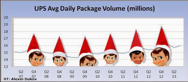
Here is a graph of UPS package delivery volume since 2002 with the 4 quarter of the year highlighted on the horizontal axis. Notice the obvious jump in volume in the last 3 months of the year---ANY year.

Source:  Your Wealth Effect
Only after looking at this graph for a moment did I come to the conclusion that Santa has A LOT of help this time of year.  It is a Merry Christmas for UPS indeed as a good portion of their revenue comes at this time of year.

With the Photo Shop skills of a former student (Alexei Dukov) I thought I would modify this graph in the spirit of the holiday.
Source: Modified by www.haywardeconblog.blogspot.com


"WTF-150"--See the Number 1 selling vehicle by State.


Top Selling Car by State chart
Source: Business Insider

Tuesday, December 17, 2013

Map of where "Multiple Jobs Holders" are located in the US. Why do you think the Mid-West has a majority of these workaholics?

This is from the Bureau of Labor Statistics (BLS).  It shows the concentration of people who are considered "Multiple Job Holders". That could be someone with a a full time job and a part time job or 2 full time jobs, or two part time jobs, etc. Some combination there of.

The darker blue the area the higher the percentage of people with multiple jobs.  Notice much of this takes place in the Mid-West. The Farm Belt, for the most part.  The BLS does not breakdown the data to this level (that I could find) but could it be farmers who have to hold down second jobs during the non-harvest time of the growing season?

Just a guess on my part.  What do you think?

Welp, I know where we go wrong with health care costs in the US compared to other countries. We have to stop reaching the age of 55. See here why...

This is a bit dated (2009), however I am going to assume the proportions probably have not changed much.  Something happens with the cost structure of the US health care system (RED line) after people reach the age of 55 that does not happen in some European countries. The cost curve goes vertical.  I inserted an estimate of per person spending on health care in the US in 2009 ($8,400).

It is quite surprising to me that US health care costs are right in line, albeit higher on average, with these European countries right up to age 55. Our average per capita cost is definitely brought up by the marginal cost of each person 55 and beyond.  Seems like we know the where the problem lies.

What are we doing about it?
Source: Forbes

Is the US still a welcomed destination for the worlds migrants? This graph suggests no at first look. It is all how you look at numbers.

The graph below (minus my edits) is making the rounds on various blogs and twitter showing migrants to select countries as a percent of that countries population.

As you can see (by the BLACK bar for 2010) Singapore, Australia, and Canada have larger percentages than the US.  I wondered what those percentages represented in nominal numbers of immigrants so I calculated a rough estimate (had to eyeball the percentages in the graph).  The actual number of human being immigrants is in RED  (in millions) for all other countries than the US.

As you can see, the US absorbs a larger number of REAL LIVE people from abroad.  Far more than any other country individually and just slightly less than ALL THE OTHERS COMBINED.

Source: Business Insider

View My Stats