Saturday, December 28, 2013

Me, Eddie Murphy and Trading Places...We all have something in common. See here what that is...

I was watching "Trading Places" the other night, for the 1,000th time, and saw something I have never seen before. In the scene on the train where Eddie Murphy plays the foreign exchange student "Nanga Eboko" he is wearing a bag hanging from his neck.  See it below in the left.

I have one almost identical to it! There is some variation because they are handmade. It was given to me in 1983 by the drivers in the motor pool at the US embassy in Bamako, Mali (Northwest Africa) as a going away gift. I was a very young US Marine security guard stationed at the embassy.

It is one of my most prized possessions.  The drivers do not make a lot of money but they pooled some and got me this from the local market.

The movie came out in 1983, so the wardrobe people REALLY did go for authenticity in dressing Mr. Murphy.  Wow...1983...30 years ago....Feeling old BUT having warm thoughts of the many Malians I met long ago...

Thursday, December 26, 2013

"The Post Office is Dead. Long Live the Post Office". The price of a stamp is increasing in January. Send an e-mail, text or instant message to tell all your friends! Oh, wait...

On Christmas Eve, the governing board of the US Postal System approved an increase in the price of a first class stamp.

Postal Service Raises Price Again but Says It’s Not Forever

The cost of first-class postage stamps is going up by 3 cents — but only until the Postal Service makes up losses that it has estimated it accumulated during the recession. The increase — to 49 cents from 46 cents will go into effect on Jan. 26.
The Postal Regulatory Commission announced the increase on Tuesday, but it stressed that it would “last just long enough to recover the loss.” The commission determined that loss to be $2.8 billion, caused by a substantial drop in mail volume, totaling about 25.3 billion pieces, between 2008 and 2011.
That is a 6.5% price increase in the price of an individual First Class stamp.

Here is a look at the price changes of stamps since 2002:
Source: HERE
In 2002 the price was $.37.  At the new price of $.49 that means the price of a stamp has increased 32% in 10 years.

Since 2002 the volume of First Class mail has gone from 102,378,632 pieces to 66,700,419 (Fiscal Year 2013--Source HERE).  The volume of First Class mail has DECREASED by 35% in 10 years.

Here are the year over year changes in the volume of First Class mail since 2002 (source HERE):

2002-2003  -3.2%
2003-2004 -1.1%
2004-2005  +.1%
2005-2006  -.5%
2006-2007  -1.6%
2007-2008  -4.8%
2008-2009  -8.6%
2009-2010  -6.6%
2010-2011  -6.4%
2011-2012  -5.6%

2012-2013  -4.2%

Pre and Post Recession(s) all (except 2004-05 with a slight increase) have negative percentage changes.

I believe the Post Office is in a no win situation. First Class mail as a business is in decline as a result of differing forms of communication (e-mail, text, fax, etc).  It cannot decrease prices in hopes that it can win over market share. They could offer free mailing and I don't think it would much stem the declines in the numbers you see above.

All they can do is milk the current segment of the market that is relatively insensitive to the change in price. But even that segment will drift away as they move to some other form of communication. The presence of substitutes is a cruel master in the market place!

My opinion is the US Postal Service will eventually have to "spin-off" the delivery of First Class mail and cede ownership of it to the Federal Govt where it will reside forever more and not have to worry about making a profit.  The Post Office is a creature feature of the US Constitution (Article 1, Section 8--an explicit power) so its basic function of delivering mail will not cease.


Monday, December 23, 2013

Used car mileage and pricing. What is so magic about the 10,000 mile mark when it comes to the value of a used car? I need help on this one...

We behave in strange ways as consumers when it comes to numbers.  The graph below is from a study on the sale of used cars (HT: Priceonomics).  On the vertical axis is the average sales price of a used car at auction.  On the horizontal axis is the mileage of the cars sold.

As expected, there is an inverse relationship between the price of the car and the mileage:  The higher the mileage the lower the price.

However, the study noted an interesting trend. Look at the vertical bars along the horizontal axis representing the mileage at 10,000 mile increments.  Notice the drop off in the price of the car RIGHT AT the 10,000 mile increment (arrows pointing).

If the mileage is just short of the 10,000 mile mark the vehicle gets a significantly higher price than if it has 100 or so additional miles OVER the 10,000.  Otherwise the relationship is pretty smooth BETWEEN the 10,000 mile increments.

If you want to get the highest possible price for your car, given its mileage, the best time is to sell it BEFORE it rolls over the the next 10,000 mile mark.  Otherwise you will be out some money!  If you are a buyer then look at cars that just cross the threshold.

There is one interesting point on the graph. Look at the RED arrow.  At the 30,000 mile mark the pattern is noticeably interrupted.  There appears to be no price "cliff" at that threshold.

Any guesses as to why (1) the noticeable drop off in prices at all  but one (really more at the very high mileage level) of the 10,000 mile increments, and (2) why the absence of one at 30,000 miles?
Source HERE (I modified the original by inserting the arrows)

Saturday, December 21, 2013

If you lose your job you can apply for unemployment compensation. What are the requirements? You might be surprised.

When teaching basic macroeconomics in high school (AP or "regular") one of the topics that seems to generate the most student queries is unemployment (or its flip side employment). Most of the questions center around eligibility.

The Center on Budget Policy and Analysis offers a nice primer on the subject in VERY understandable language  for laymen like myself.

I may write a series of very short blog entries on this topic to explain further some of finer points of the Unemployment Insurance program that I find are misunderstood by many/most students.

First, I will start with eligibility.

Who Is Eligible for Unemployment Insurance?
To qualify for unemployment insurance benefits, a person must:

(1)  have lost a job through no fault of his or her own;
(2)  be “able to work, available to work, and actively seeking work;” and
(3) have earned at least a certain amount of money during a “base period” prior to becoming unemployed. 

You cannot collect unemployment benefits if you (1) voluntarily quit your job to look for another one, (2) are in the job market for the first time looking for work (high school dropout, high school or college graduate seeking first job), (3) a re-entrant into the workforce (stay at home parent looking for a job after raising kids, retiree looking for another job, formerly incarcerated person looking of job).

However, if you are (1) laid off (2) lost job due to business closing, (3) in some narrow instances on strike, you are entitled to unemployment compensation. You would have been considered to "have lost a job through no fault of" your own.  As an aside, you MAY qualify for benefits if you quit your job because of "harassment", but you would have to make that case individually.

While you are collecting compensation you are required to show you are "actively seeking work".  The burden of proof is quite low. Showing that you filled out an application (in writing or online) or got a business card from a prospective employer is usually sufficient (I know this from being an employer in the past).

Bullet point #3 is the one students seen to ask about the most. Students suggest: "I will get a job then get myself fired the first week file for unemployment compensation!"

Not so fast.  You must have earned a specified minimum amount of income in what is termed a "base period" before you lost your job.

This is generally defined as "the first four of the last five of the last calendar quarters".  In other words you must have earned a minimum amount of money spread out over the previous 12 months.

This required minimum income to qualify varies considerably from State to State.  HERE is a link to a US Dept of Labor document that gives an overview (scroll down to Table 3-3). You can find your State there.

This is certainly not comprehensive, but I hope it gives you a better idea of who is and isn't eligible for unemployment compensation.

NOTE:  Just saw this late today on the St. Louis Fed.  A lesson on unemployment that covers some things I did not cover BUT I covered some things they did not.  They have a few nice "quiz" questions for you to use.


Thursday, December 19, 2013

How much would it cost to buy the items in the song "The Twelve Days of Christmas"? See them here and how they have changed over time...

Every year for the past 30 years the bank PNC has compiled the prices of the items contained in the traditional Christmas song "The Twelve Days of Christmas". If you were REALLY going to give these as gifts what would the prices be and how have those prices changed over time. It is a fun way to learn about the Consumer Price Index (CPI).

Click on image to make larger or go HERE .

Here is a more detailed analysis of the prices and percentage change from last year and from 1984 when the index was started

Source: PNC

Wednesday, December 18, 2013

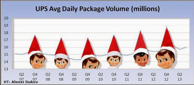
How do you spell "ELF"? No, that is not right. It is spelled "UPS". See here why. :)

I believe I know who the REAL Elves are.

Here is a graph of UPS package delivery volume since 2002 with the 4 quarter of the year highlighted on the horizontal axis. Notice the obvious jump in volume in the last 3 months of the year---ANY year.

Source:  Your Wealth Effect
Only after looking at this graph for a moment did I come to the conclusion that Santa has A LOT of help this time of year.  It is a Merry Christmas for UPS indeed as a good portion of their revenue comes at this time of year.

With the Photo Shop skills of a former student (Alexei Dukov) I thought I would modify this graph in the spirit of the holiday.
Source: Modified by www.haywardeconblog.blogspot.com


"WTF-150"--See the Number 1 selling vehicle by State.


Top Selling Car by State chart
Source: Business Insider

Tuesday, December 17, 2013

Map of where "Multiple Jobs Holders" are located in the US. Why do you think the Mid-West has a majority of these workaholics?

This is from the Bureau of Labor Statistics (BLS).  It shows the concentration of people who are considered "Multiple Job Holders". That could be someone with a a full time job and a part time job or 2 full time jobs, or two part time jobs, etc. Some combination there of.

The darker blue the area the higher the percentage of people with multiple jobs.  Notice much of this takes place in the Mid-West. The Farm Belt, for the most part.  The BLS does not breakdown the data to this level (that I could find) but could it be farmers who have to hold down second jobs during the non-harvest time of the growing season?

Just a guess on my part.  What do you think?

Welp, I know where we go wrong with health care costs in the US compared to other countries. We have to stop reaching the age of 55. See here why...

This is a bit dated (2009), however I am going to assume the proportions probably have not changed much.  Something happens with the cost structure of the US health care system (RED line) after people reach the age of 55 that does not happen in some European countries. The cost curve goes vertical.  I inserted an estimate of per person spending on health care in the US in 2009 ($8,400).

It is quite surprising to me that US health care costs are right in line, albeit higher on average, with these European countries right up to age 55. Our average per capita cost is definitely brought up by the marginal cost of each person 55 and beyond.  Seems like we know the where the problem lies.

What are we doing about it?
Source: Forbes

Is the US still a welcomed destination for the worlds migrants? This graph suggests no at first look. It is all how you look at numbers.

The graph below (minus my edits) is making the rounds on various blogs and twitter showing migrants to select countries as a percent of that countries population.

As you can see (by the BLACK bar for 2010) Singapore, Australia, and Canada have larger percentages than the US.  I wondered what those percentages represented in nominal numbers of immigrants so I calculated a rough estimate (had to eyeball the percentages in the graph).  The actual number of human being immigrants is in RED  (in millions) for all other countries than the US.

As you can see, the US absorbs a larger number of REAL LIVE people from abroad.  Far more than any other country individually and just slightly less than ALL THE OTHERS COMBINED.

Source: Business Insider

Saturday, December 14, 2013

Nice Graphic showing the change in beneficiaries for various Federal benefits. The Social Safety Net in action.

Here is a nice resource when teaching US Fiscal Policy and discussing the difference between "Means-Tested" (Gold print) and "Non-Means Tested" (Blue print) programs.  The former (means tested) takes into consideration a recipients income and assets when deciding to grant benefits and the latter (non-means tested) does not.

The data show the change in participation in various government programs from the end of 2008 to 2011.

As you can see the largest percentage increases (gold lines) are in Medicaid, the Federal health insurance program for low income people, "SNAP" which is the food assistance program for low income people, and "SSI" which is a program that covers disabilities of many sorts (physical and/or intellectual).

What you see here is the Social Safety Net in action.  Increases in cash/non-cash benefits as the economy falters and "built in stabilizers" take effect to provide a floor of support for those adversely affected.

Normally, as the economy recovers the demand for these benefits should decrease. This remains to be seen.

Click on image to make larger of go HERE for it at the US Census.
More American Households Rely on Government Benefit Programs infographic image

[Source: U.S. Census Bureau] 

Friday, December 13, 2013

Hayward's Sub Shop is Open for Business!! Now, I just have to see if I can make it with the various Minimum Wage hike scenarios. See the numbers here....

Hayward's Sub Shop is open for business!! However, am I going to make it at the various proposed minimum wage hikes?  Let's see. 

Assume I have 4 part time workers earning $7.25 per hour.  Each works 25 hours per week so I have 100 hours of labor time scheduled.

There are 4.3 weeks in a month.

Total Labor Hours in a month for my employees = 430.

I pay them $7.25 per hour BUT they (at the minimum) cost me $7.73 per hour because I have to pay the employer share of the workers Social Security and Medicare (6.65%).

My total Wage cost at the end of the month is $3,324.00.

Assume a minimum wage of $10.00 instead ($10.67 with SS and Medicare taxes)
$10.67 X 430 Labor Hours = $4,588.00

A difference of $1,264.00 in wage expense for me compared to the current minimum wage.

If the minimum wage were to go to $15.00 per hour plus what I pay in Social Security and Medicare on behalf of the employee, then the total wage rate would be $16.00.

$16.00 X 430 Labor Hours = $6,880.00

A difference of $3,556 in wage expense for me compared to the current minimum wage. 

Let’s say my daily average revenues are $500.00 (100 sandwich combo meals at $5.00 each—trying to compete with Subway!) and I am open 7 days a week.  My monthly revenues are $15,000 ($500.00 X 30 days).  Assume my rent, utilities, interest on the loan I took out to start the business, advertising, taxes and other expenses total $3,000 per month. Assume the cost of the inputs (bread, meat and fixins’, chips, soft drink, cups, etc) to make each combo meal is $1.50 (I am pretty sure this is LOW). I sell 100 combo meals per day or 3,000 per month.  Total cost of inputs to make the meals is $4,500 ($1.50 X 3,000).
My total monthly costs to stay open (not including labor) are $7,500.

So my Net Revenues BEFORE labor costs are $7,500.00 ($15,000 Revenues minus $7,500 costs)

1.       Under a Minimum Wage of $7.25 my labor costs are $3,324.00.  Subtract this from $7,500 = $4,176.00
Multiply this by 12 and I am earning $50,170 per year from my little sandwich shop.

2.       Under a Minimum Wage of $10.00 my labor costs are $4,588.00.  Subtract this from $7,500 = $2,912.00
Multiply this by 12 and I am earning $37,856 per year. That is a 25% DECREASE.

3.       Under a minimum Wage of $15.00 my labor costs are $6,880.00. Subtract this from $7,500 = $610.00
Multiply this by 12 and I am earning $7,300.00 per year. That is an 85% DECREASE.

At what point do I have to consider my “Opportunity Cost” of staying in this business (how much can I earn doing something else)?

It is ok to pressure the Walmarts, McDonalds and Subways of the world to VOLUNTARILY  increase the pay of their workers.  But when you advocate an increase in the minimum wage for ALL workers, please remember the smallish business guy or gal. 

Judge for yourself as to whether we can make it or not.

Oh, and could you help the 4 workers I had to let go find a job. Thanks!!  :
                                                                                                                                                                  
 NOTE: Regarding my numbers.  I am sure my $3,000 in expenses might be a little high BUT my estimate  for the cost of each combo meal is likely low. Also, Social Security and Medicare are not the only additional costs of hiring a worker. The wage rate is also underestimated.  So, it probably evens out or favors expenses on the low side.  In other words, the "profit" is overstated for the most part.


US Defense spending from Soup to Nuts. No, really, from soup to nuts...

From Mother Jones:  See more on defense spending at the link.


How is the Federal Budget like a loaf of bread? You got your Texas Toast and your breadcrumbs. Which one will fill you up faster? Congress seems to think it is the breadcrumbs....

A nice quick reference visual that gives you an idea of of the relationship between Mandatory ("Non-Discretionary") and Discretionary ("Non-Mandatory") spending in the US Federal budget.

To use a baked good analogy, a loaf of bread, mandatory spending items are thickly cut slices of bread. Think Texas Toast (the BIG circles)! Non-mandatory spending item are either (1) thin slices, like crostini's (medium sized circles), or (2) even smaller pieces, like breadcrumbs used for Thanksgiving stuffing (the small circles).

In budget negotiations politicians are trying to make a political meal out of the breadcrumbs (cutting the small-ish things) and think it will nourish the Federal budget body and make it healthy.

The real "bread", if you will, is in the Texas Toast. However, it is neglected, left to mold, and get crusty.

Oh, well, whichever side YOU butter your bread I hope you find this graphic warm and toasty.

Source: Mother Jones

View My Stats