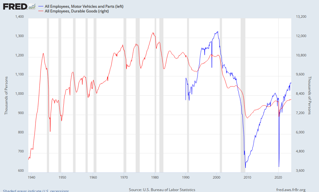
He puts the scale in an index form. Look at the line labeled "100" and move straight across. Manufacturing OUTPUT is back to pre-recession levels. Nice! However, what has this done for EMPLOYMENT in the manufacturing sector? See the next graph below.
 |
| Source: Carpe Diem |
Employment pre and post recession has not made the same gains as output. The question of the day is WHY do you think that is so? It is getting better, but the separation between output and employment continues. Look at the time period between the last recession in 2001-2002 and the one we just went through. What do you notice? Is employment in this sector EVER going to return to that level? The problem is not as easy to identify as it is portrayed in the media and by politicians.
No comments:
Post a Comment