Saturday, June 15, 2013

I am "egg-cited" to offer you this graphical explanation as to why the price of eggs has increased dramatically..."Umm-Let" me know what you think.


My demand for eggs is almost perfectly Inelastic. This means my quantity demanded pretty much stays the same regardless of the price (or within a pretty wide price range). I don't buy more as the price decreases or less as it increases.

However, I do recognize this is not the case with most people for individual consumption or businesses for commercial use as an input.

So, this article in the Wall Street Journal caught my interest and is game for a little graph-fest..

What Made Egg Prices Soar Nearly 42%?

"...A leading reason for the crack up: U.S. farmers are exporting more eggs to Mexico, eating into supplies for American consumers. The United States’ southern neighbor has been hit by avian influenza, forcing the slaughter of thousands of chickens...."
 Let's illustrate what is going on here.

First here is the US Market for Eggs in equilibrium before the change cited in the excerpt above.
"Supply*" represent domestic US supply.  If US egg producers export more eggs to Mexico, presumably because Mexican consumers and businesses are willing and able to pay a higher price, then there will be FEWER eggs at EVERY PRICE for US consumers:
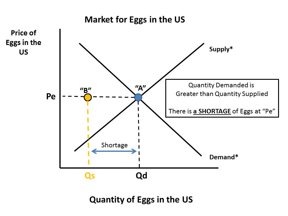
At the equilibrium price of "Pe" we no longer have an equilibrium market quantity of "Qe" where Quantity Supplied = Quantity Demanded.  We are in disequilibrium where Quantity Demanded is GREATER than Quantity Supplied.  What is true at "Pe" is going to be true at every other price Quantity Supplied combination on "Supply*".  Our market supply curve will shift to the LEFT---"Supply 1".
Our new equilibrium price is going to be "C"...But WHY?

Assume the market place does not immediately adjust and the price remains at "Pe".  A shortage in the market will emerge equal to the distance between "Qd" and "Qs". Will American egg producers sell all those eggs to citizens of Mexico?  No, but they WILL ask Americans to bid against them for the eggs.

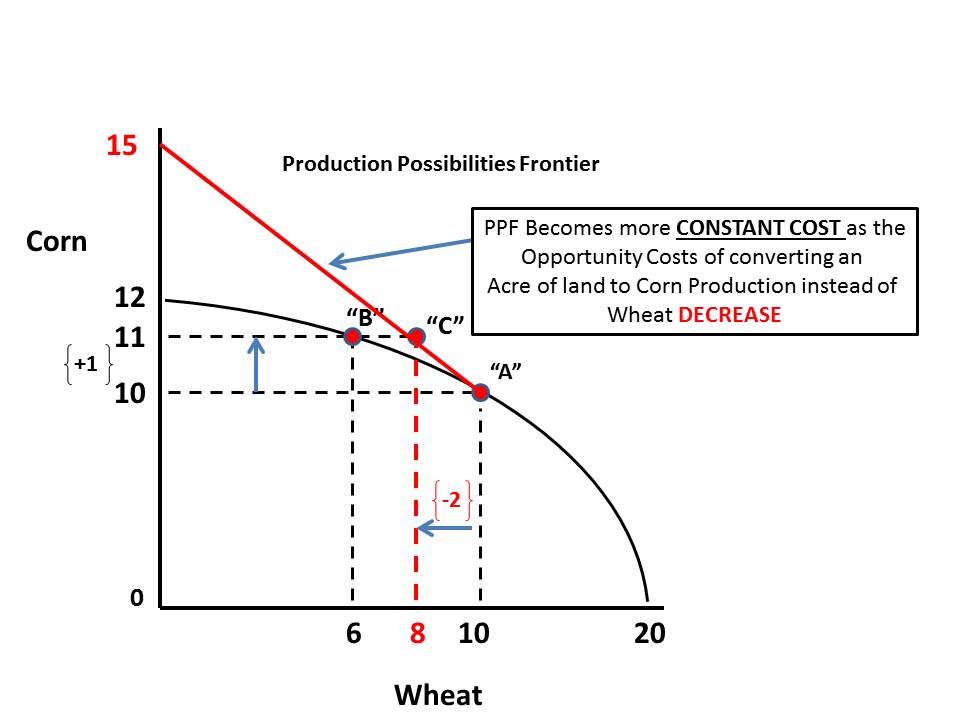
In this next graph, look at the triangle formed by Points "A", "B" and "C".
It is important to understand what happens next to reach a new market equilibrium.  As the price is bid up, producers are willing and able to supply and larger quantity to US consumers.  However, at a higher price consumers are willing and able to demand a smaller quantity.
We move ALONG our respective Supply Curve ("Supply 1") and ALONG our respective Demand Curve ("Demand*") until we reach new market price "P1" and market quantity "Q1").

Here is our final graph, all cleaned up.
I hope this lesson was Egg-actly what you need to understand a little supply and demand.

Don't "poach" these graphs to use as your own.

"Ummm-Let" me know what you think.  :)


The Corn Belt is expanding at the expense of Wheat. If you are a teacher or student of economics you will be interested in my analysis of how this affects the PPF for Corn and Wheat...

Here is a nice example of how changing conditions ("exogenous variables") alter opportunity costs as they are illustrated on a Production Possibilities Frontier.  Read this excerpt and my discussion continues below.

U.S. Corn Belt Expands to North

Warmer Climate, Hardier Seeds Help Crop Gain on Wheat, North Dakota's Staple

"...Wheat has long dominated the windswept farm fields of the northern Great Plains. But increasingly, farmers here are switching to corn, reflecting how climate change, advancements in biotechnology and high corn prices are pushing the nation's Corn Belt northward.
The shift, which is occurring in northern Minnesota and Canada's Manitoba province as well, shows how warming temperatures and hardier seeds are enabling farmers to grow corn in areas once deemed inhospitable to the crop. As a result, North Dakota's farmers, who produced 4% of last year's U.S. corn crop and are benefiting from high prices for other crops, are invigorating the state's agricultural economy at the same time its energy sector is thriving...."
The general assumption in the PPF model is resources used for one purpose are not easily adaptable or convertible to alternative uses. Some land is more suited for wheat production and if a farmer tries to use some of that land for corn production instead, then it will be increasingly costly to do so in terms of the amount of wheat that land could have produced.

Example:  If I grow wheat on acreage more suited for wheat production and then try to grow some corn instead it might take 4 acres I used to grow wheat to get 1 acre equivalent yield in corn.  In other words, to get 1 acre yield in corn I gave up 4 acres yield in wheat.  That is pretty costly.

The highlighted and underlined portion of the above excerpt suggests that the listed factors have served to reduce the opportunity costs for planting more corn by making wheat resources MORE adaptable to the alternative use of producing corn.

Hey, look, I made some graphs to show this!!

Currently this farmer is producing a bundle of corn and wheat at Point "A".
 Assume she wants to produce another acre worth of corn.  According to the PPF if she does this it is going to cost her 4 acres worth of wheat. We are at Point "B" now.
 Lets assume that the factors listed in the article reduce the opportunity costs of producing corn to just 2 acres worth of wheat. So instead of moving to Point "B" she moves to Point "C" on her PPF.
 The way I read this now is the PPF above Point "A" is going to be less "bowed" (indicating ever increasing opportunity costs as you move along it) and more "constant".
There will be MORE potential yield of corn per acre of wheat given up than there was before.  So, now every time the farmer gives up 2 acres of wheat production, the yield in corn will be greater than before. (I use 15 as an outlier). As the farmer moves along the Red section of the PPF they still give up bushels of wheat to get more corn but it is less costly than before ("ceteris paribus").
Note: Not built to scale so the numbers on the vertical and horizontal axis are not perfect.  Also, keep in mind the numbers reference potential yield in bushels of wheat and corn per acre.  I am not suggesting corn acreage is increasing from 12 to 15.

Sunday, June 9, 2013

"When you turn off your cell phone, does it dream?"---Is Freud working for the NSA now?

My mind wonders even at the movie theater.

In an effort to get people to turn off their phones they have this little PSA that asks "When you turn off your cell phone, does it dream?".

My snarky thought: I don't know. Why don't you ask the NSA.  They would know the answer to that question.

Saw "Now You See Me".  Did not really like it. How does a full-time FBI agent have all the free time to think that stuff up and carry out the details.  Oh, maybe it relates to my thought---he lets the NSA collect data and analyze it for him.

Now it makes sense.

View My Stats