Monday, December 14, 2015

Where did the jobs in education go during the recession? They moved downtown...

More fun with education data...

Below are data from the National Center for Education Statistics.  I just highligted the data between 2005 and 2012 (last year available).

Much/Most of this tracks through the recession so the numbers are interesting to me.


Click on image to make a bit larger.

Through the budget cuts of the recession school level staffing, notably teachers, librarians, and counselors decreased in numbers, but Administrative staff "downtown" increased (probably lots of the "support staff" on the right side were downtown staff as well).

If you do the additions and subtractions you pretty end up with, not a net loss of jobs in education, but a relative status quo.  School level jobs (with exception of principals) just morphed on over to the administration offices downtown.

Number of Students at each grade level 2005-2014

Having fun with data and working on my excel skills which are at the most basic level.

I was looking at different categories of in the Census Bureau's "American FactFinder" (good stuff for research purposes!) and came across surprising data on the number of students in grades 9-12 from 2005 through 2014 (only years available).

I created some bar charts. Becareful in reading the vertical (Y-axis).  They  do not start at 0 but at the lowest millionth that the category falls under. Perhaps not good technique, but...


The vertical axis (left hand scale) starts at 16,000,000. Notice the rise in 2006 then a steady fall until we get back where we started (the actual numbers or on the horizontal axis below the corresponding year.  I put the actual enrollment numbers along the  bottom of the horizontal axis for reference.

Starting in 2012 the number flatlines. No growth in the secondary students in 10 years.

How about the younger grades?


No growth there either. Pretty flat from 2010 on.


Now we are getting somewhere. Grades 1-4 show a growth from 2005 to 2014 of 849,262 or 5.46%


Kindergarten has 236,792 or 5.97% more little ones.


Total enrollment K-12 increased 1,088,579 or 2.05%.

Friday, November 6, 2015

Why is the US using all of Yellowstone National Park to grow corn for Ethanol?

Sort of...

This bar graph was derived from US Dept of Agriculture data.  I found it on Twitter HERE.  The numbers on the left are in "1,000's", so add 3 zeroes at the end of the numbers you see.

My perspective is Corn for Fuel is, on net, a bad policy.


Just to put the numbers in some perspective, in May the number of bushels to of corn used to produce fuel alcohol was 450,000,000 (450 million!).

US Dept of Agriculture estimates the average number of bushels of corn harvested in 2015 was 168 per acre.

To find the number of acres required for the corn used to make ethanol in May alone, divide 450,000,000 by 168.

That equals 2,678,571 acres.  Yellowstone National Park is 2,219,000 for comparison.


Sunday, October 18, 2015

The Relationship between the Minimum Wage and SNAP Benefits

In light of current policy, how much does a minimum wage earning single mother with 2 dependent children  stand to gain/lose in SNAP benefits ("food stamps") if the minium wage in the US is increased to $10.10 per hour?

I use the basic guidelines from the USDA website that determine the level of SNAP (Food Assistance) based on an applicants income.

Here is the link to the Dept of Agriculture's website that the following graphic organizers came from.

All I did was change the amounts of monthly income based on 2 different wages ($7.25 and $10.10).  I also made assumptions regarding monthly shelter ($600) and dependent daycare costs ($350).  These may be higher or lower, depending of where the person lives in the US. I also use 172 work hours in month---40 hours per week X 4.3 weeks in a month.

I double checked my math so I am relatively confident of the numbers (however, check if you like and let me know. I am a bit math challenged).

This first one shows the level of SNAP benefits at the prevailing $7.25 minimum wage. The person would be entitled to $469.00 per month in food assistance (see last line "16") out of a maximum $511 allowed.

This is a form of "non-cash" income that supplements the market income a person earned. In effect, if you add this amount to the monthly market income earned ($1,247 "cash income") you have a total of $1,716 in monthly income. Back this out to an effective hourly rate and you have $9.98 ($1,716/172 work hours per month).

The SNAP subsidy works out to $2.73 per hour ($9.98 minus $7.25).


The next one shows a minimum wage of $10.10 per hour.

Market  monthly "cash income" is $1,737.00 at $10.10 (line 2).  "Non-cash" SNAP benefits are $293.00 per month (line 16).  Total income is $2,030.00 for an effective hourly wage of $11.80 ($2,030/172 hrs).

The SNAP subsidy works out to $1.70 per hour ($11.80 minus $10.10).

The market income the person earns is $490.00 per month more at $10.10 an hour vs $7.25 and  SNAP benefits decrease by $176.00 per month. Net change in total compensation is +$314 or an additional $1.82 on an hourly basis ($314/172 hours worked in a month) for the single mother of two.

While the hourly minimum wage increased by $2.85 per hour ($10.10 minus $7.25), a 39% increase, the SNAP subsidy decreased by $1.03 on an hourly basis ($2.73 minus $1.70), 38% decrease, the single mother of two is effectively "better off"on net by just $1.82 per hour worked when all is said and done as the minimum wage moves from $7.25 to $10.10 per hour.

Raise the minimum wage by $2.85 and the single parent is ultimately better off by only $1.82.  Beats a sharp stick in the eye, but is it a pathway out of poverty?


Note: LOTS of caveats with this posting.  Market income is subject to payroll taxes so an increase in the min wage will cost a worker more.  There may or may not be a "dis-employment effect" with raising the min wage (more so in some industries than others).  How might this affect the EITC tax credit. On and on and on...I just wanted to present a cursory perspective on the merits (demerits) of increasing the min wage in light of existing policy on SNAP (food stamp) benefits.

Hope it helps do just that.  Comments welcome.  Thanks.

Thursday, September 17, 2015

The Minimum Wage and Poverty Level Income. How much do I need to make? Numbers here...

Here is a table of the official income levels the US Federal government uses to determine whether or not someone is classified as "poor" (copied from HERE but I saw it at The Conversabel Economist)


This is useful but it does not help me fully understand what these numbers mean.

Below, I calculated the hourly wage I would need to earn in order meet these levels of  income based on household size.

I am going to use 2,000 hours worked per year as my measuring stick (40 hours per week, 50 weeks per year).  To make it simple, I am only going to use the numbers in the first colum "Weight Average Thresholds".  If I divide these income numbers by 2,000 I will get the hourly wage needed to make that amount of income (numbers in RED). I am assuming ONLY 1 wage earner in the household for this calculation.

This is the same graphic as above but enlarged:


The number I am most interested in is the "Three people".  This could be a single parent with two children.  That parent would have to earn at least $9.43 (not including taxes/other deductions NOR othe public transfer payments) per hour in order to meet or exceed the Federal definition of poverty for a family of 3.

You can compare this to the minimum wage of $7.25 per hour.

I think looking at it like this allows us to have a more effective discussion of how we get the "working poor" AT LEAST to a poverty level income.  Raise the minimum wage? Increase Transfer Payments (EITC for low income workers, Food/Housing Assistance, etc).

How do we intelligently cover that deficit between the actual minium wage and a near poverty wage I calculated?

Let me know in the comments.  I hope this perspective gives some body to your thoughts on the subject.  I do realize there are many ways of looking at these numbers too.  What about a family of 4 (two working parents with two kids). Combined they need to make "only" $12.12 an hour, less than their combined minium wage incomes.  Does this mean they are living above the poverty line and all is well?

Thanks!


Tuesday, June 9, 2015

US per Pupil Spending Adjusted for Purchasing Power. A shake up in the rankings!

Dr. Tim Taylor ("The Conversable Economist") has a post regarding "The Variation in US Spending Per Pupil".

The data shown are just the nominal dollar amount a State spends on each student (Total Spending (Local, State and Federal funds) divided by the students served).

Using the US Census Bureaus American Factfinder, I show nominal spending by State for 2013 (latest data) in the chart below. Where a State ranks in terms of spending on each student is shown in the numbers under "Nominal Spending (2013)".

One of my first thoughts when I looked at the figures was not all dollars are the same in terms of purchasing power. The purchasing power of a dollar in New York is not the same as one in Mississippi, for instance.  How would the rankings change if we took this into account?  Glad you asked...

The Bureau of Economic Analysis (BEA) has a handy-dandy spreadsheet that gives us a Price Index for each State. Now we can adjust the purchasing power of each dollar spent into something that allows for a more apt comparison.  You can find it HERE. Click on "Tables Only" on the right.

Using the Price Index for each State, I adjusted the purchasing power of each dollar spent on a student. You will find that under the "Adjusted Using State Price Index" column.

Here is how to read the table.

Gold means the relative position of the State did not change even with the adjustment (although the dollar figures did change).  Green means the State moved UP the rankings. Red means the State moved DOWN in the rankings.  The number in parenthesis is how many spots in the rankings the State moved either up or down.

I found some surprises. Hawaii, California, Washington (State) are States that fell down the list significantly.  Mississippi, Alabama and Arkansas moved up the list in a significant way.

What observations/conclusions, if any, can you come up with looking at this data?  Thanks!


Thursday, May 14, 2015

Bourbon producers are over a barrel...

Excellent article to use for a lesson on the basics of demand and supply and the variables that contribute to the respective curve shifting.  Several graphs can spring forth from it!

The overall market demand for bourbon (the final output) has increased significantly over the past few years and that has had an impact on the supply side (the inputs) of producing bourbon.

This article focuses on bourbon barrels, an obvious vital input that goes into making this spirit. One businesses input is another businesses output and here we see how interdependent each participant in a market is on each other.

It also serves as a reminder of how complicated it is to get a final product in the hands of the end user--the consumer---at the lowest price/cost that the consumer can bear.  Notice the lengths certain suppliers go to in order to secure the raw materials to fulfil their part in the supply chain.

Bourbon Feels the Burn of a Barrel Shortage: Surge in popularity coincided with downturn in white oak logging

"...Bourbon production levels surged more than 50% between 2010 and 2013, according to the Kentucky Distillers’ Association. In 2013, Kentucky’s bourbon distilleries filled 1.2 million barrels, an increase of about 200,000 barrels from 2012. Compounding the problem is an emerging craft-distilling movement that doubled to 600 distillers over the past three years, of which about 300 are whiskey producers needing barrels, according to the American Distilling Institute. 
All the growth might have been intoxicating except for a sobering fact: The demand for more barrels coincided with a massive contraction in the lumber industry. As the housing market crashed in 2007, sawmills shut down and loggers abandoned the market. Lumber production shriveled to about 5.9 billion board feet in 2009 from 11.7 billion board feet in 2005, according to the Hardwood Market Report, which tracks the forestry industry...."


Wednesday, April 29, 2015

What is up (or down) with the price of milk?

No big observation for this posting.  New data from USDA ERS on the cost of producing milk came out today, and I was just looking at the numbers.

I knew feed would be a large cost for dairy farmers but I did not know it was of this magnitude.

If you too are curious, take a look.  Next time you hear the price of milk has increased (or decreased) the primary reason might be the cost of this vital input.  Cows gotta eat!

The data are for the whole US dairy industry and this graphic includes only the "operating costs". These would be considered "Variable Costs (VC's)" for the purposes of Microeconomics.  Using Excel, I took the average for each year (costs were listed by month in the spreadsheet).

The bottom line for what what I wanted to look at is in RED. 


"CWT"= 100 pounds of milk. Total Operating Costs for 2014 were $16.42.  Divide this by 100 and you get the per pound cost of producing milk---$.13 (13 cents).

There are about 8.6 pounds in a gallon of milk.

So, total operating costs (but not ALL costs) for the dairy farmer to produce a gallon of milk are $1.12. Remember that the next time you are at the grocery store!

Feed costs are the obvious out-sized individual cost of producing milk---pretty close to 80% of operating costs.

Feed costs increased 27%**  from 2010 through 2014 and all other operating costs have increased by 6.7%.

**Note:  feed costs in 2014 were, in percent terms, lower than in 2012 and 2013 so the average increase is likely larger---I did not calculate it.

Monday, April 20, 2015

Dollar Appreciates and the Price of Oil Decreases. WHY?

The Wall Street Journal has an article today on the relationship between the strength of the US dollar and the price of crude oil:

Oil Prices Fall on U.S. Dollar Strength

Most major commodities are traded in US dollars, whether the trading partners use US dollars in their economies or not.  It is simply the common currency for international trade. So, trading partners DO care a lot about US dollar exchange rates as it helps in determining profitability.

I am going to use a VERY simple example to try to get this point across. I know it can be a difficult concept for students, and teachers as well.

In the country of "Hayward-istan" oil is the main commodity produced and sold on the world market. Oil is priced in dollars, so when I sell my oil I receive US dollars for it.  I can then take those dollars and exchange them for the currency of Hayward-istan---the Hayward Dollar.

Right now the going exchange rate is $1.00 US exchanges for 2 Hayward Dollars, or the inverse, 1.00 Hayward Dollar exchanges for $.50 US cents.

To make the math easy, assume one barrel of oil currently fetches $100.00 US on the world market. This means when I sell a barrel and exchange it in my currency I will receive 200.00 Hayward dollars.

 Easy enough.

Now assume the exchange rate changes to $1.00 exchanges for 3.00 Hayward dollars or 1.00 Hayward dollar exchanges for $.33 US cents.  The US dollar has APPRECIATED (it "buys" more Hayward's) and the Hayward dollar has DEPRECIATED (it "buys" fewer dollars (or cents)) in value.

Nothing concerning the fundamentals of the oil market (demand and/or supply) has changed---only the value of the currencies used to trade oil has changed. So, now when I go to exchange my oil for dollars and then exchange it back into Hayward dollars I have 300.00 instead of 200.00. Ka-Ching! Instant windfall of 100.00 more Hayward dollars, or in percentage terms, 50% more than before.

If the market going to let me get away with this?

Nope. If the markets were to work efficiently (BIG IF, but it is an assumption I will make for illustration purposes), the US dollar price of oil will adjust so I am not better or worse off than before (again, just go with me on this).

With the new exchange rate of $1.00US = 3.00 Hayward's (or 1.00 Hayward = $.33 US cents), in order for me to just receive the old 200.00 Hayward dollars, the price of oil would decrease to $66.66 US dollars.

In other words, when I took my oil to market I would get $66.66 for a barrel.  I would exchange that $66.66 for 200 Hayward dollars---$66.66 US dollars X 3.00 Hayward's = 200.00 Hayward's.

SAME AS BEFORE the currency change.

If the dollar were to depreciate and the Hayward appreciate, the OPPOSITE would occur.

At a very basic level, I hope this helps you understand the relationship described in the article.  It is not the whole story but it is an essential part of it.


Friday, April 10, 2015

Part 2---Mini Lesson on the US Dollar vs The Euro.

One year ago (April 9th, 2014) the US dollar price per Euro was $1.40.  Read that as it took $1.40 to "buy" 1 Euro dollar. If I wanted to buy something that was priced in Euros, say 100 Euros, I would have had to exchange $140.00US dollars in order to buy it.
Today (April 9th, 2015) the US dollar price per Euro is $1.08. Read that as it takes $1.08 to "buy" 1 Euro--rounded up a bit). If I wanted to buy that same item today and it was still priced at 100 Euros, I would have to exchange $108.00US dollars to make that purchase.
When I exchange my US Dollars to get 100 Euros I give up FEWER US Dollars today than I did one year ago to do so---$32.00 to be exact. The purchasing power of a US Dollar relative to the Euro has INCREASED by 23% ($32.00 divided by $140.00 X 100) in 365 days.
In Macroeconomic terms, we can say the US Dollar has APPRECIATED by 23%.
Today I want to look at the same problem but from the standpoint of the Euro.

Currency valuations are simply reciprocals of each other. If you know one, you know the other---with a little math.

The above example read "the US dollar price per Euro was $1.40" one year ago.  Expressed as a ratio this would be $1.40/1.00Euro.

If we take the reciprocal of $1.40/1.00Euro we will have 1.00Euro/$1.40.  Divide that out and we get "The Euro price of per US Dollar was .71 Euro cents" one year ago.

In other words, last year the holders of Euros had to give up .71 Euro cents in order to "buy" $1.00.

In sum:  Holders of dollars had to give up $1.40 to buy 1.00 Euro and conversely the holders of Euros had to give up .71 Euro cents to buy a $1.00.

So, if last year if the holders of Euros wanted to buy something priced at $100.00US they would have had to exchange 71.00 Euros in order to do so (.71 Euro cents X 100).

Move ahead one year.

Yesterday, the US dollar price per Euro was $1.08.  If we take the reciprocal of that (1.00 Euro/$1.08) we get the "Euro price per US Dollar was .93 Euro cents.

So, yesterday the holders of Euros would have had to exchange 93 Euros in order to "buy" $100.00. Last year it was 71 Euros.  That is a difference of 22 Euros, or in percentage terms, a 31% decrease in value of the Euro relative to the US Dollar (22Euros/71Euros X 100).

In Macroeconomic terms, we can say the Euro has DEPRECIATED by 31%.

Notice while the currencies are reciprocals of each other the percentage changes are not (23% versus 31%). This is because...math.  The base numbers are different. One starts at a high base and goes lower and the other a lower base and goes higher.  No conspiracy there.

Hopefully you can see from this example that exchange rates matter.

The physical/non-physical properties of the goods or services bought in either the US or Europe are the same (ceterus paribus).  The only thing that changes the relative prices of the goods/services is the value of the currencies used to purchase them.

Thursday, April 9, 2015

Mini lesson--US Dollar vs the Euro.

One year ago (April 9th, 2014) the US dollar price per Euro was $1.40.  Read that as it took $1.40 to "buy" 1 Euro dollar. If I wanted to buy something that was priced in Euros, say 100 Euros, I would have had to exchange $140.00US dollars in order to buy it.

Today (April 9th, 2015) the US dollar price per Euro is $1.08. Read that as it takes $1.08 to "buy" 1 Euro--rounded up a bit). If I wanted to buy that same item today and it was still priced at 100 Euros, I would have to exchange $108.00US dollars to make that purchase.

When I exchange my US Dollars to get 100 Euros I give up FEWER US Dollars today than I did one year ago to do so---$32.00 to be exact. The purchasing power of a US Dollar relative to the Euro has INCREASED by 23% ($32.00 divided by $140.00 X 100) in 365 days.

In Macroeconomic terms, we can say the US Dollar has APPRECIATED by 23%.

Assuming businesses in the EuroZone did not change their prices over the course of the year, Europe is "On Sale" by 23% today for the holders of US Dollars.

Here is the strange part.  If Americans take advantage of this "sale" and go to Europe on vacation, this affects the IMPORTS of goods and/or services to the US from the EuroZone.  This is a bit counter-intuitive because we usually think of imports as foreign stuff that is already in the US that we purchase (think Walmart, for example).

Consuming a European good or service, whether here or "there", is considered an import.

Here is your homework.  Consider the above example from the perspective of a holder of Euros, using the same exchange rates. Re-write the explanation from that perspective.

Hope this helps you understand a bit more the complex concept that is exchange rates.

Wednesday, April 8, 2015

Low oil prices adversely affect recycling efforts. How does that happen?

Plastic bottles that hold our favorite soft drink or choice of bottled water contain an input called Polyethylene Terephthalate, or "PET".

One of the inputs used to make PET is crude oil.  However, once PET is created it can be reclaimed through the recycling of plastic bottles and used over and over and over again...

Producers of plastic bottles have a choice between using newly produced "virgin" PET or recycled PET made from plastics recovered from re-cycling programs across the US.

When crude oil prices are high, virgin PET is more expensive to produce and recycled PET has a competitive price advantage.

The recent plunge in crude oil prices has eliminated that advantage, and then some:

Recycling Becomes a Tougher Sell as Oil Prices Drop The fall in oil prices has dragged down the price of virgin plastic, erasing recyclers’ advantage
"...At the start of this year, new polyethylene terephthalate, a type of plastic widely known as PET and used to make soft-drink and water bottles, cost 83 cents a pound, according to data compiled by industry publication Plastics News. That was 15% higher than the cost of recycled PET. 
As of late March, the cost of new PET had fallen to 67 cents a pound, or 7% less than the recycled form, which costs 72 cents a pound...."---(Wall Street Journal)
Here is a graphic from the article that illustrates the change in price over time.  When the BLUE line is above the RED line, it is more cost effective to use recycled PET.


This turn of events in the crude oil markets has had a negative affect on the recycling industry.
"...Prices are “very important to stimulate good recycling rates among our communities,” saysCarey Hamilton, executive director of the Indiana Recycling Coalition.
Especially hurt are the middlemen of the recycling supply chain, who buy used bottles, cans, paper and other items and then use machinery to sort, bale and sell the recyclables. Prices middlemen get when reselling some types of plastic have plummeted by as much as half in just a few months, says Allan Zozzaro, a partner at Zozzaro Atlantic Coast Processing LLC in Passaic, N.J. “It’s putting a real strain on all recycling companies,” he says..."---WSJ
This example is a nice one to use in class to illustrate the microeconomic concepts of Substitute Goods in production, "Substitution Effect" vs "Substitutes", the difference between Quantity Demanded (or Quautity Supplied) and Demand (or Supply), and the power that prices hold over the allocation of societal resources.

Monday, February 23, 2015

Credit is the fuel for an economy. The resulting debt is the exhaust that chocks it.

That is the best analogy I can come up with at the moment.

This wise posting is from The New Arthurian. Go there to read the BEST stuff on credit vs debt, among other topics he dives deep into. You will be better for it.

(bold and underlined are my emphasis)
It's not that complicated 
The Real Effects of Debt, PDF, 34 pages, by Stephen G Cecchetti, M S Mohanty and Fabrizio Zampolli, 2011. They evaluate government debt and non-financial corporate debt and household debt. The opening sentences of the Abstract:

Dammit, no. Debt is not a flashing light that sometimes flashes red and other times green. Debt is always bad, period. Debt is the cost that is associated with credit use. Credit use is always good, and debt is always bad.
You may want to finesse that a bit, and say credit use is sometimes good and sometimes bad, and I won't argue with you. But please understand: I'm saying it my way to emphasize a point. Credit-use is demand. Credit-use is spending, and spending is demand. But credit-use doesn't cost anything, while it's still just credit-use. It's like getting stuff for free. That's why it's good. That's why it boosts the economy.
But then, a month or so after you use the credit, you get the bill. Now it's not credit-use anymore. Now it is debt. And now it's like paying for something, without getting anything. That's why debt is always bad.
Don't argue with me, dammit, I'm trying to make an idea simple.
In the PDF they say moderate levels of debt improve growth. But that's wrong. It's the credit-use that improves growth, because credit-use is demand. It's debt that harms growth, because the payment is disconnected from demand, and with debt there is payment but no demand.
Moderate levels of debt improve growth? Not really. Moderate levels of debt harm the economy less than high levels of debt. Moderate debt is easier to bear, because moderate credit-use can balance against it. When you have high levels of debt, it takes high levels of credit-use to offset the drag from the debt.
To understand debt, keep three principles in mind: Debt always hurts the economy. Credit-use always helps the economy. And credit-use always creates debt.
At moderate levels, debt improves welfare and enhances growth. But high levels can be damaging. When does debt go from good to bad?

To go along with my initial analogy, I think Art is suggesting there is no "clean-energy".  :)


Saturday, February 14, 2015

The US Exports water and land mass in the form of Ethanol. Madness.

I follow several agricultural organizations on Twitter because they provide lots of good info and graphics on things that interest me.

The US Grains Council is one of them.  They posted this graphic on my favorite thing to hate on---Ethanol.

They give a nice breakdown in the first orange bullet point below.  800 million gallons of ethanol exported they represents the use of 286 million bushels of corn (a bushel is about 56 pounds of corn which is between 45 and 60 ears of corn).


Couple of facts I calculated.

1.  How much water does it take to make one gallon of ethanol:  2.5 gallons (split estimate from HERE).

Just for the production of exported ethanol (not including water to grow the corn) we used at least 2 Billion gallons of domestic water.

Two Billion gallons of water would cover the whole State of Maryland in water one foot deep (one acre foot of water covers 3.07 acres of land). That is what we exported in water to make ethanol.

2.  In the US in 2014 the average number of bushels harvested per acre was 170. So, we utilized 1,682,352 acres of land to grow corn just for export. This is a little less than the size of Delaware and Rhode Island combined.

No one except lobbyists and politicians from farm states like ethanol. It is not supported by environmentalists or advocates for the poor (in the US or around the world).

Madness, I say, madness....

Why do the Ukranians and the Rebels continue to fight even when a cease fire is only hours away? Game Theory might tell us.

Ukraine crisis: Fighting rages as ceasefire nears
I read this headline and the accompanying story and wondered why the fighting remains at the same level when ALL the soldiers/rebels know a cease fire is just hours away.  Where is the "Invisible Hand" to direct the soldiers to do "what is in their best interest!" :)

Seems like simple Game Theory would come into play.  Both sides have full information that fighting will cease at a near pre-determined time.

If both sides continue to fight, they both will suffer high fatalities.  If the Ukrainians stop firing but the Rebels don't the Ukrainians will suffer deaths but the Rebels won't. The inverse is true it the Rebels stop firing.

Seems like the BEST outcome, since both sides know what the other could choose to do, would be for both of them to stop fighting and suffer no casualty's.

I made a simple Game Theory matrix to illustrate this.  You can see, with cooperation, the best outcome for each side is to cease hostilities (Lower Right Quadrant)....However...


...what if each side is a little "fuzzy" about the other sides intentions and does not know for sure they will stop firing?  If one side takes the initiative to stop firing they will suffer larger casualties relative to if they continued to fight. So, given the lack of information as to what the other side will choose, BOTH will continue to fight even though is seems the less rational thing to do. (Upper Left Quadrant below)


Or it could be they just hate each other so much that the "rational" human being in them is quashed. 

War is hell and human rationality is temporal...

Thursday, February 12, 2015

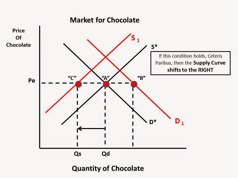
Chocolate and Simultaneous Shifts in Demand and Supply----Happy Valentines Day!

Can you feel the love of supply and demand yet?

A very nice article in the New York Times that can be used for a basic supply and demand example showing the possible outcome with a simultaneous change in a determinant of Demand AND Supply. This is a common problem encountered in a basic economics class.
Valentine’s Day Chocolate Will Cost More This Year, as Cocoa Prices Rise

The article suggest that the price of chocolate will increase because of an increase in Demand from emerging Asian countries, primarily China,  and a decrease in Supply though a combination of bad weather and a fungi that has attacked the cocoa bean plants.

I put together some slides to illustrate these affects.  For the purposes of this lesson I am going to assume the magnitude of change in Demand and Supply are equal. In other words, the curves will shift accordingly by the exact same amount/percentage.

Any comments or corrections are appreciated.


Wednesday, February 4, 2015

December Truck/SUV sales. Is there more to the story than low gas prices? Yes.

I got the graphic below from a Wall Street Journal article on the big jump in "large vehicle" sales in December in the US.  They give credit to easy credit and low gas prices.
Wall Street Journal

However, I think they might be missing one other key factor.

The purchasers of large vehicles and SUV's over 6,000 pounds who use them for "business purposes" are entitled to a depreciation allowance.  In 2014 the allowance was $25,000. This means a business could deduct up to $25,000 on there taxable income when they purchased a large vehicle/SUV.  This effectively reduces the price a business pays for the SUV---it is a subsidy through the tax code for the purchase of the vehicle.

That $25,000 depreciation allowance was only good for 2013 and most of 2014. However, in mid-December, the Congress extended this depreciation allowance for a very short time (the rest of month!) AND increased it to $500,000! Yes, read that again.  There are many caveats as to how this allowance can be taken, but the bottomline is, well, the bottomline: Many companies, small medium and large, probably purchase more vehicles in December before the legislation changes again.

Read more about the details HERE at Forbes.  It gets more complicated, of course.

Here is the ppt I put together to show students how this plays out on a basic supply and demand graph.  If you cannot read it, then go to the source HERE.  Comments welcome on any errors or omissions.

Thursday, January 29, 2015

Nice illustration of shift in crop production in the US(1990-2015). Good lesson on Allocative Efficiency

A nice visual showing how the allocation of agricultural land used for large scale farming has shifted in what it produces over time.  This can be the result of a change in consumer tastes, technology, environmental conditions or government policies.

In a basic economics class we refer to this as "allocative efficiency".

In Macroeconomics we identify it as a point anywhere on the Production Possibilities Frontier indicating a particular bundle of goods produced at its lowest cost (Productive Efficiency) and most desired by consumers

In Microeconomics we identify is at the point where the Price (P) equals the Marginal Cost (MC) of producing the last unit(s).  The price consumers are willing and able to pay and amount that at least equals the cost of the productive resources used to produce that unit.

Any hoot, this can be part of a lesson in allocation of resources and to pose the question "Why the movement away from Wheat production to Corn and/or Soybean?"

Found on Twitter and credited to The US Dept of Agriculture (that is all I know).


View My Stats