Saturday, March 8, 2014

Made a graphic to show why Chipotle is concerned about the supply of avocados. Maybe we DO need to be worried after you see this.

I pieced together two maps (sources cited below) to show why the Chipotle restaurant chain has expressed some concern about its supply chain in regards to avocados.

California produces 86% of the avocado crop in the US. Roughly 390 million pounds.

Chipotle uses about 35 million pounds of Avocados per year, or 9% of the total crop by itself.

Any reduction in the crop due to drought loss would have a negative impact on the over-all supply.  Hence rationing by price would be the order of the day.

Might be a good time to get into the futures market for Avocados....IF there is one!?!?!
Drought Map from Washington Post.  The avocado map from Mission Avacado

All the nuts are in California. No, really, they are. Nice graphic on nut production (and veggies and fruits) in the Bay State.

This from Mother Jones via Big Agriculture.

I was very surprised by the percentages here.  I am guessing you might be as well.

They include a nice reference map of the drought areas so you can see how it may affect food stuff production, hence the price of food in the chain.


Crop map

Friday, March 7, 2014

Why did the unemployment rate INCREASE in February when more jobs were created than expected? You know what they say about Statistics. See here the what for's...

Lately the pace of job creating has been tepid, to say the least, BUT the unemployment rate has been going DOWN.  How does that happen?

This month (Feb 2014) the number of jobs created has been far better than in past months BUT the unemployment went UP.  How does that happen?

Mostly has to do with the movement of people in and out of the labor force.

I pluck the following data from the latest Household Survey on Employment (Feb 2014).  I highlighted the "Civilian Labor Force" in yellow.  This shows the number of people employed and unemployed added together.

I highlighted in brownish the numbers for the past two months and for one year ago (Feb 2013).  Notice the Civilian Labor Force DECREASED on net last year.  From January 2013 to December 2013 there was a net DECLINE in the Labor Force of 51,000.  This will tend to LOWER the unemployment rate as people exit the labor force for various reasons (retirement, giving up looking for work).

So, a decrease in the unemployment rate in the short run can be a bad sign.

However, in February there was a BIG bump UP in the Labor Force by 264,000.  This will tend to INCREASE the unemployment rate as more people jump back in (or enter for the first time) to the Labor Force.

This can be a GOOD thing!  If people are more confident about job prospects then initially more people who were not looking for jobs are not looking.

So, an increase in the unemployment rate in the short run can be a positive sign.

Don't you just love economics and statistics?


First look at the latest jobs report out today. Some good, some bad, but not necessarily ugly.

Here is your first look at the BLS's "Establishment Survey" of employment in the US for Feb 2014.  This is a survey of US businesses (big and small) to determine how many jobs have been created in the economy.

I highlight in YELLOW the positives and in RED the lukewarm-to-negatives.

A total of 175,000 new jobs were created in February.  Of that total, 162,000 were private industry jobs and 13,000 were public sector government jobs.  Of those 13,000 government jobs, 11,000 were at the State level, 8,000 were at the Local level and there was a net LOSS of Federal government jobs of 6,000.  I have not looked but guessing a good chunk of those were post office jobs.

"Professional and Businesses Services" was a big gainer at +79,000.  This represents 45% of all the new jobs.  Within the category, 24,400 were Temp jobs.  This represents 31% of the Business and Services jobs created.  So, Professional and Business Service jobs minus Temp jobs was 54,600, which is 31% of all the jobs created.  It has not performed so well the last couple of months, so it picked up the slack somewhat from other sectors that faltered.

We want all job sector boats to rise in the tide.  Seems like job creation lately has been more displacement from one sector to the other as opposed to consistent growth overall.  And THAT latter thing is what we need!


Tuesday, March 4, 2014

Maps of India, South Africa and the Korean Peninsula at night. One has more light, one has the same, and one has none. Economic progress in one blog posting...

One of my favorite maps is "The World at Night". It is composite map that shows the presence of artificial light or more specifically the presence of electricity to create that light.  It is an indicator of modern economic and social activity.

It makes a great lesson for an economics and/or geography class.


I came across these two maps below that show to specific countries and the difference in the presence of artificial light.  It is suggested that this tells a story of differing paces of economic progress.

The first is of India in 1994 (left) and 2010 (right).  A very noticeable difference.


The one below is of South Africa from 2000 to 2009.  I can't see an appreciable difference.  To be fair it is only a period of 9-10 years.


Here is another one that NEVER changes.  The Korean Peninsula.  Lights out for the North...


Monday, March 3, 2014

Conserve Water, Eat Less Broccoli. Nice infographic on amount of water needed for various food staples.

How much water does it take to grow your favorite veggie?

Conserve water.  Eat LESS Broccoli...Done.  :)

Found HERE
Source: Mother Jones

My take-down of a Wall Street Journal article. It helps with understanding the difference between a Giffen and a Veblen Good AND a market reaction. They confuse ALL three!

In today's Wall Street Journal there is an article on the state of the world wide luxury goods market.

In my opinion they make LOTS of Microeconomics 101 (or AP Microeconomics) mistakes in their analysis. Read for yourself but I want to focus on how they use, or misuse, the term "Giffen Good".  Here is the relevant excerpt:

"...An economic theory holds that for certain goods, higher prices increase desirability and drive sales, rather than suppress demand as they would for ordinary products. Economists refer to such luxury products as Giffen goods, named for Scottish economist Robert Giffen, who described the phenomenon...."

First, they REALLY should have used the term Veblen Good instead of a Giffen Good.  A Veblen Good refers to luxuries ("status or pretige goods") and a Giffen Good is used generally in the context of inferior goods.

Here is a definition I found that I REALLY like and makes the concept easier for me to understand:
 "We use the term “Giffen behavior” rather than “Giffen good” to emphasize that the Giffen property is one that holds for particular consumers in a particular situation and therefore depends on, among other things, prices and wealth. Thus, it is not the good that is Giffen, but the consumers’ behavior. The Giffen phenomenon should also not be confused with prestige or Veblen goods, where consumers desire the goods precisely because the price is high, “snob appeal,” where consumers desire the good because it is rare, or situations where consumers interpret a high price as a signal of high quality. In all three cases, the goods in question are normal. Giffen behavior is a phenomenon that arises entirely within the neoclassical framework where consumers care about price only inasmuch as it affects their budget sets. If demand is Giffen the good in question must also be inferior, which rules out Veblen, snob and signaling effects". ---LINK HERE to where I got this definition.
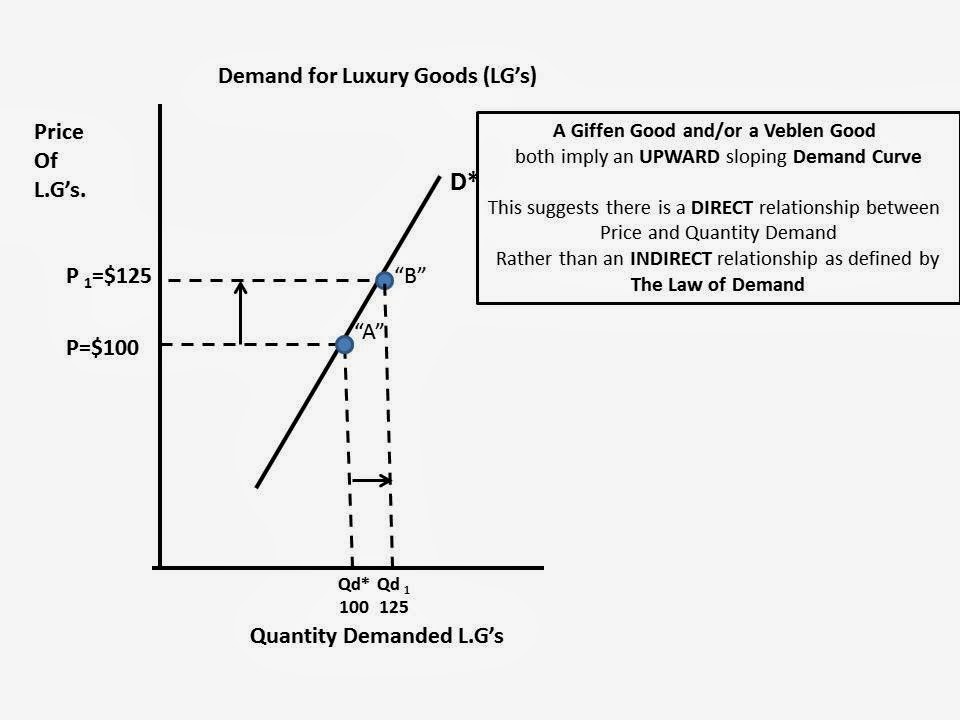
In both cases it suggests the Market Demand Curve is UPWARD sloping, indicating there is a DIRECT relationship between Price and Quantity Demanded of a good.  In other words, we only buy MORE when the price increases (or buy less when the price decreases).  This graph illustrates this phenomena:


This is counter to the Law of Demand that indicates we buy more only when the price decreases (or less when the price decreases).

So, what is really going on in the Market for Luxury Goods that I believe maintains the integrity of the Law of Demand?  Let's go to the graphs!

Here is a downward sloping Demand Curve for Luxury Goods. I just made up some random numbers for illustration purposes and to make the math easy.

At a price of $100 assume the market quantity demanded is 100.  Total Revenue would be $10,000


Assume the price of the Luxury Good increased to $125 and following the Law of Demand the Quantity Demanded decreases to 80.  Even though price increased and quantity demanded decreases, Total Revenues stayed the same.  This could or could not happen. It depends on "Elasticity of Demand", but I am not going to include that analysis here to keep it simple and short. :)


Why do I believe this is true in "Real Life".  Well, because the article told me so, in TWO places:
(1)---One reason ultra luxury brands are raising prices is to distinguish their products from entry-level luxury goods that are fast picking up market share. 
"The more Tory Burches and Michael Kors there are, the more the Chanels and Louis Vuittons will try to price up," said Milton Pedraza, the chief executive of the Luxury Institute, a research and consulting firm. 
The unintended consequence could be that the luxury brands drive even more customers toward less-expensive rivals....
...(2)---Jamie Moore, a homemaker in Cleveland, Tenn., said that on her annual shopping sojourn to New York, she usually splurged on a Prada handbag, for which even a basic nylon model can cost $1,230. Not this year. 
"The prices have gotten so expensive that I'm not buying one," she said.
So, a switch to an less expensive brand because of a viable substitute (1) AND because it is no longer affordable (2).  Nice example of BOTH the "Substitution AND Income Effects" that explain the DOWNWARD sloping nature of a demand curve...Hmmmm...

The article introduces two variables into the equation---rising income from China which creates new entrants into the market for Luxury Goods.


"A change in Income"  and "A change in the Number of Buyers" are two determinants of demand that will shift our demand curve, either left or right.

If at the SAME TIME there is a decrease in quantity demanded (20 units) from "the West" because of an increase in price, rising incomes and more Chinese wanting Luxury Goods can off-set this decrease in quantity demanded at $125.

Point "C" represents a new Price ($125) and Quantity Demanded (100) that lies to the RIGHT of the original Demand Curve "D*" (Price $125, Quantity Demanded 80).


We can assume (Ceterus Paribus) what happened between Point "B" and Point "C" will happen at 
every other point along Demand Curve "D*.  The Demand Curve will shift to Right:

Bottom line: I THINK  I maintained the integrity of the Law of Demand within the context of the Wall Street Journal article and its suggestion there is a case of Giffen/Veblen Goods going on in the luxury goods market.

This is just one inconsistency I found in the article. I believe there are many more.  

Extra Credit if you can find them!!  :)
View My Stats