Saturday, March 10, 2012
Why is a hospital room so expensive? Nice graph showing the decline in number of hospital beds since 1975...What has happened to the population since then? This ain't Rocket science...
The number of hospital beds in the US declined by 35% since 1975.

The US population was 216,000 in 1975 and 305,000 in 2008. That is an INCREASE of 41% in population.
How do you ration out a declining number of beds to a rising number of customers/patients? Price....An additional reason for rising healthcare costs?

The US population was 216,000 in 1975 and 305,000 in 2008. That is an INCREASE of 41% in population.
How do you ration out a declining number of beds to a rising number of customers/patients? Price....An additional reason for rising healthcare costs?
Why the demand curve slopes downward AND do we REALLY throw away this much clothing? Maybe Will Johnson is RIGHT!!
This quote comes from an article on cotton production and how our demand for clothes made from cotton has, at the margin, "crowded out" the production of food commodities. I liked the article because it nicely illustrates the downward sloping nature of a Market Demand Curve, specifically the inverse relationship between Price and Quantity Demanded:
""...Since 1994, the consumer price of apparel, in real terms, has fallen by 39 percent..... In the mid-1990s, the average American bought 28 items of clothing a year. Today, we buy 59 items.
I was also intrigued by this:
"...We also throw away an average of 83 pounds of textiles per person, mostly discarded apparel, each year. That’s four times as much as we did in 1980, according to an EPA analysis of municipal waste streams [PDF]...."
This since they quoted the statistic on a per person basis, I wondered how much the population has changed since 1980. Here is the graph:
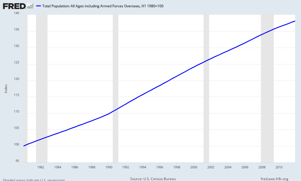
Using an Index of 100 to represent the base year 1980, we can see the population has increased approximately 38% since 1980. Population increased 38% and we throw away 400% more. I ain't no mathemetician, but that seems out of balance! Reduce, Reuse, (Recycle??)...MAYBE Will Johnson has a point!! :)
""...Since 1994, the consumer price of apparel, in real terms, has fallen by 39 percent..... In the mid-1990s, the average American bought 28 items of clothing a year. Today, we buy 59 items.
I was also intrigued by this:
"...We also throw away an average of 83 pounds of textiles per person, mostly discarded apparel, each year. That’s four times as much as we did in 1980, according to an EPA analysis of municipal waste streams [PDF]...."
This since they quoted the statistic on a per person basis, I wondered how much the population has changed since 1980. Here is the graph:
Using an Index of 100 to represent the base year 1980, we can see the population has increased approximately 38% since 1980. Population increased 38% and we throw away 400% more. I ain't no mathemetician, but that seems out of balance! Reduce, Reuse, (Recycle??)...MAYBE Will Johnson has a point!! :)
A couple of nice graphs showing a link between Capital Stock and Economic Growth---Hey, STOP yawning and find out why this is important!!!
Here are a couple of graphs that help illustrate an important concept in AP Macroeconomics---the relationship between "Capital Stock"(or Stock of Capital) and economic growth. Capital Stock, simply, is "the stuff you use to make other stuff"--Tools/Equipment that produce goods/services but also help workers be more productive. The assumption is as more Captial Stock is employed, in terms of quanitity and quality, the higher future economic growth will be (Actual and/or Potential Economic Growth).
The graphs from this study compare the use of capital in IT (Information Technology) by multinational corporations in the US and Europe (the top graph--Capital Employed-Per Labor Hour Worked) and the potential effect on overall productivity (the bottom graph--Output Per Labor Hour Worked) between the two geographical areas.
I inserted the Red Line at the year 2000 just to get a before and after perspective. I did not post these to prove anything on a large scale. There are/could be many other variables affecting productivy between the continents. However, I believe some of the difference in productivity gains can be attributed to a higher level of Capital Stock employment and the effective use of that Capital in producing goods and/or services.
 |
| Source: Conversable Economist |
I inserted the Red Line at the year 2000 just to get a before and after perspective. I did not post these to prove anything on a large scale. There are/could be many other variables affecting productivy between the continents. However, I believe some of the difference in productivity gains can be attributed to a higher level of Capital Stock employment and the effective use of that Capital in producing goods and/or services.
Tuesday, March 6, 2012

Subscribe to:
Comments (Atom)
 View My Stats