Demand by U.S. consumers is up, imports are down and prices have soared. “You have almost what you can call a perfect storm,” said Fisher, 64, who has about 3,100 animals on his acreage near Sonora. “The great part is we have record prices for lambs — the highest ever by a whole lot.” Last year’s May delivery of lamb fetched about $1.39 a pound; this year the price is around $2.20 a pound, said Fisher, the immediate past president of American Sheep Industry Association.......Still, Mazen Munaser, whose father owns the Islamic Village Market in Dearborn, said demand remains strong.The determinant of demand in this case seems to be a change in preferences. Lamb is also a substitute for other meats (Mutton is mentioned in the article). It has become a more preferable meat source. The demand curve shifts to the right because, relative to the original demand curve, there is a greater quantity demanded at "Pe" and we assume this will be the case at every other price as well. "Demand 1" will lie to the right of "Demand*".
The first graph illustrates the Market for Lamb at equilibrium. The second shows the increase in demand, or a shifting of the demand curve to the right.


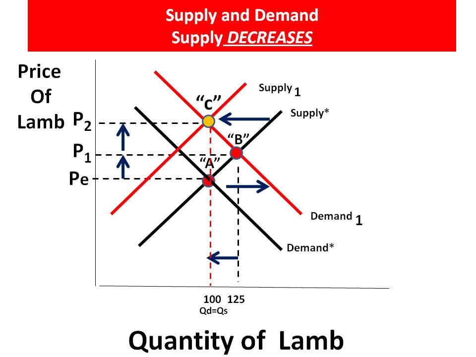
On the supply side:
That increased demand comes as supply drops, in part due to decreased production in Australia and New Zealand, two of the world leaders in production and large exporters to the U.S., Orwick said.The suppy curve shifts to the left because, relative to the original supply curve, there is less quantity supplied at "Pe" and we assume this will be the case at every other price as well. "Supply 1" will lie to the left of "Supply*".
Australia has about 70 million sheep, down from 170 million 20 years ago. The drop has been blamed on the ending of a government support program and extended drought followed by recent flooding, Orwick said.
In New Zealand, sheep numbers have dropped from about 70 million to 40 million, and many producers have switched to dairies and beef production.
Drought also has hurt some producers in Texas, but others in states such as Tennessee, Kentucky, Michigan and Ohio have picked up the slack, Orwick said.
This article presents a real world example of an AP Microeconomics multiple choice question. If you get a question like this, draw a S/D graph next to the question and shift the curves in the same proportion (unless instructed otherwise). This will lead you to the correct answer on the change in price and market quantity...
 View My Stats
No comments:
Post a Comment