 |
| Source HERE |
Thank you for visiting my blog. I post things I think will be of interest to high school students and teachers of economics/government/civics etc. Please leave a comment if what you find here has been useful to you. THANK YOU!
Wednesday, February 2, 2011
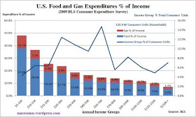
Nice graph showing percentage of income spent on food and gasoline at different income levels...Are we that much different than Egypt or Tunisia?
A statement of the obvious: Rising food prices disproportionately hurt the poor/lower income groups. In the US this does not have the major political consequences that it has in many other parts of the world. In percentage terms, we have smaller part of the population classified as poor. The graph below shows approx. how much, in percentage of income, households in the US spend on food and gasoline. These are two major commodities we consider necessities and use everyday. Roughly 20%-25% of the US population falls into the lowest income levels. This is much less than in countries where we see social unrest or out-right rebellion. Does the US have a "tipping point" where we could descend into mass protest? But for the grace of God, there go I...
No comments:
Post a Comment