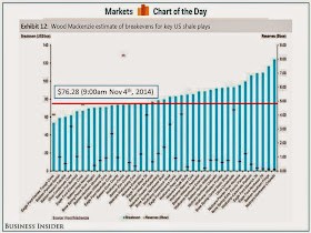
This is a follow up to yesterdays posting on the Break-Even point for oil drillers in different geographic areas of the US.
The point of that post was to use a firms costs curves (AVC + AFC =ATC) to show how low the price would have to go in order for firms to exit the industry.
Today in Business Insider they had this bar graph that helps clarify the point. I inserted a horizontal RED bar to show the current price drillers are receiving for each barrel of oil produced.
Together they give you an indication of how drillers, at the current price, are faring in terms of profitability.
I think teachers and students alike can use info to plot on a graph of the firm that is a "Price Taker" in the marketplace. Small drillers are relatively numerous and they must take the given market price (for the most part) for each barrel of oil the bring up.
Thank you for visiting my blog. I post things I think will be of interest to high school students and teachers of economics/government/civics etc. Please leave a comment if what you find here has been useful to you. THANK YOU!
Tuesday, November 4, 2014
Monday, November 3, 2014
Ebola Update: Last week was not a good one in this fight.
The data-base for Ebola reporting (found HERE) is updated to Oct 27th. You can see in the graph below that the week of October 21st to 27th (Circled in black) was not a good one in the fight against this virus. HERE is the latest World Health Organization(Oct 31) report on the status of Ebola.
This is a record of "Reported,Suspected and Confirmed Cases".
A noticable jump in all three of the afffected courntries, but Liberia and Sierra Leon the most frightening.
This is a record of "Reported,Suspected and Confirmed Cases".
A noticable jump in all three of the afffected courntries, but Liberia and Sierra Leon the most frightening.
PPT on Firm Cost Curves as it relates to the price of oil.
I love it when the media post(s) helpful resources.
The graphic below comes from a Wall Street Journal article: Energy Boom Can Withstand Steeper Oil-Price Drop
It gives a range of "Break-Even" price points for barrels of oil from different shale formations throughout the US and compares it to the current price of a barrel of oil, $82.20 (Wednesday, Oct 29).
The graphic below comes from a Wall Street Journal article: Energy Boom Can Withstand Steeper Oil-Price Drop
| Source: Wall Street Journal |
In AP Microeconomics, "Break-Even" is defined when the price the firm receives for a good equals the Average Total Cost (ATC) or producing that good. ATC is the sum of the firms "Explicit" money costs (dollars paid out in expenses) and its "Implicit" Opportunity Costs.
The article has a couple of relevant quotes that help in the analysis I put together in the form of a PPT to helps students understand this concept.
The article has a couple of relevant quotes that help in the analysis I put together in the form of a PPT to helps students understand this concept.
"U.S. crude closed Wednesday at $82.20 a barrel, and far less in some parts of the country where few pipelines are available to move it to refineries. Lower oil prices mean drillers will have less cash to cover their borrowings, especially if crude prices tumble more.""Borrowings would be considered "Fixed Costs" as they have to be paid back regardless of production.
"To be sure, even small price drops could begin to affect production around the margins. “The clear losers in a low-price environment are going to be smaller companies that are overleveraged,” said Daniel Katzenberg, a Baird analyst. The downturn will be particularly toughon companies drilling in areas without much history of oil production. Costs tend to be high in these areas, which include the Tuscaloosa Marine Shale in Louisiana and Mississippi and some relatively unexplored shale formations in Oklahoma.
The current price environment is a bit like a stress test to determine which companies have their financial and operating houses in order. Those that spent too much to lease property to drill, or have high operating costs, are most likely to suffer."Keep these things in mind as you view the PPT. Visual the price of oil you see in the graphic moving to the left (decreasing) and encroaching on the Break-Even points. Hopefully it will help! Let me know of anything I might have missed. Thanks!

