This graphic comes from a recent study (found HERE) on the state of entrepreneuship in the US. There are MANY other interesting graphs and data in the study, but this one interested me because I believe it is important element in the movement to reform our immigration policies.
It shows the incidence of entrepreneurship between native born Americans and Immigrants. The gray line represent immigrants, the blue line "native borns". Look at the trend over time.
Immigration = Entrepreneurship = Economic activity = Jobs. We need to be mindful of this when we formulate policy.
Something about babies and bath water, if I recall.
HT: New York Times for the link to this study
Thank you for visiting my blog. I post things I think will be of interest to high school students and teachers of economics/government/civics etc. Please leave a comment if what you find here has been useful to you. THANK YOU!
Friday, April 19, 2013
Thursday, April 18, 2013
What can a new Kubota production plant in the US tell us about manufacturing and employment in the US? You will need i-pad skills to work there, not welding or assembly skills..
 Kubota, a Japanese maker of heavy equipment/smallish tractors, just opened a new manufacturing facility in Georgia. This is a nice example of state of manufacturing and manufacturing employment in the world today. Here is the operative paragraph from an article about the grand opening:
"Efficiency is a watchword in every aspect at the plant. Robots do 70% of the welds. Workers with iPads do quality checks and wirelessly send reports to large monitors so supervisors can follow progress every step of the way. If automated sensors on parts of the line detect a bolt is not tightened to specifications, the line shuts down.
The 522,000-square-foot plant is up and running. But more work is needed before it produces its capacity of up to 22,000 tractors annually. Another 100 workers will soon join the current 100 employees. Expansion space is available."200 or so workers to produce 1,000's of tractors. The line workers carrying i-Pads instead of welding torches. Robots doing most of the skilled labor and heavy lifting.
Manufacturing revival without the revival in the employment of traditional manufacturing labor skills.
Politicians and policymakers want to make industrial policy with the notion that these two are still directly linked in the 21st century.
We need a better plan...
HT: Big Picture Agriculture for link to article
Nice graph showing the dramatic reduction in Extreme Poverty world-wide since 1981. THIS is a good thing!!
From The World Bank in a report on the reduction of "extreme poverty" (subsisting on less than $1.25 per day):
Open markets, the Asian supply line, and free(er) trade have lifted 100's of millions out of extreme poverty. This is a good thing.
Extreme poverty in the world has decreased considerably in the past three decades (figure 1). In 1981, more than half of citizens in the developing world lived on less than $1.25 a day.
This rate has dropped dramatically to 21 percent in 2010. Moreover, despite a 59 percent increase in the developing world’s population, there were significantly fewer people living on less than $1.25 a day in 2010 (1.2 billion) than there were three decades ago (1.9 billion).
But 1.2 billion people living in extreme poverty is still a extremely high figure, so the task ahead of us remains herculean.---The World BankThe fact that the reduction comes in spite of a 59% INCREASE in population in developing countries over this time is stunning to me. Greater Asia and India account for a disproportionate amount of the reduction.
Open markets, the Asian supply line, and free(er) trade have lifted 100's of millions out of extreme poverty. This is a good thing.
Wednesday, April 17, 2013
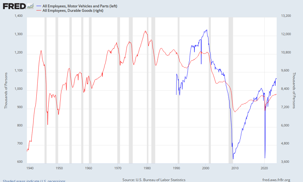
Manufacturing Output and Manufacturing Employment. Never shall the two meet again...See graphs here...
Mark Perry at AEI (Carpe Diem) has this graph showing the state of manufacturing in the US to date. Specifically, Industrial Production of Durable Goods and Motor Vehicles and Parts.
He puts the scale in an index form. Look at the line labeled "100" and move straight across. Manufacturing OUTPUT is back to pre-recession levels. Nice! However, what has this done for EMPLOYMENT in the manufacturing sector? See the next graph below.
The lines are colored coded to represent the same industries in both graphs. The employment graph is scaled in "thousands or persons", so add 3 zeroes to the numbers you see below.
Employment pre and post recession has not made the same gains as output. The question of the day is WHY do you think that is so? It is getting better, but the separation between output and employment continues. Look at the time period between the last recession in 2001-2002 and the one we just went through. What do you notice? Is employment in this sector EVER going to return to that level? The problem is not as easy to identify as it is portrayed in the media and by politicians.

He puts the scale in an index form. Look at the line labeled "100" and move straight across. Manufacturing OUTPUT is back to pre-recession levels. Nice! However, what has this done for EMPLOYMENT in the manufacturing sector? See the next graph below.
| Source: Carpe Diem |
Employment pre and post recession has not made the same gains as output. The question of the day is WHY do you think that is so? It is getting better, but the separation between output and employment continues. Look at the time period between the last recession in 2001-2002 and the one we just went through. What do you notice? Is employment in this sector EVER going to return to that level? The problem is not as easy to identify as it is portrayed in the media and by politicians.

Monday, April 15, 2013
Want to know where your Federal Tax dollars go? Nice interactive shows you in detail based on a programs percentage of the budget.
Here is a cool interactive ("cool" is a relative term when speaking of taxes) that allows you to input how much in Federal Taxes you actually paid (Income, Social Security, Medicare) and displays the specific programs (based on percent of the Federal Budget) your money was spent on.
If you are not sure, input $10,000 just to get an idea. Be sure to choose the "Expand All" button to ge the full effect.
CLICK HERE FOR THE LINK.
If you are not sure, input $10,000 just to get an idea. Be sure to choose the "Expand All" button to ge the full effect.
CLICK HERE FOR THE LINK.

